Menus allow users to browse through options, settings, and commands available in your application. A well-organized set of menus shows users what your application can do and makes it easy to locate particular functions. This chapter describes the kinds of menus your application should use and how menus and menu items should be organized, in these sections:
“Types of Menus” defines the three types of menus that your application can use: pull-down, popup, and option menus.
“Menu Traversal and Activation” describes the default IRIS IM model for accessing menus with the mouse and the keyboard, with two additions that your application should support.
“The Menu Bar and Pull-Down Menus” discusses how to design pull-down menus (which include cascading, or nested, menus).
“Popup Menus” discusses how to design popup menus.
Option menus are discussed only briefly in this chapter; they're covered in detail in “Option Buttons” in Chapter 9.
IRIX Interactive Desktop supports three types of menus, all of which are defined in the OSF/Motif Style Guide: pull-down menus, popup menus, and option menus. This section discusses these menu types:
Of the three types, pull-down menus are the most frequently used. Most applications have a menu bar, which is a collection of pull-down menus. Figure 8-1 shows a typical menu bar.
Each pull-down menu is represented in the menu bar by its title. A user can display a menu by pressing the left mouse button on the menu title. Figure 8-2 shows a typical pull-down menu.

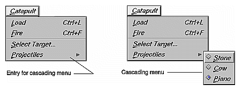
Pull-down menus can include submenus, or cascading menus. A menu entry for a cascading menu is indicated by an arrowhead next to the entry, as shown in Figure 8-3. Pull-down menus are discussed in detail in “The Menu Bar and Pull-Down Menus” later in this chapter.
Unlike pull-down menus, popup menus are not represented by a title on the screen. A user displays a popup menu by pressing the right mouse button. The contents of the popup menu depend on where the mouse pointer is located when the button is pushed. Figure 8-4 shows a popup menu. Popup menus are discussed in detail in “Popup Menus” later in this chapter.
Option menus allow the user to select a single option from a list of options. An option menu appears as a button marked with a horizontal bar, as shown in Figure 8-5.
The option button is labelled with the currently selected option. When a user presses the left mouse button over the option button, the option menu is displayed, as shown in Figure 8-6. If the user selects a different option from this menu, the label on the button updates to reflect this new value.
Entries in an option menu represent mutually exclusive values of a parameter. They shouldn't be used for actions. Guidelines for using option buttons and option menus are discussed in “Option Buttons” in Chapter 9.
Pull-down, popup, and option menus should use the default IRIS IM model for menu traversal and activation, with two additions. This model is defined in the OSF/Motif Style Guide, Chapter 3, and summarized below. The two additional guidelines are also described in the following paragraphs.
Pull-down menus use mnemonics and keyboard accelerators for traversal and activation; these techniques are described in the next section, “The Menu Bar and Pull-Down Menus.”
With the default model, users can use either the mouse or the keyboard to display, traverse, activate, and close menus. This section describes:
With the mouse, users have the additional choice of manipulating menus in either a spring-loaded or a posted manner.
To display a pull-down or option menu in a spring-loaded manner, the user positions the pointer over the menu and presses the left mouse button. To display a popup menu in a spring-loaded manner, the user positions the pointer in an area of the window that has a popup menu associated with it and presses the right mouse button. The user traverses any of these menus by moving the pointer over the menu entries while continuing to hold the mouse button.
If the pointer is over a menu entry when the user releases the mouse button, that entry is activated and the menu is removed.
To display a menu in a posted manner, the user positions the mouse pointer over the menu or over the appropriate area of the window and clicks the appropriate mouse button (left for pull-down and option menus, right for popup). The menu is then displayed with the location cursor on the first available menu entry (that is, the first non-disabled entry). To activate one of the menu entries, the user positions the pointer over the appropriate entry and clicks the left mouse button.
To remove the menu, the user clicks the left mouse button anywhere outside the menu. For popup menus, the user can click either the left or right mouse buttons to select an entry or remove the menu.
In addition to supporting this default model for manipulating spring-loaded and posted menus with the mouse, make sure your application handles the mouse click that closes a posted menu as follows: Even though this click is passed on to the underlying application window, your application should ignore this click so that users don't lose selections they've made in the window just because they display and close menus.
By default, in IRIS IM, users can also display, traverse, activate, and close menus using the keyboard:
To display pull-down menus, users first press <F10> to move the keyboard focus to the leftmost menu in the menu bar and then press the down arrow key. To display an option menu, users first move keyboard focus to the option menu button and then press the space bar.
Once a menu is displayed, the user can use the up arrow and down arrow keys to traverse a menu. Similarly, the user can use the left arrow and right arrow keys to move from menu to menu across the menu bar.
Once a menu is displayed, pressing <Enter> or the space bar activates the item under the location cursor, closes the menu, and returns the keyboard focus to where it was before the menu was displayed.
Pressing <Esc> while a menu is displayed closes the menu and returns the keyboard focus to where it was before the menu was displayed. Pull-down menus can also be closed by pressing <F10>.
In addition to supporting this default model for manipulating menus with the keyboard, your application should allow <Shift><F10> to display a popup menu if one is available and move the keyboard focus to the first available entry in the menu. Pressing <Shift><F10> again should close the popup menu and return the keyboard focus to where it was before <Shift><F10> was pressed originally. This behavior is recommended in the OSF/Motif Style Guide (where <Shift><F10> is described as the substitute for the <Menu> key), but it isn't supported by default in IRIS IM.
In general, when designing traversal and activation for your menus . . .
Allow users to activate and traverse the menus using the default IRIS IM behaviors for mouse and keyboard actions.
If a user closes a menu by clicking somewhere outside of the menu, make sure the application ignores this click so that users don't lose selections they've made in the window just because they display and close menus.
Allow users to display and close popup menus using the key combination <Shift><F10>. When <Shift><F10> displays a popup menu, the location cursor should be on the first available menu entry. When <Shift><F10> closes the menu, the keyboard focus should be returned to where it was before the menu was displayed.
In most cases, each of an application's primary windows has a menu bar as described in “Menu Bars in Primary Windows” in Chapter 6. Users should be able to access most of an application's functions through its menu bars. This makes it easy for users to see what functions are available to them. This section describes the menu bar and pull-down menus:
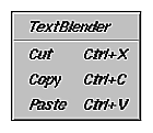
Each menu bar contains several pull-down menus. Each pull-down menu is represented in the menu bar by its title and contains entries that are either an action, a label for a cascading menu, or a separator, as shown in Figure 8-7. Also as shown, the cascading menus contain additional actions. See “What to Put in the Pull-Down Menus” for more information about the content of pull-down menus.
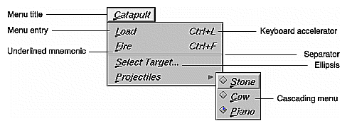
Users interact with pull-down menus according to the model described in the previous section, “Menu Traversal and Activation.” In addition, users can access menu entries using mnemonics, which are the underlined characters in the menu titles and on menu entries (see Figure 8-7).
To access a menu using a mnemonic, a user moves the pointer into the application window, then holds down the <Alt> key while pressing the character key that matches the underlined character in the menu title. For example, to display the Catapult menu shown in Figure 8-7, the user holds down the <Alt> key and presses the “c” key. Then, to select a projectile from the Projectiles cascading menu, the user presses the “p” key to display the Projectiles cascading menu, and then presses “p” again to select “Piano.” Note that mnemonics are always activated without the <Shift> key, even if the underlined character happens to be uppercase. Choosing appropriate mnemonics is discussed in more detail in “Choosing Mnemonics” later in this chapter.
Menu entries that represent frequently used actions can have keyboard accelerators, as shown in Figure 8-7. These keyboard accelerators are displayed in the menu next to the action and are typically a combination of the <Ctrl> key and one other key. To initiate a menu action using a keyboard accelerator, a user moves the pointer over the window to make it the active window and then presses the key combination shown in the menu entry. For example, instead of selecting “Fire catapult” from the Catapult menu in Figure 8-7, a user could fire the catapult by holding down the <Ctrl> key and pressing the “f” key. When to use keyboard accelerators and how to choose ones which are appropriate are discussed in more detail in the “Choosing Keyboard Accelerators” section later in this chapter.
A menu entry that's followed by an ellipsis (such as the “Select target...” entry shown in Figure 8-7) brings up a dialog that requests more information from the user before any action is performed. When to use an ellipsis in a menu entry is discussed in more detail later in this chapter in “Naming Menu Entries in the Pull-Down Menus.” Menu entries that aren't currently available are disabled. This is usually shown by graying out the menu entry, as discussed in “Disabling Menu Entries.”
When designing the menu bar and its pull-down menus for your application, start with the standard menus described in the next section, “Standard Menus.” Then, modify these standard menus to fit your specific application, using the guidelines in the section “What to Put in the Pull-Down Menus.”
Your application needs its own customized set of menus and menu entries; however, use the standard set as the starting point for the overall menu structure. Standard menus include:
All of the menu entries discussed in this chapter are optional; many of them are appropriate for most applications (but there are always exceptions), and some entries are generally less common than others. For example, “Print” is a fairly common entry for the “File” menu, but printing doesn't generally make sense for audio applications. “Import” is another entry for the “File” menu, but it's less common than “Print.” Figure 8-8 shows a menu bar with all of the standard menus (in the correct order) and their mnemonics. This menu bar includes all of the menus defined in the MenuBar reference page of Chapter 9 in the OSF/Motif Style Guide, plus an additional menu, Tools, which is defined in the IRIX Interactive Desktop environment. The standard menus are described in the following sections.
Note that for each of the standard menu entries described in the following sections, mnemonics are represented by the underlined character in the entry label. This label also includes an ellipsis if the entry should include them. The entries are listed in the order in which they should appear in menus, and entries that are likely to be less common are indicated. Keyboard accelerators, if they exist, are listed in the description of the specific menu entry (Table 8-3 lists standard keyboard accelerators). Appropriate places for separators are shown in the figures depicting the standard menus. Situations where a menu entry should be disabled are included in the description of the menu entry if applicable. Also, the keyboard shortcuts are shown as they should be displayed in the menus (for example, <Ctrl>-s is shown as “Ctrl+S”).
The File menu contains entries for actions that are performed on files, such as “Open,” “Save,” and “Print,” and on the application as a whole, such as “Exit.” Figure 8-9 shows the standard File menu with the most common entries; note that its mnemonic is “F.” These standard entries, as well as a few other less common ones (“Reopen,” “Import,” and “Revert”), are described in Table 8-1 in the order in which they should appear in the menu. All of these entries should behave as defined by the File Menu reference page in the OSF/Motif Style Guide, Chapter 9, except as noted in the table. Note that “New,” “Open,” “Close,” and “Exit” should display a dialog as described in “Invoking Dialogs” in Chapter 10 if there are unsaved changes to the current document.
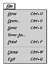
Table 8-1 lists each File menu entry, its mnemonic, OSF/Motif behavior, IRIX Interactive Desktop additions and exceptions, and keyboard accellator.
Menu Entry and Mnemonic | OSF/Motif Behavior | IRIX Interactive Desktop Additions and Exceptions | Keyboard Accelerator |
|---|---|---|---|
Creates a new, empty file. | If your application allows more than one document window to be open at a time, it should create a new, empty document window; if the current document window is already empty, the action should have no effect. For more information on designing applications that support multiple open documents, see “Standard Application Models” in Chapter 6. If your application requires more information before creating a new document (for example, the user must select a template), this action may display a dialog to request the information. In this case, the entry label should be followed by an ellipsis. | Ctrl+N | |
Brings up a dialog, allowing the user to choose an existing file to open. | If your application allows more than one document window to be open at a time, it should create a new document window to display the specified file; however, if the current document window is already empty, the file should be displayed in the current document window. This new document window shouldn't be a separate instantiation of the application. | Ctrl+O | |
Reopen [a] | Not defined. | “Reopen” allows a user to return to a file that had been previously opened by the application. Choosing “Reopen” should display a cascading menu of previously opened files; you might choose to limit the length of this list to a maximum of 10 entries. (You should disable this entry if there are no previously opened files—for example, if this is the first time the user has launched the application.) If there are unsaved changes to the current file, your application should display a dialog that asks the user whether to save or discard the changes (see “Invoking Dialogs When Manipulating Files” in Chapter 10). |
|
|
Import a | Not defined. | “Import” allows a user to read an existing data file into the current application. This entry can display the IRIX Interactive Desktop file selection dialog (in which case it should be displayed with an ellipsis), and the application should automatically determine the type of the file after it's selected. (See “Types and Modes of Dialogs” in Chapter 10 for details on the IRIX Interactive Desktop file selection dialog.) Alternatively, this entry can use a cascading menu to display the types of data that your application allows users to import. Each of these entries should be followed by an ellipsis and display the file selection dialog to allow the user to specify the specific file to import. Follow this entry with a separator. |
|
|
Save
| Saves the current file. | Although some applications disable this entry when there are no changes to be saved, your application should never disable this entry (as described in “Disabling Menu Entries”). | Ctrl+S |
Brings up a dialog and saves the current file with a new name. Also closes the previous file and opens the new one. | If the current document already has a filename, that filename should be the default value in the file selection dialog. |
| |
Not defined. | “Revert” allows a user to undo all changes made to the current file since the last time the user saved it. (This entry should be disabled if there are no unsaved changes.) Your application should display a warning dialog before executing this action, as described in “Invoking Dialogs When Manipulating Files” in Chapter 10. |
| |
|
Print
| Prints the current file. | If choosing “Print” brings up a dialog to allow the user to select from a list of all available printers, it should be followed by an ellipsis. If the keyboard accelerator is used to activate this entry, the print job should be sent to the default printer. | Ctrl+P |
Closes a window and its associated support windows and dialogs, without quitting the current application. | “Close” should be provided on co-primary windows and on support windows if they have menu bars. It shouldn't be provided on the main primary window. (See “Window Types” in Chapter 6 for definitions of these window types and “Window Decorations and the Window Menu” in Chapter 3 for details on the “Close” entry.) Applications that follow the “Multiple Document, No Visible Main” model should exit the application when the last co-primary window is closed. (See ““Multiple Document, No Visible Main” Application Model” in Chapter 6.) | Ctrl+W | |
Closes all windows for the application and quits the application. | “Exit” should always be provided in the main primary window. If users are likely to want to exit your application from a specific co-primary window in the application, that window should include an “Exit” entry in the leftmost menu, in addition to a “Close” entry. (See “Window Decorations and the Window Menu” in Chapter 3 for details on when to use “Exit” and “Close.”) | Ctrl+Q | |
[a] These entries are probably less common than the others. | |||
The Selected menu contains application-specific actions that are performed on the currently selected objects. For example, Directory View windows on the IRIX Interactive Desktop display icons representing files. Each Directory View window has a Selected menu that allows users to perform actions on the selected files, such as “Open,” “Print,” and “Remove.” (Note that since actions in the Selected menu act on the selected data while actions in the File menu act on the entire file of data, the same entry—“Print,” for example—can mean something different in the two menus.) The Selected menu should not contain editing actions such as “Cut” since these should be in the Edit menu. Use “S” as the mnemonic for the Selected menu.
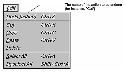
The Edit menu contains actions that transfer data to or from the clipboard, actions that modify the current selection, and “Undo.” It contains actions for both the clipboard data exchange model (“Cut,” “Copy,” and “Paste”) and for the primary data exchange model (“Promote”). Both of these data exchange models are described in Chapter 5, “Data Exchange on the IRIX Interactive Desktop.” Figure 8-10 shows the most common entries in the standard Edit menu; use “E” as its mnemonic.
These standard entries, as well as a few other less common ones (“Clear,” “Promote,” and “Color Editor”), are described in Table 8-2 in the order in which they should appear in the menu. Make sure that all of these entries behave as defined in the Edit Menu reference page in Chapter 9 of the OSF/Motif Style Guide, except as noted in the table.
Table 8-2. Standard Edit Menu Entries
Menu Entry and Mnemonic | OSF/Motif Behavior | IRIX Interactive Desktop Additions and Exceptions | Keyboard Accelerator |
|---|---|---|---|
Reverses the effect of a previous action. The “Undo” action may apply to actions that the user accomplishes without using the menus—typing text, for example. | At a minimum, your application should be able to undo all of the actions in the Edit menu. If an undo action will change the data significantly and can't be undone, you should display a warning dialog explaining that the change can't be undone and ask for confirmation. See “Types and Modes of Dialogs” in Chapter 10 for information on warning dialogs. The “Undo” entry should be disabled if the last change cannot be undone or if there are no changes. If your application has only a single-level undo (that is, it can undo only the most recent action), after the user selects “Undo,” the “Undo” entry should be changed to “Redo [action].” If the user selects “Redo” the application should reverse the effects of the previous “Undo,” and toggle the menu entry back to “Undo [action].” If your application has multiple-level undo (that is, it can undo a series of actions), you should provide a separate “Redo” menu entry. Typically, applications don't allow users to undo beyond the saved version of the file; if your application does, you should display a warning dialog. | Ctrl+Z | |
Not defined. | “Redo” reverses the effect of a previous “Undo” action. It is useful to have a separate “Redo” entry if your application has multiple-level undo. Like “Undo,” the “Redo” entry should indicate the action that will be redone (for example, “Redo Cut,” “Redo Paste”). If you provide a “Redo” command, place it after the Undo entry and follow it with a separator. | Shift+Ctrl +Z | |
Removes the selected data from the application window to the clipboard. | The “Cut” entry should be disabled if there's nothing currently selected in the window. | Ctrl+X | |
Copies the selected data to the
clipboard without removing it from | The “Copy” entry should be disabled if there's nothing currently selected in the window. | Ctrl+C | |
Copies the contents of the clipboard into the application window. | If there's nothing currently on the clipboard available to be pasted, display a dialog saying there's nothing available. See “Invoking Dialogs” in Chapter 10. | Ctrl+V | |
Removes the selected data from the application window. | The “Delete” entry should be disabled if there's nothing currently selected in the window. |
| |
Selects all of the elements in a component of the application window. | The mnemonic for “Select All” is “A.” | Ctrl+A | |
Deselects all of the elements in a component of the application window. | The “Deselect All” entry should be disabled if there's nothing currently selected in the window. The mnemonic for “Deselect All” is “l.” | Shift+Ctrl +A | |
Clear [a] | Same as “Delete,” except that the remaining data isn't reorganized to fill in the space left by the cleared data. | If you provide a “Clear” command, place it before the “Delete” entry. The “Clear” entry should be disabled if there's nothing currently selected in the window. |
|
|
mote a | Promotes the current selection to the primary selection. | “Promote” should be included if it can be difficult or time-consuming to recreate a selection in your application, and if your application supports the primary transfer model described in “Supporting the Primary Transfer Model” in Chapter 5. Disable this entry when there's no current selection or when the current selection is already the primary selection; it should be enabled only when the application window has a selection that isn't currently the primary selection. See “Selection” in Chapter 7 for information on selections. The mnemonic for “Promote” is “m.” | Alt+ Insert |
|
olor Editor... a | Not defined. | Choosing “Color Editor” invokes the IRIX Interactive Desktop color chooser, which allows the user to select colors. (See “A Specific Standard Support Window: The IRIX Interactive Desktop Color Chooser” in Chapter 6.) |
|
[a] These entries are probably less common than the others. | |||
The View menu contains entries for application-specific actions that change the user's view of the current data but that don't change the actual data.
For example, if your application window has several panes of information, the View menu could provide the user with a way to turn each individual pane on or off. Group together the entries representing the individual panes, and provide a checkbox in front of each one indicating whether the pane is currently being displayed or not. (See “Splitting Primary Windows Into Panes” in Chapter 6 for information on multiple-pane windows. You can find more information on menu checkboxes in “Using Radio Buttons and Checkboxes in Pull-Down Menus.”)
Other entries in the View menu can adjust the scale of the view (zoom in and zoom out), display support elements (such as rulers and grid lines), and hide or display certain parts of the data. Use “V” as the mnemonic for the View menu.
The Tools menu contains application-specific entries that allow the user to open support windows for manipulating the data in the parent primary window. For example, a desktop publishing package might have separate support windows that provide special controls for editing graphics, tables, and mathematical equations; access to these support windows would be placed in the Tools menu. See “Support Windows” in Chapter 6 for a discussion of support windows. Use “T” as the mnemonic for the Tools menu.
The Options menu contains application-specific entries that allow the user to customize the application. For example, a multi-window application might have entries in the Options menu to allow the user to set preferences such as which windows should come up by default when the application is started, and whether window sizes and positions should be saved between sessions. Use “O” as the mnemonic for the Options menu.
The Help menu contains entries for actions that provide several different kinds of help information to the user. All application windows that have a menu bar should contain a Help menu. Its mnemonic is “H.” The standard entries for the Help menu are discussed in “Providing Help through a Help Menu” in Chapter 4.
Make sure your application's pull-down menus include the standard menu entries that are relevant to your application, plus the application-specific entries you need to represent your application's core functionality. The previous section, “Standard Menus,” describes when and how to use the standard entries; this section presents guidelines for application-specific modifications and additions to the standard menus.
As you decide which standard entries to include in your application, consider each of these entries on a case-by-case basis. For example, you almost certainly need an “Exit” entry, but it's possible that none of the other standard File menu entries make sense for your application, including the “File” menu title itself.
Users often learn the functionality of a new application by scanning the menus to see what actions are available and by browsing the online help. Also, when users want to perform some action, they usually look first for that action in the pull-down menus. Thus, make all simple, frequent actions accessible from the pull-down menus.
Be sure to include actions for performing basic operations (such as “Cut,” “Paste,” or “Save”), for setting the value of an attribute (for example, make selected text bold, or turn grid lines on or off), for online help, and for “Undo” (particularly if users can perform actions that destroy or significantly change their data). If this important functionality is hidden in a dialog, users won't easily discover it. (See Chapter 10, “Dialogs” for details on when to use dialogs.) Also, don't include more than 10-12 entries in a menu or users will have trouble scanning it; make sure that all of your entries fit on the screen at one time because Motif doesn't support scrolling menus.
Actions that are accomplished using buttons in primary windows should be repeated in the pull-down menus because they're probably the most frequently accessed actions. Including them in the menus gives users one place to look for all actions and allows you to assign keyboard accelerators and mnemonics that are clearly shown in the menu entries.
Provide users with the option of using the keyboard for frequently used actions rather than restricting them to pointing-and-clicking on buttons. In addition, all simple actions should have an associated menu command even if there's a direct manipulation method or mouse double-click shortcut available for accomplishing the task. Providing menu commands avoids hidden functionality, and helps those users who have difficulty performing double-clicks.
If you think that your users need constant access to a group of actions, make these actions available in your application's support window. As a second choice, you can use a tear-off menu as described in the OSF/Motif Style Guide, section 6.2.3. Support windows are designed to include groups of controls that the user might want to use continuously. Support windows allow for a more flexible layout of controls than tear-off menus do, and support windows can contain all kinds of components, such as labels and text input fields, not just push buttons. (See “Support Windows” in Chapter 6 for information on designing support windows.) Make sure that users can access such support windows as well as co-primary windows from the menu bar of their parent window. Make sure that these windows have an appropriate titlebar.
Use one-word (capitalized) titles in all menus in the menu bar since users may interpret a second word as a separate menu title. Use entire words for menu titles rather than abbreviations. Don't use bitmaps as menu titles. Use the standard titles for menus (for example, File and Edit) if they're applicable to your application, but don't use a standard title if you're changing the standard definition. (See “Standard Menus” for standard menu titles and their definitions.)
The leftmost menu contains actions that operate on a logical unit of data for the application; it's generally titled “File” because most applications read and write data files. However, if your application doesn't manipulate data files, the leftmost menu should reflect the unit of data that the user expects to operate on. For example, the Search tool's leftmost menu is called Page because the application doesn't manipulate data files, but it does offer several different pages that define search categories.
If your application does read and write data files but the word “File” might be confusing to users, choose a more appropriate title for the leftmost menu. For example, in MediaMail, a group of documents (mail messages) are stored in a single file referred to as a mail folder. The leftmost menu in the main window is named “Folder” to make it clear that it contains actions that apply to the entire folder of messages rather than to individual messages. If the menu were named “File,” it might not be clear whether the “Open” entry opened a message or a mail folder. Similarly, you can change the names of other standard menus to make them more meaningful. The second menu in the main window of MediaMail is named “Message” because all operations in that menu are performed on the selected messages. This menu could have been called the Selected menu, but “Message” makes it clear what the menu entries act on.
As with menu names in the menu bar, use the standard names for menu entries within pull-down menus if they're applicable to your application; don't use a standard name if you're changing the standard definition. (See “Standard Menus.”) Menu entries should be capitalized using the same rules for capitalizing book titles: capitalize the first word and other non-articles, but don't capitalize articles unless they're the first word. Generally, a menu entry should be one of the following:
A verb—such as “Cut,” “Copy,” or “Delete.”
A value for a parameter, when the action is to set the parameter to that specific value. For instance, IRIS Showcase has a “Grids” cascading menu with entries corresponding to grid sizes such as “1/8 inch” and “1/4 inch.”
An attribute name, when the action is to assign some entity that attribute—such as whether shapes are drawn filled or unfilled.
A window name, if the menu entry brings up a co-primary, support, or dialog window. For example, a Directory View window has a menu entry for setting permissions. This entry brings up a dialog named “Permissions,” so the menu entry is also named “Permissions,” rather than “Set Permissions.”
The name of a cascading menu (see “Using Cascading Menus” later in this chapter).
If none of these categories applies, choose a one- or two-word phrase that indicates clearly what action will be taken. Include the name of the object that will be acted on if it's needed for clarity. For example, “New,” generally indicates that a new data file will be created. If your application doesn't create data files, the menu entry for creating a new entity should be “New object” such as “New Folder” (Directory View windows) or “New Page” (Icon Catalog). Don't use abbreviations in menu entries.
You can use graphic labels for menus entries, but keep in mind that graphic labels are often unclear. They work best when used along with a text label, and typically there's not enough room for both graphic and text labels in a menu entry. For those cases where graphics are better descriptions than text (for example, when showing bitmaps or textures), you should probably include these options in a tool palette either as individual buttons or as entries in an option menu. See “Pushbuttons” and “Option Buttons” in Chapter 9 for more information about these alternatives.
If the entry is something that toggles its state, use one of the following alternatives:
Toggle the menu entry name to indicate the action that will be taken if the user selects this entry. For example, a menu entry “Show Grid” indicates that the grid isn't currently shown and that choosing this item will display it. If the user chooses this item, the grid is displayed and the entry should toggle to “Hide Grid.”
Choose a menu entry name that clearly indicates what action will be taken, place a checkbox indicator next to the menu entry, and use the checkbox to indicate whether or not the action has been taken. For example, the menu entry “Italics” with a checkmark next to it indicates that the current font is an Italic one; the same entry with no checkmark indicates that the current font isn't Italic. (For more details on the use of checkboxes in menus, see “Using Radio Buttons and Checkboxes in Pull-Down Menus” later in this chapter.)
If the entry belongs to a group of related entries, all of which toggle their states, place checkbox indicators next to each of them. The entry names should be nouns or attributes that clearly imply their actions (and these names should remain constant rather than toggling). And separate the entire group from other menu items by separator lines. (See “Using Radio Buttons and Checkboxes in Pull-Down Menus.”)
A menu entry should be followed by an ellipsis if it brings up a dialog for the purpose of requesting more information from the user before performing the action. The ellipsis does not simply mean that the menu entry displays a dialog. For example, the “Save As...” menu entry brings up a dialog that asks the user to enter additional necessary information before the action can be performed. “Help,” on the other hand, brings up a dialog that contains the information that the user requested.
Use the order described in “Standard Menus” for standard menus in the menu bar and their entries. If you need to create additional menus for your application, place them between the View and Tools menus. If you need to change the name of one of the standard menus (as discussed earlier in “Naming Menus in the Menu Bar”), leave this menu in the same order as if it had the standard name. For example, in MediaMail the File menu is renamed Folder and the Selected menu is renamed Message, but Folder is still the leftmost menu and Message is still next to the Folder menu.
Within menus, organize entries into logical groups. If one of your application-specific menu entries is logically related to one of the standard menu entries, place it near that standard entry. If this isn't a good fit, create new menus that group the entries according to function. For example, the Directory View window has an Arrange menu that contains different options for arranging the file icons displayed in the window. Within the logical groups, first place entries in the order in which they need to be used. For example, in the Edit menu, “Copy” is before “Paste” because the user must do a “Copy” operation before doing a “Paste.” Secondarily, order them by frequency of use, placing the more frequently used entries closer to the top of the menu. In any case, be sure that when you use “Close” and “Exit,” they're always at the end of the leftmost menu, whether or not this menu is named File.
When creating logical groups of entries, use separators to define the groups, but avoid overusing separators because they can make it difficult to scan the entries. Two situations where separators are especially useful are:
Groups where only one of the entries can be selected at any one time
Groups whose entries represent multiple attributes that can be applied to a single object
As described later in “Using Radio Buttons and Checkboxes in Pull-Down Menus,” also use radio buttons in the first case and checkboxes in the second.
If the menu contains entries that can be determined only when the user launches the application (for example, a menu listing plug-in modules), alphabetize the entries. If this alphabetized group appears in a menu that contains other entries, place the group at the end of a menu and use a separator between it and the preceding entries.
As you're organizing your menus, you can use cascading menus, but don't use more than a single level. If you think you need more than one level of cascading menus, try adding a new menu instead, especially if you have numerous items in the cascading menus. If you have only a few items, consider creating groups of items by using separators, rather than putting them in separate cascading menus.
In general, try to limit your use of cascading menus since users tend to scan only the top-level menus when they're looking for a specific function or trying to learn the functionality of the application. When naming a cascading menu, use a name that suggests what it contains so that users know what functions they're likely to find. For example, in an early version of IRIS Showcase, the grid was under a cascading menu named “Editing Options” in the Edit menu, and users often weren't able to find it. Now, the different grid sizes are under a cascading menu named “Grids” in the View menu.
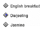
If a user can select only one of a group of menu items at any one time, provide a radio button next to each item in the group, and allow only one radio button to be active at any given time. For example, the radio buttons in allow the user to choose exactly one type of tea at a time, because if you ordered two cups of tea at a time the second one would get cold before you could drink it. Use separator lines to separate a set of radio buttons from other entries in the menu.
If a user can select several of a group of related menu items at any one time, provide a checkbox next to each item in the group, and show the active entries with checkmarks. These items typically represent attributes of an object, more than one of which can be applied to the object. For example, the checkboxes in allow the user to select milk or sugar, or both, or neither. Use separator lines to separate a set of checkboxes from other entries in the menu.

You need to choose single-character mnemonics for any menus or menu entries you create. Each of the menus in the menu bar should have a unique mnemonic, as should each of the entries within any specific menu. Use the standard mnemonics for standard menu titles and entries, as described earlier in “Standard Menus.” You can use a standard mnemonic for a different entry if you're not using that standard entry.
If possible, use the first character in the label for the mnemonic. If two menu titles—or two entries in the same menu—have the same first character, use the first character for the mnemonic of the menu title or entry that will be used most frequently. For example, “Save” is used more frequently than “Save As...”, so “Save” has the mnemonic “S” and “Save As...” has the mnemonic “A.”
When the first character can't be used as the mnemonic, try to pick a consonant in the name that's strongly associated with the word (such as “x” for Maximize in the Window menu). If no such consonant exists, choose the first available vowel (such as “a” for Raise in the Window menu). Note that the mnemonic chosen can be an uppercase or lowercase character in the label, but it must be case insensitive for activation (that is, users don't need to hold down the <Shift> key).
Use the keyboard accelerators for the standard menu entries as described in “Standard Menus”; don't use any of the standard accelerators for application-specific entries, even if you're not using those standard entries. For menu entries you create, provide keyboard accelerators only for the most commonly used actions, not for every menu entry in every pull-down menu.
In most cases, use the <Ctrl> key and a character for a keyboard accelerator. To avoid conflicts with mnemonics, don't use the <Alt> key rather than <Ctrl>. To make accelerators easier to remember, choose a character that's associated with the menu entry. For example, the standard keyboard accelerators include <Ctrl-c> for “Copy” and <Ctrl-s> for “Save,” and the Directory View window uses <Ctrl-i> for “Get Info.” Table 8-3 lists the standard keyboard accelerators.
Table 8-3. Keyboard Accelerators
Menu Entry and Mnemonic | Keyboard Accelerator |
|---|---|
New | Ctrl+N |
Open | Ctrl+O |
Save | Ctrl+S |
Ctrl+P | |
Get Info | Ctrl+I |
Close | Ctrl+W |
Exit | Ctrl+Q |
Undo [action] | Ctrl+Z |
Redo [action] | Shift+Ctrl+Z |
Cut | Ctrl+X |
Copy | Ctrl+C |
Paste | Ctrl+V |
Select All | Ctrl+A |
Deselect All | Shift+Ctrl+A |
Promote | Alt+Insert |
Click for Help | Shift+F1 |
If a pair of menu entries that both require keyboard accelerators, and one entry reverses the results of the other, their keyboard accelerators should be related. Choose a character that's associated with the more frequently used entry (so that its accelerator is <Ctrl-character>), and add <Shift> to create the other accelerator (so that its accelerator is <Shift-Ctrl-character>, where character is the same for both accelerators). For example, the keyboard accelerator for Undo is <Ctrl-z>, and the keyboard accelerator for Redo is <Shift-Ctrl-z>. In general, avoid using multiple modifier keys such as <Shift-Ctrl-character>, except for this situation.
Note that any keyboard accelerator that involves a lowercase character should be shown in the menu as “Ctrl+uppercase_character” (for example, <Ctrl-s> should be displayed as “Ctrl+S”). This is because uppercase characters are easier to read in the menus. If the accelerator involves an uppercase character, display it as “Shift+Ctrl+uppercase_character” (for example, <Ctrl-S> should be displayed as “Shift+Ctrl+S”).
As discussed in “Standard Menus,” disable menu entries that aren't currently available (they become grayed out). See the next section, “Dynamic Menu Entries,” for discussion of the rare cases in which menu entries can be removed from the menu when they're unavailable.
In general, disabling entries when selecting them would give the user an error message. For example, if a menu entry works on a selection (such as “Cut” and “Copy”), disable it if there's no current selection. If selecting the menu entry would result in no action at all (not even an error message), do not disable the menu entry. As an example, choosing “Save” from the File menu saves the current document; if the document hasn't been edited, selecting “Save” has no real effect, but there's no need to display an error message, so never disable this menu entry.
Never disable menu entries that launch modeless dialogs. If the dialog isn't applicable when it's launched, disable the OK and Apply buttons on the dialog rather than disabling the menu entry that launches the dialog. Suppose the user launches the dialog and the current context of the application is such that the dialog isn't applicable. Because the dialog is modeless, the user should be able to change the state of the application after the dialog has been launched to put the application in a state where the dialog is now applicable. In contrast, menu entries that launch modal dialogs should be disabled if the dialog isn't currently applicable because the user must dismiss the modal dialog before changing the state of the application. So, if the modal dialog isn't applicable when it's launched, the user has no way to change the state of the application to get it in a state where the dialog would be applicable. See “Dialog Modes” in Chapter 10 for a discussion of modal and modeless dialogs.
Don't include always-disabled menu entries whose action isn't available in the current version of your application, so that users don't waste time looking for a way to enable the entry. For example, if your application doesn't provide a tutorial, don't include a disabled menu entry for “Tutorial” in the Help menu. Instead, just leave this entry out of the Help menu. If a feature requires certain hardware configurations, don't disable its menu entry; instead, have it display an information dialog stating why the feature isn't available.
Dynamic menu entries are strongly discouraged, especially when less than four such entries exist. If you have only a few entries that aren't always available, put them in the menu and disable them when they aren't available. You can use dynamic menu entries in those rare cases when almost everything in a menu can change. For example, the grelnotes program has a Chapter menu that has entries for each chapter in the current set of release notes. When the user loads a new set of release notes, the entries in the Chapter menu are changed to reflect the new chapter titles. Unless a more obvious ordering is suggested by the content of the entries (for example, the order of chapters), alphabetize the entries in a dynamic menu.
Dynamic menu entries are discouraged because they make it hard for users to learn what entries are in each of the menus since they're visible only when the application is in a specific state. Users are likely to assume that certain functions aren't available when they don't see menu entries for them as they're scanning your application's menus for the first time. Users might not realize that they must first get the application in a particular state before they can even see the action. Even when users work with your application for a while, they may not look for certain actions in the menus because they think they've already seen the full contents of the menus, which never included the action that they now want. Also, users become accustomed to the spatial positions of items in menus—for example, “Cut” is always the second item in the Edit menu—and will be frustrated if these positions change.
In general, when designing pull-down menus in a menu bar . . .
Be sure that users can access most of your application's functionality from the menu entries. At a minimum, make sure that the core functionality can be accessed from the menus.
Don't include more than a 10-12 entries in a menu and make sure that all of your entries can fit on the screen at one time.
Provide mnemonics for all menus and menu entries. In most cases, the mnemonic should be either the first character of the name or, if there's a conflict, a character that's strongly associated with and included in the name. Use standard mnemonics for standard menus and entries.
Limit the use of tear-off menus. Instead, use support windows for groups of controls that users might want to use continuously.
When selecting specific menus and entries for an application window . . .
Use the standard menus and menu entries as the basis for the overall design of the menu structure. Include all standard menus and entries that are applicable to your application.
Include a Help menu as the rightmost menu.
Include an “Undo” menu entry, particularly if users can perform actions that destroy or significantly change their dataÞ.
Include an “Exit” menu entry for all main windows and for co-primary windows if users will want to completely exit the application from that co-primary window.
Include a “Close” menu entry for all co-primary windows and support windows that have menu bars. Don't provide a “Close” entry for main windows.
Include menu entries that repeat the functionality of any pushbuttons on the primary window.
Include menu entries for actions that are accomplished using a direct manipulation method or a mouse shortcut such as double-clicking.
Include menu entries for accessing all primary and support windows that are children of the current window.
Don't include entries for functions that aren't available for the current version of your application.
When naming menus . . .
Use entire one-word titles for menus rather than abbreviations.
Use the standard titles for menus (for example, File and Edit) if they're applicable, but change the standard title if this will make the function more clear.
Don't use a standard menu title if you're changing the standard definition.
When naming menu entries . . .
Use the standard names for standard menu entries, but don't use a standard name for a menu entry that doesn't support the standard behavior.
Each entry name should be an action word, the value of a parameter, an attribute name, the name of a cascading menu, or the name of a co-primary, support, or dialog window. Don't use more than two words (except for task-oriented Help menu entries), and avoid using graphic labels for menus entries unless the graphics make the functionality more clear.
Choose descriptive names that help users learn the functionality of the application. For cascading menus, choose a name that clearly implies the contents of the menu.
Add a word if necessary to be sure the entry clearly indicates what entity will be acted upon. For example, you might use “New object” such as “New Folder” or “New Page” rather than just “New.”
If a menu entry toggles its state, use a checkbox and leave the menu entry name the same for the different states (“Italics”). If this won't be clear, toggle the name so that it indicates what action will be taken if the menu entry is selected (“Show Grid,” “Hide Grid”).
Capitalize the menu entry using the same rules as capitalizing book titles.
Use entire words rather than abbreviations.
Display an ellipsis (...) after menu entries that bring up a dialog that requests more information from the user. Don't use ellipses if the dialog simply brings up information that the user requested (for example, a Help dialog).
When ordering menus and menu entries . . .
Place the standard menus in the standard order (File, Selected, Edit, View, Tools, Options, Help), even if you have renamed any of these menus. Place any new menus between the View and Tools menus.
Place standard menu entries in the standard order. “Close” and “Exit” are always at the end of the leftmost menu whether or not this menu is named File.
Group menu entries logically. If a new menu entry is related to one of the standard menu entries, place it near that standard menu entry.
Place items in the menu first according to the order they will be used, and second according to their frequency of use (with more frequently used items closer to the top of the menu).
Alphabetize entries that can be determined only when the user launches the application. If this alphabetized group appears in a menu that contains other entries, place the group at the end of a menu and use a separator between it and the preceding entries.
Use radio buttons for mutually exclusive menu entries, and checkboxes for a group of related menu entries, any number of which can be selected at any one time.
Use separators when necessary to group items—for example, to set off a group of related entries that use radio buttons or checkboxes.
Limit the use of cascading menus. Never use more than one level of cascading menus.
When selecting keyboard accelerators for menu entries . . .
Use standard keyboard accelerators for standard menu entries; don't use any of the standard accelerators for your own entries, even if you're not using those standard entries.
Provide keyboard accelerators for the most frequently used menu entries. Don't provide accelerators for all menu entries.
Use the key combination <Ctrl>character. Don't use the key combination <Alt>character because this conflicts with mnemonics.
For pairs of menu entries where one entry reverses the results of the other entry (“Undo” and “Redo”), use <Ctrl>character for the most frequently used entry and <Shift><Ctrl>character for the other entry where character is the same for both accelerators.
Display all characters in keyboard accelerators as uppercase (for example, display <Ctrl>s as “Ctrl+S”). For keyboard accelerators that involve uppercase characters, show the <Shift> key as part of the keyboard accelerator (for example, display <Ctrl>S as “Shift+Ctrl+S”).
When deciding when to disable menu entries . . .
If selecting the menu entry in the current context would give the user an error message, show the menu entry as disabled (dimmed).
Avoid using dynamic entries. Rather than removing an entry when it's temporarily unavailable, include it and disable it as appropriate.
Use popup menus to provide a quick way for users to access the most commonly used functions in the associated work are. This section covers:
For example, you might provide a popup menu containing “Cut,” “Copy,” “Paste,” and “Delete” in a text application. Never allow popup menus to be the sole access to functions because these menus are hidden. Instead, popup entries typically represent the most commonly used actions from the application window's pull-down menus. (See “Menu Traversal and Activation” for a description of how users interact with popup menus.)
At most, provide a different popup menu for each main area of your application's window (that is, for each main field or pane). Note that this differs from the OSF/Motif Style Guide, which allows the availability and content of popup menus to vary depending on the element under the pointer or the selection state of the element.
Provide one set of entries in the popup menu, and enable and disable each of them as appropriate, instead of following the OSF/Motif model. With one set of entries, users will become familiar with the popup entries more quickly and won't be confused when entries are sometimes unavailable (see “Dynamic Menu Entries” for discussion of how dynamic entries can be confusing to users).
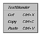
For each popup menu, include a title followed by a separator and the individual menu entries (see Figure 8-13). The title should be the name of the application or, if the application has more than one popup menu, it should describe the purpose of the menu. Since the entries typically repeat entries found in the pull-down menus, display titles similarly: in the same order, and with the same or very similar names as in the pull-down menu. Include ellipses and keyboard accelerators if they're included in the corresponding entry in the pull-down menu, but don't show mnemonics in popup menus.
Popup menus generally don't have entries that require radio buttons or checkboxes since these are rarely common enough actions to be included in a popup menu. If you do need to include these kinds of entries in a popup menu, separate them from the rest of the entries with separators and include the radio buttons or checkboxes. See “Using Radio Buttons and Checkboxes in Pull-Down Menus” for more information. Popup menus shouldn't contain cascading menus, nor should they be tear-off menus.
As with pull-down menu entries, if one of the entries in a popup menu is unavailable for selection in the current context, disable that menu entry. Don't, however, remove it from the menu.
When choosing when a popup menu should appear . . .
At most, provide a different popup menu for each main area (that is main field or main pane) of the window. Don't change the availability of a popup menu based on what graphical element the pointer is over or based on the selection state of any of the graphical elements.
When deciding what to include in a popup menu . . .
Include entries for the most commonly used functions from the pull-down menus, and use the same names in the same order as they're displayed in the pull-down menus.
Avoid entries that require checkboxes or radio buttons. These are typically not the most commonly used menu functions.
Don't make menu entries the sole access to these functions.
Don't change the content of the menu based on what graphical element the pointer is over, or based on the selection state or contents of this element. Instead, put all entries in the popup menu for the main area of the window, then enable and disable entries as appropriate.
Don't include cascading menus and don't use tear-off menus.
When displaying the contents of the popup menu . . .
Include a title that's either the name of the application, or if the application has more than one popup menu, that describes the purpose of the menu.
Use only one separator, which goes between the title and the individual menu entries.
Show ellipses and keyboard accelerators if these are shown in the corresponding pull-down menu entry, but don't show mnemonics.
If selecting the menu entry in the current context would give the user an error message, show the menu entry as disabled (dimmed). Don't remove the menu entry when it's temporarily unavailable.