Users can interact with your application through three general mechanisms, which are discussed in the following sections:
“Keyboard Focus and Navigation” discusses how your application should allow users to direct keyboard input to specific components. It also discusses how certain components should be controlled from the keyboard.
“Selection” discusses various models for allowing users to select data in your application.
“Drag and Drop” discusses how users expect to directly manipulate text and other objects in your application by dragging them with the mouse.
Keyboard input allows users to enter data into text fields and to control other components in your application. The keyboard focus policy determines which component in which window receives the keyboard input. Only one component in one window receives input from the keyboard at any given time; this component has the keyboard focus (also called input focus). For example, if a button has the keyboard focus and the user presses the Space bar on the keyboard, the button is activated. The process of moving the keyboard focus is called navigation. Keyboard navigation allows the user to navigate among components in a window using only the keyboard rather than having to manipulate the mouse (or other pointing device).
As described in “Keyboard Focus Across Windows” in Chapter 3, the IRIX Interactive Desktop environment uses one policy for moving the keyboard focus among components within a window and a different policy for moving the keyboard focus between windows. When moving the keyboard focus among components within a window, your application should use an explicit focus policy. In other words, the user clicks a mouse button or presses a key to move the keyboard focus to a new component in the active window. In contrast, 4Dwm, the window manager for the IRIX Interactive Desktop, uses implicit focus across windows: the window directly underneath the pointer receives keyboard input (that is, it's the active window). Note that users can't navigate among windows using the keyboard when using 4Dwm in its default configuration.
This section discusses keyboard focus and navigation among components in the active window and includes:
Only one component in the active window has the keyboard focus at any given time. Your application should use explicit focus (as opposed to implicit focus) within a window; in other words, the user must explicitly select the component that receives the keyboard input. Your application should support the models described in this section for navigating to specific components in a window and for using the keyboard to activate these components.
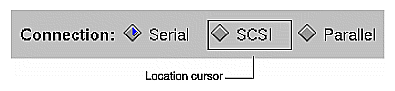
Within the active window, the component with the keyboard focus is visually identified by the location cursor. The location cursor isn't necessarily a cursor in the traditional sense of a text cursor. It gives the user visual feedback as to which component receives the keyboard input. Each standard component described in Chapter 9, “Controls,” has its own method for displaying a location cursor when the component has keyboard focus. For example, the location cursor used to indicate that a specific radio button has the keyboard focus is a simple box, as shown in Figure 7-1.
Keyboard activation and keyboard navigation are strongly linked: if a user can activate or control a component from the keyboard, the user should also be able to navigate to that component from within the window using the keyboard. This enables the user to perform the task without having to frequently switch between using the mouse and keyboard.
Section 2.2 in the OSF/Motif Style Guide states that “all application functionality must be available from the keyboard alone.” This includes navigating among windows, navigating among components in a window, and activating components. By default, users will be able to navigate to and control all components in a window except for those that aren't traversable or don't accept input (for example, labels and separators).
Since all Silicon Graphics systems include a mouse, it's not as critical to provide access to all functionality from the keyboard alone when programming for Silicon Graphics systems. Just keep in mind that some users use alternate input devices that rely on having functions available from the keyboard. At a minimum, your application should let users do the following from the keyboard:
navigate between editable text fields in a window
enter data into editable text fields
select data in a text field (see “Selection” later in this chapter and “Text Fields” in Chapter 9)
navigate to a list component (see “Lists” in Chapter 9)
select data in a list (see “Selection” later in this chapter and “Lists” in Chapter 9)
navigate among all types of menus (pull-down, popup, and option menus) and their entries (see “Menu Traversal and Activation” in Chapter 8)
activate menu entries (see “Menu Traversal and Activation” in Chapter 8)
scroll any scrollable component (see “Scrollbars” in Chapter 9)
activate the default button in a dialog if there is one (see “Standard Dialog Actions” in Chapter 10)
use mnemonics for all menu titles and menu entries in the pull-down menus (see “Choosing Mnemonics” in Chapter 8)
use keyboard accelerators for frequently used entries in the pull-down menus, such as “Cut,” “Copy,” and “Paste” in the Edit menu (see “Choosing Keyboard Accelerators” in Chapter 8)
This section discusses guidelines for moving the focus to a different component in the window using the keyboard. (The OSF/Motif Style Guide refers to this as component navigation.) Each window is divided into fields, where a field can be an individual control (for example, a text input field) or a group of controls (such as a group of radio buttons). By default, the fields that can accept the keyboard focus are ordered, in general, from upper left to lower right. If a window has multiple panes, the focus moves by default through the fields in the topmost (or leftmost) pane, then the fields in the next pane, and so on, until it wraps back to the beginning.
In some cases, you may have to modify the default order in which components are navigated from the keyboard. For example, when a window first becomes active, the component that should have the keyboard focus is the one that the user is most likely to want to interact with using the keyboard. This isn't necessarily the component in the upper left-hand corner. Also, when a user returns the keyboard focus to a window that was previously the active window, the keyboard focus should return to where it was when the user moved the focus out of that window.
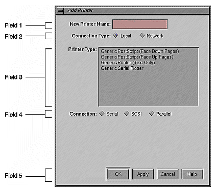
By default, users can cycle through the fields in order using the <Tab> key. They also can use the arrow keys to move the keyboard focus among the individual components in the current field. For example, in the Add Printer window, shown in Figure 7-2, a user can use <Tab> to move keyboard focus from the first field (“New Printer Name”) to the second field (“Connection Type”). Once in the second field, the user can move keyboard focus between the radio buttons using the directional arrow keys.
By default, the following keyboard commands are used for navigating within a window. In addition, as discussed in “Menu Traversal and Activation” in Chapter 8, <Shift>-<F10> should move the location cursor to a popup menu if one is available for the current context.
| <Tab> | Moves the location cursor to the next field that can accept the keyboard focus, unless the current field is a multi-line editable text field. In this case it simply inserts a tab character. | |
| <Ctrl>-<Tab> | Always moves the location cursor to the next field that can accept the keyboard focus. | |
| <Shift>-<Tab> | Moves the location cursor to the previous field that can accept the keyboard focus. | |
| <Ctrl>-<Shift>-<Tab> |
| |
| <down arrow> | Moves the location cursor within a field forward (or down) to the next component that can receive the keyboard focus, eventually wrapping back to the first component. If the components are in a matrix, <down arrow> moves down through a column and then proceeds to the top of the next column to the right. | |
| <up arrow> | Moves the location cursor within a field opposite to the direction of the <down arrow> to the next component that can receive the keyboard focus. Eventually it wraps back to the last component. | |
| <right arrow> | Moves the location cursor within a field to the next component to the right that can receive the keyboard focus, eventually wrapping back to the first component. If the components are in a matrix, <right arrow> moves across an entire row and then proceeds to the row below. | |
| <left arrow> | Moves the location cursor within a field opposite to the direction of the <right arrow> to the next component that can receive the keyboard focus. Eventually it wraps back to the last component. | |
| <F10> | Moves the location cursor to the leftmost menu in the menu bar if there is one. If a menu is already displayed, <F10> closes the menu and returns the location cursor to where it was previously. (See “Menu Traversal and Activation” in Chapter 8.) |
Because the keys listed above are used for navigating among components, don't use them for other purposes. However, there's an exception to this rule: the arrow keys can be used to control a component that's the only component in its field. For this reason, each editable text field, list, scrollbar or sash is by default placed in its own field.
To move the keyboard focus in the current active window using the mouse, users put the pointer over a specific component and click the left mouse button. The keyboard focus moves to the selected component, if you've allowed that component to accept keyboard focus, and typically performs some action or selects some data. For example, clicking the left mouse button on a pushbutton activates the pushbutton, as well as moves keyboard focus to the pushbutton. Clicking the left mouse button in an editable text field moves keyboard focus to the text field and places the insertion point in the text field at the pointer location. If users want to move the keyboard focus to a component using the mouse without activating that component, they can position the pointer over the component, then hold down the <Ctrl> key while clicking the left mouse button.
By default, certain components do not grab the keyboard focus when activated using the mouse. These include scrollbars, sashes, any other component that's used only to change the size or location of other elements, and any components that you've designated as being unable to accept keyboard focus. If the user uses the mouse to activate any of these components, it's activated and the keyboard focus stays where it was.
When designing keyboard focus and navigation for your application windows . . .
Use explicit focus for navigating among components within a window.
Support at least the minimum required functionality from the keyboard, such as navigating to and entering data into editable text fields, using mnemonics and keyboard accelerators to access menu entries, and scrolling any scrollable component. Keep in mind that some users use alternate input devices that rely on having functions available from the keyboard.
When the window becomes active for the first time, give focus to the component that the user is most likely to want to interact with using the keyboard. When a user returns the keyboard focus to a window that was previously the active window, return the keyboard focus to where it was when the user moved the focus out of that window.
Put each component that requires the use of arrow keys to control it in its own field. The following components are by default put in fields of their own: editable text fields, lists, scrollbars, and sashes.
Don't use the default keyboard navigation keys for other purposes. These keys are <Tab>, <Ctrl>-<Tab>, <Shift>-<Tab>, <Ctrl>-<Shift>-<Tab>, the arrow keys, <F10>, <Shift>-<F10>, and <Ctrl> in combination with a left mouse button click.
IRIS IM is based on the object-action model of direct manipulation. This means that a user must first select an object or group of objects, then choose an action to perform on that data. Users typically select data by clicking the left mouse button (to select a single object) or by dragging with the left mouse button (to select a range of objects). The selection is completed when the mouse button is released. Making a selection shouldn't automatically perform any operation on that selection. When users select data in an application window, that data should be highlighted in some way so that when they pick an action, they'll know which chunk of data that action is being applied to.
At any time, there's one selection that's the primary selection. This is the last selection explicitly started by the user and is used to copy data between applications. For details on supporting the primary transfer model in your application, see “Supporting the Primary Transfer Model” in Chapter 5.
This section describes:
The data in an application window is divided into collections. A collection is a group of related elements that share a selection model. There are four basic selection models described in the OSF/Motif Style Guide:
In the single selection model, only one element in the collection can be selected at any given time. For example, a color palette usually allows you to pick only one color at a time.
The browse selection model is essentially the same as the single selection model, except that it allows users to browse through the available elements by dragging with the left mouse button. The list of available schemes in the Schemes control panel is an example of this model.
In the range selection model, more than one element in the collection can be selected at any given time, but these elements must be next to each other. Text is usually selected in this fashion—a user can select any number of contiguous characters in a piece of text.
In the discontiguous selection model, more than one element in the collection can be selected at any given time, and these elements don't have to be next to each other. An example of this model is a list of files that allows a user to select multiple files.
Note that the OSF/Motif Style Guide also describes a fifth selection model, multiple selection. Your application shouldn't use this model because it uses mouse actions for adding and removing selected elements that are different from other mouse actions. Eliminating these inconsistent mouse actions for selection makes it much easier for users to learn how to select data.
Each collection of data in your application should support the mouse and keyboard actions for selecting and deselecting data listed in Table 7-1, depending on which of the above models it supports. By default, the IRIS IM list component supports the browse selection model, and the IRIS IM text component supports the range selection model.
Table 7-1. Selection Actions and Results
Action | Model | Result |
|---|---|---|
Click on an element in the collection | All | The element is selected, and any elements in the collection that were previously selected are deselected. The location cursor is moved to the selected element. |
Drag through a range of data in the collection | Browse | As the user moves the pointer over each element in the collection, that element becomes selected and all other elements in the collection are deselected. When the user releases the left mouse button, the element currently under the pointer remains the selected item, and the location cursor is moved to this element. |
Drag through a range of data in the collection | Range and discontiguous | Any elements in the collection that were previously selected are deselected, and an anchor is set on the element or at the location where the left mouse button was pressed. While the user continues to drag the mouse, all elements between the anchor and the current location of the pointer are selected. When the user releases the mouse button, the current selection is set to all the elements between the anchor and the location of the pointer when the mouse button was released. |
<Shift>-click on an element or <Shift>-drag through a range of elements in a collection | Range or discontiguous | The anchor is left in place, and the current selection is modified using one of three models for extending a range described in Section 4.1.4 of the OSF/Motif Style Guide. The preferred model is the balance beam model, which is also the default for the IRIS IM text component. |
<Ctrl>-click on an element in the collection | Discontiguous | The selection state of the element is toggled, and the anchor and location cursor are moved to that element. |
<Ctrl> drag through a range of data in the collection | Discontiguous | The selection state of the range of elements is toggled based on the anchor toggle model described in the OSF/Motif Style Guide, section 4.1.5. That is, you pick the element in the range that is closest to the anchor and set all of the elements in the range to the inverse of the selection state of this element. |
Click outside of the selection (but not on any element in a collection that requires at least one element to be selected at any given time) | All | All elements are deselected. |
When all of the data in a collection is selected, click anywhere inside the collection | Range and discontiguous | All elements are deselected. |
<Esc> while in the process of making a selection in any collection of data. | All | The current selection action is cancelled, and all user input is ignored until the user has released all keys and buttons. The selection state is returned to its previous state. |
<Ctrl>-</> when the collection has keyboard focus | Range and discontiguous | All elements in the collection are selected. The anchor is placed at the beginning of the collection. The location cursor remains unchanged. |
<Ctrl>-<\> when the collection has keyboard focus | Range and discontiguous | All elements in the collection are deselected. The location cursor remains at its current position, and the anchor is moved to where the location cursor is. |
When users select data in a component that can be scrolled, the component should support automatic scrolling—that is, if the data being selected is in a scrollable component and the user drags the pointer out of the data display region while still holding down the mouse button, the data should scroll in the direction of the pointer and should continue to be selected. Note that this behavior is automatically supported in the IRIS IM list and text components.
The mouse and keyboard actions described above represent a subset of those defined in the OSF/Motif Style Guide, which requires that all functionality be available from the keyboard. The OSF/Motif Style Guide describes specific keyboard actions to select individual elements, select a range of data, and modify the data selected. If you determine that users will want to access any of this functionality in your application using the keyboard, see Section 4.1.6 of the OSF/Motif Style Guide for details on supporting keyboard selection. Note that keyboard selection is automatically supported in IRIS IM list and text components.
When the user initiates and continues to add to a selection, your application should visually highlight the currently selected data. In addition, while the data in the collection is being adjusted, the currently selected data should always be highlighted to show users what would be selected if they were to release the mouse button immediately. Selections should remain highlighted, even when the window containing that selection is no longer the active window. The OSF/Motif Style Guide refers to this as persistent always highlighting. This is the best type of selection highlighting to use when implicit focus is used for moving the keyboard focus across windows (implicit focus is the default for 4Dwm, as explained in “Keyboard Focus Across Windows” in Chapter 3).
Use persistent always highlighting except when the only reason a user can make a selection is to transfer that data using the primary transfer model and the user cannot perform any other actions on this data. (The primary transfer model is discussed in “Supporting the Primary Transfer Model” in Chapter 5.) For this type of data, your application should use nonpersistent highlighting, which means that the selection is highlighted only when it's the primary selection. When this data is no longer the primary selection, the currently selected data is no longer highlighted and the current selection is set to empty.
This section describes some common ways that multiple collections of data might interact in a single application window. There are three basic scenarios for using multiple collections in the same window:
The user can select data in only one collection at a time.
The user can select data in more than one collection at a time, and any given mouse, keyboard, or menu command applies to only one of the collections.
The user can select data in more than one collection at a time, and some mouse, keyboard, or menu commands can be applied to more than one of the collections.
If the user can select data in only one collection at a time, deselect the previous selection whenever the user makes a new selection in any of the collections. If the user can select data in more than one collection at a time, and any given mouse, keyboard, or menu command applies to only one of the collections, don't do anything special. Since each action can be applied only to one collection, it's obvious which collection to apply it to. For mouse, keyboard, or menu commands that can be applied to more than one of the collections, apply the operation to the collection that most recently had a selection made in it. (See “Keyboard Focus and Navigation” earlier in this chapter.)
For each collection of data . . .
Use one of the four recommended selection models—single selection, browse selection, range selection, or discontiguous selection. Don't use the multiple selection model.
Automatically scroll the data as the user drags the pointer out of the scrollable data display region.
Determine if your users will need to create or modify a selection using the keyboard. If so, then support the keyboard actions defined in Section 4.1.6 of the OSF/Motif Style Guide. (These actions are automatically supported if you use the IRIS IM list or text components.)
When highlighting a selection . . .
Update the highlighting continuously as the user initiates and extends the selection.
Use persistent always highlighting, unless the only reason a user can select this data is to transfer it using the primary transfer model. In this case, use nonpersistent highlighting.
When managing multiple collections of data in a single window . . .
Deselect the previous selection whenever the user makes a new selection in any of the collections for cases where the user can select data in only one collection at a time.
Apply the operation to the collection that most recently had a selection made in it when the user can select data in more than one collection at a time and there are mouse, keyboard, or menu commands that can be applied to more than one of the collections.
Direct manipulation, or drag and drop, describes an interface in which the user moves icons on the desktop or in application windows in order to perform various actions on the objects represented by the icons. Some typical uses for drag and drop include the following:
Moving an object from one place to another by dragging the object with the mouse and dropping it on a target. For example, to move a file from one directory to another, the user drags the icon representing the file and drops it on the folder icon representing the new directory location.
Making a reference to the object in the new location. For example, to add an online book to the personal bookshelf in IRIS Insight, the user drags an icon representing an online book from the main bookshelf to the personal bookshelf. This creates a reference to that book on the personal bookshelf in addition to the reference on the main bookshelf.
Performing some operation on the item being dragged. For example, a user can print a file by dragging the icon that represents the file onto a printer icon.
If the user presses <Esc> during a drag and drop operation, the operation should be cancelled, and both the object and the target should be left as they were before the operation was initiated.
This section covers the following topics:
Two models for drag and drop exist, one recommended for use with text, and the other recommended for use with other objects.
The most common model for drag and drop found in applications requires the user to select and drag the object using the left mouse button. This is the preferred model for implementing drag and drop of non-text objects; it reinforces the direct manipulation model of controlling objects directly using the left mouse button. The two most common scenarios for this are the following:
The user initiates dragging the object by positioning the cursor over the object, pressing with the left mouse button and dragging the mouse. Pressing the left mouse button in this case selects the object. Dragging the mouse drags the object. (Note that if the pointer is over two different elements that can be dragged, the topmost element should be the one selected and dragged.) Releasing the mouse button drops the object on the target below the pointer location.
The user selects one or more objects in a collection using the left mouse button. The user then positions the pointer anywhere over the selection, presses the left mouse button, and drags the mouse to drag the object(s). As with the above scenario, when the user releases the mouse button, the object is dropped on the target below the pointer location. Note that in this case, if users positions the pointer outside of the selection and begins dragging with the left mouse button, they're indicating that they want to make a new selection. See “Selection” earlier in this chapter.
For either of the above scenarios, after a drop the target should determine both the format of the data and whether the user meant to perform a move or a copy operation. In some cases, dropping the object might simply mean that the object should be moved to a new location in the same component. In the case where the drop is in the same component, after the drop the data should remain selected. For example, the user can move files around in a Directory View window using drag and drop. In other cases, dragging an object onto a target means that the object should be copied to the target so that the target can perform some operation on it. For example, when the user drags a file onto a printer icon, the file is translated into an appropriate format and sent to the printer.
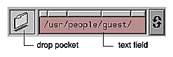
To make drag and drop of file objects easy to include in your application, IRIX Interactive Desktop includes a file finder component, which provides a drop pocket (see Figure 7-3). If the user drops a file icon in the drop pocket, the text field updates to show the pathname of the file represented by the icon. If the user types in the field, the icon in the drop pocket changes to show the new choice. For guidelines on when to use this type of control in your application, see “File Finder” in Chapter 9.
Drag and drop can also be implemented using the middle mouse button. Use this model of drag and drop for transferring text rather than the model described in the previous section because the left mouse button is so heavily used for selection in text.
In this case, the user selects a region of text to be dragged using the selection techniques described in “Selection,” earlier in this chapter. Then the user positions the pointer over the selected text region and drags the text with the middle mouse button. When the user releases the middle mouse button, the text is dropped on the target under the pointer. By default, all text (including labels) can be dragged using the middle mouse button. You may want to turn off drag and drop for some of the text in your application if users will never need to drag it (for example, labels).
For additional details of implementing drag and drop of text, see Sections 4.3.4 and 6.2.5 in the OSF/Motif Style Guide.
When selecting and dragging are integrated into the left mouse button, use the standard arrow cursor for simplicity. When drag and drop is implemented using the middle mouse button (typically for dragging text), replace the standard pointer with a drag icon. This reinforces to users that they're using the middle mouse button to perform a drag and drop operation. The design of drag icons is discussed in Section 6.2.5.1 of the
OSF/Motif Style Guide.
When designing drag and drop for your application . . .
Cancel a drag and drop operation if the user presses <Esc>, and leave both the object and the target as they were before the operation was initiated.
Use the left mouse button for both selecting and dragging non-text objects. Use the standard cursor in this case.
Use the middle mouse button for dragging text, and replace the cursor with a drag icon when the text is being dragged.