Two types of controls are described in this chapter—those supported in the standard OSF/Motif environment (such as pushbuttons, lists, and scrollbars), and those unique to the IRIX Interactive Desktop environment (such as enhanced scales, thumbwheels, and dials). These controls can be used in any window of an application. Each description consists of a general description of the control and guidelines for when to use it, how to label it, and how it should behave.
Note that some of the standard controls have been enhanced in the IRIX Interactive Desktop environment as described in “Enhanced Graphics in the IRIX Interactive Desktop Look” in Chapter 3. To use these enhanced controls in your application, see , “Using the Silicon Graphics Enhanced Widgets,” of the IRIX Interactive Desktop Integration Guide. The reference pages in Chapter 9 of the OSF/Motif Style Guide provide details on the behavior of the OSF/Motif controls discussed in this chapter. This chapter describes the following controls:
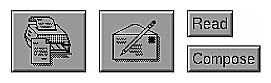
A pushbutton is a button that invokes an operation. Pushbuttons are rectangular and can be labeled with either text or icons, as shown in Figure 9-1. The basic operations for pushbuttons are described in the section “Other Operations,” in the reference page for PushButton in the OSF/Motif Style Guide, Chapter 9. See “Control Areas in Primary Windows” in Chapter 6 for guidelines on using pushbuttons in control areas and tool palettes, and see “Standard Dialog Actions” in Chapter 10 for guidelines on using pushbuttons in dialogs.
When using pushbuttons . . .
In windows with menu bars, use pushbuttons to provide easy access to the most frequently used application-specific functions in the pulldown menus. For primary windows, these pushbuttons appear in the control area of the window.
In windows without menu bars, use pushbuttons to access help and to close the window.
Use pushbuttons to create tool palettes, either in support windows or in primary windows.
Use pushbuttons in the response area of a dialog for the standard actions for that dialog.
Always have the pushbutton perform the same operation (although the input to that operation may vary based on what data is currently selected). Don't use the same pushbutton to perform different tasks based on some mode of the application.
Use pushbuttons to perform an action; don't use them merely to set state, such as a parameter value in a dialog box. Use checkboxes, radio buttons, or option menus for this purpose.
When labeling a pushbutton . . .
Use either a text or graphic label that describes the action associated with the button. With text labels, use an active verb describing the operation the button performs. Make each text label a single, capitalized word. Don't use abbreviations in labels.
Center the label on the button.
If the pushbutton opens a dialog to collect more information from the user before the action represented by the pushbutton can be completed, place an ellipsis after the button label. Don't use an ellipsis if the button opens a dialog simply to display some information to the user as an end result of the operation. This use of ellipses is the same as that described for menu entries in the section “Naming Menu Entries in the Pull-Down Menus” in Chapter 8.
When displaying pushbuttons . . .
If the action associated with a button is temporarily unavailable, disable the button rather than remove it.
Don't resize pushbuttons when the window is resized.
Don't use dynamic buttons whose labels change to indicate different functionality depending on the current context. Instead, use multiple buttons and disable buttons that represent functionality that's currently unavailable. With multiple buttons, the functionality is obvious even if some of the buttons aren't currently active. With dynamic buttons, the user has to put the application into the proper context to discover some of the functionality. The one exception to this guideline is the Cancel/Close button used in Dialogs with the Apply button. See “Standard Dialog Actions” in Chapter 10 for information on this special case.
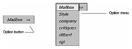
An option button is a button that displays an option menu. It allows the user to choose one of the options listed in the menu, and its label changes to reflect the currently selected menu entry. Entries in the option menu represent mutually exclusive values of a parameter. Users interact with option menus according to the model described in “Menu Traversal and Activation” in Chapter 8. Figure 9-2 shows an option button and its option menu. Note that the button has a special graphic on it to distinguish it from regular pushbuttons. The basic operations for option buttons are described in the section “Other Operations,” in the reference page for OptionButton in the OSF/Motif Style Guide, Chapter 9.
When using option buttons . . .
Use an option button when you want to offer the user about 5-12 mutually exclusive options; use a list for more than 12 choices. If there's enough space, use radio buttons for fewer than 5 choices.
Don't put radio buttons or checkboxes in an option menu.
Don't use an option button if the user can select several options at the same time—use a list or a set of checkboxes instead.
Don't put actions (such as zoom or rotate) in the option menu—use pulldown menus or pushbuttons instead.
Don't add or delete the choices in the option menu. If the choices must change, use a list.
Don't use cascading menus in the option menu. If there are so many items that they don't fit conveniently into an option menu, use a scrolling list instead.
Don't use a tear-off entry in an option menu.
When labeling an option button . . .
Use the default label for the option button itself, which is the current value of the parameter.
Use a second label that describes the parameter that the option button controls. Place this parameter label to the left of the option button and put a colon (:) and a space after it (see Figure 9-2). This label is typically a noun and is not abbreviated.
When labeling the entries in an option menu . . .
Use nouns that indicate the possible values of the parameter being set.
Use entire words for the entries rather than abbreviations.
When displaying option menus . . .
If one of the entries in an option menu is unavailable for selection in the current context, disable the menu entry. Don't remove the entry from the menu. Note that the user should always be able to display the contents of an option menu even if all of the menu entries are currently disabled.
Don't include a title in option menus.
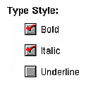
A checkbox is a button with two states—on and off. In a group of checkboxes, each can be turned on or off independently. The on state is indicated in the IRIX Interactive Desktop look by a red check mark, as shown in Figure 9-3. The basic operations for checkboxes are described in the section “Other Operations,” in the reference page for CheckButton in the OSF/Motif Style Guide, Chapter 9.
When using checkboxes . . .
Use checkboxes for single attributes or states that can be turned on and off, or for groups of items where multiple items in the group can be selected independently. (Also see “Using Radio Buttons and Checkboxes in Pull-Down Menus” in Chapter 8.)
Use checkboxes for groups of less than about six items. When dealing with more than a handful of items, use a list that allows multiple elements to be selected at the same time.
Don't use checkboxes for mutually exclusive options. If only one item in a group of items can be selected at a time, use radio buttons instead.
Don't use checkboxes for actions; use pushbuttons instead.
Don't change the choices in the group based on the current context. If you want to offer a dynamic set of choices, use a list.
When labeling checkboxes . . .
Give each checkbox a label that describes the attribute, state, or option it controls.
Create a group label for each group of checkboxes, and indent the checkboxes below the label. This group label should be a noun that describes the function of the group.
Don't use abbreviations for either the checkbox labels or the group label.
When displaying checkboxes . . .
Keep checkboxes updated to reflect the current state of the application and the settings of the current selection (if the settings of the checkboxes relate to the current selection). For example, if a checkbox exists for turning underlining on and off and the user selects some text, update the checkbox to reflect whether or not the selection is underlined.
Disable checkboxes representing choices that aren't currently available. Don't remove the checkboxes.
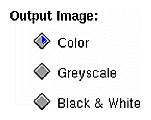
A radio button is a button with two states—on and off. Unlike checkboxes, radio buttons are always used in groups. Only one of a group of radio buttons can be turned on at any given time. The on state is indicated in the IRIX Interactive Desktop look by a blue triangle, as shown in Figure 9-4. The basic operations for radio buttons are described in the section “Other Operations,” in the reference page for RadioButton in the OSF/Motif Style Guide,
Chapter 9.
When using radio buttons . . .
Use radio buttons in groups, never as single buttons. If you need to use a single button that shows an on/off state, use a checkbox instead. (Also see “Using Radio Buttons and Checkboxes in Pull-Down Menus” in Chapter 8.)
Use radio buttons for mutually exclusive options. If more than one item in the group can be selected at a time, use checkboxes or a list instead.
Use radio buttons when you want to offer the user fewer than six options. If you have more than six options, or if screen space is extremely limited, use an option button instead. (See the section “Option Buttons” earlier in this chapter.) If you have more than 12 options, consider using a list where only a single element can be selected at a time. (See the section “Lists” later in this chapter.)
Don't use radio buttons for actions; use pushbuttons instead.
Don't change the choices in a group of radio buttons based on the current context. If you want to offer a dynamic set of choices, use a list because users expect the elements of a list to change occasionally, but they don't expect radio buttons to change.
When labeling radio buttons . . .
Give each radio button a label that describes the attribute or option it controls.
Create a group label for each group of radio buttons, and indent the radio buttons below the label. This group label should be a noun that describes the function of the group.
Don't use abbreviations for either the radio button labels or the group label.
When displaying radio buttons . . .
Keep radio buttons updated. If the settings of the radio buttons depend on the current selection, update them when the user makes a new selection so that they reflect the settings of the new selection.
Disable radio buttons representing options that aren't currently available. Don't remove the radio buttons.
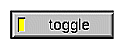
The LED Button is a toggle button with an enhanced appearance. It appears in the form of a push button, with an imbedded indicator lamp (LED) that provides state feedback. The button has two states—on or off. When the button is toggled to the ON state, it appears lighted; when OFF, it appears darkened.
You can use a LED button (as shown in Figure 9-5) instead of a radio button to indicate that one of a range of options or modes is currently in effect. Alternatively, you can use a toggle button instead of a checkbox, to indicate whether a given option or mode is currently on or off.
In either case, an LED button is most appropriate in a context where other push buttons are used as part of a control panel, since an LED button is the same size as a push button.
For LED example code, see “Example Programs for SGI Enhanced Widgets” in the IRIX Interactive Desktop Integration Guide.
When using LED buttons . . .
Use LED buttons for single attributes or states that can be turned on and off, or for groups of items where multiple items in the group can be selected independently. (Also see “Using Radio Buttons and Checkboxes in Pull-Down Menus” in Chapter 8.)
Don't use LED buttons for actions; use pushbuttons instead.
Don't change the choices in the group based on the current context. If you want to offer a dynamic set of choices, use a list.
When labeling LED buttons . . .
Label each LED button with a term that describes the attribute, state, or option it controls.
If there is a group of LED buttons, create a group label for the group, and indent the LED buttons below the label. Use a noun that describes the function of the group.
Don't use abbreviations for either the LED button labels or the group label.
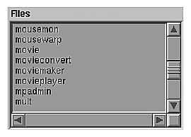
A list allows the user to choose from a series of elements. It can allow the user to choose a single element at a time or choose multiple elements at once. Lists should have vertical and horizontal scrollbars when necessary. (See “Scrollbars” later in this chapter.) When allowing users to select elements in the list, follow the selection guidelines described in “Selection” in Chapter 7. Figure 9-6 shows a list with vertical and horizontal scrollbars. The basic operation of lists is described in the section “Other Operations,” in the reference page for List in the OSF/Motif Style Guide, Chapter 9.
When using lists . . .
Use a list when you want to allow the user to choose a single option from a large list (that is, more than 15 options). If you have fewer than 15 options, use either an option button (best for 5-15 options; see “Option Buttons” earlier in this chapter) or a set of radio buttons (best for 2-5 options; see “Radio Buttons” earlier in this chapter).
Use a list when you want to allow the user to choose several options from a list of six or more elements. If you have fewer options, use checkboxes (see “Checkboxes” earlier in this chapter).
If you want to allow the user to choose elements from a dynamic list of options, use a list regardless of the number of options. (Option menus and groups of checkboxes or radio buttons should represent static lists of options.)
Label the list with a noun that indicates the function of the elements in the list. Don't use abbreviations in the label.
Place the label directly above and either left-aligned with or slightly to the left of the first element of the list.
When labeling the list entries . . .
If the elements in the list represent operations to perform, use active verbs. Otherwise, use nouns. In either case, use entire words rather than abbreviations.
When displaying lists . . .
When a window using a list is first opened, the currently selected list elements should be highlighted and the list should be scrolled to display these. If multiple elements are selected, scroll the list so that the first selected one appears at the top of the viewing area. See “Selection” in Chapter 7.
Allow users to select elements in the list according to the selection guideline discussed in “Selection” in Chapter 7.
Disable list elements that aren't currently available.
Allow the list to autoscroll (the default behavior) if the user is making a selection and the selection goes outside the range of the displayed elements. See “Selection” in Chapter 7.
Text fields can be single-line or multi-line. Single-line text fields don't have scrollbars, even if all of the text can't be displayed horizontally in the field. Multi-line text fields should have vertical and horizontal scrollbars when necessary. (See “Scrollbars” later in this chapter.)
Text fields can be either editable or noneditable. Editable and noneditable text fields have different colored backgrounds to indicate to the user whether the information can be changed. These background colors vary depending on what scheme the user has selected (see “Schemes for Colors and Fonts” in Chapter 3 for information on schemes).
IRIX Interactive Desktop offers an enhanced text field; it allows the application to select a section of text and flag it with an error status. The error selection shows up with a special background color to distinguish it from an ordinary text selection. For example, a debugger might use the error selection to indicate to the user which section of code was causing an error.
The enhanced text field control allows you to specify the following:
both the foreground and background colors of the selected text (See “Selection” in Chapter 7 for information on selection.)
the background color for text that's marked with an error status
whether to show the text cursor only when the text component currently has keyboard focus (See “Keyboard Focus and Navigation” in Chapter 7 for information on keyboard focus.)
The basic operations for text fields are described in the section “Other Operations” in the reference page for Text in the OSF/Motif Style Guide, Chapter 9.
When using text fields . . .
Use single-line, editable text fields to display values of parameters that users can edit.
Use single-line, noneditable text fields to display values of parameters that users can't edit, whenever these values either change over time or might need to be selected by the user. If the value doesn't change and the user doesn't need to select it, use a label.
Don't use a text field if you need to display and edit pathnames; use the IRIX Interactive Desktop File Finder instead.
Use text fields for values that change over time; don't use labels.
When labeling text fields . . .
Label each editable or noneditable text field, unless the field represents the bulk of a window and the field's function is clear. Use entire words in labels rather than abbreviations.
For single-line text fields, place the label to the left of the text field, and follow the label with a colon (:) and a space. Vertically center the label within the text field.
When displaying text fields . . .
Use the default selection and highlighting discussed in “Selection” in Chapter 7.
Allow the user to cancel a text edit in progress by pressing <Esc>. That is, once the user has selected text and started to replace it with new text, <Esc> should cancel any changes that the user has made.
Keep text fields updated. When a window using a text field is first opened, show the default or current setting (if either exists) for the text field.
Make the text automatically scroll if the user is making a selection and the selection goes outside the range of the displayed elements.
When an editable text field can't be edited in the current context but the information is still useful to the user, change it to a noneditable text field. If the information isn't useful to the user (that is, the user doesn't need to know the value and won't need to select it), disable the text field.
A scrollbar “scrolls” the data in a viewing region to change the portion of the data that's visible. Scrollbars can be either horizontal or vertical. (“Enhanced Graphics in the IRIX Interactive Desktop Look” in Chapter 3 describes enhancements to the scrollbar's appearance.) Figure 9-7 shows a scrollbar.
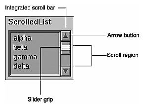
A scrollbar includes the scroll region (shown as a trough), which represents the size of the entire scrollable element with arrow buttons at each end. If there's data that can be scrolled, the scrollbar also includes a slider that indicates the relative position and portion of the data currently being displayed. As the user moves the slider, a temporarily indented impression of the slider indicates the position of the slider before the user began moving it. This indented impression disappears when the user releases the mouse button to complete the scroll action. The basic operations for scrollbars are described in the section “Other Operations,” in the reference page for ScrollBar in the OSF/Motif Style Guide, Chapter 9.
When using scrollbars . . .
Use scrollbars to pan an associated view.
Use scrollbars with components that can be resized such that all of the available information contained in the component can't be displayed at one time. Typical scrollable components include work areas in primary windows, lists, multiple line text fields, and data display areas in primary or support windows.
Use scrollbars with a list when the number of elements in the list doesn't fit in the viewing region (vertical scrollbar), when the elements are too wide to fit in the viewing region (horizontal scrollbar), or when the window containing the list can be resized such that either of these situations can occur. See “Lists” earlier in this chapter for information.
Use scrollbars with multi-line text regions when the data can't all be displayed vertically or horizontally or when the window can be resized such that this is true. See “Text Fields” earlier in this chapter for information.
Don't use scrollbars with single-line text fields. See “Text Fields” earlier in this chapter for information.
Don't use scrollbars for zooming or for rotation. Use an IRIX Interactive Desktop thumbwheel instead. See “Thumbwheels” later in this chapter.
Don't use scrollbars to choose a value in a range; use the IRIX Interactive Desktop scale instead.
When displaying scrollbars . . .
Place vertical scrollbars along the right of the element being scrolled, and place horizontal scrollbars along the bottom of the element being scrolled.
Keep scrollbars updated. When a window using a scrollbar is first opened, the scrollbar should reflect the current area being displayed in the scrolled region.
Update the data in the scrolled area continuously as the user drags the slider along the scroll region. This gives the feeling of direct, continuous control. Don't wait until the user has released the slider to update the data, because users often use the current view of the data to determine when to stop dragging the slider.
When a component is being scrolled, don't scroll it beyond the first or last elements. That is, there should be no extra white space before the first element or after the last element. The exception to this rule is scrolling text elements that represent physical pages (for example, in a desktop publishing application).
Make all components that use scrollbars automatically scroll when the user makes a selection that goes outside of the data currently being displayed. Also, make the component automatically scroll if the user performs an operation that moves the cursor outside of the current view (for example, if the user inserts or deletes text that moves the cursor outside of the current view). In this case, the view should be automatically scrolled so that the cursor is shown when the operation is finished.
When using the <Page Up>, <Page Down>, <Ctrl>-<Page Up>, or <Ctrl>-<Page Down> key sequences to scroll a page at a time, leave one unit of overlap from the previous page to make it easier for the user to preserve the current context. This unit is application-specific; it might be a line of text, an item in a list, a row of icons, or a specific number of pixels (for example, in a drawing region). By default, this behavior is automatic for IRIS IM list and text components.
Remove the slider from the scrollbar when all of the data is currently being displayed. Don't remove the scrollbar or disable it in some other fashion.
Allow the user to cancel scroll actions by pressing <Esc>. By default, if the user presses the <Esc> key while dragging the slider along the scroll region, the scroll action is canceled, and both the data and the slider are returned to the position they had before the user initiated the scroll action.
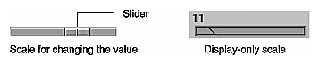
Scales can be used either to allow users to change a value in a given range or to display a value in a range. The size of the control shows the size of the range. When the scale is being used to allow users to specify or change a value, the slider indicates the current value in the range and can be dragged by the user. When the scale is being used for display only, there's no slider for the user to control. Figure 9-8 shows the IRIX Interactive Desktop scale in both modes. The basic operations for scales are described in the section “Other Operations” in the reference page for Scale in the OSF/Motif Style Guide, Chapter 9. For specific details on using the IRIX Interactive Desktop scale in your application, see “The Scale (Percent Done Indicator) Widget” in Chapter 4, “Using the Silicon Graphics Enhanced Widgets,” in the IRIX Interactive Desktop Integration Guide.
When using the IRIX Interactive Desktop scale . . .
Use scales to allow users to change a value in a given range. Use scales in display-only mode to display values that the user can't control. For example, use a display-only scale as a percent-done indicator to show progress in a Working dialog. (See “Working Dialogs” in Chapter 10.)
Don't use scales for scrolling.
Label it with the current value for the scale.
If the function of the scale isn't immediately apparent, give the scale an additional label that indicates its purpose. Don't use abbreviations in this label.
When displaying scales . . .
Keep scales updated. When a window using a scale is first opened, the slider of the scale should show the current setting for the scale control.
For sliders where the user can change the value, update the value being manipulated as the user moves the slider. Give the impression of direct, continuous manipulation. For sliders that also manipulate an object, update the object continuously as well. For sliders that are used only to display values, immediately update the slider to reflect the new value as the value changes.
Allow the user to cancel a scale operation by pressing <Esc>. If the user presses the <Esc> key while manipulating the scale, the action should be canceled, and the scale should return to the position it had before the user initiated the action.
Labels are noneditable text or graphical objects. They aren't selectable.
When using labels . . .
Use entire words in labels rather than abbreviations.
Use labels for displaying text information that the user won't need to edit or select.
Use labels for labeling controls as described under the individual controls in this chapter.
Use labels for labeling groups of controls. When used to label a group of controls, use a colon (:) and a space after the label, and place it either to the left of the item in the upper left corner of the group or above and slightly to the left of the item in the upper left corner of the group.
Use labels for simple instructions when necessary. Before adding instructions to any of your application windows, however, first try to design some alternatives that might make the instructions unnecessary. For example, if these instructions are necessary because the user interface works in a nonstandard way, redesigning the interface to be more standard is likely to make the instructions unnecessary.
Place labels on the background of the window (that is, the part of the window that isn't recessed).
When displaying labels . . .
Don't change the text or graphic on a label. If this information will change, consider putting it in a noneditable text field instead; users don't expect label text to change.
Disable labels when the controls they represent are disabled. Don't disable group labels.
The File Finder is an IRIX Interactive Desktop control. It allows users to navigate the file hierarchy quickly and to specify directories and files easily, using drag and drop of desktop icons. The File Finder is pictured in Figure 9-9.
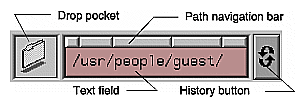
The File Finder includes several pieces:
text field—allows the user to enter the pathname for a file or directory.
drop pocket—displays the desktop icon representing the current file or directory whose name is displayed in the text field. A user can also drop a desktop icon into this drop pocket and have the text field automatically update with the pathname of the icon.
path navigation bar—each button represents the directory being displayed below it in the text field. A user can quickly navigate to ancestor directories by clicking on any of these buttons.
history button—similar to an option menu button; maintains a list of directories that the user already visited while using this control. The user can select any of these previously visited directories to return immediately to that directory.
For specific details on using the file finder in your application, see the SgFinder(3X) reference page.
When using the File Finder . . .
Use the File Finder when the user needs to enter the pathname of a directory or file. This allows the user to drag and drop desktop icons to specify the file and to navigate the file hierarchy.
When a window using a file finder is first opened, the text field in the file finder should show the default or current value of the pathname, if any. Also place this value in the history list under the history button.
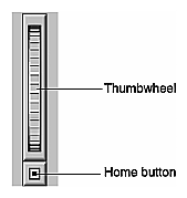
The thumbwheel is an IRIX Interactive Desktop control that allows users to specify or change a value, either in a given range (for instance, when zooming) or in an infinite range (for instance, when rotating a 3D object). Users change the current value by direct manipulation of the wheel (that is, by clicking and dragging). The thumbwheel can also include a “home button” that returns the thumbwheel to a default value. Thumbwheels can be oriented either horizontally or vertically. Figure 9-10 shows a thumbwheel. For specific details on using the thumbwheel in your application, see the SgThumbWheel(3X) reference page.
When using thumbwheels . . .
Use thumbwheels to change the values of continuous variables (that is, variables that don't have discrete values). For discrete values, consider a scale or dial instead.
Use thumbwheels with finite ranges for zooming operations and thumbwheels with infinite range for rotating objects.
When a thumbwheel is used to change a value that has a clear default, provide a home button. For example, a Directory View window has a thumbwheel that allows the user to set the size of the desktop icons. Pressing the home button on this thumbwheel sets the icons to their default size.
Use thumbwheels when screen real estate is extremely limited.
Don't use a thumbwheel for panning; use a scrollbar instead. A scrollbar gives the user much more information about the object being scrolled than a thumbwheel could.
When displaying a thumbwheel . . .
Update the object or value being manipulated as the user moves the thumbwheel. The thumbwheel should give the impression of direct, continuous manipulation.
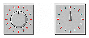
The dial is an IRIX Interactive Desktop control that allows users to specify or change a value in a given range. Users change the current value by direct manipulation of the dial—by dragging or by clicking on the appropriate tic mark that represents the desired value. The appearance and the behavior of the dial can be modified. For example, the angular range in degrees through which the dial is allowed to rotate and the color of the dial and tic marks can be changed. Figure 9-11 shows two dials with different appearance options. For a complete list of options for dials, and other specific details on using dials in your application, see the SgDial(3X) reference page.
When using dials . . .
Use dials as an alternative to scales for setting parameters. Dials are best for numeric parameters where the range of allowable values is small and the values are discrete.
Place a label either directly below or directly above the dial, specifying the parameter that the dial controls.
When you have a group of dials, place each dial label in the same position relative to its dial (that is, either all the labels are below the dials or all the labels are above the dials).
Use entire words in the label rather than abbreviations.
When displaying dials . . .
When a window using a dial is first opened, the dial should show the current setting.
As a dial is rotated, update the value being manipulated to reflect the new value on the dial. The dial should give the impression of direct, continuous manipulation. Also, if the dial is controlling an object, continuously update the object as the dial is manipulated.