This chapter discusses the role of different types of windows in the IRIX Interactive Desktop environment. It includes information on how your application should combine the different types of windows, as well as guidelines on what elements are appropriate for primary and support windows, and how these elements should be arranged. (Dialog windows are discussed in detail in Chapter 10, “Dialogs.”)
This chapter covers the following topics:
“Application Models” discusses different models for applications. Which model is appropriate for your application depends upon whether your application needs multiple primary windows, and whether it can have multiple documents open at the same time.
“Main and Co-Primary Windows” describes the design of primary windows.
“Support Windows” explains the design of support windows.
“Pointer Behavior in a Window” discusses the limits of what your application should do with the mouse pointer.
Note that by default, 4Dwm, the window manager for the IRIX Interactive Desktop, provides window decorations and a Window menu for all application windows. The specific window decorations and contents of the Window menu depend on the type of window and whether any of the components in the window are resizable. For guidelines on window decorations, Window menu entries, and related issues, see “Application Window Categories and Characteristics” in Chapter 3.
This section describes how the different types of windows used in the IRIX Interactive Desktop environment can be used together in applications. Topics include:
As discussed in “Application Window Categories” in Chapter 3, windows in the IRIX Interactive Desktop environment are divided into four types, which are subdivisions of Motif's two types: primary and secondary. Primary windows are divided into main primary windows and co-primary windows, and secondary windows are divided into support windows and dialogs. The definitions are repeated here for your convenience:
A main primary window serves as the application's main controlling window. It's used to view or manipulate data, get access to other windows within the application, and kill the process when users quit. There's only one main primary window per application (and sometimes it isn't visible to users).
A co-primary window is used for major data manipulation or viewing of data outside of the main window
A support window is a persistent special-purpose window. It typically contains a control panel or tool palette that operates directly on data in a primary window. A support window can be used repeatedly.
A dialog is a transient window, typically used for short, quick user input, such as an action confirmation, or system output, as in a warning message. A dialog may be user-requested or application-generated. It is usually dismissed as soon as it has served its purpose. Dialogs are discussed in detail in Chapter 10, “Dialogs.”
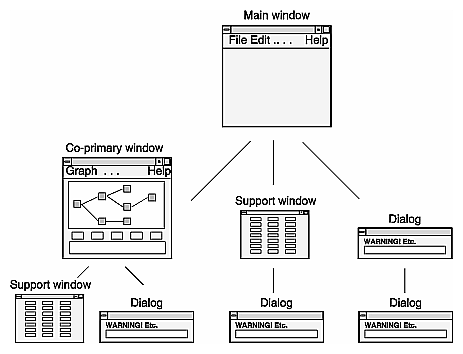
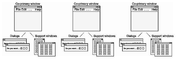
The next section (“Standard Application Models”) describes several standard models for combining these types of windows in a real application. When choosing a model, try to keep the window hierarchy shallow so users can form a relatively simple conceptual model of how your application's windows are related. Figure 6-1 shows the allowable parent and child relationships within an application's window hierarchy. For example, all co-primary windows should be children of the main window, so primary windows should never be more than two levels deep; dialogs can be children of any type of window.
Applications can combine the basic window types in many ways, but most applications fall into one of four basic models. These models differ with respect to whether they can have one or multiple documents (files) open at a time and their use of primary windows. (For information about how to implement the various models, see Chapter 5, “Window, Session, and Desk Management,” in the IRIX Interactive Desktop Integration Guide.)
 | Note: The term document means a grouping of data and shouldn't be thought of as referring exclusively to text-oriented files. A document can include such data types as film clips, audio segments, and 3D scenes. |
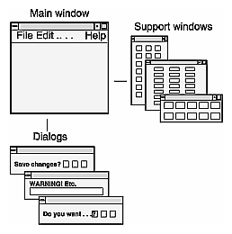
“Single Document, One Primary” (see Figure 6-2) is the most basic model. It accomplishes all of its tasks within the main window and uses as many support windows and dialogs as needed. Users can work on only one document at a time. Thus, when a user has one document open and opens a second document, the second document replaces the first. IRIS Showcase operates in this manner.
The “Single Document, Multiple Primaries” model (see Figure 6-3) uses both main and co-primary windows to accomplish major tasks. In this model, each co-primary window performs a different function; these functions supplement the functionality of the main window. MediaMail is an example of this model. Its main window lets users select electronic mail messages from a folder and perform actions on them such as viewing, printing, deleting, and sorting. Its Compose and Message windows are typical of
co-primary windows with different functions designed to support the functionality of the main window.
Also in this model, each primary window has its own menu bar tailored specifically to the functions in that window. Each co-primary window is opened from the main window. Each support and dialog window is associated with a specific primary window.
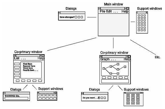
The single-document application with multiple primary windows is useful for dealing with data that the user needs to view in a number of different ways at the same time. For example, the WorkShop debugger operates on a single executable at a time. However, at a given time WorkShop might have several primary windows displaying source code, with other primary windows displaying call graphs and output from running the executable. In the case of WorkShop, the nature of the application demands multiple-primary windows.
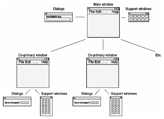
The “Multiple Document, Visible Main” model (see Figure 6-4) has a main window that's used primarily to launch co-primary windows. These co-primary windows are identical to each other and perform the same functions on different files or documents. All co-primary windows have identical entries in the menu bar and identical sets of dialogs and support windows. Each set of dialogs and support windows acts on a single document, the one represented by the co-primary window from which the dialog or support window was invoked.
Co-primary windows are opened either from the main window or from a co-primary window that's already open. IRIS InSight is an example of this model. Its main window lets users launch co-primary viewing windows, browse available files, and conduct global searches through these files. The co-primary windows are used for viewing online books.
A multi-document application should have a visible main window only if the main window offers functionality that can't be provided from the co-primary windows. For example, the IRIS InSight main window allows users to browse a list of books and to search a collection of books for specific words or phrases. A multi-document application should not have a visible main window if the only thing in the main window would be a menu bar. In this case, use the “multiple documents, no visible main” model; make the menu entries from the main window available from the pull-down menus in each of the co-primary windows, as described in the next section.
The “Multiple Document, No Visible Main” model (see Figure 6-5) is identical to the “Multiple Document, Visible Main” model described in the previous section except that the main window is invisible to the user (that is, unmapped) and new co-primary windows are launched from co-primary windows that are already open. Users open one document and leave it open while opening others. When the user has closed all of the documents, the process is killed.
Every application has at least one primary window that serves as the application's main controlling window. In fact, the majority of a user's interactions should occur in the main and co-primary windows (these window types are defined in “Window Types” earlier in this chapter).
This section discusses main and co-primary windows:
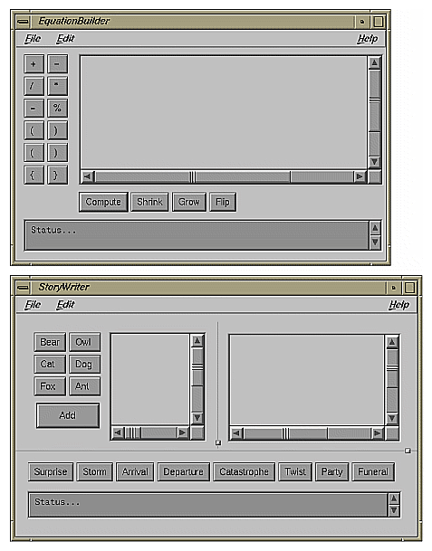
Several typical layouts for primary windows are shown in Figures 6-6 through 6-8. These layouts are discussed in the following sections.
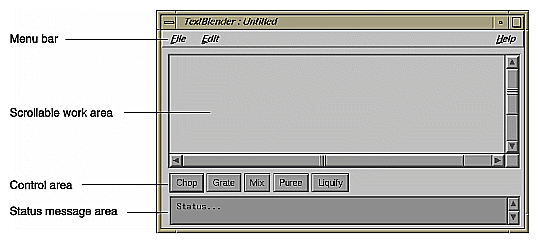
Primary windows typically have a menu bar, which is part of the window as shown in Figures 6-6 through 6-8. Don't create a detached menu bar contained in a separate window. For details on designing the menu bar and its contents for a primary window, see “The Menu Bar and Pull-Down Menus” in Chapter 8.
If the primary window doesn't have a menu bar and all of its functionality is available using buttons, the window should still respond to the keyboard accelerators for Close (Ctrl+W) and Exit (Ctrl+Q) when appropriate. That is, the window should respond to these accelerators according to the guidelines for when to use just Exit, when to use just Close, and when to use both Close and Exit for a window, as described in the section “File Menu” in Chapter 8.
The most prominent area of the window is typically a scrollable work area, as shown in Figures 6-6 through 6-8. Use scrollbars for the work area of a window when the window can be resized such that some of the available data may be hidden in the work area. Note that the scrollbars scroll only the work area and don't scroll the menu bar, buttons in a command area, or the status message area.
Each scrollbar should span the entire width or height of the scrollable region. Don't put controls or status information in the areas reserved for the scroll bars. Put controls in the control area, as described later in “Control Areas in Primary Windows.” Put status information in the status area, as described later in “Status Areas in Primary Windows.”
Use a vertical scrollbar on the right of the work area if the window or pane that contains the work area can be resized such that the data being displayed in the work area won't fit in a vertical direction. Similarly, use a horizontal scrollbar directly below the work area if the window or pane can be resized such that the data being displayed in the work area won't fit in a horizontal direction. Disable (rather than remove) the appropriate scrollbar when all of the data is being displayed in a given direction. For more information on using scrollbars, see “Scrollbars” in Chapter 9.
Controls in primary windows, which are typically pushbuttons, are generally placed directly beneath the horizontal scrollbar and on the left side of the window (see Figures 6-6 through 6-8). (Note that this is different than the OSF/Motif Style Guide, which states that controls can be arranged along the top, bottom, or side of the work area.) As stated in the previous section, don't place controls directly below or on the right side of the work area in the scroll bar area—scrollbars should span the entire width and height of the work area. (See Chapter 9, “Controls,” for more information about how to use controls in your application.)
Control areas sometimes contain pushbuttons that are grouped into tool palettes. Figures 6-6 through 6-8 show primary windows with pushbuttons in the control areas, and Figure 6-7 shows primary windows with both tool palettes and pushbuttons that aren't part of a palette. Buttons that are part of a tool palette don't need to have corresponding menu entries. These “tools” typically allow a user to launch support and co-primary windows, or put the work area in a different mode (for example, edit mode or draw mode).
In contrast, pushbuttons used in control areas that do not represent tool palettes should represent the most frequently accessed application-specific menu entries which provide users a more convenient way of accessing these actions. There are two advantages to having these buttons repeat functionality from the menus:
Having the functions in a menu allows you to assign keyboard accelerators to those common functions and allows users to choose between using point-and-click on the button or using a keyboard accelerator to access the functionality.
Having the functions in a menu means that users can skim one place (the menu entries) to get an idea of the overall functionality of the product, and can skim another place (the control area) to see the frequently used functionality.
These non-palette buttons generally don't include actions from the standard File, Edit, or Help menus because these entries typically aren't the most frequently accessed when compared to the functionality that's specific to your application. For example, these buttons don't include the actions “Exit” or “Close” because these functions are used only once each time the window is opened, and they don't include “Help” because help is easily accessible from the Help menu. (For more information on buttons, see “Pushbuttons” in Chapter 9; also see “Standard Menus” in Chapter 8.)
The control area can also include an area to enter command line input. This command line area should be in addition to the buttons. Note that this differs from the OSF/Motif Style Guide, which states that the command area can contain only command line input. For an example window with an command line input area, see Section 6.2.1 in the OSF/Motif Style Guide.
Primary windows can also include a single status message area at the bottom of the window if the application needs to post frequent messages to the user about the status of the application or the status of specific user actions (see Figures 6-6 through 6-8). For example, messages in this area might confirm that a file has been saved or that an option has been turned on or off. Provide vertical scrollbars for this area so that users can view previously displayed messages.
Don't use this area for warnings, errors, or other kinds of messages requiring the user to respond. Instead, use dialogs to display these types of messages. (See Chapter 10, “Dialogs,” for guidelines on designing dialogs.) Also, don't use it to display help information.
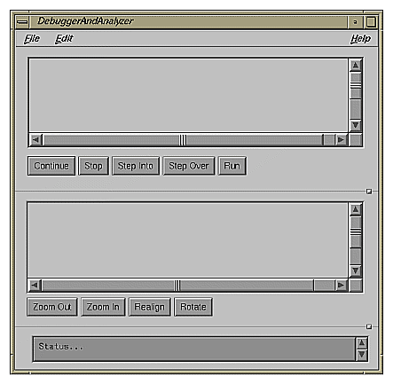
Windows can be split into various panes of information (see Figure 6-8). Panes are separated from each other by separator lines. Each separator line may or may not include a sash control, which allows users to resize the panes. (See the Sash reference page in Chapter 9 of the OSF/Motif Style Guide.) Windows can include panes that are stacked vertically (Figure 6-8) or that are next to each other in a side-by-side horizontal layout (Figure 6-7). Note that control areas can be associated either with a specific pane or with the entire window.
Don't overuse panes—each application window typically should have no more than four separate panes and no more than three sash controls. If certain panes are optional to performing the task, provide menu entries that show or hide specific panes of information (see “View Menu” in Chapter 8).
Popup menus (which aren't shown in the figures in this chapter) can provide quick access to frequently used functions in primary windows. For information on when and how to use popup menus, see “Popup Menus” in Chapter 8.
When designing a primary window . . .
Use a menu bar unless all of the window's functionality is available through pushbuttons. Don't use a “floating” menu bar in a separate window.
Support keyboard accelerators for Close (Ctrl-W) and Exit (Ctrl-Q) as appropriate, even if the window doesn't have a menu bar.
When designing a scrollable work area in a primary window . . .
Use a vertical scrollbar on the right side of the work area when the data being displayed in the work area may not fit in a vertical direction. Use a horizontal scrollbar directly below the work area when the data may not fit in a horizontal direction. Don't use scrollbars if you're certain the data will fit.
Disable the appropriate scrollbar when all the data is visible in a given direction. Don't remove the scrollbar.
Make each scrollbar span the entire height or width of the work area. Don't include controls or status information in the scrollbar region.
When designing control areas in a primary window . . .
Place controls below horizontal scrollbars or to the left of work areas.
Provide pushbuttons for the most frequently accessed application-specific functions from the pull-down menus. Don't use pushbuttons for standard menu entries such as Open, Save, Close, Exit, Cut, Copy, Paste, and Help.
Use pushbuttons only for functions that appear in menus, unless the pushbuttons are part of a tool palette.
Provide an area for command-line input, if appropriate, in addition to (not in place of) pushbuttons.
To display status information . . .
Use a status area along the bottom of a primary window if your application needs to post frequent messages about its status. Provide vertical scrollbars for this area so that users can view previously displayed messages.
Use a status area to display messages that the user doesn't have to respond to rather than posting this noncritical information in dialogs. However, don't put critical warning or error messages in the status area (use a dialog instead).
Don't use the status area to display help information.
When dividing a primary window into panes . . .
Divide panes using separator lines. If users might need to resize the pane, also include a sash control.
Try to limit the number of panes in a single window to four with no more than three sash controls.
If certain panes are optional, allow users to hide or show these individual panes using entries in the “View” menu.
As defined in “Window Types” earlier in this chapter, support windows are persistent secondary windows that allow users convenient, constant access to sets of important controls that directly manipulate data in the associated primary window. The next two sections discuss:
Each support window should be associated with a specific primary window (its parent), which should be visible and mapped to the screen. (Support windows with invisible, unmapped parents don't work properly with desks, as described in “Desks” in Chapter 3.) Support windows shouldn't have other support windows or dialogs as parent windows. Note that this differs from the OSF/Motif Style Guide, which states that secondary windows can have other secondary windows as parents.
Support windows typically don't have menu bars like primary windows, but they should still respond to the keyboard accelerator for closing a window (“Ctrl+W”). Launch support windows from items in the Tools menu of the associated primary window's menu bar (see “Tools menu” in Chapter 8) or from a tool palette in the primary window (see “Control Areas in Primary Windows”). Users can show or hide support windows as they wish, and rearrange where they're displayed with respect to the primary window. This makes support windows more versatile than control areas in a primary window. When bringing up support windows, don't overlap the work area of the associated primary window if you can avoid it. Note that 4Dwm constrains support windows to always appear on top of the parent window in the window hierarchy.
A support window should be smaller and less complex than its associated primary window, so that you don't need to split the support window's contents into separate panes. Support windows typically include a related set of controls that are associated with the parent primary window. Each related set of functions or input fields should be given its own support window. The controls (which can include buttons, text fields, and scrolling lists) typically either operate directly on selected data or change the mode of the primary window. For example, they might allow the user to choose a texture that will be applied to the selected objects in the primary window, or they might allow the user to choose a specific drawing tool that changes what's drawn in the parent window. For example, the IRIS Showcase Align Gizmo shown in Figure 6-9 aligns the objects that are currently selected in IRIS Showcase's main window. Don't add or remove controls from a support window depending on the current context—the layout and contents of a support window should be static.
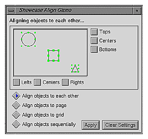
Support windows also typically contain a response area that includes standard actions for the window: “Apply,” “Cancel/Close,” and “Help.” See “Standard Dialog Actions” in Chapter 10 for more information about these actions. In addition, support windows may contain secondary work areas for manipulating data that will eventually be integrated into the work area of the associated primary window. Texture, pattern, icon, and geometry editors are examples of support windows that might contain secondary work areas. The Align Gizmo in Figure 6-9 contains a small display area showing a circle, a square, and a triangle, which shows the effects of the user's changes before they're applied to the main window.
Support windows should be modeless—that is, they shouldn't prevent the user from interacting with any of the application's other windows. If your application requires a secondary window that the user must dismiss before interacting with the rest of the application, use a modal dialog (see “Dialog Modes” in Chapter 10).
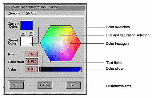
The IRIX Interactive Desktop color chooser is a standard support window that allows users to edit colors. Use the color chooser in your application whenever you want to offer the user an unrestricted choice of colors. For a restricted choice of colors, you can offer the user a palette of colors to choose from, a list, an option button, or a set of radio buttons, depending on the number of choices available. Figure 6-10 shows the color chooser in its default configuration.
You can allow users to access the IRIX Interactive Desktop color chooser from your application in one of two ways: by having them click on a button that displays its (editable) color, or having them click on an object for which the color should be changed. The first method is used by the Background control panel (which is available from the Desktop->Customize menu in the Toolchest). With this panel, the user clicks on one of the color buttons to open the color chooser. If the color chooser is already open, clicking on a color button selects that color for the color chooser to edit. The colors of the buttons represent the current colors being used by the desktop background. With the second method, the user selects an object and then chooses the “Color Editor” entry from the Edit menu, as described in the section “Edit Menu” in Chapter 8. This menu entry opens the color chooser. For details on how to include the IRIX Interactive Desktop color chooser in your application, see Chapter 4, “Using the Silicon Graphics Enhanced Widgets,” of the IRIX Interactive Desktop Integration Guide.
As noted in Figure 6-10, the color chooser includes the following components:
Two color swatches: one for showing the current selected color and one for enabling the user to store a second color for reference.
A color hexagon that provides visual selection of the hue and saturation components of a color in an HSV color space. The user changes the hue and saturation by moving the selector (which appears as a small circle) in the color hexagon.
Color sliders for controlling various color components.
Text fields that show the exact values for hue, saturation, and value color components and allow users to set these values numerically. (There are also text fields indicating the values of the red, green and blue color components when the red, green, and blue sliders are visible.)
Menus for Options (which allows users to easily find the color white) and Sliders (which provides various combinations of sliders for setting hue, saturation, value, red, green, blue input values).
Pushbuttons that allow users to apply the current values, cancel a pending change, or get help on this window.
| Note: Because of drawing-speed considerations, the color hexagon and color sliders are available only if running under GL. For X-only configurations, the Color Chooser uses a Scale widget instead of the color sliders, and there is no color hexagon. |
The user can apply the new color to the selected object by pressing either the OK or Apply buttons. If the user presses OK, the color chooser should be dismissed after the new color is applied. If the user selects a new object in the parent primary window while the color chooser is open, the color chooser should update its current color to the color of the selected object. Thus, a single color chooser window can be used to change the color of a number of different objects.
When designing support windows . . .
Use them to provide access to sets of related controls.
Allow users to access them either through entries in the Tools menu or through pushbuttons in a tool palette in the parent primary window.
Be sure that each support window has a visible parent primary window that's mapped to the screen.
When designing the layout of a support window . . .
Make the layout simple and static. Don't include multiple panes of information.
Include a response area for standard actions that's similar to the one dialogs have.
Don't include a menu bar in most cases, but do support the keyboard accelerator for Close (Ctrl-W).
When opening support windows . . .
Avoid overlapping the work area of the parent window.
Bring them up as modeless secondary windows.
When allowing the user to make color choices . . .
Use the IRIX Interactive Desktop color chooser whenever you want to offer the user an unrestricted choice of colors. For a restricted choice of colors, use a palette of colors to choose from, a list, an option button, or a set of radio buttons, depending on the number of choices available.
The user should retain control over the location of the pointer at all times. Your application shouldn't change the location of the pointer. (This is sometimes referred to as “warping” the pointer.) Similarly, your application shouldn't change the gain and acceleration characteristics of mouse movement. Users set these on a global basis using the Mouse Settings control panel available from the Desktop->Customize cascading menu in the Toolchest. If your application requires finer motion control than what's provided by the default gain settings, provide a zoom feature in the View menu that allows users to change the relative size of an area of your application. (See “View Menu” in Chapter 8 for more information about this menu.)
Although users control the location of the pointer, your application needs to control the shape of the pointer. This shape gives the user feedback about the current state of the application (for example, whether it's waiting for user input or whether it's busy processing). Pointer shapes are discussed in “Pointer Shapes and Colors” in Chapter 11.
When designing your application . . .
Always allow the user to control the location of the pointer; your application shouldn't change the position of the pointer.
Don't change the gain or acceleration characteristics of the pointer. If your application requires fine manipulation, provide a zoom feature in the View menu.