The IRIX Interactive Desktop uses icons to represent entities such as applications, files, directories, people, printers, the Indy Cam camera, removable media devices (for example, CDROM, floptical, and DAT drives), and other devices. Users can manipulate these icons through a point-and-click graphical user interface to initiate certain actions, such as launching an application or sending a data file to the printer.
This chapter covers the following topics:
“Designing the Appearance of Icons” tells you how to design an application icon to represent your application's executable file and a file icon to represent your data files.
“Defining the Behavior of Icons With FTRs” explains which File Typing Rules (FTRs) you need to define for your application and file icons so that they will respond to user actions such as double-click and drag-and-drop.
“Making Application Icons Accessible” discusses adding your application icon to the Icon Catalog and naming and locating your executable file in the file system so that users can easily find your application icon.
 | Note: In this guide, the term icon refers to IRIX Interactive Desktop icons and not to minimized windows, as in the OSF/Motif Style Guide. Minimized windows are described in “Minimized Windows” in Chapter 3. |
This section discusses icon design. Topics include:
Your application's desktop icons can appear in any of several places on the IRIX Interactive Desktop, along with icons from other applications. For example, your icons can appear on the desktop background, in Directory View windows, and in the Icon Catalog. Figure 2-1 shows the Icon Catalog, which displays several application icons representing executable files. Figure 2-2 shows various data file icons that can appear on a user's desktop.
For each application, you'll need to create an application icon. If your application saves its data in a unique format, you'll also need to create a data file icon. (If your application saves its data in a standard data format, your application's data files will automatically appear on the desktop using the appropriate standard data icon.)
To make your application and file icons stand out in a group of icons, be sure to create meaningful symbols that are distinctive and represent your product. Your icon designs should also follow the guidelines detailed in the remainder of this section so that users recognize your icons as desktop icons and know that they can interact with these icons in expected ways.
Design your application and file icons so that they:
convey your product identity
have the correct components and thus are recognizable as desktop icons
are identifiable when zoomed to the minimum and maximum sizes allowed by the IRIX Interactive Desktop
use an effective color scheme, which allows the icon to reflect its state
Your primary goal is to differentiate your icons from those of other products and to make the design fairly simple because desktop icons are small when minimized.
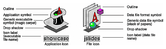
Application and file icons consist of several components (as shown in Figure 2-3):
a symbol identifying the application or type of data file
an outline around the edge of the symbol
a drop shadow that helps give the icons a 3D appearance
a label identifying the executable or data file
Application icons also include a magic carpet, the generic executable symbol, which differentiates them from file icons and shows whether or not the application is running (by moving from the horizontal, at-rest position into a vertical, up-and-running position). File icons for document-based applications incorporate the generic data file symbol (three rectangles representing sheets of paper) into the file icon design.
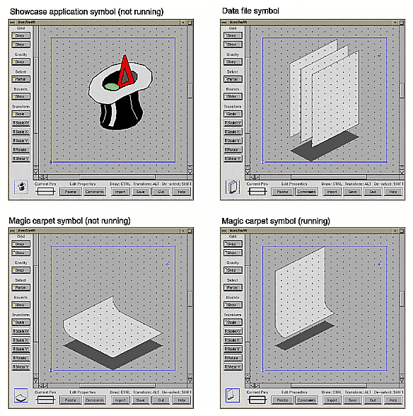
You need to create the symbols for your application icon and for any unique file types your application creates. Create the symbols with the IconSmith drawing tool, which is described in Chapter 12, “Using IconSmith,” in the IRIX Interactive Desktop Integration Guide. IconSmith provides a drawing grid with tools for creating 3D graphics. It also supplies predefined templates for the magic carpet in both the running and not running states and the data file format symbol, complete with drop shadows.
You can create your unique icon symbols in the drawing area and can readily add the predefined templates to your design. Figure 2-4 shows four examples of IconSmith. The drawing area in the example in the upper left corner contains the IRIS Showcase application symbol for its not-running state. The other three examples contain the three predefined templates. The icon labels are supplied automatically when the icons are displayed on the desktop. This label is the name of the executable for application icons and the name of the data file for file icons.
Draw your icon within the 100×100-pixel boundary box defined by IconSmith. Keep in mind that your symbol designs should allow any generic icon components, such as the magic carpet and stack of papers, to be at least partially visible. This is described in more detail in “Application Icon Design” and “File Icon Design” later in this chapter.
By default, icons are reduced to fit within a 50x50 pixel area when they're displayed on the desktop. Because users can adjust the viewing scale for icons making the icons either larger or smaller than this default, your icon drawings should look good across the range of available sizes. You can use the IconSmith preview box to see what your icon looks like when scaled to various sizes.
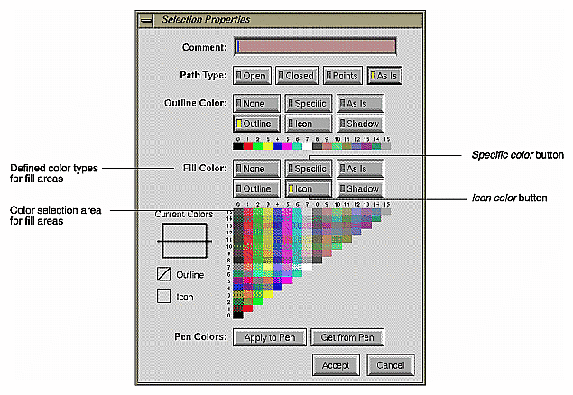
IconSmith provides the color palette shown in Figure 2-5 for specifying the colors in your icon. The following two buttons are of particular importance for applying color to icons:
Specific—lets you apply a color from the color selection area to the selected part of the graphic. The specific color remains constant as an icon goes through its states.
Icon—lets you apply the predefined icon color to the selected part of the graphic. Portions painted with the icon color change color dynamically as the icon changes its state.
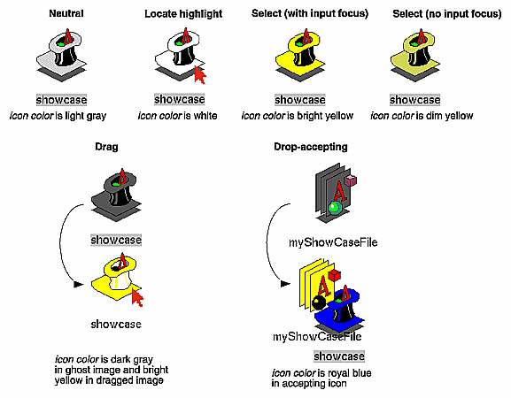
When choosing colors for your icons, consider that the icon color changes to indicate state and that icons appear against a variety of differently colored backgrounds. To accommodate these issues, you need to enable your icon to show its state and make sure your icon stands out from the most likely backgrounds, as explained in the following paragraphs. (See Chapter 1, “Overview of the IRIX Interactive Desktop,” for explanations of icon states from the user's point of view.)
To enable your icon to reflect what state it's in, you need to paint portions of it with the predefined icon color supplied by IconSmith. Those portions of your icon are changed automatically by the IRIX Interactive Desktop to indicate the icon's state. In the example shown in Figure 2-6, the hat brim, the light shading on the hat, and the carpet of the IRIS Showcase application icon use the predefined icon color (which is a light gray in the neutral state). In addition, to make the state color changes easier for users to detect in your icons, avoid (or use sparingly) intense, strongly saturated colors and the specific colors used by the IRIX Interactive Desktop to indicate state—bright yellow, dim yellow, royal blue, pure white, and light gray.
You can increase your icon's visibility on user-customized desktops. (Remember that users can customize the desktop background to be any color and pattern, as described in Chapter 1, “Overview of the IRIX Interactive Desktop.”) To increase visibility:
Use the icon color defined by IconSmith to color most of your icon.
Use two or more areas of accent colors to help your icon stand out against user-customized background colors.
Avoid using only very small color areas (2-4 pixels) because these small areas may be difficult to see against a patterned background.
Use the outline color (which is black) supplied by IconSmith to define the outline of your icon.
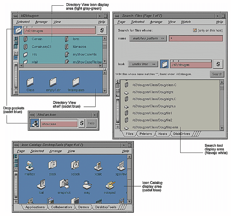
Since your icons can display in certain IRIX Interactive Desktop tools as shown in Figure 2-7, avoid (or use sparingly) the following background colors used by these tools:
light gray-green—used in Directory View windows
cadet blue—used in read/write panes such as drop pockets, shelves in Directory View windows, and the Icon Catalog pages
Navajo white—used in read-only panes such as the results area of the Search tool
See /usr/lib/X11/schemes/Base/OzSpec for colors used by these tools:
*ozDirPanelColor: AlternateBackground4
*ozCltnPanelColor: AlternateBackground5
*ozDropPocketColor: AlternateBackground5
See /usr/lib/X11/schemes/Base/BaseColorPalette for definitions of these colors:
#define AlternateBackground4 #729c9c
#define AlternateBackground5 #5680ab
#define AlternateBackground6 #b6b6aa
| Note: The color descriptions “light gray-green” and “cadet blue” are approximate since hardware and gamma values vary. Look at these colors on your system in Directory View windows and read/write panes, and avoid using these colors in your icon or use them sparingly. |
Icons on the IRIX Interactive Desktop should display at a three-quarter view and face the lower right of the screen to make them appear 3D. When designing your application and data file format symbols, draw them using this perspective. This is the same perspective that is used for the generic executable symbol (the magic carpet) and the generic data file symbol (stack of papers). Icons that don't follow this convention appear to be facing the wrong way.
In addition to adhering to the guidelines discussed in the previous section, “General Icon Design: Components, Size, and Colors,” the application icon that represents your application's executable needs to convey to users:
that it's an application icon (as opposed to a data file icon)
what its current state is (whether or not the application is running)
The magic carpet is the generic executable symbol; it differentiates application icons from data file icons. As mentioned in the previous section, the magic carpet and its drop shadow are predefined components that can easily be incorporated into your icon design when using IconSmith. For details of having them appear with your application symbol, see Chapter 11, “Creating Desktop Icons: An Overview,” in the IRIX Interactive Desktop Integration Guide.
As shown in Figure 2-8, the application icon uses both of the following techniques to indicate its state—that is, whether or not the application is running:
The 3D application symbol changes (in this example, items pop out of the hat in the running state).
The magic carpet moves from a horizontal, at-rest position to a vertical, up-and-running one, and the drop shadow changes shape appropriately. Since the magic carpet must be recognizable in both states, make sure that your application symbol doesn't completely obscure it in either position.
To have your application icon change to reflect its running state, create two different symbols using IconSmith and associate them with your application. See Chapter 11, “Creating Desktop Icons: An Overview,” in the IRIX Interactive Desktop Integration Guide for details on how to do this. The specific design of the two symbols is up to you, but keep in mind that you're trying to convey an inactive state and an active, running one. Also, when viewed in succession, the two symbols look like a progressive animation rather than two unrelated icons.
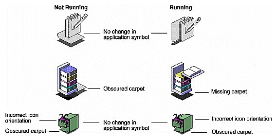
The IRIS Showcase application icon shown in Figure 2-8 is an example of a well-designed icon: it animates to show which state the application is in, and the carpet is always visible. Figure 2-9 shows three examples of application icon designs that can be improved:
The first example is an application icon for a point-and-click ASCII text editor. Its carpet is clearly visible and functions properly. The application symbol doesn't change, however, to reflect that the application is running. To improve the design, the existing symbol could be used to show the running state and the pencil could be aligned at the bottom or side of a blank version of the pad when the application isn't running.
The application icon in the second example represents an online book viewer. The application symbol changes nicely to indicate its running state. The carpet, however, is almost totally obscured when the application isn't running and doesn't appear at all when the application is running.
The third application icon represents a database application for tracking software bugs. The application symbol is visually appealing but completely obscures the carpet. In addition, there's no change in the application symbol to reflect its running state, and the symbol is oriented toward the lower left instead of the lower right. The design could be improved by adding a second symbol for the not-running state (perhaps showing the file drawer closed with the bug's antennae sticking out), making the application symbol smaller so that the magic carpet is visible, and redrawing the symbol so that it faces the lower right.
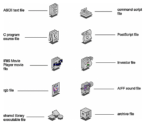
If your application creates files, those files need to be associated with data file icons. Silicon Graphics defines a set of standard data formats and provides associated data file icons, some of which are shown in Figure 2-10. (For information on these file formats, see Appendix E, “Predefined File Types,” in the IRIX Interactive Desktop Integration Guide.) If your application saves its data in any of these standard formats, it will automatically use the appropriate data file icon for those files.
If your application saves its data in a unique format, however, you need to design a distinctive file icon that relates graphically to the theme of your application icon. Indicate, if possible, how the data is used. Your file icon should follow the guidelines discussed in this section and in the earlier section “General Icon Design: Components, Size, and Colors.”
The standard file icons shown in Figure 2-10 that symbolize documents all contain the generic data file symbol (stack of papers). If your application creates data files, your file icon should include this generic symbol. Both the generic symbol and its drop shadow are predefined components available in IconSmith. If you're creating a unique icon that does not use the generic data file symbol, create an appropriately shaped drop shadow for your design and paint it with the shadow color predefined in IconSmith.
Figure 2-11 shows some file icons for application-specific file formats. For example, the IRIS Showcase file icon includes the generic data file symbol (a stack of papers) to indicate that it represents a document, and the data file format symbol is similar to that found in the IRIS Showcase application symbol for the running state.
Provide a meaningful, distinctive symbol that gives your product an identity and that allows users to readily identify your application and its corresponding custom data files, if any.
Keep designs fairly simple because desktop icons can be displayed in small sizes.
Make sure that your icon can be identified across the range of viewing sizes.
Color most of your icon using the icon color predefined by IconSmith so that your icon's state is easy to detect.
Use two or more areas of accent colors to help your icon stand out against user-customized background colors.
Avoid small areas of color (2-4 pixels) because they're difficult to see against patterned backgrounds.
Use an outline around your custom symbol, and use the outline color supplied by IconSmith.
Avoid or use sparingly intense, strongly saturated colors and the specific colors used by the IRIX Interactive Desktop—bright yellow, dim yellow, royal blue, light gray-green, cadet blue, and Navajo white. These colors make it difficult to distinguish between certain icon states and to find your icon against the background colors of many desktop tools.
Orient your icon so that it displays a three-quarter view that faces the lower right corner of the screen.
When designing an application icon . . .
Include the magic carpet, the generic executable symbol, with your application's symbol.
Indicate the state of the application (not running vs. running) by moving the magic carpet from a horizontal (not running) to vertical (running) position, or by providing two different application symbols and moving the magic carpet from a horizontal to vertical position. Remember that your application symbols should resemble a progressive animation when viewed in succession.
Make sure that your application symbols do not completely obscure the magic carpet in either its horizontal or vertical position.
Application icons that have two separate symbols for the not running and running states should make sure that the main part of the symbol remains in the same location during both states, so that the symbol appears stationary to the user.
If your application saves data in a custom file format . . .
Design a unique data file format symbol that is readily associated with your application icon design and also indicates how the data is used.
If your application is document-based, include the generic data file symbol (stack of papers) in your design.
If your data file icon does not use the generic data file symbol, create an appropriately shaped shadow for your file icon and use the predefined shadow color supplied by IconSmith.
Define the behavior of icons on the IRIX Interactive Desktop by creating a File Typing Rule (FTR) file for each icon. This behavior includes such things as what happens when the user double-clicks on an icon and what happens when the user drags and drops one type of icon onto another type of icon. This section describes:
“User and Icon Interaction,” which explains how users can interact with icons, how an FTR supports these interactions (in brief).
“Icon Appearance Design Guidelines,” which lists the minimal set of standard behaviors your application and file icons should support.
Table 2-1 shows the behavior users expect for given interactions with application and file icons. The last column lists the rules for each type of interaction. For information on implementing these behaviors, see Chapter 11, “Creating Desktop Icons: An Overview,” in the IRIX Interactive Desktop Integration Guide.
Table 2-1. User/Icon Interactions and Expected Behavior
User Goal | User Action | Expected Behavior | Implementation Hints |
|---|---|---|---|
Launch application | Selects application icon and
chooses “Open” from the
corresponding Selected menu | The magic carpet and the application symbol change from the not-running to the running state. The application launches, set to a new file. | Add a CMD OPEN rule for the application icon |
Launch application with a particular file by directly opening file | Selects file icon and chooses
“Open” from the corresponding
Selected menu | The magic carpet and the application symbol change from the not-running to the running state. The application launches, set to the specified file. | Add a CMD OPEN rule for the file icon that specifies its application[a] |
Launch application with a particular file by dragging and dropping | Drops file icon onto application icon | If file is compatible, application launches, set to specified file If file is incompatible, application posts an appropriate error message and doesn't launch. In both cases, the magic carpet and the application symbol change from the not running to the running state. | Add a CMD DROP rule for the application icon |
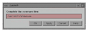
Launch application with command-line arguments | Double-clicks application icon while holding down the <Alt> key | The Launch dialog box opens, displaying the path to your executable (see Figure 2-12). Users can add arguments if desired. Clicking OK executes the text input as specified. The magic carpet and the application symbol then change from the not-running to the running state. | Add a CMD ALTOPEN rule for the application icona |
Selects file icon and chooses
“Print” from the corresponding
Selected menu | Specified file prints on default printer if activated by a menu selection or prints on specified printer if activated by a drag and drop action. | Add a PRINT rule for the file icona | |
[a] Design the application so it can accept specific data (for example, a filename) as a command-line argument. | |||
When creating an FTR to define your application icon's behavior . . .
Provide a CMD OPEN rule that launches the application. This allows the user to open your application either by selecting your application icon and then choosing “Open” from the corresponding Selected menu, or by double-clicking your application icon.
Provide a CMD ALTOPEN rule that opens the Launch dialog box shown in Figure 2-12 with the path to your executable displayed in the text field of this window. This allows the user to open the Launch dialog box by double-clicking your application icon while holding down the <Alt> key.
Provide a CMD DROP rule that launches your application with the file specified by the dropped icon. If your application doesn't understand the type of file represented by the icon dropped on it, your application should provide an appropriate error message to the user rather than launching. This allows the user to launch your application with a specific file by dragging the file icon and dropping it on your application icon.
When creating an FTR for your file icon . . .
Provide a CMD OPEN rule that launches your application and automatically opens the file represented by the file icon. This allows the user to open a file created by your application either by selecting the file icon and then choosing “Open” from the corresponding Selected menu, or by double-clicking the file icon.
Provide a CMD PRINT rule that sends the file represented by the file icon to the specified printer. This allows the user to send your application's data files to the default printer by selecting the file icon and then choosing “Print” from the corresponding Selected menu. It also allows the user to send your application's data files to any printer by dragging the file icon and dropping it on an icon that represents the specific printer.
In addition to designing the appearance and defining the behavior of your application icon, you need to make it accessible to users. This section describes:
After users install an application, they expect to find its icon in the Icon Catalog (described in “Overview of the Desktop” in Chapter 1), so you need to add your application icon to the Catalog as part of the installation process. Also, decide on which page of the Catalog your icon should appear or, if necessary, create a new page. Once you've chosen an appropriate page for your application icon, refer to Chapter 11, “Creating Desktop Icons: An Overview,” in the IRIX Interactive Desktop Integration Guide for details on making your application icon appear on the chosen page.
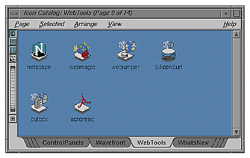
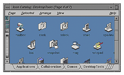
As shown in Figure 2-13, the Icon Catalog lets users access applications visually without having to search through the file hierarchy. Some of the Icon Catalog pages are listed below along with typical applications that can appear on them:
Application page—multimedia presentation application (showcase), text editor (jot), electronic mail program (MediaMail)
Collaboration page—desktop conferencing application (inperson), 3D model annotator (annotator)
Desktop Tools page—calculator program (xcalc), clock program (xclock), select fonts (xfontsel), mail notifier utility (mailbox), calendar display (ical), and screen magnifier (mag)
Media Tools page—compact disc player (cdman), digital audio tape player (datman), image file format conversion utility (imgcopy), movie creation/editing application (moviemaker), audio editing application (soundeditor)
Control Panels page—audio control panel (apanel), background setting control panel (background), desktop settings control panel (desktop)
Web Tools page—Netscape Navigator (netscape), WebMagic (webmagic), WebSpace Navigator, WebJumper (webjumper), OutBox/WebServer, DynaWeb Server, What's New, TarDist
In most cases your application icon will appear on the Applications page, since that's where users will expect to find it. If you're developing a suite of applications, however, you may want to create a new page for your icons and let users know (in your product's documentation) that you've done this.
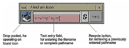
The Find an Icon tool, shown in Figure 2-14, allows users to find applications by typing the name of the executable. If they type the correct name and if the executable is located in a directory on the user's search path or under the user's home directory, the corresponding icon appears in the drop pocket. The user can then drag the icon to another location such as the desktop, or open it directly from the Find an Icon tool by double-clicking the icon.
Since users may be guessing at the most likely name for the application's executable, adhere to the following naming conventions:
Choose a name that matches the product name or is strongly associated with the product. For example, the name of the IRIS Showcase executable is showcase, and the name of the online book application, IRIS InSight, is insight. Don't use an abbreviation of your product name.
Use only lowercase letters for the name. For example, the name for the SoundEditor executable is soundeditor.
Don't include spaces in the name since UNIX doesn't handle spaces elegantly.
Don't use numbers in the name to represent versions of a product. For example, the executables for IRIS InSight 2.2.1 and its earlier versions are all named insight.
Don't use any special characters in the name, such as underlines or periods. Simply remove any spaces when converting your product's name to an appropriate name for your executable.
Since the Find an Icon tool searches only directories on the user's search path and under the user's home directory, put your executable—or a link to it, which is preferable—in one of the directories on the user's default path. The directories included in the default path are:
/usr/sbin |
/usr/bsd |
/sbin |
/usr/bin |
/bin |
/usr/bin/X11 |
The most appropriate place to put a link to your executable—and the one that will result in users finding your application the fastest—is /usr/sbin.
When making your application icons accessible to users . . .
Place your application icon on the Applications page in the Icon Catalog. If you produce a suite of software applications, consider creating your own page.
In your documentation, refer users to the appropriate page in the Icon Catalog after they've installed your application.
When naming your executable, use the product name or choose a name that's strongly associated with the product.
When naming your executable, use only lowercase letters. Don't use numbers, spaces, or special characters such as underlines or periods. Don't use an abbreviation of the product name.
Make sure that a link to your executable (preferred method) or the executable itself resides in a directory in the user's default search path. Ideally, place a link to your executable in the /usr/sbin directory. This helps ensure that users can quickly find your application icon using the Find an Icon tool.