The IRIX Interactive Desktop environment allows users to interact with applications by using a graphical, point-and-click interface based on icons and windows. It offers an easy, powerful alternative to typing commands in the traditional UNIX style.
This chapter provides a brief overview of the IRIX Interactive Desktop environment from the user's perspective. It describes how users expect to interact with their graphical environment and with your application. The specific implications for your application are discussed in the remainder of Part One, “Integrating With the IRIX Interactive Desktop.” For details on how users interact with the IRIX Interactive Desktop, see the online Desktop Users Guide.
This chapter covers the following topics:
“Overview of the Desktop” briefly describes the major elements of the IRIX Interactive Desktop including the various types of desktop icons.
“How Users Interact with Desktop Icons” describes how users interact with icons and how icons appear on the desktop during these interactions.
“Mouse and Keyboard Hardware” describes the mouse and keyboard hardware provided for use with Silicon Graphics systems.
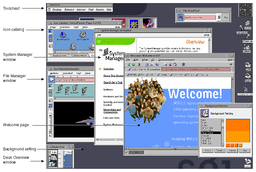
Figure 1-1 shows an example of the IRIX Interactive Desktop, with the following tools running:
Welcome page design and navigation (the center, blue Netscape window). This window can be launched from the Welcome_to_SGI icon.
Toolchest. The Toolchest serves as the primary access point for desktop user interfaces. For example, users can access interfaces for everyday tasks such as customizing their desktop, accessing applications and Web tools, backing up and restoring their files, and finding information (help) on a variety of desktop topics. By default, the Toolchest is located in the upper left corner.
New background patterns. The background in the new screensnap is one of the new patterns available from the Background Setting panel. The Background Setting panel itself is visible in the screensnap (lower right), previewing the new background pattern called "Citrus Citrus.” The background panel can be launched from the Toolchest by selecting “Desktop > Customize > Background.”
System Manager (center window). This window has a new design but the same functionality as before. System Manager can be launched from the Toolchest by selecting “System > System Manager.”
Desks Overview window. With the Desks Overview window, users can switch from one “desk,” or group of applications, to another. When your application appears in a desk other than the one currently in use, it is in a state similar to the minimized state. You need to be careful about what processes your application runs while in a minimized state. The Desks Overview window is shown in the lower left corner.
Icon Catalog. Users can access icons from the different pages in the Icon Catalog. Some of the pages are: Applications, Demos, Desktop Tools, Media Tools, and Web Tools. Since the Icon Catalog is one of the first places users look when they need to find an application, you should add your product's icons to this catalog. By default, the Icon Catalog is below the Toolchest.
File Manager window. From this window, you can view file contents (example shown is a model of an X29 fighter jet, partly obscured by the System Manager window). The File Manager window is shown at the left, above the Desks Overview window.
In addition, the “noiconlogin-mode” image has been updated to show the new SGI logo. The EZsetup account login and web page design have also been updated. Other elements that remain from the previous desktop design include the File QuickFind (shown in the upper right), minimized windows (five across on the left side under the Toolchest), and device icons along the right side. These are just a few examples of the kinds of things you will need to consider to integrate your application into the Desktop Environment. This book provides style guidelines while the “IRIX Interactive Desktop Integration Guide” gives you complete and detailed instructions for integration. For the best results, use both books together.
These tools affect the design of your application. Specific design implications are discussed in detail in the remainder of Part One. For more information on the tools themselves, see the Desktop Users Guide.
Users interact with icons on the IRIX Interactive Desktop using a point-and-click graphical user interface. For example, the following techniques represent some of the ways a user can launch an application using icons:
double-clicking the application icon, which launches the application and opens a new file
double-clicking a file icon, which launches the application opened to that specific file
selecting the application icon (by single-clicking or dragging a rectangle that encloses it) and then choosing “Open Icon” from the Selected menu (in the Toolchest for icons on the screen background or in the specific tool window for other icons)
dragging a compatible file icon and dropping it on top of the application icon, which launches the application and opens that specific file
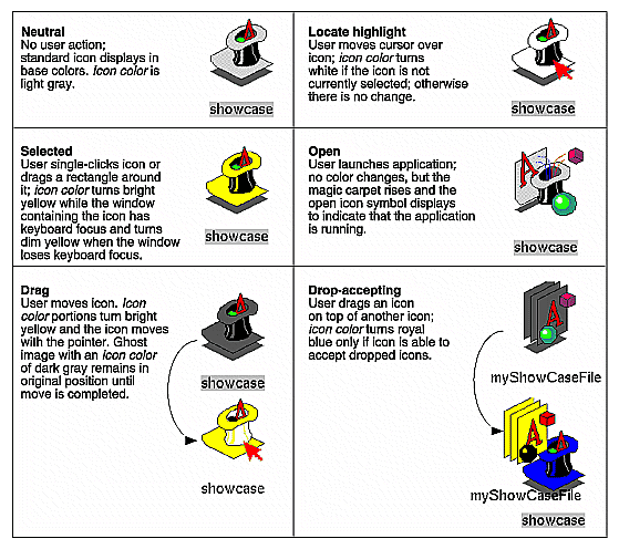
The six states that are used to represent icon manipulations are indicated primarily by painting specific portions of the icon with a predefined “icon color.” As the state changes, the areas painted with the icon color change color. For the specific implications on the design of your application's icons, see “General Icon Design: Components, Size, and Colors” in Chapter 2.
The icon states of the IRIS Showcase application icon are illustrated in Figure 1-2. (Note that the magic carpet under the magician's hat is the generic executable symbol used in the IRIX Interactive Desktop environment to identify the icon as an application icon.) In the figure, the hat brim, the light shading on the hat, and the carpet are in the predefined icon color and thus change color as the state changes. The states are:
neutral—the icon is not involved in any operations. The icon appears in the base colors you've chosen. The portions containing the icon color appear in light gray.
locate highlight—the pointer is resting on the icon and the icon isn't currently selected (see the following description of the selected state). The icon color portions change from the neutral state color light gray to white. The locate highlight feature lets the user know that the highlighted icon will be selected if the user single-clicks or opened if the user double-clicks. (The locate highlight feature also applies to components in windows to provide feedback as to which objects are true components and which are passive graphics, as described in “Enhanced Graphics in the IRIX Interactive Desktop Look” in Chapter 3.)
selected—the icon has been chosen potentially for some operation. Users select an icon by single-clicking on it with the left mouse button or dragging a rectangle around it using the left mouse button. When an icon is selected, the icon color portions turn yellow. Note that the icon color is bright yellow when the window containing the icon (or the screen background) has the keyboard focus; otherwise, the icon color is a dim yellow. Users can choose entries from the Selected menu (from the Toolchest if the icon is on the screen background or from a window's menu bar if contained in a tool window) to perform various operations on the object represented by the icon.
open—applies to application icons but not to data file icons. For application icons, the open state indicates that the application is running. Application icons indicate their open state by moving the magic carpet from a horizontal to a vertical position and by changing their application icon symbol. This is discussed in more detail in “Application Icon Design” in Chapter 2. Note that application icons don't indicate their open state with colors.
drag—an icon is in the process of being moved on the screen. Users drag icons by pressing and holding down the left mouse button while the pointer is positioned over the icon and then moving the mouse. The icon moves around the desktop with the pointer. As an icon is dragged, the portions colored with the icon color display in yellow since it's in the selected state, and a ghost image of the icon with the icon color portions displaying in dark gray remains in the original position. The ghost image remains until the user drops or places the icon or cancels the drag operation.
drop-accepting—an icon has another icon moved on top of it to perform some operation. For example, users can move a file from one directory to another by dragging the icon representing the file and dropping it onto the icon representing the new directory. When an icon has another icon positioned over it, the icon color portions of the destination icon turn royal blue if the destination icon can accept dropped icons or remain in their current color if the destination icon doesn't accept them.
The Silicon Graphics three-button mouse supports the mouse actions defined in the OSF/Motif Style Guide (such as press, release, click, motion, multiclick, multipress, and multimotion). Table 1-1 lists these buttons and their functions. If a mouse action is mentioned in this guide without reference to a specific mouse button, assume that the button being used is the left mouse button. For example, “when the user clicks on the OK button. . .” means “when the user positions the pointer over the OK button and clicks the left mouse button. . . .” Note that users can switch the mouse to a left-handed mouse via the Mouse Settings control panel available from the Desktop->Customize menu in the Toolchest.
Table 1-1. Mouse Button Names and Functions
Button[a] | OSF/Motif Name | Silicon Graphics Name | Function |
|---|---|---|---|
Leftmost button | Used for all primary interactions, including selection, activation, and setting the location cursor. | ||
Middle button | Used for moving and copying elements. Can be used for advanced user shortcuts that are also included in a more obvious interface. | ||
Rightmost button | Exclusively used for popping up menus. | ||
[a] This table assumes a right-handed mouse. | |||
Silicon Graphics keyboards support the following special keys that are used to interact with Motif-compliant applications:
<Tab> |
<Space> |
<Back Space> |
<Escape> |
<Insert> |
<Delete> |
<Home> |
<End> |
<Page Up> |
<Page Down> |
Modifier keys: <Ctrl>, <Alt>, <Shift> |
Ten function keys: <F1> through <F10> |
Special printing characters: </>, <\>, <!> |
Arrow keys: <down arrow>, <left arrow>, <right arrow>, <up arrow> |
In addition to these keys, Silicon Graphics keyboards also support the function keys <F11> and <F12>, which aren't included in the OSF/Motif Style Guide. If your application uses these keys, limit them to application-specific functionality rather than the general functionality described in this guide.
Table 1-2 lists the keys that the OSF/Motif Style Guide defines but that don't appear on Silicon Graphics keyboards; it also lists the corresponding Motif-compliant substitutions for Silicon Graphics keyboards.