Regardless of whether they use a mouse, a keyboard, or both, users need to move the location cursor to new positions. That is, they will need to navigate around the workspace. The model is simple for mouse users, and more complicated for keyboard users. This chapter describes the general navigation model for mouse and keyboard users, describes the more complicated Menu navigation model, and then describes navigation within scrollable components.
In mouse-based navigation, the mouse is used to move the focus among controls. If an implicit focus policy is in use, the keyboard focus simply follows the mouse pointer, and no other explicit action is required to change the focus.
With an explicit focus policy, pressing BSelect on a component must move focus to it, except for components that are used to adjust the size and location of other elements, such as ScrollBars. Pressing BSelect on these components need not move the focus. If not, after the mouse has acted on the component, the focus should remain on the component that previously had it. Pressing BSelect will also generally perform some selection or activation operation. Clicking <Ctrl> BSelect on an activatable component can move focus to it without any other effect.
The only exception to the simple model of pointer navigation is a Menu system because Menus are not available on the screen until activated. Activating a Menu causes it to be shown on the screen. There are three types of Menus: Pulldown Menus, Popup Menus, and Option Menus. The MenuBar is also a special kind of Menu. A Menu system consists of all the Menus cascading from a single CascadeButton, OptionButton, or Popup Menu. The MenuBar system consists of the MenuBar and all of its associated Menus.
A Pulldown Menu is generally activated by pressing BSelect on a CascadeButton, which displays the Pulldown Menu. A Popup Menu is generally activated by pressing BMenu in an area with a Popup Menu, which displays the Popup Menu. An Option Menu is generally activated by pressing BSelect on an OptionButton, which displays the Option Menu. A Pulldown Menu pulled down from a CascadeButton within a Pulldown, Popup, or Option Menu is called a Cascade Menu. A MenuBar is generally activated by moving the input focus to the MenuBar. Since a MenuBar is always visible, activating the MenuBar does not change its appearance. Navigating to a Menu is equivalent to activating a Menu.
Menus are activated in one of two ways: spring-loaded or posted. Spring-loaded means that the Menu is removed when the mouse button that activated it is released. Posted means that the Menu is not removed when the mouse button that activated it is released, but must be explicitly removed by another user action.
BSelect Press with the pointer on a Menu must activate the Menu in a spring-loaded manner. If the pointer is in an element with an inactive Popup Menu and the context of the element allows a Popup Menu to be displayed, BMenu Press must post (activate) the Menu in a spring-loaded manner. Note that the availability and contents of the Popup Menu can depend on the location of the pointer within the element, the contents of the element, or the selection state of the element. In the case where a Popup Menu can be posted by both an element and an element contained within it, the Popup Menu of the internal element must be posted.
Once a Popup Menu is posted, BMenu must behave just as BSelect is described for any Menu system. BSelect must also be available from within a posted Popup Menu system, and must behave just as in any Menu system. BSelect Release within a spring-loaded Menu system must activate the button under the pointer at the time of the release. If the release is on a CascadeButton or OptionButton and the associated Cascade Menu was already posted at the time BSelect was pressed, it should be unposted; otherwise, the associated Cascade Menu must be posted.
Whenever any Menu is popped up or pulled down, the location cursor must be placed on the Menu's default entry, or on the first entry in the Menu if there is no default entry. Support for default entries in Menus is optional.
A spring-loaded Menu must be removed when the mouse button that activated it is released, except when the button is released on a CascadeButton in the Menu hierarchy. While a spring-loaded Menu system is popped up or pulled down, moving the pointer within the Menu system must move the location cursor to track the pointer. If the pointer rests on a CascadeButton, the Menu must be pulled down and must also become traversable. The Menu must be removed, possibly after a short delay, once the pointer moves to a Menu item outside of the Menu or its CascadeButton. If the Menu system is part of a MenuBar, moving the pointer to any other element on the MenuBar must unpost the current Menu system and post the Pulldown Menu associated with the new element. Releasing the button must activate any component in the Menu system, including a CascadeButton. Note that releasing the mouse button during a spring-loaded Menu operation in a CascadeButton, even a CascadeButton in the MenuBar, causes the associated Menu to remain posted.
BMenu Click with the pointer in an area with a Popup Menu that was not previously posted must activate the Menu in a posted manner. BMenu Release with the pointer in an area with a Popup Menu that was posted prior to the associated BMenu Press should unpost the Menu.
A posted Menu remains visible until explicitly unposted. The keyboard focus model is forced to explicit, and the Menu system can be traversed using the keyboard as described later in this section.
If a mouse button is pressed outside of the Menu to unpost the Menu, the button press can also be treated as follows:
The button press can have no effect other than to unpost the Menu.
The button press can be passed to the underlying component, either always or only if some condition is met. For example, it can be passed to the underlying component only if the component is in the same window as the Menu system.
Whether or not the button press is passed to the underlying component, it can have some other effect. For example, it can raise and give focus to the underlying window.
If the button press that unposts a Menu is not also passed to the underlying component, subsequent events up to and including the button release must not be passed to the underlying component.
Once a Pulldown or Option Menu is posted, BSelect Press in the Menu system must cause the Menu to behave as a spring-loaded Menu. Once a Popup Menu is posted, BSelect Press or BMenu Press in the Menu system must cause the Menu to behave as a spring-loaded Menu. Because of this, the pointer-driven activation behavior of spring-loaded Menus fully describes pointer-driven activation behavior in Menus.
The navigation model for keyboard users is more complicated than the pointer navigation model. As described earlier, keyboard navigation is only required when the focus policy is explicit. Since window managers, applications, and components must support the explicit focus policy, they must also support keyboard navigation. The keyboard navigation model is composed of the following:
A focus identifier (the location cursor)
Navigating among windows
Navigating within windows
The window with the focus is identified by highlighting the window border as described in Chapter 7, "Window Manager Design Principles." Within the window with the focus, the component with the keyboard focus is identified by the location cursor. The term location cursor refers to any visual element that indicates the location where keyboard events are sent. The location cursor is not strictly a cursor. The name cursor simply refers to its use as indicating the location of input.
The location cursor is shown in a number of ways, depending on the type of component with the keyboard focus. Possible location cursor types and their uses are described in the following text. When designing new components, p]you should try to use one of the existing styles of location cursor, but you can create your own if it is appropriate.
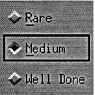
| Box | The box cursor should be the default location cursor. It is shown as a box drawn around the object. Figure 3-1 shows the first ToggleButton in a group with a box style location cursor. | |
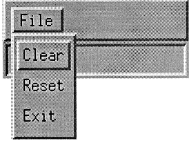
| Outline Highlight |
| |
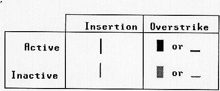
| Text Cursor | In Text components, the text cursor acts as the location cursor to indicate that the Text component has the keyboard focus. Figure 3-3 shows possible text cursor shapes. A text cursor must be shown differently when the Text does and does not have the keyboard focus. This can be done by
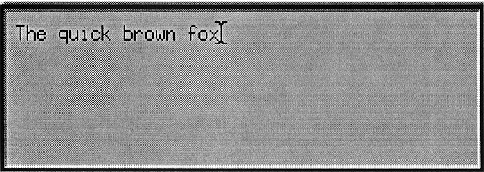
If the text cursor is hidden when the Text component does not have the focus and if the component gets the focus, the text cursor must reappear at the same position it had when the component lost focus. A Text component can optionally include an outline highlight style location cursor to reinforce the location of the keyboard focus. Figure 3-4 shows a Text component with the keyboard focus. | |
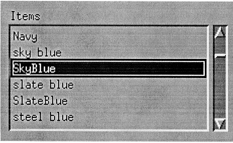
| Item Cursor | A component that manages groups of elements, like a List, should indicate that it has the keyboard focus with an item cursor style location cursor. An item cursor highlights a single element, or group of elements, that the component acts on. In the case of a List, the item cursor should be a box around an element. In the case of a Drawing area, it could be a box with resize handles around a drawn element. Components that use an item cursor to indicate keyboard focus can optionally include an outline highlight style location cursor to reinforce the location of the keyboard focus. Figure 3-5 shows a List component with the keyboard focus. | |
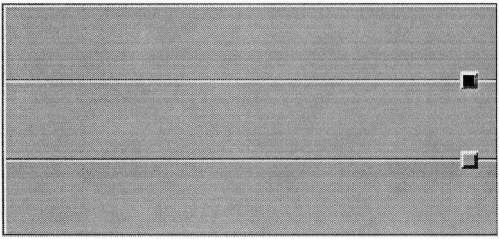
| Fill | Some very small components, like a Sash for resizing Panes, should indicate the keyboard focus by filling. Where this is the case, there must be no other meaning associated with the filled state. Filling avoids the problem caused by other styles of location cursor that make the small component too large. Figure 3-6 shows the first of two Sashes with the keyboard focus. Components must be designed and positioned within applications so that adding and removing the component's location cursor does not change the amount of space that the component takes up on the screen; that is, there is always room for the location cursor. |
A typical environment has several applications in operation simultaneously. Each application typically has a main or primary window that displays data and in which the user carries on primary interaction with the application. Applications can have additional windows to communicate context-specific interactions with the user of the application. These additional windows are called secondary windows, or transient windows. DialogBoxes are often used to create secondary windows.
The window navigation model can be divided into two levels:
A window family consists of a single primary window and all of its associated secondary windows. <Alt> <F6> and <Alt> <Shift> <F6> move the focus among windows in a window family. <Alt> <Tab> and <Alt> <Shift> <Tab> move the focus among window families. Window navigation is described in more detail in Chapter 7, "Window Manager Design Principles."
Component navigation moves the location cursor, and therefore the keyboard focus, among components in a window. The window is divided into fields, and operations that use the <Tab> key move the cursor from one field to another. For this reason, fields are also known as tab groups. The directional keys <Down arrow>,<Up arrow>,<Right arrow>,and <Left arrow> are used for navigation within a field.
Menu systems, including the MenuBar, follow a different traversal model, described in Section 3.3, "Menu Traversal."
A field can be an individual control, such as a Text control. In this case, the directional keys are used for internal navigation within the control. Alternately, a field can consist of a group of controls such as a RadioBox, which holds a group of RadioButtons. In this case, the directional keys are used to navigate among the component controls of the group.
The fields in a window are ordered. <Tab> generally moves the location cursor to the next field, and <Shift> <Tab> moves the location cursor to the previous field. However, a field can use <Tab> and <Shift> <Tab> for internal navigation. For example, within a multiline Text control, <Tab> is used to tab within the text. Consequently, <Ctrl> <Tab> must always navigate to the next field, and <Ctrl> <Shift> <Tab> must always navigate to the previous field.
<Tab> (if not used for internal navigation) and <Ctrl> <Tab> must move the location cursor forward through fields according to the following rules:
If the next field is a control, <Tab> (if not used for internal navigation) and <Ctrl> <Tab> must move the location cursor to that control.
If the next field is a group, <Tab> (if not used for internal navigation) and <Ctrl> <Tab> must move the location cursor to a traversable component within the group. If the field contains a button that currently shows default highlighting, the location cursor should be placed on that button; ]otherwise, the first control in the field (the top-leftmost one in a left-to-right language environment) should get focus.
If the next field contains no traversable components, <Tab> (if not used for internal navigation) and <Ctrl> <Tab> must skip the field. Note that Separators and Labels should not be traversable. The ScrollBars of ScrolledWindows also should not be traversable, particularly if a <ScrollLock> key is available on the keyboard.
<Shift> <Tab> (if not used for internal navigation) and <Ctrl> <Shift> <Tab> must move the location cursor backward through fields in the order opposite to that of <Tab> (if not used for internal navigation) and <Ctrl> <Tab>.
When a window acquires focus, the location cursor must be placed on the control that last had focus in the window, providing that all the following conditions are met:
The window uses an explicit keyboard focus policy.
The window acquires the focus through keyboard navigation or through a button press other than within the client area of the window.
The window had the focus at some time in the past.
The control that last had focus in the window is still traversable.
If the component that last had focus is no longer traversable, or if the window has not previously had the focus, the location cursor should be placed on the component with which the user is most likely to want to interact. In a DialogBox, this is often a text control or a default button. If no such control exists, the location cursor should be placed in the first field in the window—in a left-to-right language environment, the top-leftmost field.
Developers should follow these general rules for field navigation:
Fields should be traversed from the upper left to the lower right in a left-to-right language environment. In a right-to-left language environment, fields should be traversed from the upper right to the lower left.
Field navigation must wrap between the first and last fields of the window.
In a PanedWindow, each Pane should consist of one or more fields, and each Sash should be a field. Fields in a PanedWindow should be traversed in the following order:
All fields in the topmost Pane
The topmost Sash
All fields in the next Pane toward the bottom
The next Sash toward the bottom
and so on, to the bottom of the PanedWindow.
Directional keys are used both for component navigation within a field and for internal purposes, including internal navigation, within a control.
When <Down arrow> and <Up arrow> are used for component navigation within a field, they must behave in the following way:
In a left-to-right language environment, <Down arrow> must move the location cursor through all traversable controls in the field, starting at the upper left and ending at the lower right, then wrapping to the upper left. If the controls are aligned in a matrix-like arrangement, <Down arrow> must first traverse one column from top to bottom, then traverse the column to its right, and so on. In a right-to-left language environment, <Down arrow> must move the location cursor through all traversable controls, starting at the upper right and ending at the lower left.
<Up arrow> must move the location cursor through all traversable controls in the field in the order opposite to that of <Down arrow>.
When <Right arrow> and <Left arrow> are used for component navigation within a field, they must behave in the following way:
In a left-to-right language environment, <Right arrow> must move the location cursor through all traversable controls in the field, starting at the upper left and ending at the lower right, then wrapping to the upper left. If the controls are aligned in a matrix-like arrangement, <Right arrow> must first traverse one row from left to right, then traverse the row below it, and so on. In a right-to-left language environment, <Right arrow> must move the location cursor through all traversable controls, starting at the lower left and ending at the upper right.
<Left arrow> must move the location cursor through all traversable controls in the field in the order opposite to that of <Right arrow>.
Controls that use directional keys internally—such as Text, List, Canvas, Sash, ScrollBar, and Scale—should be fields. If a control that uses directional keys internally does not act like a field, the directional keys must be used for both internal purposes and component navigation.
In particular, controls can use directional keys in one dimension for internal purposes and in another dimension for component navigation. For example, a vertically organized group of single-line Text controls can be grouped together as a single field. <Down arrow> and <Up arrow> navigate among the single-line Text controls in the field. <Right arrow>,<Ctrl> <Right arrow>,<Left arrow>,and <Ctrl> <Left arrow> navigate among characters and words within an individual single-line Text control.
The directional keys modified with <Ctrl> can also be used for component navigation, following the same rules specified above. If the directional keys modified with <Ctrl> are used for component navigation, the unmodified directional keys can be used for internal purposes.
For example, a table can consist of an array of single-word Text controls, with <Up arrow> and <Down arrow> used to navigate up and down a column. <Right arrow> and <Left arrow> can navigate among characters within an individual single-word Text control, while <Ctrl> <Right arrow> and <Ctrl> <Left arrow> navigate horizontally among the Text components in a row.
Within a control, the directional keys can be used in a variety of ways. In list-like controls, or in graphics-like controls in which the elements are laid out in a matrix-like arrangement, internal navigation using the directional keys should move the cursor among elements using the same rules followed for component navigation. However, if the control is scrollable, directional navigation should not wrap between the first and last elements of the control; a directional key that would otherwise cause wrapping should have no effect at the first or last element.
Additional internal navigation techniques may be needed in situations not covered by this guide, such as the following:
Graphics-like controls in which the elements are densely populated or are organized into layers
Applications that use 3-dimensional navigation
Applications that organize elements hierarchically
In such cases, navigation models should not deviate unnecessarily from the standard navigation models.
Rather than move the cursor among elements, a graphics-like control can use a positional cursor. In this case, <Down arrow>,<Up arrow>,<Right arrow>,and <Left arrow> must internally navigate by moving the cursor one unit (for example, one pixel) at a time in the direction indicated by the key. In this model, the cursor is sometimes on an element and sometimes in the background of the control.
The use of the directional keys for internal navigation in text-like controls is described in the Text reference page in Chapter 9, "Controls, Groups, and Models Reference Pages." In a control that displays a value, the directional keys can increment or decrement that value.
When the directional keys cause changes that are based on some unit, the directional keys modified by <Ctrl> can cause changes based on a larger unit. For example:
In Text, <Right arrow> moves the cursor a character to the right, and <Ctrl> <Right arrow> moves the cursor a word to the right.
In a Canvas, <Right arrow> can move a positional cursor one pixel to the right, and <Ctrl> <Right arrow> can move the cursor some number of pixels to the right.
In a Scale, <Right arrow> can increment the Scale value by one unit indicated by minor tick marks, and <Ctrl> <Right arrow> can increment the Scale value by an amount corresponding to the distance between major tick marks.
If a control uses <Right arrow> and <Left arrow> for internal navigation, it must support the following behavior:
| <Begin> | In a left-to-right language environment, this action must move the location cursor to the leftmost edge of the data or the leftmost element. In a right-to-left language environment, this action must move the location cursor to the rightmost edge of the data or the rightmost element. | |
| <End> | In a left-to-right language environment, this action must move the location cursor to the rightmost edge of the data or the rightmost element. In a right-to-left language environment, this action must move the location cursor to the leftmost edge of the data or the leftmost element. |
If a control uses <Up arrow> and <Down arrow> for internal navigation, it must support the following behavior:
| <Ctrl> <Begin> |
| |
| <Ctrl> <End> |
|
Groups that are fields can also use <Begin>,<End>,<Ctrl> <Begin>,and <Ctrl> <End> to move the location cursor to appropriate controls within the group.
The Menu traversal model is different from the field traversal model. This allows Menus to be traversable even when the focus policy is implicit. If a Menu is traversed to while the focus policy in the application is implicit, the focus policy must temporarily change to explicit. The focus policy must revert to implicit whenever the user traverses out of the Menu system.
Traversing to a Menu system is the same as activating the Menu system. If the MenuBar is inactive, <F10> must traverse to, or activate, the MenuBar system. The location cursor must be placed on the first traversable CascadeButton in the MenuBar. If there are no traversable CascadeButtons in the MenuBar, <F10> must do nothing. Note that <Shift> <Menu> is used on systems where <F10> is not available.
If the keyboard focus is on an element with an inactive Popup Menu and the context of the element allows a Popup Menu to be displayed, <Menu> must post (activate) the Popup Menu. The location cursor must be placed on the default item of the Menu, or the first traversable item if there is no default item. Note that the availability of the Popup Menu can depend on the location of the cursor within the element, the contents of the element, or the selection state of the element. Menus popped up from the keyboard should be in the context of the insertion position of the element with the location cursor. If there are no traversable items in the Popup Menu, it is up to the system and the application whether to post the Menu or not. Note that <Shift> <F10> is used on systems where <Menu> is not available.
If the keyboard focus is in an OptionButton, <Select> or <Space> must post the Option Menu. The location cursor must be placed on the previously selected item in the Option Menu. If the Option Menu is pulled down for the first time, the location cursor must be placed on the default item in the Menu. If there are no traversable items in the Option Menu, the application should decide whether to post the Menu or not. If there is an active Option Menu, <Enter>,<Return>,<Select>,or <Space> must select the current item in the Option Menu, unpost the active Option Menu system, and return the location cursor to the OptionButton.
Once a Menu system is posted, the Menu items can be traversed using <Down arrow>,<Left arrow>,<Right arrow>,and <Up arrow>.A posted Menu system behaves somewhat like a field, with the addition of traversing among Menus in the system. When a Menu traversal action traverses to the next or previous component in a Menu or MenuBar, the order of traversal and the wrapping behavior must be the same as that of the corresponding component navigation action within a field, as described in Section 3.2.3, "Component Navigation."
Two-dimensional Menus must not contain CascadeButtons.
The following Menu traversal behavior must be supported:
| <Down arrow> | This action must do the following:
| |
| <Up arrow> | If the component is in a vertical or 2-dimensional Menu, this action must traverse up to the previous traversable component, wrapping within the Menu if necessary, and proceeding in the order opposite to that of <Down arrow>. | |
| <Left arrow> | This action must do the following:
| |
| <Right arrow> | This action must do the following:
|
For all Menu traversal actions, when the Menu is first posted, traversal should go to the second traversable entry in the Menu if the Menu has no default and the first traversable entry is a TearOffButton. Subsequent traversal actions must traverse to the TearOffButton in the same way as for other Menu entries.
The user can use keyboard actions to exit a Menu or a Menu system in the following way:
When a MenuBar system is active, <F10> should unpost the entire Menu system.
When a Popup Menu system is active, <Menu> should unpost the entire Menu system.
In a Pulldown Menu, <Cancel> must either dismiss the Menu and move the location cursor to the CascadeButton used to pull down the Menu, or unpost the entire Menu system.
In a Popup Menu, Option Menu, TearOff Menu, or MenuBar, <Cancel> must unpost the Menu system.
When <F10>,<Menu>,or <Cancel> is used to unpost an entire Menu system and an explicit focus policy is in use, the location cursor must be moved back to the component that had it before the Menu system was posted.
Certain components, such as List and Text, have built-in support for scrolling. However, any component or group of components can be associated with scrolling components or placed inside a ScrolledWindow and made scrollable.
A scrollable component generally has ScrollBars or some other type of scrolling component associated with it. When a component does not have a scrolling component associated with it, it generally should not be scrollable; however, components whose visible contents alone indicate that additional items exist beyond the bounds of the visible area, like Text, can be scrollable even if they do not have an associated scrolling component.
Any scrollable component must support the appropriate navigation and scrolling operations. You must use the page navigation keys <PageUp>,<PageDown>,<PageLeft> or <Ctrl> <PageUp>,and <PageRight> or <Ctrl> <PageDown> for scrolling the visible region by a page increment. A page is the portion of data that is visible, not any underlying structure of the data. When scrolling by a page, you must leave at least one unit of overlap between the old and new pages; for example, a line in a Text component.
If the location cursor can be made visible, it must be. It should be moved within the component so that it remains as near as possible to its original location in the viewport. However, if a navigation key (including directional and page navigation keys) is pressed while the <ScrollLock> key is down, the navigation key should be interpreted as specified for an associated ScrollBar—that is, it causes scrolling, while leaving the position of the cursor within the scrollable component unchanged. See the ScrollBar reference page in Chapter 9, "Controls, Groups, and Models Reference Pages."
You should use the directional keys <Up arrow>,<Down arrow>,<Left arrow>,and <Right arrow> for moving the location cursor among elements, moving the location cursor by increments, or scrolling the visible region by regular increments. In general, keyboard operations should traverse through the entire scrollable component, not just through the visible portion.
When a mouse button is pressed initiating a selection operation within a scrollable component, and the pointer is then dragged outside of the scrollable component, the component should scroll toward the pointer. This is called autoscrolling. Drag and drop operations should produce similar scrolling behavior within scrollable components that force dragged elements to remain within the component. Releasing the button outside of the component must not do any transfer in these cases. Parking the cursor on the edge of the scrollable component during the drag and drop operation should scroll the component toward the pointer.
When the location cursor is within a scrollable component, scrolling can move the cursor out of view; however, any keyboard operation that moves the cursor to or in the component, or that inserts, deletes, or modifies items at the cursor location must scroll the component so that the cursor is visible when the operation is complete. When scrolling using the mouse, the location cursor can be allowed to scroll out of the visible region. When scrolling using the keyboard, the location cursor must be moved so that it remains within the visible region, if that is possible.
If a mouse-based scrolling action is in progress, <Cancel> must cancel the scrolling action and return the slider to its position prior to the start of the scrolling operation.