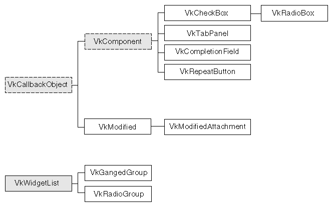
This chapter contains descriptions of miscellaneous ViewKit classes that you would use primarily for data input. Figure 14-1 shows the inheritance graph for these classes.
The VkCheckBox class, derived from VkComponent, provides a simple method for creating check boxes. Instantiating the component creates an empty, labeled component to which you can add individual toggle buttons. VkCheckBox provides a variety of methods for determining when the user changes the state of a toggle button; you can use the method most convenient for your applications. You can also programmatically change the values of the toggle buttons.
The VkCheckBox constructor accepts the standard ViewKit component name and parent widget arguments:
VkCheckBox(const char *name, Widget parent) |
The constructor creates an empty, labeled component.
You add toggle buttons to the check box using the VkCheckBox::addItem() function:
Widget addItem(char *name, Boolean state = FALSE,
               XtCallbackProc proc = NULL,
               XtPointer clientData = NULL)
|
name is the name of the toggle item. You can specify its initial state by providing a state argument; TRUE sets the toggle and FALSE clears it.
You can also provide an Xt-style callback function, proc, that VkCheckBox activates whenever the user changes the value of the toggle; and clientData, which VkCheckBox passes as client data to the callback function. Following ViewKit conventions as described in “Using Xt Callbacks With Components”, if you provide a callback function, you should pass the this pointer as client data so that the callback functions can retrieve the pointer, cast it to the expected component type, and call a corresponding member function. “Using Xt-Style Callbacks to Handle Changes in Check Box Toggle Values” further discusses how to use the callback function.
The VkCheckBox component creates a LabelGadget named “label” to display a label. Each toggle button in the check box is implemented as a ToggleButtonGadget. The name of the gadget is the name string that you provide to addItem() when you add the toggle.
Set the XmNlabelString resource of the check box label and its toggles to set their labels:
Use the VkComponent::setDefaultResources() function to provide default resource values as described in “Setting Default Resource Values for a Component”.
Set resource values in an external app-defaults resource file. Any values you provide in an external file will override values that you set using the VkComponent::setDefaultResources() function. This is useful when your application must support multiple languages; you can provide a separate resource file for each language supported.
Set the resource values directly using the XtSetValues() function. Values you set using this method override any values set using either of the above two methods. You should avoid using this method because it “hard codes” the resource values into the code, making them more difficult to change.
For example, consider a simple window that contains only a check box with four toggles, as shown in Figure 14-2.
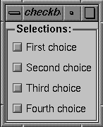
Example 14-1 shows the code used to create this check box.
Example 14-1. Code to Create Sample Check Box
#include <Vk/VkApp.h>
#include <Vk/VkSimpleWindow.h>
#include <Vk/VkCheckBox.h>

class CheckBoxWindow: public VkSimpleWindow {
  protected:
    virtual Widget setUpInterface ( Widget parent );
    static String _defaultResources[];

  public:
    CheckBoxWindow ( const char *name ) : VkSimpleWindow ( name ) { }
    ~CheckBoxWindow();
    virtual const char* className();
};

CheckBoxWindow:: ~CheckBoxWindow()
{ }

const char* CheckBoxWindow::className() { return "CheckBoxWindow"; }

String CheckBoxWindow::_defaultResources[] = {
  "*check*label.labelString: Selections:",
  "*check*one*labelString: First choice",
  "*check*two*labelString: Second choice",
  "*check*three*labelString: Third choice",
  "*check*four*labelString: Fourth choice",
  NULL
};

Widget CheckBoxWindow::setUpInterface ( Widget parent )
{
  setDefaultResources(parent, _defaultResources);

  VkCheckBox *cb = new VkCheckBox("check", parent);
  cb->addItem("one");
  cb->addItem("two");
  cb->addItem("three");
  cb->addItem("four");
  cb->show();
  return cb->baseWidget();
}

void main ( int argc, char **argv )
{
VkApp *cbApp = new VkApp("checkBoxApp", &argc, argv);
CheckBoxWindow *cbWin = new CheckBoxWindow("checkbox");

cbWin->show();
cbApp->run();}
|
After creation, you can programmatically set the state of any toggle with the VkCheckBox::setValue() function:
void setValue(int index, Boolean newValue) |
index is the position of the toggle in the check box; the first toggle in the check box has an index of 0. newValue is the new state for the toggle; TRUE sets the toggle and FALSE clears it.
 | Note: Setting a toggle using setValue() activates the toggle's valueChanged callback. This in turn activates all of the VkCheckBox object's methods for detecting changes in toggle values as described in “Recognizing Changes in Check Box Toggle Values”. |
You can set the values of multiple toggles using the VkCheckBox::setValues() function:
void setValues(Boolean *values, int numValues) |
The Boolean array values specifies the new values for a group of toggles in the check box beginning with the first toggle. numValues specifies the number of values the values array contains.
| Note: Setting toggles using setValues() activates each toggle's valueChanged callback. This, in turn, activates all of the VkCheckBox object's methods for detecting changes in toggle values, as described in “Recognizing Changes in Check Box Toggle Values,” once for each toggle changed. |
You can retrieve the value of a specific toggle with the VkCheckBox::getValue() function:
int getValue(int index) |
index is the position of the toggle in the check box; the first toggle in the check box has an index of 0. The function returns TRUE if the toggle is set and FALSE if the toggle is not set.
VkCheckBox provides three different methods that you can use to determine when the user changes the value of a toggle: Xt-style callbacks, ViewKit callbacks, and subclassing. You can use whichever method is most convenient.
The first method of determining when the user changes a toggle value is to register an Xt-style callback for each toggle button. When you create a toggle with the addItem() function, you can optionally specify a callback function and client data. When the value of the toggle changes, the callback function is called with the client data you provided, and a pointer to a XmToggleButtonCallbackStruct structure as call data.
For example, the following adds a toggle named “lineNumbers” to the parametersBox check box and registers a callback function:
MyComponent::MyComponent(const char *name, Widget parent) : VkComponent (name)
{
  // ...
  parametersBox->addItem("lineNumbers", FALSE,
                         &MyComponent::toggleLineNumbersCallback(),
                         (XtPointer) this );
  // ...
}
|
MyComponent::toggleLineNumbersCallback(), which must be declared as a static member function of the class MyComponent, is registered as a callback function for this toggle, and the this pointer is used as the client data. The definition of toggleLineNumbersCallback() could look like this:
void MyComponent::toggleLineNumbersCallback(Widget,
                                          XtPointer clientData,
                                          XtPointer callData )
{
  MyComponent *obj = (MyComponent) clientData;
  XmToggleButtonCallbackStruct *cb =
                               (XmToggleButtonCallbackStruct) callData;

  // Call MyComponent::toggleLineNumbers(), a regular member function to either
  // display or hide line numbers based on the value of the toggle.

  obj->toggleLineNumbers(cb->set);
}
|
The second method of determining when the user changes a toggle value is to use a ViewKit callback. The VkCheckBox component provides the VkCheckBox::itemChanged callback. Any ViewKit component can register a member function to be called when the user changes a check box toggle. The VkCheckBox object provides the integer index of the toggle as client data to the callback functions.
| Note: The itemChanged callback is activated whenever the user changes any of the toggles; you cannot register a ViewKit callback for an individual toggle. |
For example, the following line registers the member function MyComponent::parameterChanged() as a ViewKit callback function to be called whenever the user changes a toggle in the parametersBox check box:
MyComponent::MyComponent(const char *name, Widget parent) : VkComponent (name)
{
  // ...
  parametersBox->addCallback(VkCheckBox::itemChanged, this,
                            (VkCallbackMethod) &MyComponent::parameterChanged );
  // ...
}
|
Note that in this example, no client data is provided.
The definition of parameterChanged() could look like this:
void MyComponent::parameterChanged(VkComponent *obj, void *,
                                   void *callData )
{
  VkCheckBox *checkBox = (VkCheckBox) obj;
  int index = (int) callData;
  switch (index) {
    // ...

    // Assume that the constant LINE_NUMBER_INDEX is set to the index of
    // the "lineNumber" toggle. If the "lineNumber" toggle value changed,
    // Call MyComponent::toggleLineNumbers(), a regular member function to
    // either display or hide line numbers based on the value of the toggle
    case LINE_NUMBER_INDEX:
      toggleLineNumbers( checkBox->getValue(index) );

    // ...
  }
}
|
The third method of determining when the user changes a toggle value is to create a subclass of VkCheckBox. Whenever the user changes a toggle, VkCheckBox calls the virtual function VkCheckBox::valueChanged():
virtual void valueChanged(int index, Boolean newValue) |
index is the index of the item that changed and newValue is the current (new) value of that item. By default, valueChanged() is empty. You can override its definition in a subclass and perform whatever processing you need.
Derived classes have access to the following protected data members of the VkCheckBox class:
The VkRadioBox class provides a simple method for creating radio check boxes (that is, check boxes in which only one toggle at a time can be selected). VkRadioBox is a subclass of VkCheckBox. The only difference between the two classes is that VkRadioBox enforces radio behavior on the toggles it contains.
VkRadioBox provides all of the same functions and data members as VkCheckBox does. You use the VkRadioBox class in the same way that you do the VkCheckBox class.
For example, consider a simple window that contains only a check box with four toggles as shown in Figure 14-3.
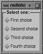
Example 14-2 contains the code used to create this check box.
Example 14-2. Code to Create Sample Radio Box
#include <Vk/VkApp.h>
#include <Vk/VkSimpleWindow.h>
#include <Vk/VkRadioBox.h>

class RadioBoxWindow: public VkSimpleWindow {

  protected:
    virtual Widget setUpInterface ( Widget parent );
    static String _defaultResources[];

  public:
    RadioBoxWindow ( const char *name ) : VkSimpleWindow ( name ) { }
    ~RadioBoxWindow();
    virtual const char* className();
};
RadioBoxWindow:: ~RadioBoxWindow()
{ }

const char* RadioBoxWindow::className() { return "RadioBoxWindow"; }

String RadioBoxWindow::_defaultResources[] = {
  "*radio*label.labelString: Select one:",
  "*radio*one*labelString: First choice",
  "*radio*two*labelString: Second choice",
  "*radio*three*labelString: Third choice",
  "*radio*four*labelString: Fourth choice",
 NULL
};

Widget RadioBoxWindow::setUpInterface ( Widget parent )
{
  setDefaultResources(parent, _defaultResources);

  VkRadioBox *rb = new VkRadioBox("radio", parent);
  rb->addItem("one");
  rb->addItem("two");
  rb->addItem("three");
  rb->addItem("four");
  rb->show();

  return rb->baseWidget();
}

void main ( int argc, char **argv )
{
  VkApp *rbApp = new VkApp("radioBoxApp", &argc, argv);
  RadioBoxWindow *rbWin = new RadioBoxWindow("radiobox");

  rbWin->show();
  rbApp->run();
}
|
The VkTabPanel class, derived from VkComponent, displays a row or column of overlaid tabs. A tab can contain text, a pixmap, or both. The user can click a tab with the left mouse button to select it. One tab is always selected, and appears on top of all the others. When the user selects a tab, VkTabPanel activates a ViewKit member function callback indicating which tab the user selected. You can register callback functions to perform actions based on the tabs selected.
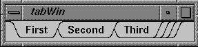
Figure 14-4 shows an example of a horizontal VkTabPanel component.
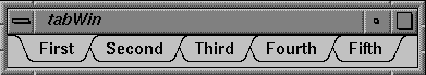
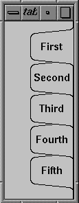
Figure 14-5 shows an example of a vertical VkTabPanel component.
When the tabs do not fit within the provided space, the VkTabPanel object “collapses” tabs on the left and right ends of the component (or top and bottom if the VkTabPanel object is vertical). Figure 14-6 shows these collapsed tabs.
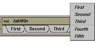
The user can click the collapsed tabs with either the left or right mouse button to display a popup menu listing all the tabs, as shown in Figure 14-7. The user can then select a tab by choosing the corresponding menu item.
The VkTabPanel class also provides work areas implemented as Motif Form widgets to the left and right of the tab display (or top and bottom if the VkTabPanel object is vertical). By default, these work areas are empty. You can access these work area widgets and implement additional displays or controls if you desire. “Tab Panel Access Functions” describes the work area access functions.
The VkTabPanel constructor initializes the tab panel and allocates all resources required by the component:
VkTabPanel(char* name, Widget parent,
           Boolean horizOrientation = TRUE, int tabHeight = 0)
|
name and parent are the standard component name and parent widget arguments.
The optional horizOrientation argument determines the orientation of the tab panel. If horizOrientation is TRUE, the tab panel is horizontal; if it is FALSE, the tab panel is vertical.
The optional tabHeight argument determines the height of the tab display area. The default value, 0, indicates that tab height is determined by the default label height. If you plan to include pixmaps in your tabs, you should specify a height sufficient to contain your largest pixmap. You can also set the tab height by setting the value of the VkTabPanel object's tabHeight resource. For example, to set the tab height of the VkTabPanel object tabs to 30, you could include the following line in an app-default file:
*tabs*tabHeight: 30 |
| Note: In most cases when you display a vertical tab panel, you must explicitly set the height of the tab display area. As described above, the default tab display area height is determined by the tab label's font height rather than the width of the label. As a result, the tabs might not be large enough to display all of the label text. |
Once you have created a tab panel, you can add a tab to it using VkTabPanel::addTab():
int addTab(char *label, void *clientData, Boolean sorted = FALSE) |
label specifies the label displayed by the tab. You should use a distinct label for each tab. addTab() first treats this argument as a resource name which is looked up relative to the tab panel's name. If the resource exists, its value is used as the tab label. If no resource is found, or if the string contains spaces or newline characters, the string itself is used as the tab label.
When the user selects this tab, the VkTabPanel object activates either VkTabPanel::tabSelectCallback or VkTabPanel::tabPopupCallback (depending on how the user selected the tab). If you provide a pointer to some data as the clientData argument to addTab(), the tab panel includes that data as part of the VkTabCallbackStruct returned as call data by the callbacks. “Responding to Tab Selection” describes in depth these callbacks and how to use them.
The sorted flag determines where the new tab is added in relation to existing tabs. If sorted is FALSE, addTab() adds the tab after all existing tabs; if sorted is TRUE, addTab() inserts the tab before the first tab whose label alphabetically succeeds the new tab's label.
| Note: addTab() compares the labels actually displayed in the tabs, so if you use resources to specify tab labels, addTab() correctly uses the labels specified by the resource values. |
The return value of addTab() is the position of the newly added tab in the tab panel. Tabs are numbered sequentially, with 0 representing the leftmost tab in a horizontal tab panel or the topmost tab in a vertical tab panel.
New tabs initially have a NULL pixmap. If you want to add a pixmap to a label, see “Adding a Pixmap to a Tab”.
If the new tab is the first tab in the group, addTab() automatically selects the tab by calling VkTabPanel::selectTab(). Note that selectTab() activates VkTabPanel::tabSelectCallback, so if you register a callback function before adding a tab, you activate that callback function when you add your first tab. See “Responding to Tab Selection” for more information on selectTab() and VkTabPanel::tabSelectCallback.
You can add more than one tab at a time using VkTabPanel::addTabs():
void addTabs(char **labels, void **clientDatas, int numTabs,
             Boolean sorted = FALSE)
|
labels is an array of tab label strings. As with addTab(), these label strings are first treated as resource names that are looked up relative to the tab panel's name. If the resources exist, their values are used as the tab labels. If a particular resource name is not found, or if the string contains spaces or newline characters, the label string itself is used as the tab label. clientDatas is an array of client data; the data for a particular tab is included as part of the VkTabCallbackStruct returned as call data by the selection callbacks. numLabels specifies the number of tabs to be added by addTabs(). sorted determines whether or not the tabs are sorted as addTabs() adds them.
You can remove a tab from a tab panel using VkTabPanel::removeTab():
Boolean removeTab(int index) Boolean removeTab(char *label) |
You can specify the tab to remove using either its position index or its label. If removeTab() successfully removes the tab, it returns TRUE; otherwise, if the position index was out of range or it couldn't find a tab with the label string you specified, it returns FALSE.
| Note: If you use the same label for two or more tabs and provide a label string to removeTab(), it removes the first tab (that is, the one with the lowest index) that matches the label string. In general, you should avoid using duplicate label strings. |
You can set or change the pixmap associated with a tab using VkTabPanel::setTabPixmap():
Boolean setTabPixmap(int index, Pixmap pixmap) Boolean setTabPixmap(char *label, Pixmap pixmap) |
You can specify the tab using either its position index or its label. If setTabPixmap() successfully sets the tab, it redraws the tabs and returns TRUE; otherwise, if the position index was out of range or it couldn't find a tab with the label string you specified, it returns FALSE.
The pixmap can be either a bitmap (pixmap of depth 1) or a full-color pixmap.
| Note: If you use the same label for two or more tabs and provide a label string to setTabPixmap(), it sets the pixmap for the first tab (that is, the one with the lowest index) that matches the label string. In general, you should avoid using duplicate label strings. |
To remove an existing pixmap from a tab, call setTabPixmap() with a NULL pixmap.
You can retrieve the pixmap currently installed in a tab using VkTabPanel::tabPixmap():
Boolean tabPixmap(int index, Pixmap *pixmap_return) Boolean tabPixmap(char *label, Pixmap *pixmap_return) |
You can specify the tab using either its position index or its label. If tabPixmap() is successful, the function returns TRUE and the value of the pixmap_return argument is set to point to the tab's pixmap; otherwise, if the position index was out of range or the function couldn't find a tab with the label string you specified, tabPixmap() returns FALSE.
The user can select a tab either by clicking a tab with the left mouse button, or by clicking a group of collapsed tabs with the left or right mouse button and choosing a menu item corresponding to a tab. When the user selects a tab by either method, the VkTabPanel object activates its VkTabPanel::tabSelectCallback. You can register callback functions to perform actions based on the tabs selected.
When activated, tabSelectCallback provides a pointer to a VkTabCallbackStruct as call data. The format of VkTabCallbackStruct is as follows:
typedef struct {
    char *label;
    void *clientData;
    int tabIndex;
    XEvent *event;
} VkTabCallbackStruct
|
label is the label displayed by the tab. Note that if you set the label by specifying a resource name when you added this tab, the value of label is the value of the resource you specified.
clientData is the client data you provided when you added this tab to the tab panel.
tabIndex is the position index of the tab. Tabs are numbered sequentially, with 0 representing the leftmost tab in a horizontal tab panel or the topmost tab in a vertical tab panel.
If the user selected the tab directly (that is, not through the popup menu), event is the ButtonPress event that triggered the selection. Otherwise, event is NULL.
In your callback function, you should cast the call data to (VkTabCallbackStruct *), determine which tab the user selected, and perform whatever action is appropriate.
The VkTabPanel object also detects when the user clicks the right mouse button on one of the tabs. Doing so does not select the tab, but it does cause VkTabPanel to activate its VkTabPanel::tabPopupCallback. When activated, tabPopupCallback provides a pointer to a VkTabCallbackStruct as call data. You can register callback functions to handle this event and perform any actions that you want.
You can programmatically select a tab using VkTabPanel::selectTab():
Boolean selectTab(int index, XEvent *event = NULL); Boolean selectTab(char *label, XEvent *event = NULL); |
You can specify the tab to select using either its position index or its label. If selectTab() successfully selects the tab, it returns TRUE; otherwise, if the position index is out of range or it can't find a tab with the label string you specified, it returns FALSE.
| Note: If you use the same label for two or more tabs and provide a label string to selectTab(), it selects the first tab (that is, the one with the lowest index) that matches the label string. In general, you should avoid using duplicate label strings. |
You can optionally provide an event argument that selectTab() places in a VkTabCallbackStruct structure, which is then passed as call data to tabSelectCallback.
You can also determine the currently selected tab with VkTabPanel::selectedTab():
int selectedTab() |
selectedTab() returns the index of the currently selected tab. Tabs are numbered sequentially, with 0 representing the leftmost tab in a horizontal tab panel or the topmost tab in a vertical tab panel.
VkTabPanel provides several functions for accessing information about a tab panel and its tabs:
VkTabPanel::getTab() retrieves information about a specific tab. Specify the position index of the tab with the index argument. getTab() sets the value of the label_return argument to point to the tab's label. Note that if you set the label by specifying a resource name when you added this tab, the value of label_return is the value of the resource you specified. getTab() sets the value of the clientData_return argument to point to the client data you provided when you added the tab.
getTab() returns TRUE if it is successful, and FALSE if the position index was out of range.
Boolean getTab(int index, char **label_return,
               void **clientData_return)
VkTabPanel::horiz() returns TRUE if the tab component is horizontally oriented, and FALSE if it is vertically oriented:
Boolean horiz()
VkTabPanel::size() returns the number of tabs in the tab panel:
int size()
VkTabPanel::tabHeight() returns the height of the tab display area:
int tabHeight()
This is the maximum display height for pixmaps. Larger pixmaps are truncated, and smaller pixmaps are centered. The height of the tab display area is determined by any of these four values:
The value you specify in the VkTabPanel constructor.
The value of the VkTabPanel component's tabHeight resource.
The value of the height resource of the tabLabel widget created by VkTabPanel.
The height of the tab label's font as specified by the fontList resource of the tabLabel widget created by VkTabPanel.
If you attempt to set the tab height through multiple methods, the method 1 has the highest precedence and method 4 has the lowest.
Note: In most cases when you display a vertical tab panel, you must explicitly set the height of the tab display area. As described above, the default tab display area height is determined by the tab label's font height rather than the width of the label. As a result, the tabs might not be large enough to display all of the label text. The height of a tab, including decoration, is the total of these three measurements:
The height of the tab display area as returned by tabHeight().
The tab's top and bottom margin, determined by the value of the marginHeight resource of the tabLabel widget created by VkTabPanel.
The value of the VkTabPanel component's additionalMarginHeight resource.
The total height of the VkTabPanel component (or width, if the tab panel is horizontal) is the total height of the tab as described above, plus the value of the VkTabPanel component's margin resource.
VkTabPanel::uniformTabs() returns TRUE if the tabs have a uniform width (or height, if the tab panel is vertical):
Boolean uniformTabs()
By default, tabs take on the width necessary to display their label and pixmap. You can force all tabs to take the width of the largest tab in the group by setting the VkTabPanel component's uniformTabs resource to TRUE.
The total width of a tab, including decoration, is the total of these three measurements:
The width of the tab label.
If the tab has a pixmap installed, the width of the pixmap plus the pixmap spacing, determined by the value of the VkTabPanel component's pixmapSpacing resource.
The tab's left and right margin, determined by the value of the marginWidth resource of the tabLabel widget created by VkTabPanel plus the value of the VkTabPanel component's additionalMarginWidth resource.
VkTabPanel::lineThickness() returns the line thickness used when drawing the tab edges:
int lineThickness()
The line thickness defaults to 1. You can set this value through the lineThickness resource of the VkTabPanel component, but a line thickness other than 1 might not render properly.
VkTabPanel::tabBg() returns the color used for the background area around the tabs:
Pixel tabBg()
This color is set by the background resource of the VkTabPanel component.
VkTabPanel::labelFg() returns the color used for tab foregrounds (that is, the tab lettering and the foreground bits if the pixmap you supply is a bitmap):
Pixel labelFg()
This color is set by the foreground resource for the tabLabel widget created by VkTabPanel.
VkTabPanel::labelBg() returns the color used for tab backgrounds:
Pixel labelBg()
This color is set by the background resource for the tabLabel widget created by VkTabPanel. When a bitmap is supplied as the pixmap, this color is used for the background bits.
VkTabPanel::gc() returns the X graphics context used for drawing the tabs:
GC gc()
This might be useful if you create pixmaps and want to use the same foreground and background colors as the tabs.
VkTabPanel::area1() returns the work area widget to the left of the tab display (or top if the tab panel is vertical), and VkTabPanel::area2() returns the work area widget to the right of the tab display (or bottom if the tab panel is vertical):
Widget area1()
Widget area2()
Both work areas are implemented as Motif Form widgets. By default, these work areas are empty. You can access these work area widgets and implement additional displays or controls if you desire.
The VkTabPanel class provides several X resources that determine display characteristics of the component:
| additionalMarginHeight |
| |
| additionalMarginWidth |
| |
| background | The background color of the VkTabPanel component, shown in the space around the tabs. | |
| endMultiplier | The number of overlapped tab symbols displayed as an “end indicator” when there are more tabs in the panel than can be displayed at one time (default value 3). | |
| endSpacing | The space, expressed in pixels, between overlapped tab symbols in the “end indicator” (default value 9). | |
| lineThickness | The line thickness used when drawing the tab edges. The default value is 1. You can provide another value, but line thickness other than 1 might not render properly. | |
| margin | The margin, expressed in pixels, between the tab edges and the component edge (default value 5). | |
| margin1 | The margin, expressed in pixels, between the left or top work area widget and the tabs (default value 5). | |
| margin2 | The margin, expressed in pixels, between the right or bottom work area widget and the tabs (default value 5). | |
| pixmapSpacing |
| |
| selectedTabBackground |
| |
| sideOffset | The amount of tab overlap, expressed in pixels (default value 17). | |
| tabHeight | The height of the tab display area is determined by one of the following four values:
If you attempt to set the tab height through multiple methods, the method 1 has the highest precedence and method 4 has the lowest precedence. The default value of tabHeight is 0. | |
| uniformTabs | Determines whether all tabs have the same width. The default value, FALSE, allows tabs to be wide enough to display their label and pixmap. You can force all tabs to take the width of the largest tab in the group by setting this resource to TRUE. |
The VkTabPanel class creates a widget called tabLabel to manage the tabs in a tab panel. VkTabPanel provides several X resources that determine display characteristics of the tabLabel widget:
| tabLabel.background |
| |
| tabLabel.fontList |
| |
| tabLabel.foreground |
| |
| tabLabel.height |
If you attempt to set the tab height through multiple methods, method 1 has the highest precedence and method 4 has the lowest precedence. The default value of tabLabel.height is 0. | |
| tabLabel.marginHeight |
| |
| tabLabel.marginWidth |
|
The VkCompletionField class, derived from VkComponent, provides a text input field component that supports name expansion. While typing in the field, if the user types a space, then the component attempts to complete the current contents of the field based on a list of possible expansions provided by the application. For example, in a field where the user is expected to enter a filename, the application could provide a list of all files in the current working directory.
The VkCompletionField constructor accepts the standard ViewKit component name and parent widget arguments:
VkCompletionField(const char *name, Widget parent) |
The constructor creates an Motif TextField widget as the component's base widget. You can access this widget using the baseWidget() function provided by VkComponent.
The VkCompletionField destructor destroys the component's widget and associated data, including the VkNameList object that stores the list of possible expansions. You should be aware of this in case you provide an existing VkNameList object as an argument to the VkCompletionField::clear() function, described in “Setting and Clearing the Text Completion Field Expansion List.” Consult the VkNameList(3x) reference page for more information on that class.
You can add individual strings to the completion list by passing them as arguments to the VkCompletionField::add() function:
void add(char *name) |
You can clear the completion list by calling the VkCompletionField::clear() function:
void clear(VkNameList *nameList = NULL) |
If you provide a VkNameList object, clear() deletes the current completion list and uses the VkNameList object that you provide as the new completion list for the completion field. Consult the VkNameList(3x) reference page for more information on that class.
The VkCompletionField::getText() function duplicates the contents of the text field and then returns a pointer to the duplicate string:
char *getText() |
| Note: Because getText() creates a copy of the text field's contents, you can safely change or delete the returned string. |
For example, the following line retrieves the contents of a VkCompletionField object called fileName and assigns the string to the variable openFile:
openFile = fileName->getText(); |
The VkCompletionField class supplies a ViewKit member function callback named VkCompletionField::enterCallback. This callback is activated whenever the user presses Enter while typing in the text field. The callback does not pass any call data. If you want to notify a ViewKit component whenever the user presses Enter while typing in a VkCompletionField object, register a member function of that component as an enterCallback function.
The VkCompletionField class should be sufficient for most applications; however, if you want to have more control over the expansion process you can create a subclass of VkCompletionField.
The protected member function VkCompletionField::expand() is called whenever the user types in the text field:
virtual void expand(struct XmTextVerifyCallbackStruct *cb) |
By default, expand() checks whether the user has typed a space, and if so, tries to expand the current contents of the text field; if the user types any other character, expand() simply adds that character to the text field. At any point after an expansion, the VkNameList object pointed to by the protected data member _currentMatchList contains a list of all possible expansions:
VkNameList *_currentMatchList |
You can override the expand() function to install your own expansion algorithm. You have access to the VkNameList object pointed to by the protected data member _nameList, which contains all possible expansions registered with the component:
VkNameList *_nameList |
You can also override the protected member function VkCompletionField::activate(), which is called whenever the user presses Enter while typing in the text field:
virtual void activate(struct XmTextVerifyCallbackStruct *cb) |
activate() is called after expanding the current contents of the text field and after invoking all member functions registered with the enterCallback callback. By default, this function is empty.
The VkRepeatButton class, derived from VkComponent, provides an auto-repeating pushbutton. A regular pushbutton activates only once when the user clicks it and releases it. A VkRepeatButton behaves more like a scrollbar button: it activates when the user clicks it; after a given delay it begins repeating at a given interval; and it stops activating when the user releases it.
The VkRepeatButton constructor takes three arguments:
VkRepeatButton(char *name, Widget parent,
               VkRepeatButtonType type)
|
name is a character string specifying the component name. parent is the parent widget of the component. type is a VkRepeatButtonType enumerated value specifying the type of button to create. This value can be any of RB_pushButton, RB_pushButtonGadget, RB_arrowButton, or RB_arrowButtonGadget. These create PushButton, PushButtonGadget, ArrowButton, and ArrowButtonGadget widgets, respectively.
A VkRepeatButton object triggers a VkRepeatButton::buttonCallback ViewKit callback whenever the button activates. Any ViewKit object can register a member function with the callback to be invoked when the button activates.
The callback provides an XmAnyCallbackStruct pointer as call data; the XmAnyCallbackStruct.reason contains the reason for the callback, and the XmAnyCallbackStruct.event field contains the event that triggered the callback.
The VkRepeatButton::setParameters() function changes the delay parameters for the button:
void setParameters(long initial, long repeat) |
initial controls how long, in milliseconds, the user has to hold the button down before it begins to repeat. repeat controls the interval between auto-repeat activations, in milliseconds.
If you need to determine the type of a VkRepeatButton after creation, you can call the VkRepeatButton::type() function:
VkRepeatButtonType type() |
The return value is a VkRepeatButtonType enumerated value specifying the type of button. This value can be any of RB_pushButton, RB_pushButtonGadget, RB_arrowButton, or RB_arrowButtonGadget, which indicates PushButton, PushButtonGadget, ArrowButton, and ArrowButtonGadget widgets, respectively.
ViewKit provides some management classes that control the operation of components and widgets. These classes function as attachments: you attach them to one or more existing widgets or components. Then, you can use the management class to control some aspect of operation of the widgets and components to which the class is attached.
The VkGangedGroup class provides support for “ganging” together Motif ScrollBar or Scale widgets so that all of them move together; when the value of one of the ScrollBar or Scale widgets changes, all other widgets in the group are updated with that value. VkGangedGroup is derived from the convenience class VkWidgetList. Consult the VkWidgetList(3x) reference page for more information on that class.
To use the VkGangedGroup class, you create a VkGangedGroup object and add widgets or components to the group. Thereafter, the VkGangedGroup object automatically updates all of the scales and scrollbars in the group whenever the value of one of them changes.
The VkGangedGroup constructor does not take any arguments:
VkGangedGroup() |
VkGangedGroup objects do not require names because they are not components; ViewKit uses names to uniquely identify the widget trees of components, and the VkGangedGroup class does not create any widgets.
The VkGangedGroup destructor destroys only the VkGangedGroup object. If you have widgets or components managed by the object, they are unaffected by the VkGangedGroup destructor.
Use the VkGangedGroup::add() function to add widgets or components to a VkGangedGroup object:
virtual void add(Widget w) virtual void add(VkComponent *obj) |
If you provide a widget, add() adds that widget to the alignment group. If you provide a pointer to a component, add() adds the component's base widget to the alignment group.
| Note: If you add a component to a VkGangedGroup object, the base widget of that component must be an Motif ScrollBar or Scale widget. |
You can remove widgets or components from a VkGangedGroup object with the remove() function inherited from VkWidgetList:
virtual void remove(Widget w) virtual void remove(VkComponent *obj) |
Provide the widget ID or component pointer that you used to add the widget or component to the ganged group.
You can also use the removeFirst() and removeLast() functions inherited from VkWidgetList to remove the first or last item respectively in the ganged group:
virtual void removeFirst() virtual void removeLast() |
Motif supports collections of toggle buttons that exhibit one-of-many or “radio-style” behavior by placing all related buttons in a RadioBox widget. This is adequate in many cases, but in some cases it is useful to enforce radio-style behavior on a collection of buttons dispersed throughout an application.
The VkRadioGroup class provides support for enforcing radio-style behavior on an arbitrary group of toggle buttons, no matter where they appear in your application's widget hierarchy. The VkRadioGroup class supports both Motif ToggleButton and ToggleButtonGadget widgets. Furthermore, you can add Motif PushButton and PushButtonGadget widgets to a VkRadioGroup object; the VkRadioGroup object simulates radio-style behavior on these buttons by displaying them as armed when the user selects them (using the XmNarmColor color resource as the button's background color and displaying the XmNarmPixmap if the button contains a pixmap).
VkRadioGroup is derived from the convenience class VkWidgetList. Consult the VkWidgetList(3x) reference page for more information on that class.
To use the VkRadioGroup class, create a VkRadioGroup object and add widgets or components to the group. Thereafter, the VkRadioGroup object automatically updates all buttons contained in the group whenever the user selects one of the buttons.
| Note: Membership in a VkRadioGroup object is not exclusive; a widget can potentially belong to multiple groups at once. |
The VkRadioGroup constructor does not take any arguments:
VkGangedGroup() |
VkRadioGroup objects do not require names because they are not components; ViewKit uses names to uniquely identify the widget trees of components, and the VkRadioGroup class does not create any widgets.
The VkRadioGroup destructor destroys only the VkRadioGroup object. If you have widgets or components managed by the object, they are unaffected by the VkRadioGroup destructor.
Use the VkRadioGroup::add() function to add widgets or components to a VkRadioGroup object:
virtual void add(Widget w) virtual void add(VkComponent *obj) |
If you provide a widget, add() adds that widget to the radio group. If you provide a pointer to a component, add() adds the component's base widget to the alignment group.
| Note: If you add a component to a VkRadioGroup object, the base widget of that component must be an Motif ToggleButton, ToggleButtonGadget, PushButton, or PushButtonGadget widget. |
You can remove widgets or components from a VkRadioGroup object with the remove() function inherited from VkWidgetList:
virtual void remove(Widget w) virtual void remove(VkComponent *obj) |
Provide the widget ID or component pointer that you used to add the widget or component to the radio group.
You can also use the removeFirst() and removeLast() functions inherited from VkWidgetList to remove the first or last item, respectively, in the radio group:
virtual void removeFirst() virtual void removeLast() |
If you use a direct instantiation of VkRadioGroup, you must rely on Xt callback functions registered directly with the toggle buttons to detect and handle state changes in the group. Another approach is to derive a subclass of VkRadioGroup and override the protected VkRadioGroup::valueChanged() function:
virtual void valueChanged (Widget w, XtPointer callData) |
valueChanged() is called whenever any member of the radio group changes state. The first argument is the selected widget. The second argument is the call data from the XmNvalueChangedCallback (in the case of a ToggleButton or ToggleButtonGadget widget) or the XmNactivateCallback (in the case of a PushButton or PushButtonGadget widget).
You can override valueChanged() to receive notification of state changes and perform any actions you want. If you override valueChanged(), you should call VkRadioGroup::valueChanged() to update the states of all members of the radio group before performing any other actions.
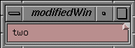
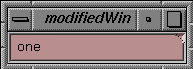
The VkModifiedAttachment class provides support for tracking the previous and current values in an Motif Text or TextField widget. The VkModifiedAttachment class automatically displays a dogear (a “folded corner”) in the upper-right corner of the text widget when the user changes the text value. Figure 14-8 shows a text widget with a VkModifiedAttachment dogear.
The user can “flip” between the previous and current text values by clicking the dogear. Figure 14-9 demonstrates the results of flipping to a previous text value by clicking the dogear.
When the user presses Enter in the text field, the text displayed becomes the current value of the text field and the previously displayed text becomes the previous value. If the current and previous values are the same, the VkModifiedAttachment object does not display the dogear; the VkModifiedAttachment object redisplays the dogear when the current and previous values are different.
| Note: If the user clicks the dogear before pressing the Enter key, any changes the user made are discarded. |
To use the VkModifiedAttachment class, you must follow these steps:
Create an Motif Text or TextField widget.
Create a VkModifiedAttachment object.
Attach the VkModifiedAttachment object to the widget.
Display the VkModifiedAttachment object (to display its dogear).
The VkModifiedAttachment class also provides several functions for retrieving the previous and current values of the text field, setting the value of the text field, and managing the display of the object.
| Note: Because the VkModifiedAttachment class adds callback functions to handle the changes in value of the text widget, you should not register your own XmNactivateCallback or XmNvalueChangedCallback functions with the text widget. Instead, you should use the VkModifiedAttachment::modifiedCallback ViewKit callback to determine when the text widget changes its value, and use the VkModifiedAttachment access functions to obtain the current or previous value of the text widget. |
VkModifiedAttachment is derived from the VkModified base class, which tracks previous and current text values not necessarily associated with a text widget. In most cases, you will use the VkModifiedAttachment class; therefore, this section describes the functions inherited from VkModified along with the functions implemented by VkModifiedAttachment. For more information on the VkModified class, consult the VkModified(3x) reference page.
| Note: The VkModified and VkModifiedAttachment classes are both declared in the <Vk/VkModified.h> header file. |
The VkModifiedAttachment constructor accepts three Boolean values:
VkModifiedAttachment(Boolean blankIsValue = FALSE,
                     Boolean autoAdjust = TRUE,
                     Boolean incrementalChange = FALSE)
|
blankIsValue determines whether the VkModifiedAttachment object accepts a null string (a blank) as a valid previous value when displaying the dogear. If blankIsValue is FALSE, the VkModifiedAttachment object does not display the dogear if the previous value is blank.
autoAdjust determines whether the VkModifiedAttachment object automatically watches its attached text widget for geometry changes and adjusts its own area accordingly. If you set this value to FALSE, you must explicitly call VkModifiedAttachment::adjustGeometry() after changing the geometry of the text widget.
If incrementalChange is TRUE, each incremental change to the text value updates the current and previous values. In this mode, activation of the text widget's XmNvalueChangedCallback callback is considered an incremental change. Examples of incremental changes are: each character added or deleted, each deletion of selected characters, and each text insertion by pasting selected text. If incrementalChange is FALSE, the VkModifiedAttachment object updates the current and previous values only when the user presses Enter in the text field.
The VkModifiedAttachment destructor destroys only the VkModifiedAttachment object. If you have a widget attached to the object, it is unaffected by the VkModifiedAttachment destructor.
Once you have created a VkModifiedAttachment object, use the VkModifiedAttachment::attach() function to attach it to an existing widget:
void attach(Widget w) |
If the VkModifiedAttachment object is already attached to a widget, it detaches from the old widget before attaching to the new widget. You can use the VkModifiedAttachment::detach() function to detach a VkModifiedAttachment object from a widget without immediately attaching it to another widget:
void detach() |
Once you have attached a VkModifiedAttachment object to a text widget, you must call VkModifiedAttachment::show() to display the attachment:
void show() |
You can hide a VkModifiedAttachment object by calling VkModifiedAttachment::hide():
void hide() |
When a VkModifiedAttachment object is hidden, it still tracks the current and previous values of the text widget to which it is attached; the user simply cannot toggle between the values. You can still use the VkModifiedAttachment class's access functions to retrieve the previous and current values of the text field.
VkModifiedAttachment::expose() forces a redraw of the attachment's dogear:
void expose() |
expose() is called whenever the dogear widget receives an Expose event. Normally, you should not need to call this function.
You can retrieve the current and previous values of the text widget with value() and previousValue() respectively:
char *value() char *previousValue() |
| Note: Do not change or delete the character strings returned by value() and previousValue(). |
The VkModifiedAttachment class provides a ViewKit member function callback named VkModifiedAttachment::modifiedCallback:
static const char *const modifiedCallback |
The VkModifiedAttachment object activates this callback whenever the text widget triggers its XmNactivateCallback or XmNvalueChangedCallback callback. The modifiedCallback provides a pointer to a VkModifiedCallback structure as call data. VkModifiedCallback has the following structure:
typedef struct {
    VkModifiedReason reason;
    class VkModified *obj;
    XEvent *event;
} VkModifiedCallback
|
The VkModifiedCallback fields are listed below:
Typically, your callback function should test the reason for the callback and perform an action if appropriate. For example, you can use one of the access functions to obtain the current or previous value of the text widget.
| Note: Because the VkModifiedAttachment class adds callback functions to handle the changes in value of the text widget, you should not register your own XmNactivateCallback or XmNvalueChangedCallback callback functions with the text widget. Instead, always use the modifiedCallback ViewKit callback to determine when the text widget changes its value. |
You can programmatically set the new current value of a VkModifiedAttachment object with VkModifiedAttachment::setValue():
virtual void setValue(const char *value) |
setValue() sets the object's new current value; the old current value becomes the previous value. VkModifiedAttachment forces the text widget to display the new current value.
VkModifiedAttachment::toggleDisplay() programmatically toggles the text widget display between the current value and the previous value:
virtual void toggleDisplay() |
To determine which value the text widget is displaying, call VkModifiedAttachment::latestDisplay():
Boolean latestDisplay() |
latestDisplay() returns TRUE if the text widget is displaying the current value or FALSE if the text widget is displaying the previous value.
Finally, you can reset the contents of the text widget with VkModifiedAttachment::displayValue():
void displayValue() |
displayValue() discards any changes the user may have made and updates the text widget with the current value (if the user has the current view selected) or the previous value (if the user has the previous view selected).
By default, the VkModifiedAttachment object automatically watches its attached text widget for geometry changes and adjusts its own area accordingly. If you set the autoAdjust argument in the VkModifiedAttachment constructor to FALSE, you must explicitly call VkModifiedAttachment::adjustGeometry() after changing the geometry of the text widget to adjust the attachment's geometry:
void adjustGeometry() |
You can also control the size of the VkModifiedAttachment dogear. By default, the dogear is 10 pixels wide by 10 pixels tall. You can set the width and height to different values with the VkModifiedAttachment::setParameters() function:
virtual void setParameters(Dimension width, Dimension height) |
To retrieve the current width and height of the dogear, call VkModifiedAttachment::getParameters():
void getParameters(Dimension *width, Dimension *height) |
The VkModifiedAttachment class provides several additional utility and access functions:
VkModifiedAttachment::fixPreviousValue() allows you to specify a fixed value to use as the attachment's previous value:
virtual void fixPreviousValue(char *fixedValue,
                              Boolean setValueAlso = TRUE)
After setting a fixed previous value, the attachment does not update the previous value; this provides a “default” value that the user can always toggle to and use.
If setValueAlso is TRUE, fixPreviousValue() also updates the attachment's current value to fixedValue; however, this does not permanently fix the current value.
VkModifiedAttachment::widget() returns the text widget to which the VkModifiedAttachment object is currently attached:
Widget widget()
VkModifiedAttachment::modified() returns TRUE if the current value and the previous value are equal and FALSE if they are not equal:
Boolean modified()
VkModifiedAttachment::setModified() forces the value of the object's modified flag:
virtual void setModified(Boolean value)
If you set the value to TRUE, the VkModifiedAttachment object displays its dogear; otherwise, it hides its dogear.
You can set the value of an XmNdisplayModified resource for a text widget to determine whether or not the attached VkModifiedAttachment object should display its dogear. If you set the text widget's XmNdisplayModified resource to TRUE or if you do not provide a value for the text widget's XmNdisplayModified resource, the attached VkModifiedAttachment object displays its dogear. This is the default behavior.
If you set the text widget's XmNdisplayModified resource to FALSE, the attached VkModifiedAttachment object does not display its dogear, but it does continue to track the text widget's current and previous values. You can still use the functions and callbacks provided by VkModifiedAttachment to manipulate the values and manage the text widget.