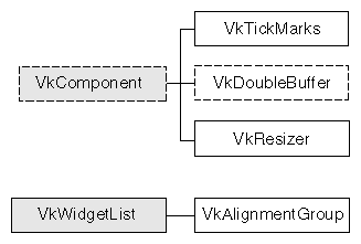
This chapter contains descriptions of miscellaneous ViewKit classes that you use primarily to display information or to manage display items. Figure 13-1 shows the inheritance graph for these classes.
VkDoubleBuffer is an abstract class that provides support for components that need to display double-buffered graphics.
 | Note: VkDoubleBuffer provides software double-buffering only; it does not use the hardware double-buffering available on many Silicon Graphics workstations. As a result, you might notice some flickering in your VkDoubleBuffer animations. |
You must create a separate subclass of VkDoubleBuffer for each double-buffered display component in your application. In each subclass, you include the Xlib calls to create the text or graphics that the component displays. You do not have to worry about handling Expose events or resize requests, because VkDoubleBuffer handles these automatically.
The public interface to VkDoubleBuffer consists simply of a function that your application calls whenever it needs to update the component's display. For example, to drive an animation, you could set a timer to update a component at a desired interval.
The VkDoubleBuffer constructor accepts the standard ViewKit component constructor arguments, a component name and a parent widget:
VkDoubleBuffer(const char *name, Widget parent) |
The constructor creates the various widgets and Pixmaps used by the component and installs callbacks to handle Expose events and resize requests. In your subclass constructor, you can initialize any graphics contexts and other data that your component requires.
The VkDoubleBuffer destructor frees the widgets and Pixmaps allocated by the VkDoubleBuffer constructor:
~VkDoubleBuffer() |
In your subclass destructor you should free any graphics contexts and other data allocated by your component.
The VkDoubleBuffer class calls your component's draw() function when your component needs to draw a new frame:
virtual void draw() |
draw() is declared by VkDoubleBuffer as a pure virtual function, and it is the only function you must override when creating a derived class of VkDoubleBuffer. The draw() function should use Xlib calls to display text or graphics by drawing to the _canvas data member:
Pixmap _canvas |
The derived class always draws to the back buffer, although the derived class does not need to be aware of this. The VkDoubleBuffer class copies the contents of this Pixmap to the front buffer as needed.
VkDoubleBuffer::update() is the public member function that the application calls to update the component's display:
virtual void update() |
update() calls your component's draw() function to obtain a new frame. Then it swaps buffers, and if the component is currently displayed, updates the screen with the contents of the front buffer. Finally, update() clears the back buffer by filling it with the component's background color.
VkDoubleBuffer automatically handles window resize requests, resizing the front and back buffers and filling them with the component's background color. If you need to perform additional operations in your derived class, you can override the virtual function VkDoubleBuffer::resize():
virtual void resize() |
VkDoubleBuffer calls resize() after resizing and reinitializing the buffers. The new height and width of the drawing area are contained in the _width and _height data members:
Dimension _width Dimension _height |
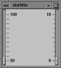
The VkTickMarks class, derived from VkComponent, displays a vertical set of tick marks. Most frequently, you would use this component next to a vertical Motif XmScale(3Xm) widget. By default, a VkTickMarks component right-justifies its tick marks and displays its labels to the left, which is appropriate if you display the component to the left of a scale. You can also configure a VkTickMarks component to left-justify its tick marks and display its labels to the right, which is appropriate if you display the component to the right of a scale. Figure 13-2 shows an example of each version of the tick marks.
The VkTickMarks constructor accepts five arguments:
VkTickMarks(char* name, Widget parent, Boolean labelsToLeft = TRUE,
            Boolean noLabels = FALSE, Boolean centerLabels = FALSE)
|
The first two arguments are the standard ViewKit component constructor arguments, a component name and a parent widget. If labelsToLeft is TRUE, the tick marks are right-justified and the labels appear to the left; if labelsToLeft is FALSE, the tick marks are left-justified and the labels appear to the right. If you set noLabels to TRUE, the VkTickMarks component does not display any labels. If you set centerLabels to TRUE, the VkTickMarks component centers the labels. This is useful if you want to center a VkTickMarks object between two XmScale widgets.
You can set the scale of the tick marks with the VkTickMarks::setScale() function:
void setScale(int min, int max,
              int majorInterval, int minorInterval)
|
min and max specify the minimum and maximum values for the tick mark component. If you set the VkTickMarks component to display labels, it displays these minimum and maximum values next to the bottom and top tick marks respectively.
majorInterval and minorInterval specify the tick mark spacing. You can specify the number of units (not pixels) between each major and minor tick mark.
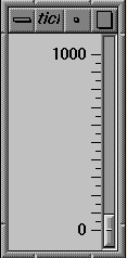
For example, the following sets the minimum value of the ticks VkTickMarks object to 0, the maximum to 1000, the major interval to 100, and the minor interval to 50:
ticks->setScale( 0, 1000, 100, 50 ); |
Figure 13-3 shows the resulting display of the VkTickMarks object.
If you do not use setScale() to set the scale of the tick marks, VkTickMarks uses the values of the resources minimum, maximum, majorInterval, and minorInterval to set the respective scale values.
You can add additional labels to the scale with VkTickMarks::addLabel():
void addLabel(int value) |
The VkTickMarks object displays a label at the value you indicate. You can call addLabel() multiple times to add multiple labels.
The VkTickMarks::setMargin() function controls the VkTickMarks margins:
void setMargin(int marginTop, int marginBottom); |
setMargin() allows you to specify the spacing between the top of the VkTickMarks component and the first tick mark, and the bottom of the component and the last tick mark. The default settings are designed for use next to an XmScale widget: the first and last tick marks align horizontally with the mark in the middle of the scale's slider.
The VkTickMarks class provides several X resources that determine display characteristics of the component:
| minimum | The initial minimum value (default value 0). | |
| maximum | The initial maximum value (default value 10). | |
| majorInterval | The major tick interval (default value 5). | |
| minorInterval | The minor tick interval (default value 1). | |
| majorSize | The width in pixels of the major tick marks (default value 10). | |
| minorSize | The width in pixels of the minor tick mark width (default value 6). | |
| labelSpacing | The spacing in pixels between tick marks and labels (default value 3). | |
| marginTop | The margin in pixels between the top of the component and the top tick mark (default value 19). | |
| marginBottom | The margin in pixels between the bottom of the component and the bottom tick mark (default value 19). | |
| lineThickness | The thickness in pixels of the tick marks thickness (default value 1). | |
| label.foreground |
| |
| label.background |
| |
| label.fontList | The font used for labels. |
ViewKit provides some management classes that control the display of components and widgets. These classes function as attachments: you attach them to one or more existing widgets or components. Then you can use the management class to control some aspect of displaying the widgets and components to which the class is attached.
The VkAlignmentGroup class provides support for aligning collections of widgets with each other in various ways. VkAlignmentGroup is derived from the convenience class VkWidgetList. Consult the VkWidgetList(3x) reference page for more information on that class.
To use the VkAlignmentGroup class, you create a VkAlignmentGroup object, add widgets or components to the group, and then call one of the alignment functions provided by VkAlignmentGroup.
The VkAlignmentGroup constructor does not take any arguments:
VkAlignmentGroup() |
VkAlignmentGroup objects do not require names because they are not components; ViewKit uses names to uniquely identify the widget trees of components, and the VkAlignmentGroup class does not create any widgets.
The VkAlignmentGroup destructor destroys only the VkAlignmentGroup object. If you have widgets managed by the object, they are unaffected by the VkAlignmentGroup destructor.
Use the add() function to add widgets or components to a VkAlignmentGroup object:
virtual void add(Widget w) virtual void add(VkComponent *obj) virtual void add(VkOptionMenu *menu) |
If you provide a widget, add() adds that widget to the alignment group. If you provide a pointer to a component, add() adds the component's base widget to the alignment group. If you provide a pointer to a VkOptionMenu object, add() adds all menu items individually to the VkAlignmentGroup object rather than adding the VkOptionMenu object as an entity.
You can remove widgets or components from a VkAlignmentGroup object with the remove() function inherited from VkWidgetList:
virtual void remove(Widget w) virtual void remove(VkComponent *obj) |
Provide the widget ID or component pointer that you used to add the widget or component to the alignment group.
To align or distribute the elements in a VkAlignmentGroup object, call one of the following functions (all of which take no arguments and have a void return type):
VkAlignmentGroup provides the following access functions:
VkAlignmentGroup::width() returns the maximum width of all widgets in the group. This value is not set until after you have called alignWidth().
Dimension width()
VkAlignmentGroup::height() returns the maximum height of all widgets in the group. This value is not set until after you have called alignHeight().
Dimension height()
VkAlignmentGroup::x() returns the minimum x position of all widgets in the group. This value is not set until after you have called either alignLeft() or alignRight().
Position x()
VkAlignmentGroup::y() returns the minimum y position of all widgets in the group. This value is not set until after you have called either alignTop() or alignBottom().
Position y()
VkAlignmentGroup also inherits all of the access and utility functions provided by VkWidgetList. Consult the VkWidgetList(3x) reference page for more information on that class.
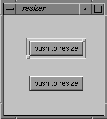
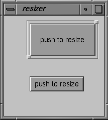
The VkResizer class provides controls for moving and resizing an existing widget. Figure 13-4 shows a simple example of a push button with a VkResizer attachment.
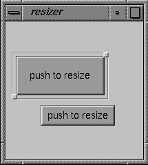
If you use the left mouse button to click either of the square handles provided by the VkResizer object, you can drag the handle to a new location. When you release the handle, the VkResizer object resizes the widget to which it is attached so that the widget matches the new size of the VkResizer object. Figure 13-5 shows an example of resizing the pushbutton shown in Figure 13-4.
If you use the middle mouse button to click either of the square handles provided by the VkResizer object, you can drag the entire widget to a new location. When you release the handle, the VkResizer object moves the widget to which it is attached to the new location of the VkResizer object. Figure 13-6 shows an example of moving the pushbutton shown in Figure 13-5.
To use the VkResizer class, you create a VkResizer object, associate an existing widget with the object, and then display the resizer's geometry controls.
The VkResizer constructor accepts two Boolean arguments:
VkResizer(Boolean autoAdjust = FALSE, Boolean liveResize = FALSE) |
autoAdjust controls whether the VkResizer object automatically tracks outside geometry changes of its attached widget. If you set this value to TRUE, the VkResizer object automatically adjusts its geometry controls whenever its attached widget changes geometry. If you set this value to FALSE, you must call the VkResizer::adjustGeometry() function whenever you want the VkResizer object to adjust its geometry controls to the geometry of its attached widget. The default value of this argument is FALSE.
liveResize controls whether the widget itself or a rectangle representing the widget area is displayed during geometry changes. Setting the second parameter to TRUE causes intermediate geometry changes in the attached widget, which may affect performance. The default value is FALSE.
VkResizer objects do not require names because they are not components; ViewKit uses names to uniquely identify the widget trees of components, and the VkResizer class does not create any widgets.
The VkResizer destructor destroys only the VkResizer object. If you have a widget attached to the object, it is unaffected by the VkResizer destructor.
Once you have created a VkResizer object, use the VkResizer::attach() function to attach it to an existing widget:
void attach(Widget w) |
You can also attach a VkResizer object to a component by attaching it to the component's base widget. For example, if resizer is a VkResizer object and obj is a component, you can attach the resizer to the component as follows:
resizer->attach( obj->baseWidget() ); |
If the VkResizer object is already attached to a widget, it detaches from the old widget before attaching to the new one. You can use the VkResizer::detach() function to detach a VkResizer object from a widget without immediately attaching it to another:
void detach() |
After attaching a VkResizer object to a widget, you must call the VkResizer object's VkResizer::show() function to display its geometry controls:
void show() |
You can hide the geometry controls by calling the VkResizer object's VkResizer::hide() function:
void hide() |
The VkResizer::shown() function returns a Boolean value indicating whether the VkResizer object is visible and displaying its geometry controls:
Boolean shown() |
You can configure the VkResizer object's geometry manipulations with the VkResizer::setIncrements() function:
void setIncrements(int resizeWidth, int resizeHeight,
                   int moveX, int moveY)
|
setIncrements() accepts four integer arguments. The first two arguments specify the resize increments in the horizontal and vertical dimension, respectively. The last two arguments specify the move increments in the horizontal and vertical dimension, respectively. Setting an increment to zero prohibits resizing or moving in that dimension.
The VkResizer class also provides a ViewKit member function callback named VkResizer::stateChangedCallback:
static const char *const stateChangedCallback |
This callback informs the application when VkResizer has modified the geometry of its attached widget. The callback supplies as call data a value of the enumerated type VkResizerReason (defined in <Vk/VkResizer.h>). The value can be any of VR_resizing, VR_moving, VR_resized, or VR_moved. VR_resizing and VR_moving indicate that resizing or moving are in progress, and are sent repeatedly as the user adjusts the geometry. VR_resized and VR_moved indicate that the resizing or moving is complete, and are sent when the user releases the VkResizer geometry controls.