Tcl Motif, or Tm, is a binding of the Tcl language to the Motif library. Tm provides access to a useful subset of Motif widgets, accessible through the simple Tcl language.
Tcl is an interpreted language originally intended for use as an embedded command language for other applications. It has been used for that, but has also become useful as a language in its own right.
Tcl was extended with a set of widgets called Tk. These are not based on the Xt intrinsics, but are built above Xlib. Tk provides an easy way to write X11 applications.
The standard set of widgets in the X world is now the Motif set. Motif offers a large number of widgets, which have seen a lot of development over the last five years. Use of Motif is sometimes a requirement by business, and other widget sets try to conform to Motif in appearance and behavior. Furthermore, many toolkits use Xt-based widgets, so an Xt-compatible interface builder is often useful.
Tm allows the programmer to use Motif widgets instead of Tk widgets from within Tcl programs. This increases programmer choices, and allows comparison of the features of the Tcl Motif and the Tk style of widget programming.
Tm is based on Tk for its style of widget programming, because Tk provides a good model, and to allow Tcl programmers to work with both Tk and Tcl Motif. An alternate style is the WKSH system, a binding of the Korn Shell to the Motif library.
The first two sections, "Getting Started" and "Widget Basics", present basic Motif concepts and are intended for Motif beginners.
The remaining sections, starting with "Resources", constitute a full reference manual for Tcl Motif, with tables of supported resources with their default values, lists of callbacks, and example programs.
This chapter was derived from a document on Tcl Motif written by Jan Newmarch (the author of Tm) and Jean-Dominique Gascuel.
Tcl Motif programs can be run with the moat (Motif and Tcl) interpreter. When called with no arguments, moat reads commands from standard input. When given a file name, moat reads commands from Tm-file, executes them, and then enters the main event loop:
moat Tm-file |
The moat command is similar in concept to Tk's wishx windowing shell. See the moat(3) reference page for information about the Tm shell.
It is possible to run Tcl Motif scripts as standalone programs. Since the moat interpreter on IRIX is installed in /usr/sgitcl/bin, make this the first line of a Tcl Motif script:
#! /usr/sgitcl/bin/moat |
Throughout this chapter, when InSight displays the line above in red, click it to run that sample program.
The following example is in the /usr/share/src/sgitcl directory as progEG.tcl. Typically, a Motif program has a top-level object called a mainWindow. This holds a menu bar and a container such as a Form or rowColumn, which in turn holds the rest of the objects. Here is code to create a mainWindow with a list and some buttons in a form:
#! /usr/sgitcl/bin/moat xtAppInitialize -class Program xmMainWindow .main managed xmForm .main.form managed xmList .main.form.list managed xmPushButton .main.form.btn1 managed xmPushButton .main.form.btn2 managed |
The xmForm acts as what is called the "workWindow" of the mainWindow. This resource would be set as follows:
.main setValues -workWindow .main.form |
Values would also be set into the list and buttons:
.main.form.list setValues \
        -itemCount 3 -items "one, two, three" \
        -selectionPolicy single_select
.main.form.btn1 setValues -labelString Quit
.main.form.btn2 setValues -labelString "Do nothing" |
Callbacks are set up for the Quit button and the selection list:
.main.form.btn1 activateCallback {exit 0}
.main.form.list singleSelectionCallback {puts stdout "Selected %item"} |
Geometry would be set for the form, placing all objects in correct relation to each other. This produces a list on the left, with the two buttons above and below on the right:
.main.form.list setValues \
        -topAttachment attach_form \
        -leftAttachment attach_form \
        -bottomAttachment attach_form
.main.form.btn1 setValues \
        -topAttachment attach_form \
        -leftAttachment attach_widget \
        -leftWidget .main.form.list
.main.form.btn2 setValues \
        -topAttachment attach_widget \
        -topWidget .main.form.btn1 \
        -leftAttachment attach_widget \
-leftWidget .main.form.list |
Since we initially created all the widgets as managed, it is not necessary to explicitly manage them before entering the main loop.
Finally, windows are created and the main event loop is entered:
. realizeWidget . mainLoop |
Once entered in the main event loop, the application is really running: widgets are created, displayed, and manipulated as user events that trigger associated callbacks.
To access new and extended IRIS IM™ widgets, and to produce a Motif style with gray instead of blue backgrounds, run your Tm application with these resources set:
*useSchemes: all *sgiMode: true |
These resources may be set in a user's .Xdefaults file, or by an application class file in the /usr/lib/X11/app-defaults directory.
To set these resources for a specific application, include the application name before the asterisk in the lines above. Remember that you may set a particular application class name during initialization:
xtAppInitialize -class ApplicationClass |
Motif uses a hierarchy of subwindows to create and organize interface elements such as menu items, push buttons, or data entry fields. In Motif and Xt jargon, these are called widgets. Widgets are organized in a hierarchy, with the application itself forming the root (or top) of the hierarchy.
Programming a graphical user interface consists of the following steps:
Create all the widgets you need, in a suitable hierarchy.
Configure widget color, size, alignment, and fonts.
In Motif, widgets are configured based on resources, which may be set for all widgets in a class or on a per-widget basis. For example, one push button could have a red background, or all push buttons could have a red background. Motif also provides inheritance between widget classes: push buttons have a background color resource because they inherit this resource (but not its setting) from Label.
Program your interface to react when users supply input. For example, a function should be called when the PushMe button is clicked. This functions is a callback associated with the widget. A callback is a fragment of Tcl code executed when some event occurs. Here is an example callback for the PushMe button:
{puts stdout "Hello World"}
Tcl is a text-based language—the only data type is string— so it works well to describe widgets organized in a hierarchical structure. The naming of objects within the widget hierarchy is similar to absolute pathnames of system files, with a dot (.) replacing the slash (/) for pathnames. The application itself is known as "." or dot. An xmForm widget within the application might be known as .form1, while an xmLabel widget within this form might be known as .form1.okLabel, and so on.
Note that Xt requires that "." can have only one child (except for dialog boxes, which are not mapped inside their parents). Tcl Motif follows this naming convention.
Widgets belong to classes, such as Label, xmPushButton or List. For each class there is a creation command that takes the pathname of the object as its first argument:
createWidget widgetName ?managed? ?resourceList? |
(This follows Tcl conventions where question mark pairs indicate an option.) Here is a summary of the command and its arguments:
| createWidget | Specifies the type of widget you want to create. Basically, all the Motif XmCreateSomeWidget() calls bind to a corresponding xmSomeWidget call in Tcl Motif. The extensive list of Tm's supported createWidget calls appears starting with Table 4-1 below. | |
| widgetName | The full pathname of the new widget, specifying both the parent widget (which should already exist) and the name of the new child. | |
| managed | An option saying whether the new widget should be managed. Before a widget can be displayed, it must be brought under the geometry control of its parent. This can be done with the manageChild command, or by using the managed argument at widget creation time. This argument must appear first. A widget might be managed but unmapped, in which case it is invisible. The main use of the "not yet managed widget" are menus (when they are not visible), and subwidgets that will resize to unknown dimensions at the time their parent is created. | |
| resourceList | An optional list of resource name and string_value pairs. |
Here are some examples of widget creation commands:
xmForm .form1 managed xmLabel .form1.okLabel managed xmPushButton .form1.cancelButton managed -labelString "Get rid of me." |
This creates an xmForm called form1 as a child of "." (dot), then an xmLabel called okLabel and an xmPushButton called cancelButton, both as children of form1. The push button widget has additional arguments to set its label string to say "Get rid of me."
Creating a widget actually creates a Tcl command known by the widget's pathname in the hierarchy. This command should be executed with at least one parameter to change the behavior of the object or the value of its components, or to get information about the object. The first parameter acts as a "method" for the object, specifying an action that it should perform. The general syntax is
targetWidgetName widgetCommand ?options? |
Some specific examples appear below:
.root.label manageChild .root setValues -title "Hello world" |
Motif uses the concept of inheritance for both resources and translations (see the section "Actions and Translations"). Tm extends this to methods, which call Motif functions on the target widget.
In Motif jargon, resources are variables shared between widgets and the application. Their default values permit a common look and feel across applications. They are also used to communicate information between the application and the interface.
Tm resource names follow the usual Motif naming with a leading dash replacing the XmN prefix. For example, -font replaces XmNfont. Tm constants are specified by their Motif name, without the Xm_ prefix, either in upper or lower case.
The section "Resources" describes resource concepts, and default value types. The section "Base Classes" describes resources common to many widgets.
A user interface must react to user input such as clicks or keystrokes. Because a particular input can affect both the interface and the application, reactions may be of two kinds. Actions occur inside Motif to control the interface. Callbacks occur in an application to register user input. Each widget class may define a set of actions and callbacks.
The section "Actions and Translations" deals with actions and translations. The section "Callbacks" discusses callbacks. The section "Base Classes" presents the set of actions and callbacks common to many moat widgets.
In Motif, reactions to user input are defined from a high-level viewpoint: basic actions include choosing a menu item or setting input focus to some widget. On the other hand, basic events include mouse clicks, keystrokes, and key states, modified by the location of the mouse pointer. Motif uses a translation table for binding basic events to basic actions.
The set of classes generally mirrors the Motif set. Some classes (Core, Shell and Primitive) are not accessible from Tm because they are intended for inheritance use only. The section "Basic Widgets" discusses the widgets listed in Table 4-1:
Widget Name | Purpose |
|---|---|
xmPushButton | a simple button |
xmLabel | a fixed piece of text |
xmArrowButton | with an arrow face |
xmTextField | one line text editor |
xmToggleButton | with an on/off box |
xmText | a full text editor |
xmDrawnButton | with user graphics |
xmList | a list selector |
xmFrame | a 3-D border |
xmScale | a slider on a scale |
xmSeparator | a simple line |
xmScrollBar | horizontal or vertical |
Manager widgets are used to lay out several widgets together. Placing widgets inside widgets enables the creation of hierarchies suitable for complex user interface design. The section "Manager Widgets" discusses the widgets listed in Table 4-2:
Widget Name | Purpose |
|---|---|
xmBulletinBoard | simple x,y layout |
xmForm | layout widgets with relational constraints |
xmRowColumn | for regular geometry management |
xmPanedWindow | multiple panes separated by sashes |
Motif provides composite widgets, several object appearing together as one widget. The section "More Widgets" discusses the widgets listed in Table 4-3.
Widget Name | Purpose |
|---|---|
xmScrolledWindow | for displaying a clip view over another widget |
xmScrolledList | a partial view of a list |
xmScrolledText | a partial view of a text |
xmMainWindow | contains the main application windows, a menu bar, and so on |
xmCommand | a command entry area with a history list |
xmMessageBox | message display area on its own window |
xmSelectionBox | a list to select from |
xmFileSelectionBox | selection of a file from a list |
The section "Menus" presents widgets for building menus. Menus may contain button or separators, and of course any menu widget listed in Table 4-4:
Widget Name | Purpose |
|---|---|
xmMenuBar | a row-Column used to create an horizontal menu |
xmPulldownMenu | a row-Column used to create a vertical menu |
xmPopupMenu | a menu on its own (transient) window |
xmCascadeButton | a special pushbutton to call a sub-menu |
Motif also has convenience functions for creating dialog boxes, which appear in their own transient window, with push buttons on the bottom line (Accept/Cancel/Help). The section "Dialogs" discusses the widgets listed in Table 4-5:
Widget Name | Purpose |
|---|---|
xmBulletinBoardDialog | a dialog with arbitrary contents |
xmFormDialog | a dialog based on a form |
xmMessageDialog | a dialog showing a message |
xmInformationDialog | a dialog displaying information |
xmPromptDialog | a dialog with a prompt area |
xmQuestionDialog | a dialog asking a question |
xmWarningDialog | a dialog showing a warning |
xmWorkingDialog | a dialog showing a busy working message |
xmSelectionBoxDialog | a dialog based on xmSelectionBox |
xmFileSelectionDialog | a dialog based on xmFileSelectionBox |
When you have to destroy such widgets, you must destroy the real dialog widget; that is, the parent of the usually manipulated widget:
xmQuestionDialog .askMe managed [.askMe parent] destroyWidget |
Motif is built upon Xt. The Xt world must be brought into existence explicitly. This allows setting of class and fallback resources, and leaves hooks for things like setting the icon later in the binding. The Xt startup function is XtAppInitialize.
| xtAppInitialize | This can take parameters of -class and -fallback_resources. If the class option is omitted, Tm will deduce a class by capitalizing the first letter of the application name, and also the second letter if it follows an x. |
Several root widget methods exist to deal with Motif features related only to the main application window:
For example, the following code adds an interpreter that reads and executes moat commands that are typed in while the interface is running:
# Define the interpret function, that handles errors.
proc interpret {line} {
   set code [catch $line result]
      if {$code == 1} then {
      puts stderr "$result in :\n\t$line"
   } else {
      if { $result != "" } { puts stderr $result }
   }
      puts stderr " " nonewline
}
# Bind it as an input handler.
.addInput stdin r  {
   interpret [gets stdin]
}
# And display the first prompt
puts stderr "%" nonewline |
The list below describes additional root widget methods for Motif features related to the main application window:
Resources are inherited through the class hierarchy. They have default values and several different types. In Motif, several base classes exist, from which the actual widgets are derived. Those classes define a common set of resources, methods, and behaviors.
Each widget belongs to a class, whose name is the widget creation command name. Each widget inherits resources from its superclass. For example, xmLabel is a subclass of Primitive, which in turn is a subclass of superclass Core. From Core, xmLabel inherits resources such as -background, -height, and -width. From Primitive, it inherits resources such as -foreground. It is necessary to consult superclasses to get a full resource list for a particular xmLabel. Furthermore, each class adds resources. For example, xmLabel has the additional resources -labelType, -labelPixmap, and -labelString, among others.
Some special resource values are inherited through multiple levels of the widget hierarchy at creation time. For instance, the -buttonFontList of a bulletin board might be inherited from the -defaultFontList of an ancestor subclassing the abstract classes vendorShell or menuShell. In this case, the resource value is copied and is not modified if the original resource is modified.
For instance, in the following example, the button inherits its -fontList default value from bulletin board -buttonFontList. On the other hand, the button's background color is taken from the class defaults, not from the BulletinBoard. Pushing the button will change the BulletinBoard's -buttonFontList resource, which does not update the button's font list.
#! /usr/sgitcl/bin/moat
xtAppInitialize
xmBulletinBoard .top managed \
   -background #A22 -buttonFontList "-*-courier-*-o-*--20-*"
xmPushButton .top.bold managed \
   -y 10 -labelString Bold
xmPushButton .top.quit managed \
   -y 40 -labelString Quit
.top.bold activateCallback {
   .top setValues -buttonFontList "-*-courier-bold-o-*--20-*"
}
.top.quit activateCallback {exit 0}
. realizeWidget
. mainLoop |
The usual X defaults mechanism is used to provide defaults to resources. Default values are located in files designated by the XAPPDEFAULTS environment variable, including an optional locale directory (designated by the LANG environment). XAPPDEFAULTS defaults to /usr/lib/X11/app-defaults, and LANG is usually not defined. In this simplest case, the located file would be /usr/lib/X11/app-defaults/ApplicationName, where ApplicationName is the class name of your application.
These defaults could be reset by the xrdb command; see the xrdb(1) reference page for details. Usually, login scripts read a user-customized resource file, often named .Xdefaults or .Xresources, using the xrdb -merge command. This is the usual way for users to configure their environment.
Finally, some applications employ special configuration files, which might also reset additional resources. The Motif window manager mwm is a good example of this complex area, as it looks in not fewer than eight different resource files; see mwm(1) for more information.
Resource files contain lines specifying values for widget or widget class resources. The syntax is shown below:
resourcePath : value |
Here, resourcePath is a dot-separated path naming a particular resource in the hierarchy, while value is a string representation for the resource setting.
Resource paths start with an optional application name. Without this, the settings apply to all X applications. After that, names in the path may refer to a widget class (when starting with a capital), to widget names (as defined by moat creation command), or to application-specific scoping. The star character (*) may be used to match any portion of the resource path. Table 4-6 shows some examples of resource paths.
Table 4-6. Examples of Resource Names
Resource Path | What it Affects |
|---|---|
*Background | for all widgets, in all sessions |
*PushButton.Background | for all the push button instances |
xterm*Background | for all widgets of the xterm application |
jot.fileMenu.quit.Background | for the Quit button in the File menu of jot |
Some resources are just string values (such as -labelString), but others have more complicated types. Since moat is a string language, all values should be manipulated in string representations; moat uses either Motif internal routines or specific converters to make the necessary conversions.
This section briefly describes the main types used by Tm and moat.
In Tcl, every variable's value is a character string. Nevertheless, some strings can be interpreted as an integer or as a Boolean. In Tm, a string could be any Tcl string or list, correctly surrounded by braces or double quotes. An integer is a string containing only decimal digits. A Boolean is one of the words true, false, on, off, yes, or no (in upper, lower, or mixed case), or an integer 1 or 0 where 0 indicates false.
Dimensions are particular integers measuring distance in screen space. Their actual value depends on the -units resource. This can involve different horizontal and vertical units of measurement (when based on current font metrics, for instance). For example, the following code sets a window size to 80 x 24 characters:
$window setValues \ -units 100th_font_units \ -width 8000 -height 2400 |
In the X Window System, colors may be specified using portable symbolic names (such as NavyBlue) defined in the /usr/lib/X11/rgb.txt file, or using hexadecimal triplets of the form #RGB, with R, G, and B being two hex digits, such as #081080 (a dark blue).
Depending on the visual type, X11 may always produce the exact color you specified, or give you a close approximation. RGB values are not portable, because they depend on the screen hardware gamma, the software contrast correction, and the graphic board linearity. The /usr/lib/X11/rgb.txt file should be tuned for each hardware and software configuration (by the vendor), but this is rarely done well.
Font names used by X11 can be fully qualified dash-separated strings, or aliased nicknames. The general form of the full font name is as follows:
-foundry-name-weight-slant-width-style-14-80-100-100-m-60-encoding |
The * character can be used as a wildcard to match any specifier available for the field. Table 4-7 shows what the fields represent.
Table 4-7. Fields in a Font Name
Field | What it Represents |
|---|---|
foundry | the font maker, such as Adobe™, Bitstream™, or Silicon Graphics |
name | font family name as defined by its vendor, for example, Palatino or Helvetica |
weight | bold, book, demi, light, medium, regular |
slant | i for italic, o for oblique, r for regular (roman) |
width | narrow, normal, semicondensed |
style | sans, serif, elfin, nil |
sizes | font size (in various units) followed by resolutions |
encoding | usually iso8859-1 |
The xlsfonts command lists all fonts known to the X server; see xlsfonts(1) for details.
A font list is a comma-separated set of fonts. The first font in the list is the default one, while other ones are used for alternate codesets. This is quite useful in Japan, Korea, and China, where one font is not enough to contain all characters in common use. A widget's default font list usually derives from its ancestor. The top-level defaults are set from the VendorShell abstract class, or from the X defaults mechanism.
Pixmaps are small rectangular arrays of pixels, often used to draw a button or pointer, or to be tiled to fill a graphic area.
On color displays, pixmaps can be either two color, using the -background and -foreground resources, or full color. Pixmaps may also be partially transparent, when they are accompanied by a transparency mask.
Simple two color pixmaps are created from a bitmap, using the current foreground and background colors at the time they are first loaded. Once created, the colored pixmap is retained in the server's memory by a caching mechanism. On most X servers, this coloring is retained until the X server is restarted. Use the bitmap command to create or modify bitmaps; see bitmap(1) for details. The following code establishes a bitmap:
#! /usr/sgitcl/bin/moat
xtAppInitialize
xmPushButton .face managed \
    -labelType pixmap -labelPixmap /usr/share/src/sgitcl/face \
    -armPixmap face_no
.face activateCallback {exit 0}
. realizeWidget
. mainLoop |
Widgets must respond to user-initiated actions. For example, when a button is clicked it changes appearance to look pressed in. Some actions have Tcl code attached to them to make something else happen when an action occurs. This code is attached to a "callback" by a widget creation command. For example, a push button triggers an activateCallback when the user presses and releases the left mouse button inside the widget; it triggers an armCallback when the user presses the mouse button, and a disarmCallback when the user releases the mouse button inside the widget.
Tcl code is attached to a callback by giving it as the second argument to the appropriate widget method. For example,
$btn      armCallback {puts "Stop squashing me!!"}
$btn   disarmCallback {puts "Ah... that's better"}
$btn activateCallback {puts "Sorry Dave"; exit 0} |
This section documents Tm callback names and the actions that trigger them. Names of callbacks available for a particular widget are derived from the resource documentation for Motif. Each callback name ends with the "Callback" string. Drop the XmN from the Motif description to derive the widget command. Callbacks are treated differently from other resources because the Xt treats them differently—the resource is not meant to be handled directly by any ordinary application.
When Motif executes a callback in reaction to some event, it provides some parameters (such as the current widget) or additional data relevant to a given class. Tm follows Tk in providing the powerful mechanism of callback substitution. Before execution, the Tcl command list is scanned to look for the % character. Each time this character is found, the word that follows is extracted, analyzed, and if recognized, replaced with the corresponding data.
For example, %item in an xmList callback is replaced by the item selected, whereas %item_position is replaced by its position in the list. This is an example of callback substitution in a list:
.list singleSelectionCallback
    { print_info %item %item_position }
proc print_info item position
{ puts stdout "item was $item, at position $position" } |
The following list shows the recognized tags. Their meaning is detailed below in the context of the corresponding callbacks.
%click_count | %endPos | %newinsert | %selection_type |
%closure | %item_length | %pattern_Length | %set |
%currInsert | %item_position | %pattern_length | %startPos |
%currinsert | %item | %Pattern | %type |
%dir_length | %length | %pattern | %value_length |
%dir | %mask_length | %ptr | %value |
%doit | %mask | %reason | %w |
%dragContext | %newInsert | %selected_items |
|
The following list contains the possible callback reasons, as defined in <Xm/Xm.h> (but with the leading XmCR_ removed):
activate | apply | arm |
browse_select | cancel | cascading |
clipboard_data_delete | clipboard_data_request | command_changed |
command_entered | create | decrement |
default_action | disarm | drag |
execute | expose | extended_select |
focus | gain_primary | help |
increment | input | lose_primary |
losing_focus | map | modifying_text_value |
moving_insert_cursor | multiple_select | no_match |
none | obscured_traversal | ok |
page_decrement | page_increment | protocols |
resize | single_select | tear_off_activate |
tear_off_deactivate | to_bottom | to_top |
unmap | value_changed |
|
Table 4-8 lists all callbacks supported by Tm, and the class in which they are first defined. The Motif method names to add callback code are obtained by appending Callback and prepending XmN; these are listed in <Xm/XmStrDefs.h>.
Table 4-8. Callbacks and Classes Where Defined
Name | Defined by |
| Name | Defined by |
|---|---|---|---|---|
activate | Text/Button |
| losePrimary | Text |
apply | SelectionBox |
| losingFocus | Text |
arm | Button |
| map | BulletinBoard |
browseSelection | List |
| modifyVerify | Text |
cancel | SelectionBox |
| motionVerify | Text |
cascading | CascadeButton |
| multipleSelection | List |
commandChanged | Command |
| noMatch | SelectionBox |
commandEntered | Command |
| ok | SelectionBox |
decrement | ScrollBar |
| pageDecrement | ScrollBar |
defaultAction | List |
| pageIncrement | ScrollBar |
destroy | Core |
| popdown | Shell |
disarm | Button |
| popup | Shell |
drag | Scale |
| resize | Draw |
entry | RowColumn |
| simple |
|
expose | Draw |
| singleSelection | List |
extendedSelection | List |
| toBottom | ScrollBar |
focus | BulletinBoard |
| toPosition | (Text) |
gainPrimary | Text |
| toTop | ScrollBar |
help | Mgr./Prim. |
| unmap | BulletinBoard |
increment | Scrollbar |
| valueChanged | Text/Scale/ScrollBar |
input | DrawingArea |
|
|
|
Actions and translations are Xt concepts that exist in Tm as well. All possible user inputs have a symbolic name: these inputs are called events. All reactions of the interface to some event also have a name: these are called actions.
To describe their behavior, widgets have translation tables that say what action to take when some event occurs. Motif translation tables enable users to type on the keyboard to navigate between widgets and make window system selections. This provides keyboard equivalents for mouse actions.
Translation tables are inherited through the class hierarchy. The list of all supported events and actions is quite long. For more information on supported events and actions, consult the Motif documentation.
Actions may be added to a widget in a way similar to the C version of Motif. You define an action for the widget in a translation table. In this binding, the Tcl code is placed as the arguments to the action in the translation table. Registering the translation using the action call links a generic action handler, which in turn handles the Tcl code.
This code adds a translation to turn an arrow left or right when the l or r key is typed:
#! /usr/sgitcl/bin/moat
xtAppInitialize
xmArrowButton .arrow managed
.arrow setValues -translations \
   {<Key>r: action(arrow_direction %w arrow_right)
    <Key>l: action(arrow_direction %w arrow_left)  }
proc arrow_direction {arrow direction}  {
   puts stdout "Changing direction to $direction"
   $arrow setValues -arrowDirection $direction
}
. realizeWidget
. mainLoop |
As with callbacks, substitutions are possible. The only one currently supported is %w, to substitute the current widget path. Other substitutions return an error message.
The callActionProc method is available for every widget. Its purpose is to simulate user actions. This method takes an action as a further parameter, using the usual Xt syntax. For example, to simulate the return key press occurring within an arrow button, call the ArmAndActivate() action:
.arrow callActionProc ArmAndActivate() |
This sends a ClientMessage event to the widget. Most other widgets would ignore this event, so this call is sufficient. Some actions require event detail, though. For example, when a mouse button release occurs, the widget checks to see if the release occurred inside or outside the widget. If the event occured inside, then callbacks attached to the Activate() action are invoked; otherwise they are not. To handle this, an event of type ButtonPress, ButtonRelease, KeyPress, or KeyRelease can be prepared with some fields set. For example, a ButtonRelease occurring within the arrow can be sent by this call:
.arrow callActionProc Activate() -type ButtonPress -x 0 -y 0 |
Some of the Text manipulation actions require a KeyPress event, such as self-insert(), which inserts the character pressed. The character is actually encoded as a keycode, which is a hardware-dependent code, too low-level for this binding. To prepare such an event, this toolkit uses keysyms, which are abstractions for each type of key symbol.
The alphanumerics have simple representations as themselves (a, A, 2, and so on). Others have symbolic names (space, Tab, BackSpace). These are derived from the include file <X11/keydefs.h> by removing the XK_ prefix.
This example inserts the three characters "A a" into a text widget:
.text callActionProc self-insert() -type KeyPress -keysym A .text callActionProc self-insert() -type KeyPress -key space .text callActionProc self-insert() -type KeyPress -key a |
The set of actions requiring this level of X event preparation is not documented explicitly.
All Tm widgets derive from a small set of superclasses, namely Core, Primitive, Manager, and Shell. You cannot create any widget of those classes, because they are base classes used to define sets of resources, behaviors, and methods common to all derived widget classes that have bindings in Tm. This section describes these abstract base classes.
The Core class is the ancestor of all Tm widget classes. Any methods and resources it defines apply equally to all Tm objects. The Core class does not implement any behavior (neither action, translation, nor callback), and does not assume display should occur.
The Core class defines the set of methods common to all derived classes, shown below for widget w:
| w realizeWidget |
| ||
| w destroyWidget |
| ||
| w mapWidget | Map the given widget onto screen, to make it visible. This is done when the widget is managed (see below). | ||
| w unmapWidget |
| ||
| w manageChild |
| ||
| w unmanageChild |
| ||
| w setSensitive Boolean |
| ||
| w getValues resource variable ... |
| ||
| w setValues rsrc value ... |
Each widget class defines which resources may be set, the resource types, and their accepted values. | ||
| w resources | Returns a list of all active resources for the given widget. This returns a quadruple of the following form:
| ||
| w anyCallback tclProc |
| ||
| w parent | This method retrieves the parent widget name. If a regular widget .a.b.c has been created, then "set x [.a.b.c parent]" assigns the string ".a.b" to variable x. The exact result is not always obvious, because some widgets (such as dialogs) have hidden parents. | ||
| w processTraversal direction |
| ||
| w dragStart resource value ... |
| ||
| w dropSiteRegister resource value ... |
| ||
| w getGC resource value ... |
| ||
| w callActionProc |
|
Table 4-9 shows values for the core resources common to all widgets. A Core widget is an empty rectangle, with an optional border.
Core Resource Name | Default Value | Type or Legal Values |
|---|---|---|
-accelerators | none | String |
-background | dynamic | Color |
-backgroundPixmap | none | Pixmap |
-borderColor | dynamic | Color |
-borderWidth | 1 | Integer |
-height | dynamic | Integer |
-mappedWhenManaged | True | Boolean |
-sensitive | True | Boolean |
-translations | none | String |
-width | dynamic | Integer |
-x | 0 | Integer |
-y | 0 | Integer |
For information about usage of these resouces, see the Core(3X) reference page.
The Primitive class derives from the Core class. This abstract class is designed to define resources and behavior common to any widget that could have something drawn on it. As the user sees something, Primitive is able to define some very general behavior, which can appear as translations, actions, and callbacks.
Table 4-10 describes the resources relevant for all widgets that derive from Primitive.
Table 4-10. Primitive Resources
Primitive Resource Name | Default Value | Type or Legal Values |
|---|---|---|
-bottomShadowColor | dynamic | Color |
-bottomShadowPixmap | none | Pixmap |
-foreground | dynamic | Color |
-highlightColor | none | Color |
-highlightOnEnter | False | Boolean |
-highlightThickness | 2 | Integer |
-navigationType | none | none, tab_group |
-shadowThickness | 2 | Integer |
-topShadowColor | dynamic | Color |
-topShadowPixmap | none | Pixmap |
-traversalOn | True | Boolean |
-unitType | pixels | pixels |
The -navigationType resource controls how the keyboard affects widgets navigation. Keyboard shortcuts are often used to quickly change input fields, as with the <Tab> key.
Simple bicolor drawing is done using the Primitive's foreground color over the Core's background color. Other colors default to mixing these two at widget creation time. When they are entered (gain the input focus), primitive objects are often highlighted by drawing a color border around them. They can also be enclosed by a beveled shadow frame, making them appear to be standing out or recessed (a 3D effect).
The -unitType resource selects screen-dependent, font-related, or device-independent units. It affects subsequent dimension resources for that widget only.
Table 4-11 shows the only two callbacks defined for every drawable widget. These callbacks only support the substitution %w to expand the widget path.
Table 4-11. Primitive Callbacks
Method Name | Why |
|---|---|
helpCallback | The help key is pressed. |
destroyCallback | The widget is destroyed. |
When the Help() action occurs, either through the Help (usually <F1>) key or by a virtual binding, Motif looks for a callback to execute in the current widget. If it finds none, it looks in the parent, the parent's parent, and so on up to the main window. Hence, helpCallback may be used to implement a general or context-sensitive help facility.
The destroyCallback method can be used to call some automatic cleanup procedure when a widget is deleted.
As for any widget, there is an action to match each callback. Actions trigger callback execution and standard widget responses, if any. Primitive class actions are as follows:
| Help() | If there is no callback defined for the widget, this action propagates the help action to the widget's parent. If no callback is defined up to the root widget, the action is simply ignored. | |
| Destroy() | This action is called before widget destruction, to allow an application to perform automatic cleanup before exiting. |
This is the only translation defined for the Primitive class:
<KHelp>: Help() |
This says that the symbolic <Help> key, on most keyboards mapped to the <F1> function key, triggers the Help() action.
Shell classes are used to define resources and behaviors that are common to all widgets having their own window, such as top-level windows, popup menus, and dialogs. Motif describes several different base classes for this purpose, some inherited from Xt, and some defined inside Motif. All the shell classes are introduced below, followed by tables showing the resources available for each.
Shell is the ancestor of all the other abstract shell classes. Having only one managed child, it encapsulates interaction with the window manager. Shell inherits behavior and resources from the Composite and Core classes.
Resource Name | Default Value | Type or Legal Value |
|---|---|---|
-allowShellResize | False | Boolean |
-geometry | "" | String |
-overrideRedirect | False | Boolean |
-saveUnder | False | Boolean |
-visual | Inherited | String |
WMShell handles protocols that communicate between an application and the window manager. WMShell inherits behavior and resources from Core, Composite, and Shell.
Resource Name | Default Value | Type or Legal Value |
|---|---|---|
-baseHeight | none | Integer |
-baseWidth | none | Integer |
-heightInc | none | Integer |
-iconMask | none | Pixmap |
-iconPixmap | none | Pixmap |
-iconWindow | none | Window |
-iconX | -1 | Integer |
-iconY | -1 | Integer |
-initialState | normalState | iconicState |
-input | False | Boolean |
-maxAspectX | none | Integer |
-maxAspectY | none | Integer |
-maxHeight | none | Integer |
-maxWidth | none | Integer |
-minAspectX | none | Integer |
-minAspectY | none | Integer |
-minHeight | none | Integer |
-minWidth | none | Integer |
-title | argv[0] | String |
-titleEncoding | xa_string | compound_text |
-transient | False | Boolean |
-waitForWm | True | Boolean |
-widthInc | none | Integer |
-windowGroup |
| Window |
-winGravity | dynamic | Integer |
-wmTimeout | 5000ms | Integer |
VendorShell controls resources set up in the X server, and contains meaningful defaults for a particular implementation.VendorShell inherits behavior and resources from the Core, Composite, Shell, and WMShell classes.
Table 4-14. VendorShell Resources
Resource Name | Default Value | Type or Legal Value |
|---|---|---|
-defaultFontList | dynamic | font list |
-deleteResponse | destroy | do_nothing |
-keyboardFocusPolicy | explicit | explicit |
-mwmDecorations | –1 | Integer |
-mwmFunctions | –1 | Integer |
-mwmInputMode | –1 | Integer |
-mwmMenu | "" | String |
-shellUnitType | pixels | pixels |
-useAsyncGeometry | False | Boolean |
TopLevelShell is used for normal top-level windows such as additional window widgets that an application needs. This level is responsible for iconization. TopLevelShell inherits behavior and resources from Core, Composite, Shell, WMShell, and VendorShell.
Table 4-15. TopLevelShell Resources
Resource Name | Default Value | Type or Legal Value |
|---|---|---|
-iconic | False | Boolean |
-iconName | "" | String |
-iconNameEncoding | xa_string | compound_text |
ApplicationShell is used for an application's main top-level window. There should be more than one of these only if a program implements multiple logical applications. ApplicationShell inherits behavior and resources from Core, Composite, Shell, WMShell, VendorShell, and TopLevelShell.
Table 4-16. ApplicationShell Resources
Resource Name | Default Value | Type or Legal Value |
|---|---|---|
-argc | Set by XtInitialize() | Integer |
-argv | Set by XtInitialize() | String Array |
TransientShell is for temporary windows that do not stay visible on screen and must be iconized along with the TopLevelShell they are affiliated with. TransientShell inherits behavior and resources from Core, Composite, Shell, WMShell, and VendorShell.
Table 4-17. TransientShell Resources
Resource Name | Default Value | Type or Legal Value |
|---|---|---|
transientFor | none | Widget |
Window sizing constraints may be set either according to the dimensions of a window, or on its aspect ratio (the proportion of width to height). Beside minimum and maximum dimensions, window size may be constrained to follow a given increment.
For instance, using the following setting, the only width allowed for interactive resizing is 150 and 250:
-minWidth 100 -baseWidth 50 -widthInc 100 -maxWidth 300 |
Window aspect ratios are set using a numerator/denominator formula:
minAspectX width maxAspectX –––––––––– <= ––––– <= –––––––––– minAspectY height maxAspectY |
Hence, the following constrains the width to stay between a third and half the height:
-minAspectX 1 -minAspectY 3 -maxAspectX 1 -maxAspectY 2 |
Interactive window resizing may also be ignored by setting the -allowShellResize resource to False.
Window icon resources may be used to define the window icon type, its placement, and so forth.
Icons may be drawn using a (possibly partially transparent) pixmap, or by using a specific alternate window (-iconWindow). A window may be set up to appear in iconic state at creation (-initialState iconicState), and its current state may be retrieved or changed using the -iconic resource.
The subsections below present the basic Motif widgets, from which all the more sophisticated ones derive.
A label widget simply contains some text. For example, this is the classic "Hello world" program in Tcl Motif:
#! /usr/sgitcl/bin/moat xtAppInitialize xmLabel .lbl managed -labelString "Hello world!" . realizeWidget . mainLoop |
Note that text is broken into separate lines only if you put newline symbols in it. Text may contains non-ASCII characters, using the encoding defined in the current font, usually ISO 8859-1.
This example shows more complex use of label widgets:
#! /usr/sgitcl/bin/moat
xtAppInitialize
xmLabel .lbl managed
.lbl setValues -labelString {
    If your text contains newline symbols,\n
    it will be broken into separate lines.\n
    It may contain non-ASCII characters (àçéñôßü)
}
.lbl setValues \
    -stringDirection string_direction_r_to_l \
    -alignment alignment_end \
    -fontList -*courier-bold-r-*--18-* \
    -marginLeft 10 -marginWidth 10 \
    -x 200 -y 100
. realizeWidget
. mainLoop |
Table 4-18 shows the resources for xmLabel.
Resource Name | Default Value | Type or Legal Value |
|---|---|---|
-accelerator | "" | String |
-acceleratorText | "" | String |
-alignment | center | alignment_center |
-fontList | inherited | fontList |
-labelInsensitivePixmap | none | Pixmap |
-labelPixmap | none | Pixmap |
-labelString | widget name | String |
-labelType | string | string//pixmap |
-marginBottom | 0 | Integer |
-marginHeight | 0 | Integer |
-marginLeft | 0 | Integer |
-marginRight | 0 | Integer |
-marginTop | 0 | Integer |
-marginWidth | 0 | Integer |
-mnemonic | "" | String |
-mnemonicCharSet | dynamic | String |
-recomputeSize | True | Boolean |
-stringDirection | l_to_r | string_direction_l_to_r |
Some resources are used only in derived classes. When displayed text material changes, the size of the label may or may not be recomputed, depending on -recomputeSize. The label may display the -labelString or -labelPixmap resource, depending on the -labelType value. Labels are always centered top and bottom (inside their margins), but may be centered or left or right justified, depending on -alignment.
When a label is inactive (insensitive), the displayed text is grayed using a 50% pattern. You can change this pattern by specifying a pixmap with -label-Insensitive-Pixmap.
Table 4-19 lists resources inherited from the Primitive and Core classes.
Table 4-19. xmLabel Inherited Resources
Resource Inherited | From |
| Resource Inherited | From |
|---|---|---|---|---|
-background | (Core) |
| -backgroundPixmap | (Core) |
-borderColor | (Core) |
| -borderWidth | (Core) |
-bottomShadowColor | (Primitive) |
| -bottomShadowPixmap | (Primitive) |
-foreground | (Primitive) |
| -height | (Core) |
-highlightColor | (Primitive) |
| -highlightOnEnter | (Primitive) |
-highlightPixmap | (Primitive) |
| -highlightThickness | (Primitive) |
-mappedWhenManaged | (Core) |
| -navigationType | (Primitive) |
-sensitive | (Core) |
| -shadowThickness | (Primitive) |
-topShadowColor | (Primitive) |
| -topShadowPixmap | (Primitive) |
-translations | (Core) |
| -traversalOn | (Primitive) |
-unitType | (Primitive) |
| -width | (Core) |
-x | (Core) |
| -y | (Core) |
-accelerators | (Core) |
|
|
|
Labels do not define specific callbacks, but just inherit them from the Primitive class, namely helpCallback and destroyCallback.
Text widgets display a text string, but also allow the user to edit it. An xmTextField widget displays a single line of editable text, while an xmText widget usually spans multiple lines.
The xmScrolledText widget automatically displays scroll bars if it is larger than the allotted space on screen. These xmScrollBars enable the user to change the currently viewed portion of the text. Text selection is done with keyboard or mouse interactions, as described in the section "Actions and Translations".
A scrolled text widget is a composite widget that has the following children, where tw represents the text widget name:
tw.HorScrollBar tw.VertScrollBar tw.ClipWindow |
An associated Tcl procedure can be used to directly access them, as in this example:
xmScrolledText .txt managed set rsrc_list [.txt.ClipWindow resources] |
In addition to standard Core methods, text widgets (tw) offer these additional methods to deal with text selection and the clipboard:
| tw setString txt | Change the current text to txt. | |
| tw getString | Return the whole text as a result. | |
| tw getSubString start len var |
| |
| tw insert position string |
| |
| tw replace start stop string |
| |
| tw setSelection start stop |
| |
| tw getSelection | Return the primary text selection; if no text is selected, return nothing. | |
| tw getSelectionPosition start stop |
| |
| tw clearSelection |
| |
| tw remove | Remove the currently selected part of text. | |
| tw copy | Copy the current selection onto the clipboard. | |
| tw cut | Copy the current selection onto the clipboard and remove from the text. | |
| tw paste | Replace the current selection by the clipboard contents. | |
| tw setAddMode bool |
| |
| tw setHighlight start stop mode |
| |
| tw findString start stop string dir pos |
| |
| tw getInsertPosition |
| |
| tw setInsertPosition position |
| |
| tw getLastPosition |
| |
| tw scroll num | Scroll the text widget by num lines. A positive value means to scroll forward, while a negative value means to scroll backward. | |
| tw showPosition position |
| |
| tw getTopCharacter |
| |
| tw setTopCharacter position |
| |
| tw disableRedisplay |
| |
| tw enableRedisplay |
| |
| tw getEditable | Return true if the text is editable (the user can edit it), or false if not. | |
| tw setEditable bool |
| |
| tw setSource ref top ins |
|
Table 4-20 lists the resources for xmText, while Table 4-21 lists the resources for xmTextInput and xmTextOutput:
Resource Name | Default Value | Type or Legal Value |
|---|---|---|
-autoShowCursorPosition | True | Boolean |
-cursorPosition | 0 | Integer |
-editable | True | Boolean |
-editMode | single_line_edit | multiple_line_edi |
-marginHeight | 5 | Integer |
-marginWidth | 5 | Integer |
-maxLength | maxint | Integer |
-source | new source | Text Source |
-topCharacter | 0 | Integer |
-value | "" | String |
-verifyBell | True | Boolean |
Table 4-21. xmTextInput and xmTextOutput Resources
Resource Name | Default Value | Type or Legal Value |
|---|---|---|
-pendingDelete | True | Boolean |
-selectionArray | not supported |
|
-selectionArrayCount | not supported |
|
-selectThreshold | 5 | Integer |
-blinkRate | 500ms | Integer |
-columns | computed from -width | Integer |
-cursorPositionVisible | True | Boolean |
-fontList | Inherited | Font list |
-resizeHeight | False | Boolean |
-resizeWidth | False | Boolean |
-rows | computed from -height | Integer |
-wordWrap | False | Boolean |
The xmText widget inherits resources from two abstract classes, xmTextInput and xmTextOutput. The xmTextField widget uses the resource subset that corresponds to single-line text (it does not have an -editMode resource). The text source resource might be used to open multiple windows for editing a single text, as in the example below.
#! /usr/sgitcl/bin/moat
xtAppInitialize
xmPanedWindow .top managed
xmScrolledText .top.a managed -editMode multi_line_edit \
    -rows 3 -columns 49 -value {
When ten low words oft in one dull line creep,
The reader's threatened, not in vain, with sleep.
                      --Alexander Pope}
xmScrolledText .top.b managed -editMode multi_line_edit \
    -rows 3 -columns 49
.top.b setSource .top.a 0 0
. realizeWidget
. mainLoop |
The xmTextInput and xmTextOutput abstract classes are only used to group resources dedicated to text editing or displaying. Extensive text should be displayed or edited with the xmScrolledText widget, which automatically provides scroll bars when needed. Text widgets inherit any resources defined in the Core, Primitive, and xmLabel classes.
Table 4-22. Text Widget Inherited Resources
Resource Inherited | From |
| Resource Inherited | From |
|---|---|---|---|---|
-accelerators | (Core) |
| -alignment | (Label) |
-backgroundPixmap | (Core) |
| -background | (Core) |
-borderColor | (Core) |
| -borderWidth | (Core) |
-bottomShadowColor | (Primitive) |
| -bottomShadowPixmap | (Primitive) |
-fontList | (Label) |
| -foreground | (Primitive) |
-height | (Core) |
| -highlightColor | (Primitive) |
-highlightOnEnter | (Primitive) |
| -highlightPixmap | (Primitive) |
-highlightThickness | (Primitive) |
| -labelPixmap | (Label) |
-labelString | (Label) |
| -labelType | (Label) |
-mappedWhenManaged | (Core) |
| -marginBottom | (Label) |
-marginLeft | (Label) |
| -marginRight | (Label) |
-marginTop | (Label) |
| -navigationType | (Primitive) |
-recomputeSize | (Label) |
| -sensitive | (Core) |
-shadowThickness | (Primitive) |
| -stringDirection | (Label) |
-topShadowColor | (Primitive) |
| -topShadowPixmap | (Primitive) |
-translations | (Core) |
| -traversalOn | (Primitive) |
-unitType | (Primitive) |
| -width | (Core) |
-x | (Core) |
| -y | (Core) |
These text widgets allow the application to do special processing of entered data. After text has been typed or pasted in, initial processing by the text widget determines what the user has entered. This text is then passed to special callback functions, which can make copies of the text, alter it, or choose not to display it. Simple uses for this are text formatting widgets, and password entry widgets that read data but neither display it nor echo "*" for each character typed.
The callback mechanism for this is basically the same as for other callbacks, and similar sorts of substitutions are allowed. For example, the term currInsert is replaced by the current insert position. Other substitutions do not produce a value, but rather give the name of a Tcl variable, allowing the application to alter its value. For example, this callback substitution turns off the echoing of characters:
.text modifyVerifyCallback { set %doit false } |
An alternate style is to call a separate procedure to handle the work. The Tcl variable is in the context of the calling routine, so the Tcl upvar function is needed:
.text modifyVerifyCallback {no_echo %doit}
proc no_echo {doit} {
    upvar 1 $doit do_insert
    set do_insert false
} |
Actually, the Tcl variable here is the global variable _Tm_Text_Doit. Variables beginning with _Tm_ are reserved for use by the Tm library.
The supported callbacks are listed in Table 4-23:
Table 4-23. Text Verify Callbacks
Method Name | Why |
|---|---|
helpCallback | The help key is pressed. |
destroyCallback | The widget is destroyed. |
activateCallback | Some event triggered the Activate action. |
gainPrimaryCallback | Ownership of the primary selection is gained. |
losePrimaryCallback | Ownership of the primary selection is lost. |
losingFocusCallback | Before losing input focus. |
modifyVerifyCallback | Before deletion or insertion. |
motionVerifyCallback | Before moving the insertion point. |
valueChangedCallback | Some text was deleted or inserted. |
The following callbacks substitutions are defined for the text-specific callbacks:
| %doit | In a verify callback, the flag variable to determine whether an action should be executed or not. | ||
| %currInsert, %newInsert |
| ||
| %startPos, %endPos |
| ||
| %ptr, %length | Define the string that is to be modified in a modifyVerify callback. For instance, the following example changes input to uppercase:
|
In addition, text widgets inherit callbacks from the Primitive class, namely help and destroy callbacks.
Motif provides several different types of buttons, some of which are shown below.
This moat script creates a standard push button:
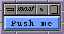
#! /usr/sgitcl/bin/moat xtAppInitialize xmMainWindow .main managed xmPushButton .main.button managed -labelString "Push me" . realizeWidget . mainLoop |
This is a regular button, displaying a text or pixmap label, surrounded by a beveled shadow. Clicking the button changes shadows to give the impression that the button has been pushed. When the button is released, it reverts to its normal appearance. When focus is gained, for instance by tabbing, the button appears brighter (if it is sensitive). The default push buttons of a dialog can be specified by setting -showAsDefault to true, in which case an additional border is drawn using Motif margin resources:
#! /usr/sgitcl/bin/moat xtAppInitialize xmMainWindow .main managed xmPushButton .main.b managed -labelString "Push me" -showAsDefault true . realizeWidget . mainLoop |
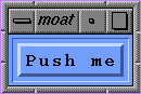
Table 4-24 lists the resources for xmPushButton.
Table 4-24. xmPushButton Resources
Resource Name | Default Value | Type or Legal Values |
|---|---|---|
-armColor | computed | Color |
-armPixmap3 | none | Pixmap |
-defaultButtonShadowThickness | 0 | Dimension |
-fillOnArm | True | Boolean |
-multiClick |
| multiclick_discard, multiclick_keep |
-showAsDefault | 0 | Dimension |
This button contains an arrow, whose direction is given by the -arrowDirection resource.
#! /usr/sgitcl/bin/moat
xtAppInitialize
xmBulletinBoard .top managed -width 110 -height 110
xmArrowButton .top.up managed -x 40 -y 10 -width 30 -height 30
xmArrowButton .top.left managed -x 10 -y 40 \
    -width 30 -height 30 -arrowDirection arrow_left
xmArrowButton .top.right managed -x 70 -y 40 \
    -width 30 -height 30 -arrowDirection arrow_right
xmArrowButton .top.down managed -x 40 -y 70 \
    -width 30 -height 30 -arrowDirection arrow_down
. realizeWidget
. mainLoop |
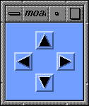
Table 4-25 lists the resources for xmArrowButton.
Table 4-25. xmArrowButton Resources
Resource Name | Default Value | Type or Legal Values |
|---|---|---|
-arrowDirection | arrow_up | arrow_up |
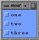
This button displays a state in an on/off indicator. Usually, a toggle button consists of a square or diamond indicator with an associated label. The square or diamond is filled or empty to indicate whether the button is selected or unselected.
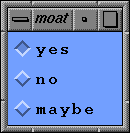
#! /usr/sgitcl/bin/moat xtAppInitialize xmMainWindow .main managed xmRowColumn .main.col managed -orientation vertical xmToggleButton .main.col.one managed xmToggleButton .main.col.two managed xmToggleButton .main.col.three managed . realizeWidget . mainLoop |
A set of buttons can be grouped into a manager with the -radioBehavior resource set to true, ensuring that only one of them can be selected at a given time. Radio buttons are represented with diamonds instead of squares.
#! /usr/sgitcl/bin/moat xtAppInitialize xmMainWindow .main managed xmRowColumn .main.col managed -orientation vertical -radioBehavior true xmToggleButton .main.col.yes managed -set true xmToggleButton .main.col.no managed xmToggleButton .main.col.maybe managed . realizeWidget . mainLoop |
See the section "Manager Widgets" for more information about manager options. Table 4-26 lists the resources for xmToggleButton.
Table 4-26. xmToggleButton Resources
Resource Name | Default Value | Type or Legal Values |
|---|---|---|
-fillOnSelect | True | Boolean |
-indicatorOn | True | Boolean |
-indicatorSize | none | Dimension |
-indicatorType | n_of_many | n_of_many |
-selectColor | computed | Color |
-selectInsensitivePixmap | none | Pixmap |
-selectPixmap | none | Pixmap |
-set | False | Boolean |
-spacing | 4 | Dimension |
-visibleWhenOff | computed | Boolean |
Text widgets also inherit resources from the Core, Primitive, and Label classes, as shown in Table 4-27.
Table 4-27. Button Widget Inherited Resources
Resource Inherited | From |
| Resource Inherited | From |
|---|---|---|---|---|
-accelerators | (Core) |
| -alignment | (Label) |
-backgroundPixmap | (Core) |
| -background | (Core) |
-borderColor | (Core) |
| -borderWidth | (Core) |
-bottomShadowColor | (Primitive) |
| -bottomShadowPixmap | (Primitive) |
-fontList | (Label) |
| -foreground | (Primitive) |
-height | (Core) |
| -highlightColor | (Primitive) |
-highlightOnEnter | (Primitive) |
| -highlightPixmap | (Primitive) |
-highlightThickness | (Primitive) |
| -labelPixmap | (Label) |
-labelString | (Label) |
| -labelType | (Label) |
-mappedWhenManaged | (Core) |
| -marginBottom | (Label) |
-marginHeight | (Label) |
| -marginLeft | (Label) |
-marginRight | (Label) |
| -marginRight | (Label) |
-marginTop | (Label) |
| -navigationType | (Primitive) |
-recomputeSize | (Label) |
| -sensitive | (Core) |
-shadowThickness | (Primitive) |
| -stringDirection | (Label) |
-topShadowColor | (Primitive) |
| topShadowPixmap | (Primitive) |
-translations | (Core) |
| -traversalOn | (Primitive) |
-unitType | (Primitive) |
| -width | (Core) |
-x | (Core) |
| -y | (Core) |
In addition to the usual helpCallback and destroyCallback, button widgets define additional methods, as listed in Table 4-28.
Table 4-28. Button Widget Callbacks
Method name | Why |
|---|---|
armCallback | Button pressed. |
disarmCallback | Button released, with the pointer still on it. |
activateCallback | Some event triggers the Activate function. |
The toggle button also defines the %set callback substitution, which is replaced by the Boolean state of the button.
Simple decorative widgets include xmFrame and xmSeparator. The former is simply a container widget that displays a frame around its child, using in-and-out shadowing or etching. The later is a primitive widget that looks like a flat or beveled line, used to separate items in a display. These two widget classes do not accept user input, so they have no associated actions, callbacks, or translations.
The decoration resources for xmFrame are listed in Table 4-29.
Resource Name | Default Value | Type or Legal Values |
|---|---|---|
-marginWidth | 0 | Dimension |
-marginHeight | 0 | Dimension |
-shadowType | dynamic | shadow_in |
The decoration resources for xmSeparator are listed in Table 4-30.
Table 4-30. xmSeparator Resources
Resource Name | Default Value | Type or Legal Values |
|---|---|---|
-margin | 0 | Dimension |
-orientation | horizontal | horizontal |
-separatorType | shadow_etched_in | shadow_etched_in |
Decorative widgets inherit resources from the Core and Primitive classes, as shown in Table 4-31.
Table 4-31. Decorative Widget Inherited Resources
Resource Inherited | From |
| Resource Inherited | From |
|---|---|---|---|---|
-backgroundPixmap | (Core) |
| -background | (Core) |
-borderColor | (Core) |
| -borderWidth | (Core) |
-bottomShadowColor | (Primitive) |
| -bottomShadowPixmap | (Primitive) |
-foreground | (Primitive) |
| -height | (Core) |
-mappedWhenManaged | (Core) |
| -shadowThickness | (Primitive) |
-topShadowColor | (Primitive) |
| -topShadowPixmap | (Primitive) |
-unitType | (Primitive) |
| -width | (Core) |
-x | (Core) |
| -y | (Core) |
A list is used to display an ordered set of strings. Mouse or keyboard interactions permit users to select one or more items.
An xmScrolledList should be used when the number of items may be too large to display in the allotted space in the interface: the interface is automatically changed to display an xmScrollBar (see below) to move the visible part of the list. A scrolled list widget w is a composite widget that has the following children:
w.HorScrollBar w.VertScrollBar w.ClipWindow |
The associated names might be used to access them directly, as in the following example:
xmScrolledList .list managed .list.VertScrollBar setValues -troughColor red |
Different selection modes exist:
| single_select | Only one item may be selected at a time. A click within the list deselects any previous selection, and selects the highlighted item. Each time a selection is made, singleSelectionCallback is called. | |
| multiple_select | Shift-clicks may be used to make multiple selections. Each time an item is selected or unselected, multipleSelectionCallback is called. | |
| extended_select |
| |
| browse_select | Mouse dragging may be used to select a range of items. Using shift-click or shift-drag, more than one range may be selected at a given time. For each newly selected item, browseSelectionCallback is called, once the mouse button is released. This is the default mode. |
In all modes, the defaultActionCallback is called when the user double-clicks an item. The following methods are provided to manage the selection list L:
| L addItem item position |
| |
| L addItemUnselected item position |
| |
| L deletePosition position |
| |
| L deleteItem item |
| |
| L deleteAllItems |
| |
| L selectPosition position notify |
| |
| L selectItem item notify |
| |
| L deselectItem item |
| |
| L deselectPosition position |
| |
| L itemExists item |
| |
| L itemPosition item |
| |
| L positionSelected position |
| |
| L setItem item | Scroll the list so that the first occurrence of item is at the top of the currently displayed part of the list. | |
| L setPosition position |
| |
| L setBottomItem item |
| |
| L setBottomPosition position |
|
Table 4-32 lists specific resources for xmList.
Resource Name | Default Value | Type or Legal Values |
|---|---|---|
-automaticSelection | False | Boolean |
-doubleClickInterval | Inherited | Integer |
-fontList | Inherited | Font List |
-itemCount | computed | Integer |
-items | none | String array |
-listMarginHeight | 0 | Integer |
-listMarginWidth | 0 | Integer |
-listSizePolicy | variable | constant |
-listSpacing | 0 | Integer |
-scrollBarDisplayPolicy | as_needed | as_needed |
-selectedItemCount | 0 | Integer |
-selectedItems | none | String array |
-selectionPolicy | browse_select | browse_select |
-stringDirection | Inherited | string_direction_l_to_r |
-topItemPosition | 1 | Integer |
-visibleItemCount | 1 | Integer |
Other resources are derived from the Core, Primitive, and Label classes.
Supported list-specific callbacks are listed in Table 4-33.
Table 4-33. List Widget Callbacks
Method Name | Why |
|---|---|
defaultActionCallback | An item was double-clicked |
singleSelectionCallback | A single item was selected |
multipleSelectionCallback | An item was selected while in multiple selection mode |
browseSelectionCallback | An item was selected while in browse selection mode |
extendedSelectionCallback | An item was selected while in extended selection mode |
The following substitutions are defined for the above callbacks:
| %item | The currently selected item string | |
| %item_length | The string length of the currently selected item | |
| %item_position | The current item position, 1 indicating the first one | |
| %selected_items |
|
Be sure to enclose item and selected_items between braces, to avoid parsing errors when item strings contain spaces.
Text widgets also inherit the standard callbacks from the Primitive class, namely helpCallback and destroyCallback.
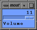
A scale widget produces an adjustable slider for adjusting some value between a minimum and a maximum. This code creates a horizontal slider:
#! /usr/sgitcl/bin/moat
xtAppInitialize
xmMainWindow .main managed
xmScale .main.slide managed -orientation horizontal \
    -maximum 11 -value 11 -showValue True \
    -titleString "Volume"
. realizeWidget
. mainLoop |
The xmScale widget class defines the new resources, as shown in Table 4-34.
Resource Name | Default Value | Type or Legal Values |
|---|---|---|
-decimalPoints | 0 | Integer |
-fontList | Inherited | Font List |
-highlightOnEnter | False | Boolean |
-highlightThickness | 2 | Dimension |
-maximum | 100 | Integer |
-minimum | 0 | Integer |
-orientation | vertical | horizontal |
-processingDirection | computed | max_on_bottom |
-scaleHeight | 0 | Dimension |
-scaleWidth | 0 | Dimension |
-scaleMultiple | $(max-min)/10$ | Integer |
-showValue | False | Boolean |
-titleString | "" | String |
-value | 0 | Integer |
The slider may be moved between the integer -minimum and -maximum. Fractional values are obtained using the -decimalPoints resource, to display a decimal point. The slider size may be set by -scaleHeight and -scaleWidth. The resource -showValue toggles display of text showing the current value, while -scaleMultiple is used for large slider moves with a <Ctrl>-Arrow key.
Table 4-35 lists callbacks defined for the xmScale widget.
Method Name | Why |
|---|---|
valueChangedCallback | The scale value had changed. |
dragCallback | The slider is being dragged. |
In addition, xmScale inherits the usual helpCallback from the Primitive abstract class.
In these callbacks, %value substitution may be used to retrieve the current scale position.
The xmScrollBar widget is made to allow moving the current view of a widget that is too large to be displayed all at once. Usually, scroll bars are part of an xmScrolledWidget, an xmScrolledText, or an xmScrolledList widget.
An xmScrollBar may be horizontal or vertical (depending its -orientation resource). An xmScrollBar is composed of two arrows, a long rectangle called the scroll region, and a smaller rectangle called the slider. The data is scrolled by clicking either arrow, clicking inside the scroll region, or by dragging the slider. When the mouse is held down in the scroll region or in either arrow, the data continues to move at a constant speed.
The following example uses two scrollbars to move a target button:
#! /usr/sgitcl/bin/moat
xtAppInitialize
xmBulletinBoard .top managed
xmScrollBar .top.h managed \
    -orientation horizontal -width 150 \
    -y 160 -minimum 10 -maximum 140
xmScrollBar .top.v managed \
    -orientation vertical -height 150 \
    -x 160 -minimum 10 -maximum 140
xmPushButton .top.target managed -labelString "X"
proc track_it {} {
    .top.h getValues -value x
    .top.v getValues -value y
    .top.target setValues -x [expr 8+$x] -y [expr 8+$y]
}
.top.h dragCallback track_it
.top.v dragCallback track_it
.top.h valueChangedCallback track_it
.top.v valueChangedCallback track_it
track_it
. realizeWidget
. mainLoop |
The xmScrollBar widget class defines the new resources listed in Table 4-36.
Table 4-36. xmScrollBar Resources
Resource Name | Default Value | Type or Legal Values |
|---|---|---|
-increment | 1 | Integer |
-initialDelay | 250 ms | Integer |
-maximum | 100 | Integer |
-minimum | 0 | Integer |
-orientation | vertical | horizontal |
-pageIncrement | 10 | Integer |
-processingDirection | computed | max_on_bottom |
-repeatDelay | 50 ms | Integer |
-showArrows | True | Boolean |
-sliderSize | computed | Integer |
-troughColor | computed | Color |
-value | 0 | Integer |
The -value resource specifies the current position of the scrollbar slider, between the minimum and maximum -sliderSize. The slider moves between -minimum and -maximum by -increment steps (clipped at the ends). Clicking either scrollbar arrow moves the slider by -pageIncrement. The -sliderSize reflects the portion of the widget currently in view.
The -troughColor specifies the scrollbar slider fill color. Constant speed movement can be parameterized with -repeatDelay and -initialDelay. If -showArrows is set to False, the scroll bar will not have arrows at either end.
Table 4-37. xmScrollBar Methods
Method Name | Why |
|---|---|
decrementCallback | Value was decremented. |
dragCallback | The slider is being dragged. |
incrementCallback | Value was incremented. |
pageDecrementCallback | Value was decremented by pageIncrement. |
pageIncrementCallback | Value was incremented by pageIncrement. |
toTopCallback | Value was reset to minimum. |
toBottomCallback | Value was reset to maximum. |
valueChangedCallback | The value had changed. |
In the callbacks above, the %value substitution returns the current scroll bar position.
Manager widgets are used to lay out several widgets together, enabling the construction of complex interfaces from simple widgets.
Their purpose is to find a suitable geometry that encloses all managed children. Geometry can be set at creation time, when the user manually sizes the window, or when widgets dynamically resize themselves.
Normally manager widgets do not interact with events, they just forward them to the appropriate child. The notable exception is navigation: use of the keyboard or mouse to change the currently selected child widget.
This class is not a subclass of Primitive, but since it has a graphical representation, it shares some of the Primitive class resources and behavior. The Manager abstract class defines the common resource set described in Table 4-38 for xmManager.
Table 4-38. xmManager Resources
Resource Name | Default Value | Type or Legal Values |
|---|---|---|
-bottomShadowColor | inherited | Color |
-bottomShadowPixmap | none | Pixmap |
-foreground | computed | Color |
-highlightColor | computed | Color |
-highlightPixmap | none | Pixmap |
-navigationType | tab_group | none |
-shadowThickness | 0 | Dimension |
-stringDirection | inherited | string_direction_l_to_r |
-topShadowColor | computed | Color |
-topShadowPixmap | none | Pixmap |
-traversalOn | True | Boolean |
| Inherited | pixels |
The Manager abstract class also defines callbacks for all manager subclasses. These callbacks are described in Table 4-39.
Method Name | Why |
|---|---|
focusCallback | The widget receives input focus |
helpCallback | The usual Help callback |
mapCallback | The widget is mapped on screen |
unmapCallback | The widget is unmapped from screen |
There is no special substitution associated with these callbacks.
The xmBulletinBoard widget is the simplest manager. Its children are positioned using their -x and -y resources. No special management occurs when this widget is resized. Table 4-40 lists the resources associated with xmBulletinBoard.
Table 4-40. xmBulletinBoard Resources
Resource Name | Default Value | Type or Legal Values |
|---|---|---|
-allowOverlap | True | Boolean |
-autoUnmanage | True | Boolean |
-buttonFontList | Inherited | Font List |
-cancelbutton | none | Widget |
-defaultbutton | none | Widget |
-defaultPosition | True | Boolean |
-dialogStyle | computed | dialog_system_modal |
-dialogTitle | none | String |
-labelFontList | Inherited | Font List |
-marginHeight | 10 | Dimension |
-marginWidth | 10 | Dimension |
-noResize | False | Boolean |
-resizePolicy | any | resize_any |
-shadowType | shadow_out | shadow_in |
-textFontList | Inherited | Font List |
-textTranslations | "" | String |
When -allowOverlap is set to False, any placement of children that would result in an overlap is rejected. Setting -noResize to True disables any resize of the widget, while -resizePolicy may be used to control what kind of resize should be allowed.
The xmBulletinBoard manager places its children in one or more columns (or rows). Different packing styles, directions, and size options permit you to create aligned or unaligned rows (or columns), as in the following examples.
This example uses horizontal orientation, pack_tight packing, and specifies the width and resize characteristics of the widget:
#! /usr/sgitcl/bin/moat
xtAppInitialize
xmRowColumn .top managed -orientation horizontal \
    -packing pack_tight -width 120 -resizeWidth false
xmPushButton .top.a managed -labelString A
xmPushButton .top.b managed -labelString BBB
xmPushButton .top.c managed -labelString CCCC
xmPushButton .top.d managed -labelString DD
. realizeWidget
. mainLoop |
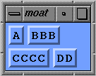
This example uses horizontal orientation, pack_column packing, and explicitly requests two columns:
#! /usr/sgitcl/bin/moat
xtAppInitialize
xmRowColumn .top managed -orientation horizontal \
    -packing pack_column -numColumns 2
xmPushButton .top.a managed -labelString A
xmPushButton .top.b managed -labelString BBB
xmPushButton .top.c managed -labelString CCCC
xmPushButton .top.d managed -labelString DD
. realizeWidget
. mainLoop |
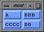
This example requests a vertical orientation:
#! /usr/sgitcl/bin/moat xtAppInitialize xmRowColumn .top managed -orientation vertical xmPushButton .top.a managed -labelString A xmPushButton .top.b managed -labelString BBB xmPushButton .top.c managed -labelString CCCC xmPushButton .top.d managed -labelString DD . realizeWidget . mainLoop |
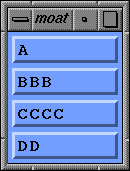
Table 4-41 lists the resources associated with xmRowColumn.
Table 4-41. xmRowColumn Resources
Resource Name | Default Value | Type or Legal Values |
|---|---|---|
-adjustLast | True | Boolean |
-adjustMargin | True | Boolean |
-entryAlignment | alignment_center | alignment_center |
-entryBorder | 0 | Integer |
-entryClass | dynamic | Widget Class |
-isAligned | True | Boolean |
-isHomogeneous | True | Boolean |
-labelString | "" | String |
-marginHeight | Inherited | Dimension |
-marginWidth | Inherited | Dimension |
-menuAccelerator | ? | String |
-menuHelpWidget | none | Widget |
-menuHistory | none | Widget |
-menuPost | "" | String |
-mnemonic | none | Key |
-mnemonicCharSet | dynamic | String |
-numColumns | 1 | Integer |
-orientation | computed | horizontal |
-packing | computed | pack_column |
-popupEnabled | True | Boolean |
-radioAlwaysOne | True | Boolean |
-radioBehavior | False | Boolean |
-resizeHeight | True | Boolean |
-resizeWidth | True | Boolean |
-rowColumnType | work_area | menu_bar |
-spacing | 3 or 0 | Dimension |
-subMenuId | none | Widget |
-whichButton | computed | Integer |
A form is a manager widget created to lay out widgets using neighborhood relationships, such as "this widget should be positioned to the left of this one." This is quite general, and allows you to define widget combinations that can resize gracefully. Figure 4-10 shows a combination of xmLabel and xmForm widgets that adjust to fit the data.
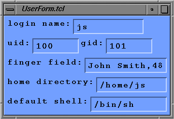
These constraints are defined in terms of attachment of each side of child widgets to the form border, to another widget, to a relative position in the form, or to the initial position of the child. When resizing occurs, children are adjusted according to these constraints.
Table 4-42 lists the resources associated with xmForm.
Resource Name | Default Value | Type or Legal Values |
|---|---|---|
-fractionBase | 100 | Integer |
-horizontalSpacing | 0 | Dimension |
-rubberPositioning | False | Boolean |
-verticalSpacing | 0 | Dimension |
-sideAttachment | attach_none | attach_form |
-sideOffset | 0 | Integer |
-sidePosition | 0 | Integer |
-sideWidget | none | Widget |
A paned window is a composite widget used to lay out several children, each in its own pane. Pane separators always contain a sash (see Figure 4-11) to allow users to change the space alloted for each widget.
#! /usr/sgitcl/bin/moat
xtAppInitialize
xmPanedWindow .top managed
xmScrolledText .top.txt managed \
        -rows 3 -editMode multi_line_edit  -value \
"This paned window has three parts:
xmScrolledText, xmScrolledList, and
xmToggleButtons inside xmRowColumn.\n\n\window{paned_window}\n"
xmScrolledList .top.list managed \
        -width 568 \
        -items {Windows, Widgets, Gadgets, Buttons} \
        -itemCount 4
xmFrame .top.f managed
xmRowColumn .top.f.rc managed \
        -orientation horizontal \
        -radioBehavior true
xmToggleButton .top.f.rc.1 managed
xmToggleButton .top.f.rc.2 managed
xmToggleButton .top.f.rc.3 managed
. realizeWidget
. mainLoop |
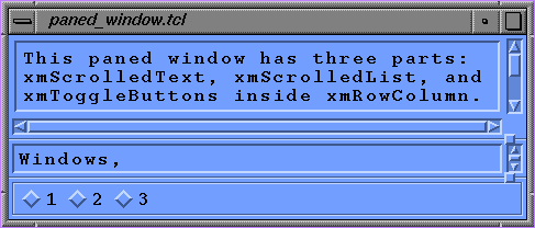
Table 4-43 lists the resources associated with xmPanedWindow.
Table 4-43. xmPanedWindow Resources
Resource Name | Default Value | Type or Legal Values |
|---|---|---|
-marginHeight | 3 | Dimension |
-marginWidth | 3 | Dimension |
-refigureMode | True | Boolean |
-sashHeight | 10 | Dimension |
-sashIndent | -10 | Dimension |
-sashShadowThickness | dynamic | Dimension |
-sashWidth | 10 | Dimension |
-separatorOn | True | Boolean |
-spacing | 8 | Dimension |
The -refigureMode resource indicates whether or not child widgets should be reset to their appropriate positions when the paned window is resized.
Table 4-44 lists the resources for xmPanedWindow that specify pane constraint behavior.
Table 4-44. xmPanedWindow Constraint Resources
Resource Name | Default Value | Type or Legal Values |
|---|---|---|
-allowResize | True | Boolean |
-paneMaximum | 1000 | Dimension |
-paneMimimum | 1 | Dimension |
-skipAdjust | False | Boolean |
The -skipAdjust constraint resource controls whether or not the paned window should automatically resize this pane.
A drag and drop facility was introduced into Motif 1.2. On the drop side, a widget must first register itself as a drop site, so that it can handle any attempts to drop something on it. Registration is done by means of the dropSiteRegister widget method. The registration must include a Tcl procedure to be executed whenever a drop is attempted, specified using the -dropProc resource.
Since drag and drop involves two different applications attempting to communicate, a protocol is needed so that applications can share a common language. Consequently, registration must specify what types of protocol are used, and how many there are. This is done using X atoms. The major X atoms are COMPOUND_TEXT, TEXT, and STRING. This example shows drop site registration:
.l dropSiteRegister \
    -dropProc {startDrop %dragContext} \
    -numImportTargets 1 \
-importTargets COMPOUND_TEXT |
This allows widget .l to be used as a drop site, accepting COMPOUND_TEXT only. Multiple types are allowed, using the Motif list structure of comma-separated elements as in "COMPOUND_TEXT, TEXT, STRING," for example.
When a drop occurs, the procedure startDrop is called, with one substituted parameter: dragContext, which is a widget created by Motif to handle the drag overhead. You must include this parameter, or the next stage will fail.
When a drag occurs, Motif creates a dragContext widget. A drag is started by holding down the left moust button in a drag source. The dragContext widget contains information about the drag source, which is matched up against the drop destination.
When the drop is triggered by releasing the left mouse button, Tcl code registered as dropProc is executed. This procedure takes the dragContext widget as a parameter.
The dropProc code may try to determine if the drop should proceed, but usually it just acts as a channel for the actual information transfer. The dragProc does not actually transfer the information, it just determines whether it is possible, and if so, what protocols to employ.
The drop recipient may decide that it wants something encoded as TEXT, followed by COMPOUND_TEXT. It signals what it wants by specifying a Tcl list of dropTransfer pairs. The list pairs consist of the protocol (as an X atom name) and the recipient widget. Why the recipient widget? Because when a drop takes place, the dragContext widget actually deals with it, and is about to hand the transfer over to a transferWidget. This is essentially a triple indirection.
This is an example of a dragProc:
proc startDrop dragContext {
    $dragContext dropTransferStart \
    -dropTransfers {{COMPOUND_TEXT .l}} \
    -numDropTransfers 1 \
    -transferProc {doTransfer %closure {%value}}
} |
The dragContext widget uses the command dropTransferStart to signal the beginning of information transfer. (It could also signal termination with no information transfer).
The dragContext widget accepts one chunk of information in COMPOUND_TEXT format, and passes this on to the .l widget. The information transfer is actually carried on by a Tcl procedure in the transferProc resource.
The only formats currently accepted (because they are hard-coded into Tcl Motif) are COMPOUND_TEXT, TEXT, and STRING.
The transferProc resource is a function that is called when the drop recipient actually gets the information dropped on it. This function takes at least two parameters: %value is substituted for the actual information dropped on it, and %closure is the second element in the dropTransfer list that should be the widget where the drop is happening. (Tcl Motif should be able to determine this, but unfortunately does not.) The dropped-on widget takes suitable action.
This function resets the label to the text dropped on it:
proc doTransfer {destination value} {
    $destination setValues -labelString $value
} |
Here, destination is substituted with %closure and value with %value.
Tk contains a primitive called send. In Tk, each interpreter has a name, and you can send Tcl commands from one interpreter to another. When an interpreter receives a sent command it executes the command, and then returns any result back to the original interpreter. Tm also contains this mechanism, so that applications can send commands to other Motif and Tk programs, and receive commands from both Tm and Tk programs.
Once a Tcl Motif application succeeds in registering its name at XtAppInitialize time, it can send commands to another Motif or Tm application. This example instructs interp2 to display a message:
send interp2 {puts stdout "hello there"} |
This section presents some useful composite widgets.
A command widget is composed of a history area (an xmScrolledList), a label to display the prompt, and a text field to edit the current command. The command widget is a subclass of xmSelectionBox. You may add an extra child, called the work area.
The command widget recognizes several new methods:
| cw appendValue command |
| |
| cw error error_message |
| |
| cw setValue command |
|
Table 4-45 lists the resources associated with xmCommand.
Table 4-45. xmCommand Resources
Resource Name | Default Value | Type or Legal Values |
|---|---|---|
-command | "" | String |
-historyItems | "" | String Table |
-historyItemCount | 0 | Integer |
-historyMaxItems | 100 | Integer |
-historyVisibleItemCount | 8 | Integer |
-promptString | ">" | String |
Other resources are inherited xmSelectionBox and its ancestors.
Table 4-46 lists the callbacks associated with xmCommand.
Table 4-46. xmCommand Callbacks
Method Name | Why |
|---|---|
commandChangedCallback | The current command changed (the user typed something). |
commandEnteredCallback | The command was entered before the <Enter> key. |
Both of these callbacks support the %value and %length substitution, which are replaced by the string (or string length) that fired the callback.
Tm has limited support for the Xlib drawable area or buttons—you can draw only strings on them. This is the only currently defined drawing method for manipulating the xmDrawingArea and xmDrawnButton widgets:
| dw drawImageString gc x y string |
|
The following example produces a familiar "Hello world" widget. It is necessary to use an exposeCallback to get the message redisplayed when needed.
#! /usr/sgitcl/bin/moat
xtAppInitialize
xmDrawingArea .top managed -height 30 -width 150
.top exposeCallback {
    set gc [.top getGC -foreground black]
    .top drawImageString $gc 10 20 "Hello world"
}
. realizeWidget
. mainLoop |
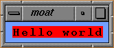
Table 4-47 lists the resources associated with xmDrawingArea.
Table 4-47. xmDrawingArea Resources
Resource Name | Default Value | Type or Legal Values |
|---|---|---|
-marginHeight | 10 | Dimension |
-marginWidth | 10 | Dimension |
-resizePolicy | resize_any | resize_any |
Table 4-48 lists the resources associated with xmDrawnButton.
Table 4-48. xmDrawnButton Resources
Resource Name | Default Value | Type or Legal Values |
|---|---|---|
-multiClick | Inherited from | multiclick_discard |
-pushButtonEnabled | False | Boolean |
-shadowType | shadow_out | shadow_in |
Table 4-49 lists the callbacks associated with xmDrawingArea and xmDrawnButton.
Table 4-49. Drawing Widget Callbacks
Method Name | Why |
|---|---|
exposeCallback | The area/button should be redrawn. |
inputCallback | A keyboard or mouse event arrived for the area. |
resizeCallback | The area/button is resized. |
activateCallback | The button was activated. |
armCallback | The button is squashed. |
disarmCallback | The button is released. |
This composite widget is used for the application's main window. As you add children to it (xmMenuBar, xmList, xmMessageBox, a work area, and so forth) it manages them, as you could do manually with xmForm.
The management of the work area is not immediate: the main window must know which of its children is the work area before you can manage that widget. The following example produces a prototype interface for a standard application:
#! /usr/sgitcl/bin/moat
xtAppInitialize
xmMainWindow .top -showSeparator True \
        -commandWindowLocation command_below_workspace
xmMenuBar .top.bar managed
xmCascadeButton .top.bar.File managed
xmCascadeButton .top.bar.Help managed
xmDrawingArea .top.work \
        -width 320 -height 240 \
        -background black
.top setValues -workWindow .top.work
.top.work manageChild
xmCommand .top.com managed \
        -historyVisibleItemCount 0 \
        -textFontList  -*-courier-medium-r-*--12-*-*-*-*-*-*
.top.com commandEnteredCallback {%value}
.top setValues -width 600 -height 500
.top manageChild
. realizeWidget
. mainLoop |
The xmMainWindow widget defines these resources, renaming resources of the parents, as shown in Table 4-50.
Table 4-50. xmMainWindow Resources
Resource Name | Default Value | Type or Legal Values |
|---|---|---|
-commandWindow | none | Widget |
-commandWindowLocation | above | command_above_workspace |
-mainWindowMarginHeight | 0 | Dimension |
-mainWindowMarginWidth | 0 | Dimension |
-menuBar | none | Widget |
-messageWindow | none | Widget |
-showSeparator | False | Boolean |
Table 4-51 lists the callbacks associated with xmMainWindow.
Table 4-51. xmMainWindow Callbacks
Method Name | Why |
|---|---|
commandChangedCallback | You typed some new text, recalled a history item, etc. |
commandEnteredCallback | You typed <Enter>, double-clicked the mouse, etc. |
focusCallback | The window gained input focus. |
mapCallback | The window was mapped on screen. |
unmapCallback | The window was unmapped. |
Boxes are complex widgets with a work area and a line of buttons. They are designed to handle common layout of several common widgets. Boxes might be used as is, or as building blocks for more complex interfaces. They are also often used inside dialogs (standalone windows); see the section "Dialogs" for more information.
Message boxes are used to display simple messages. The xmMessageBox widget can also display a pixmap symbol to indicate warnings or error conditions. This is done by setting the -dialogType resource, or by specifying a pixmap with -symbolPixmap.
This example shows the use of an xmMessageBox with custom pixmap face, which is taken from an external file:
#! /usr/sgitcl/bin/moat
xtAppInitialize
xmMessageBox .top managed \
    -messageString {Hello world!} \
    -symbolPixmap /usr/share/src/sgitcl/face
. realizeWidget
. mainLoop |
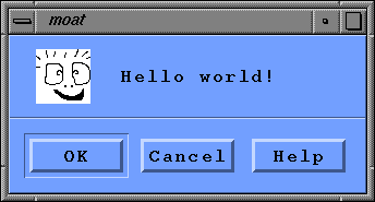
A message box is a composite widget whose component children might be managed or unmanaged. Child widgets can be included or eliminated using the Tcl Motif commands manageChild and unmanageChild applied on the automatically-derived child widgets. With a message box named mw, these are the standard child widgets:
    mw.Cancel    mw.Help        mw.Message
mw.OK mw.Separator mw.Symbol |
This example is like the xmMessageBox above, but without the Cancel and Help buttons and the separator line:
#! /usr/sgitcl/bin/moat
xtAppInitialize
xmMessageBox .mb managed -messageString {Hello world!} \
    -symbolPixmap /usr/share/src/sgitcl/face
foreach child {Cancel Help Separator} {
   .mb.$child unmanageChild
}
. realizeWidget
. mainLoop |
Table 4-52 lists the resources associated with xmMessageBox.
Table 4-52. xmMessageBox Resources
Resource Name | Default Value | Type or Legal Values |
|---|---|---|
-cancelLabelString | "Cancel" | String |
-defaultButtonType | dialog_ok_button | dialog_cancel_button |
-dialogType | dialog_message | dialog_error |
-helpLabelString | "Help" | String |
-messageAlignment | alignment_beginning | alignment_center |
-messageString | "" | String |
-minimizeButtons | False | Boolean |
-okLabelString | "OK" | String |
-symbolPixmap | depends on -dialogType | Pixmap |
Table 4-53 lists the callbacks associated with xmMessageBox.
Table 4-53. xmMessageBox Callbacks
Method Name | Why |
|---|---|
cancelCallback | The cancel button was activated. |
helpCallback | The help button was activated, or a Help action arose. |
okCallback | The OK button was activated. |
focusCallback | The window gained input focus. |
mapCallback | The window was mapped on screen. |
unmapCallback | The window was unmapped. |
Furthermore, xmMessageBox also inherits destroyCallback from the Core class.
A selection box is a composite widget designed to ease creation of interfaces that present the user with a list of items from which to choose. A selection box has a number of component children, which the application can manage or unmanage. This is often done to add or remove elements from a dialog. Managing and unmanaging are the only two operations you should perform on elements of a composite selection box widget.
With a selection box named sb, these are the automatically-derived child widgets:
    sb.Apply          sb.OK        sb.Cancel
    sb.Selection      sb.Help      sb.Separator
sb.ItemsList sb.Text sb.Items |
Table 4-54 lists the callbacks associated with xmSelectionBox.
Table 4-54. xmSelectionBox Callbacks
Method Name | Why |
|---|---|
applyCallback | The Apply button is released. |
cancelCallback | The Cancel button is released. |
okCallback | The OK button is released. |
noMatchCallback | Nothing matches the selected expression. |
These callbacks support the %value and %length substitution, which are replaced by the string (or string length) that fired the callback. The selection box widget also inherits all the callbacks defined in xmList and xmText.
A file selection box is designed to let the user interactively specify a pathname and a file. A filter may be used to display only certain files, based on a regular expression matching those filenames. This surprisingly simple code creates a file selection box:
#! /usr/sgitcl/bin/moat xtAppInitialize xmFileSelectionBox .top managed . realizeWidget . mainLoop |
With a file selection box named sb, these are the automatically-derived child widgets:
    sb.Apply       sb.FilterLabel     sb.Items         sb.Text
    sb.Cancel      sb.FilterText      sb.ItemsList
    sb.DirList     sb.Help            sb.Selection
sb.Dir sb.OK sb.Separator |
The callback substitutions supported for xmFileSelectionBox are
    %value    %value_length    %mask       %mask_length
%dir %dir_length %pattern %pattern_length |
In a graphical user interface, menus are the most common method for users to issue commands in an application. The way you program Motif is to establish separate widgets for all the pieces of a menu, such as:
| menu bar | This is used to group several menu buttons together, usually at the top of the main window, by default horizontally. | |
| menu buttons | This is a special type of xmPushButton that automatically brings up a pulldown menu. When this widget is created as a child of another popup menu, it forms a cascading submenu, with small arrows added to the right of the original pulldown menu. | |
| pulldown menu |
|
A menu bar is a permanently-displayed horizontal pulldown menu that can contain menu buttons and cascade buttons. It is used to display the buttons that trigger the pulldown menus of an application, usually at the top of the xmMainWindow.
See the section "xmPushButton" for information about this widget.
A pulldown menu is a special kind of vertical xmRowColumn. It is managed only when it should be displayed. Pulldown or cascading menus are managed when the user clicks on the top-level menu button. Popup menus are managed by a more general event, typically through a defined translation of the main window.
Menu items are implemented as child widgets, and include xmLabel, xmPushButton, xmSeparator, and xmCascadeButton. The order of definition controls menu item order. Table 4-55 lists the callbacks associated with xmPulldownMenu.
Table 4-55. xmPulldownMenu Callbacks
Method Name | Why |
|---|---|
popupCallback | The menu is managed and mapped. |
popdownCallback | The menu is unmapped. |
The cascade button is a special subclass of the push button that forces management of a pulldown menu. Table 4-56 lists the resource associated with xmCascadeButton.
Table 4-56. xmCascadeButton Resource
Resource Name | Default Value | Type or Legal Values |
|---|---|---|
-windowId | none | Widget |
Dialog boxes are child widgets that appear in their own window when managed. They are usually modeless: interactions continue with other visible widgets while the dialog is active.
Tcl Motif does support modal style, which forces the user to interact with the dialog. Select modal style by setting the dialogStyle resource to dialog_full_application_modal. This style stops when the dialog disappears, typically after the user clicks a button.
The simplest dialogs are message boxes. Tm defines five message dialogs with an icon, one without an icon, plus a simple prompt dialog. Table 4-57 lists the simple dialogs:
Table 4-57. Informational Dialog Boxes
Widget Name | Icon or Use |
|---|---|
Error (circle-backslash) icon | |
Information (i) icon | |
Question (?) icon | |
Warning (!) icon | |
Working (hourglass) icon | |
Message box without icon | |
Simple prompt selection box |
This example creates a menu that allows you to bring up each of the simple message dialogs listed above:
#! /usr/sgitcl/bin/moat
xtAppInitialize
xmMainWindow .top managed
xmMenuBar .top.bar managed
xmCascadeButton .top.bar.File managed
xmCascadeButton .top.bar.Dialog managed
xmPulldownMenu  .FileMenu
xmPulldownMenu  .DialogMenu
xmLabel .top.msg managed -labelString {\n
    To see different types of dialog boxes, \n
    choose items from the Dialog menu. \n
}
.top.bar.File setValues -subMenuId .FileMenu
xmPushButton .FileMenu.Quit managed
.FileMenu.Quit activateCallback {exit 0}
.top.bar.Dialog setValues -subMenuId .DialogMenu
foreach b {Error Information Question Warning Working Message Prompt} {
    xmPushButton .DialogMenu.$b managed
    xm${b}Dialog .$b
    .$b.Cancel unmanageChild
    .$b.Help   unmanageChild
    .$b.OK     activateCallback {.$b unmanageChild}
}
.DialogMenu.Error       activateCallback {popup Error}
.DialogMenu.Information activateCallback {popup Information}
.DialogMenu.Question    activateCallback {popup Question}
.DialogMenu.Warning     activateCallback {popup Warning}
.DialogMenu.Working     activateCallback {popup Working}
.DialogMenu.Message     activateCallback {popup Message}
.DialogMenu.Prompt      activateCallback {popup Prompt}

# callback procedure
proc popup {type} {
    .$type setValues -messageString "This is an xm${type}Dialog"
    .$type manageChild
}

. realizeWidget
. mainLoop |
The more general dialogs use two multipurpose managers inside. Tcl Motif defines the xmFormDialog and xmBulletinBoardDialog widgets to create them.
Use the xmSelectionDialog widget to select an item from an arbitrary list. See the section "xmSelectionBox" for more information.
Use the xmFileSelectionDialog widget to select a directory and a filename. See the section "xmFileSelectionBox" for more information.