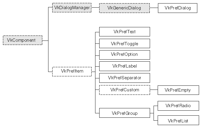
This chapter introduces the basic ViewKit classes needed to create and manipulate preference dialogs in a ViewKit application. Figure 8-1 shows the inheritance graph for these classes.
Preference dialogs allow users to customize the behavior of an application. Without high-level support, preference dialogs can take considerable time and effort to write because they can involve large numbers of text input fields, labels, toggle buttons, and other controls. A user expects preference dialogs to work in a specific way, as well. Usually, a user sets a number of preferences and then clicks an Apply button or an OK button to apply all changes at once. A user also expects to be able to click Cancel and return all preferences to their previous state, regardless of how many changes the user might have made.
ViewKit supports an easy-to-use collection of classes for building preference dialogs. Rather than dealing directly with widgets, their placement, callbacks, and so on, programmers who use ViewKit can simply create groups of preference items. These items maintain their own states, which allows an application to simply query each item to see if it has been changed. Layout is handled automatically, and ViewKit provides the ability to apply or revert all preferences to their previous state.
In ViewKit, preference dialogs are implemented as a specialized class of dialog. Specifically, the base preference dialog class, VkPrefDialog, is a subclass of VkGenericDialog, which is in turn a subclass of VkDialogManager. Thus, the VkPrefDialog class inherits all of the functions and data members provided by these base classes.
However, there are some significant differences in the way you use preference dialogs in your programs compared to the other dialog classes. For the other dialog classes, a single, reusable instance of each type of dialog is sufficient. Details such the message, the button labels, or the dialog title change from posting to posting, but the general dialog behavior remains the same.
On the other hand, individual postings of preference dialogs often vary significantly; they usually have greatly different preference items and data structures associated with each preference item. Therefore, unlike the other dialog classes, VkPrefDialog does not create a global instance of a preference dialog. Instead, you must create a separate instance of VkPrefDialog for each preference dialog that you want to display in your program. For very simple preference dialogs (for example, just a few toggle buttons), you might be able to directly instantiate a VkPrefDialog object; however, in most cases you should create a separate subclass of VkPrefDialog for each preference dialog in your application.
For each preference dialog, you create a collection of preference items and associate them with the dialog. Each preference item maintains its own state or value, and your program can query the value of preference items as needed. Users can change the values associated with any number of preference items, then click the Apply button to apply all changes and keep the dialog up, or the OK button to apply all changes and dismiss the dialog. Users can also click the Cancel button to return all preferences to their last applied values and dismiss the dialog.
The VkPrefDialog class also supplies a ViewKit callback named prefCallback. The preference dialog activates this callback whenever the user clicks the dialog's Apply, OK, or Cancel button.
The basis for all ViewKit preference item classes is the abstract class VkPrefItem, which is derived from VkComponent. All preference items are derived from the base class VkPrefItem, which provides a common set of manipulation functions.
Preference items can be divided into three groups: those that implement various controls such as text fields, toggles, and option menus; those that are “ornamental”; and those that arrange other preference items and manage them as a group.
The following preference items implement controls:
| VkPrefText | A text field. | |
| VkPrefToggle | A single toggle button (you can group multiple toggle buttons into a VkPrefRadio item, described below, to enforce radio-style behavior of the buttons). | |
| VkPrefOption | An option menu. |
The following preference items are ornamental:
| VkPrefLabel | A text label. | |
| VkPrefSeparator |
| |
| VkPrefEmpty | A “null” item that you can use to add extra space between other items. |
The following preference items create groups of items:
| VkPrefGroup | Defines a group of related items. You can specify either vertical or horizontal layout; the default is vertical. With a vertical layout, VkPrefGroup pads items so that they take equal space. You have the option of displaying a label for the group. | |
| VkPrefRadio | A subclass of VkPrefGroup for managing a group of toggle items in a radio box style. You can specify either vertical or horizontal layout; the default is vertical. Items are always padded so that they take equal space. You have the option of displaying a label for the group. | |
| VkPrefList | Defines a group of related items. The VkPrefList class arranges its items vertically. Unlike VkPrefGroup, items are not padded so that they take equal space; instead, each item takes only as much space as it needs. Also in contrast to VkPrefGroup, VkPrefList does not display any label for the group. |
Each preference item maintains its own state or value, and your program can query the value of preference items as needed. Preference items automatically handle updating their stored values when the user clicks the preference dialog's Apply or OK button, and reverting to their previous values when the user clicks the dialog's Cancel button.
Figure 8-2 shows an example of a preference dialog created using the ViewKit classes.
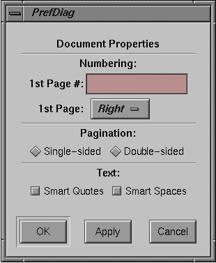
Example 8-1 lists the code used to create this preference dialog.
Example 8-1. Creating a ViewKit Preference Dialog
/////////////////////
//  DocPrefDiag.c++
/////////////////////

#include <Vk/VkApp.h>
#include <Vk/VkPrefDialog.h>
#include <Vk/VkPrefItem.h>
class DocPrefDialog: public VkPrefDialog {

 protected:

 VkPrefLabel *dialogName;
 VkPrefSeparator *sep1;
 VkPrefText *firstPageNumber;
 VkPrefOption *firstPageSide;
 VkPrefGroup *numberGroup;
 VkPrefSeparator *sep2;
 VkPrefToggle *paginSingleSide;
 VkPrefToggle *paginDoubleSide;
 VkPrefRadio *paginationGroup;
 VkPrefSeparator *sep3;
 VkPrefToggle *textQuotes;
 VkPrefToggle *textSpaces;
 VkPrefGroup *textGroup;
 VkPrefList *docList;

 static String _defaultResources[];
 virtual Widget createDialog(Widget parent);

 public:

 DocPrefDialog ( const char *name );
 ~DocPrefDialog();
 virtual const char* className();
};

String DocPrefDialog::_defaultResources[] = {
 “*dialogNameBase.labelString:	Document Properties”,
 “*numberGroupLabel.labelString:	Numbering:”,
 “*firstPageNumberLabel.labelString:	1st Page #:”,
 “*firstPageSideLabel.labelString:	1st Page:”,
 “*firstPageRight:			Right”,
 “*firstPageLeft:			Left”,
 “*paginationGroupLabel.labelString:	Pagination:”,
 “*paginSingleSideBase.labelString:	Single-sided”,
 “*paginDoubleSideBase.labelString:	Double-sided”,
 “*textGroupLabel.labelString:	Text:”,
 “*textQuotesBase.labelString:	Smart Quotes”,
 “*textSpacesBase.labelString:	Smart Spaces”,
 NULL
};

DocPrefDialog::DocPrefDialog ( const char *name ) : VkPrefDialog ( name )
{
 // Empty
}

Widget DocPrefDialog::createDialog(Widget parent) {

 setDefaultResources(parent, _defaultResources);

 VkPrefLabel *dialogName = new VkPrefLabel(“dialogName”);

 VkPrefSeparator *sep1 = new VkPrefSeparator(“sep1”);

 VkPrefText *firstPageNumber = new VkPrefText(“firstPageNumber”);

 VkPrefOption *firstPageSide = new VkPrefOption(“firstPageSide”, 2);
 firstPageSide->setLabel(0, “firstPageRight”);
 firstPageSide->setLabel(1, “firstPageLeft”);

 VkPrefGroup *numberGroup = new VkPrefGroup(“numberGroup”);
 numberGroup->addItem(firstPageNumber);
 numberGroup->addItem(firstPageSide);

 VkPrefSeparator *sep2 = new VkPrefSeparator(“sep2”);

 VkPrefToggle *paginSingleSide = new VkPrefToggle(“paginSingleSide”);
 VkPrefToggle *paginDoubleSide = new VkPrefToggle(“paginDoubleSide”);

 VkPrefRadio *paginationGroup = new VkPrefRadio(“paginationGroup”, TRUE);
 paginationGroup->addItem(paginSingleSide);
 paginationGroup->addItem(paginDoubleSide);

 VkPrefSeparator *sep3 = new VkPrefSeparator(“sep3”);

 VkPrefToggle *textQuotes = new VkPrefToggle(“textQuotes”);
 VkPrefToggle *textSpaces = new VkPrefToggle(“textSpaces”);

 VkPrefGroup *textGroup = new VkPrefGroup(“textGroup”, TRUE);
 textGroup->addItem(textQuotes);
 textGroup->addItem(textSpaces);

 VkPrefList *docList = new VkPrefList(“docList”);
 docList->addItem(dialogName);
 docList->addItem(sep1);
 docList->addItem(numberGroup);
 docList->addItem(sep2);
 docList->addItem(paginationGroup);
 docList->addItem(sep3);
 docList->addItem(textGroup);

 setItem(docList);

 Widget base = VkPrefDialog::createDialog(parent);

 return(base);
}

DocPrefDialog::~DocPrefDialog()
{
 // Empty
}

const char* DocPrefDialog::className()
{
 return “DocPrefDialog”;
}


void main ( int argc, char **argv )
{
 VkApp *app = new VkApp(“PrefDialogDemoApp”, &argc, argv);
 DocPrefDialog *docPrefs = new DocPrefDialog(“docPrefs”);

 docPrefs->show();
 app->run();
}
|
To post this dialog, you simply create an instance of the DocPrefDialog class and use one of the post() functions described in “Posting Dialogs”. For example:
DocPrefDialog *docPref = new DocPrefDialog("docPref");
// ...
docPref->post();
|
You can retrieve the value of a preference item with the getValue() function as described in “Getting and Setting Preference Item Values”. For example:
Boolean smartSpaces; // ... smartSpaces = docPref->textSpaces->getValue(); |
All preference items are derived from an abstract base class, VkPrefItem, which defines the structure of ViewKit preference items and provides a common set of manipulation functions.
Most preference items contain two top-level widgets: a base widget and a label widget. The base widget implements the preference items “control” mechanism (for example, a text field, an option menu, or a toggle button). The label widget (actually implemented as a gadget) displays a text label for the item.
The name of the base widget is the string “Base” appended to the name of the preference item as given in its constructor. The name of the label widget is the string “Label” appended to the name of the preference item as given in its constructor. So, if you create a VkPrefText object named “firstName,” the name of the base widget is “firstNameBase” and the name of the label widget is “firstNameLabel.”
To specify the string that is displayed as the label, you must set the XmNlabelString resource for the label widget. There are various ways to do this:
Use the VkComponent::setDefaultResources() function to provide default resource values. See “Creating Preference Dialog Subclasses” for information on using the setDefaultResources() function when you create a subclass of VkPrefDialog.
Set resource values in an external app-defaults resource file. Any values you provide in an external file will override values that you set using the VkComponent::setDefaultResources() function. This is useful when your application must support multiple languages; you can provide a separate resource file for each language supported.
Set the resource value directly using the XtSetValues() function. Values you set using this method override any values set using either of the above two methods. You should avoid using this method, because it “hard codes” the resource values into the code, making them more difficult to change.
The code fragment in Example 8-2 sets the labels for two VkPrefText items using the first method.
Example 8-2. Setting Default Resource Values for Preference Items
#include <Vk/VkPrefDialog.h>
#include <Vk/VkPrefItem.h>

class NameDialog: public VkPrefDialog {
  public:
    VkPrefText *firstName;
    VkPrefText *lastName;
    // ...

  protected:
    Widget createDialog(Widget)

  private:
    static String _defaultResources[];
    // ...
};

String NameDialog::_defaultResources[] = {
 "*firstNameLabel.labelString:  First Name:",
 "*lastNameLabel.labelString:   Last Name:",
};

Widget NameDialog::createDialog(Widget parent)
{
  setDefaultResources(mainWindowWidget(), _defaultResources);

  firstName = new VkPrefText("firstName");
  lastName = new VkPrefText("lastName");
  VkPrefList *nameList = new VkPrefList("nameList");
  // ...
}
|
Not all items display a label. VkPrefSeparator is an example of this type of preference item. Some preference items, such as VkPrefGroup, allow you to specify in the constructor whether or not you want to display a label for the item. The sections appearing later in this chapter that describe individual preference items discuss how each item uses its label widget.
Preference items that allow the user to input information—VkPrefText, VkPrefToggle, and VkPrefOption—have values associated with them. Each such item stores its own value internally. This value might or might not match the value currently displayed in the preference dialog. Because users can click the Cancel button to return all preferences to their last applied values, a preference item must not immediately store a new value that a user enters. Only when the user clicks the dialog's Apply or OK button do preference items update their internally stored values to match the values displayed on the screen.
Preference items provide a getValue() function that updates the internally-stored value with the currently displayed value and returns the updated value. The getValue() function is not actually declared in the VkPrefItem base class because different types of preference items use different types of values (for example, VkPrefToggle uses a Boolean value whereas VkPrefText uses a character string). Each preference item with an associated value provides its own definition of getValue().
The setValue() function allows you to programmatically set the internally stored value of a preference item. The setValue() function automatically updates the displayed value to reflect the new internal value. As with the getValue() function, setValue() is not actually declared in the VkPrefItem base class; each preference item with an associated value provides its own definition of setValue().
The VkPrefItem::changed() function checks to see whether or not the user has changed the value displayed on the screen so that it no longer matches the item's internally stored value:
virtual Boolean changed() |
If the value has changed, changed() returns the Boolean value TRUE; otherwise, it returns FALSE. You should use changed() as a test to determine whether or not you need to call getValue() for a preference item.
The activate() and deactivate() functions control whether or not a preference item is activated:
void activate() void deactivate() |
If the item is deactivated, the item is “grayed out” on the screen and the user cannot change the item's value. Call activate() to activate an item and deactivate() to deactivate an item.
Occasionally you might want to achieve certain effects by manually setting the height of a preference item's label or base widget. The setLabelHeight() and setBaseHeight() functions each accept as an argument an Xt Dimension value and respectively set the item's label and base widget to the given height:
void setLabelHeight(Dimension h) void setBaseHeight(Dimension h) |
The labelHeight() function returns the current height of the item's label widget, and the baseHeight() function returns the current height of the item's base widget, each expressed as an Xt Dimension value:
Dimension labelHeight() Dimension baseHeight() |
The labelWidget() function returns the item's label widget:
Widget labelWidget() |
labelWidget() returns NULL if an item does not have a label widget.
The type() function returns an enumerated value of type VkPrefItemType that identifies an item's type:
virtual VkPrefItemType type() |
Valid return values are: PI_group, PI_list, PI_radio, PI_text, PI_toggle, PI_option, PI_empty, PI_label, PI_separator, PI_custom, and PI_none.
The isContainer() function returns TRUE if the preference item is one used to group (or contain) other items:
virtual Boolean isContainer() |
Currently, isContainer() returns true for VkPrefGroup, VkPrefRadio, and VkPrefList items.
The following sections describe the preference item classes provided by ViewKit. In addition to specific member functions listed, each class also supports all functions provided by the VkPrefItem class.
The VkPrefText class supports text field preference items, allowing users to enter text strings. Figure 8-3 shows a simple preference dialog containing a text field preference item.
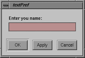
The VkPrefText constructor has the following form:
VkPrefText(const char *name, int columns = 5) |
The VkPrefText constructor expects as its first argument the name of the preference item. You can optionally provide as a second argument an integer value specifying the default number of columns for the text field.
For example, creating the text field shown in Figure 8-3 requires only this line:
VkPrefText *name = new VkPrefText("name");
|
To set the label for the text field you must set the XmNlabelString resource of the preference item's label widget. Therefore, to set the label as shown in Figure 8-3, you must set the resource:
*nameLabel.labelString: Enter your name: |
Refer to “Preference Item Labels” for more information on setting the label of a preference item.
Use the getValue() function to retrieve the internally-stored value of the text field:
char *getValue() |
getValue() duplicates the internal value and then returns a pointer to the duplicate string. (You should free this string when you no longer need it.) For example, the following line retrieves the value of the name text field shown above:
userName = name->getValue(); |
Use the setValue() function to programmatically set the value of the text field:
void setValue(const char *str) |
setValue() copies the string that you pass as an argument, sets the internally-stored value to that string, and updates the value displayed by the text field. For example, the following line sets the value of the name text field shown above to “John Doe”:
name->setValue("John Doe");
|
The VkPrefToggle class supports a single toggle button preference item. You can group multiple toggle buttons using a VkPrefGroup or VkPrefList item, and you can enforce radio-style behavior on a group of toggles by grouping them in a VkPrefRadio item. These classes are discussed later in this chapter.
Figure 8-4 shows a simple preference dialog containing a single toggle button preference item.
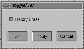
The VkPrefToggle constructor has the following form:
VkPrefToggle(const char *name, Boolean forceLabelFormat = FALSE) |
The first argument the VkPrefToggle constructor expects is the name of the preference item. For example, creating the toggle button shown in Figure 8-4 requires only the line:
VkPrefToggle *erase = new VkPrefToggle("erase");
|
You can provide an optional Boolean value as a second argument to the VkPrefToggle constructor. A TRUE value forces the VkPrefToggle object to create and use a label widget as described in “Preference Item Labels”. Otherwise, if the value is FALSE, the behavior of the label is determined as described below in “Setting Toggle Preference Item Labels.” The default value is FALSE.
Setting the label for a toggle preference item is more complex than with other preference items. Unlike many of the other preference items, the ToggleButton widget that is the base widget of the VkPrefToggle item includes a text label. Therefore, to set that label, you must set the XmNlabelString resource of the preference item's base widget instead of its label widget. For example, to set the label as shown in Figure 8-4, you must set the resource:
*eraseBase.labelString: History Erase |
This works for all cases except for when a toggle is an item in a vertical VkPrefGroup or VkPrefRadio item that contains items other than toggles. (A group that contains more than one type of preference item is a non-homogenous group; a group that contains only one type of preference item is a homogenous group.) To understand why this is done, consider first a simple vertical VkPrefGroup containing only two toggle buttons, as shown in Figure 8-5. In this case, the labels appear to the right side of the buttons as they normally do.
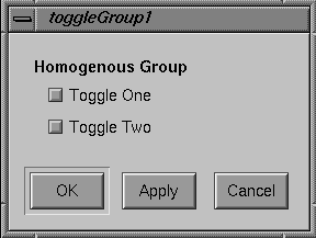
When toggle items appear in a homogenous group like the one shown in Figure 8-5, you should set the XmNlabelString resources for the base widgets of the toggle items. For example:
*firstToggleBase.labelString: Toggle One *secondToggleBase.labelString: Toggle Two |
However, the labels for most other preference items appear to the left of the items. Left uncorrected, if a vertical, non-homogenous VkPrefGroup or VkPrefRadio contained a toggle item, the label for the toggle would not align with the other labels.
Therefore, in the case of a non-homogenous vertical VkPrefGroup or VkPrefRadio, ViewKit sets the XmNlabelString resource of all toggle items' base widgets to NULL and instead displays their label widgets. The result is that all of the preference items' labels correctly align, as shown in Figure 8-6.
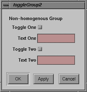
When toggle items appear in a non-homogenous, vertical group like the one shown in Figure 8-6, you should set the XmNlabelString resources for the label widgets of the toggle items rather than the base widgets. For example:
*firstToggleLabel.labelString: Toggle One *secondToggleLabel.labelString: Toggle Two |
Note that if you provide the Boolean value TRUE as a second argument to the VkPrefToggle constructor, the VkPrefToggle object always creates and uses a label widget instead of using the base widget's text label.
Refer to “Preference Item Labels” for more information on setting the label of a preference item.
Use the getValue() function to retrieve the Boolean value of the toggle:
Boolean getValue() |
For example, the following line retrieves the value of the firstToggle toggle shown above:
toggleSet = firstToggle->getValue(); |
Use the setValue() function to programmatically set the value of the toggle:
void setValue(Boolean value) |
setValue() sets the internally-stored value to the Boolean value you pass as an argument, and updates the value displayed by the toggle. For example, the following line sets the value of the secondToggle toggle shown above to TRUE:
secondToggle->setValue(TRUE); |
The VkPrefOption class supports option menu preference items, allowing users to choose an option from a menu. Figure 8-7 shows a simple preference dialog containing an option menu preference item.
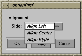
The VkPrefOption constructor has the following form:
VkPrefOption(const char *name, int numEntries) |
The VkPrefOption constructor expects as its first argument the name of the preference item. The second argument is an integer value specifying the number of entries in the option menu.
For example, you can create the option menu shown in Figure 8-7 with this line:
VkPrefOption *align = new VkPrefOption("align", 3);
|
To set the label for the option menu, you must set the XmNlabelString resource of the preference item's label widget. Therefore, to set the label as shown in Figure 8-7, you must set the resource as follows:
*alignLabel.labelString: Alignment |
Refer to “Preference Item Labels” for more information on setting the label of a preference item.
To set the labels for the individual items in the option menu, use the setLabel() function:
void setLabel(int index, const char *label) |
setLabel() expects two arguments. The first is an integer value specifying the index of the of the menu item. Menu items are numbered starting with 0.
The second setLabel() argument is a character string. This string is first treated as a resource name which is looked up relative to the menu item's widget. If the resource value exists, it is used as the label. If no resource is found, or if the string contains spaces or newline characters, the string itself is used as the label.
For example, the following lines directly set the labels for the option menu items shown in Figure 8-7:
align->setLabel(0, "Align Left"); align->setLabel(1, "Align Center"); align->setLabel(2, "Align Right"); |
On the other hand, the following lines set the labels using resource values:
align->setLabel(0, "alignLeft"); align->setLabel(1, "alignCenter"); align->setLabel(2, "alignRight"); |
In the second case, you would also have to set the appropriate resource values. You could do so using the setDefaultResources() function, or you could include the following lines in a resource file:
*align*alignLeft: Align Left *align*alignCenter: Align Center *align*alignRight: Align Right |
You can retrieve the label for a given item using the getLabel() function:
char *getLabel(int index) |
index is the index of the menu item.
 | Note: getLabel() returns the same string that you passed to setLabel() when setting the item's label. Therefore, if you set the item's label by specifying a resource name, getLabel() returns the resource name, not the value of the resource. |
In the VkPrefOption constructor, you must provide an argument specifying the number of elements in the option menu. However, after creating an option menu preference item, you can resize it as needed using the setSize() function:
void setSize(int numEntries) |
setSize() accepts an integer argument specifying the new size of the option menu. If the new size is smaller than the old size, setSize() automatically deletes all unneeded widgets. If the new size is larger, setSize() automatically creates and manages any additional widgets needed.
You can determine the current size of an option menu preference item using the size() function:
int size() |
You can access any of the button widgets contained in the option menu with the getButton() function:
Widget getButton(int index) |
Simply specify the index of the button you want and getButton() returns the appropriate widget.
Use the getValue() function to retrieve the internally stored value of the option menu:
int getValue() |
getValue() returns an integer value specifying the index of the chosen menu entry. For example, the following line retrieves the value of the align text field shown above:
alignment = align->getValue(); |
Use the setValue() function to programmatically set the value of the option menu:
void setValue(int index) |
setValue() sets the internally stored value to the index value you pass as an argument, and updates the value displayed by the option menu. For example, the following line sets the value of the alignment text field shown above to 1, corresponding to the “Align Center” option:
align->setValue(1); |
The VkPrefLabel class supports text labels for preference dialogs.
| Note: VkPrefLabel is useful only in conjunction with VkPrefList. You should not use VkPrefLabel with either VkPrefGroup or VkPrefRadio; VkPrefLabel does not create a label widget and therefore it does not align properly with other items contained in a VkPrefGroup or VkPrefRadio item. |
Figure 8-8 shows a simple preference dialog containing a label preference item.
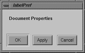
The only argument the VkPrefLabel constructor expects is the name of the preference item:
VkPrefLabel(const char *name) |
For example, creating the label shown in Figure 8-8 requires only this line:
VkPrefLabel *dialogName = new VkPrefLabel("dialogName");
|
Many other ViewKit preference items include label widgets in addition to their base widget; however, in the case of the VkPrefLabel item, the label is the base widget. Therefore, in preference item groups, a VkPrefLabel item aligns with other base widgets, not with other label widgets.
Because the label that is displayed for a VkPrefLabel item is the base widget, you set the label's text by setting the XmNlabelString resource of the item's base widget. Therefore, to set the label as shown in Figure 8-8, you must set the resource as follows:
*dialogNameBase.labelString: Document Properties |
Refer to “Preference Item Labels” for more information on setting the label of a preference item.
The VkPrefSeparator class supports a simple separator for use in preference dialogs.
| Note: VkPrefSeparator is useful only in conjunction with VkPrefList. You should not use VkPrefSeparator with either VkPrefGroup or VkPrefRadio; VkPrefSeparator does not create a label widget and therefore it does not align properly with other items contained in a VkPrefGroup or VkPrefRadio item. |
The only argument the VkPrefSeparator constructor expects is the name of the preference item:
VkPrefSeparator(const char *name) |
For example:
VkPrefSeparator *sep = new VkPrefSeparator("sep");
|
The VkPrefEmpty class provides a “null” item that you can use to add extra space between other items. This preference item is useful only in conjunction with one of the grouping preference items: VkPrefGroup, VkPrefRadio, or VkPrefList.
The VkPrefEmpty constructor accepts no arguments:
VkPrefEmpty() |
For example:
VkPrefEmpty *space = new VkPrefEmpty(); |
ViewKit provides three classes for creating groups of items: VkPrefGroup, VkPrefRadio, and VkPrefList. Both VkPrefRadio and VkPrefList are implemented as subclasses of VkPrefGroup.
VkPrefGroup defines a group of related items. You can specify either vertical or horizontal layout; the default is vertical. With a vertical layout, VkPrefGroup pads items so that they take equal space. You have the option of displaying a label for the group.
Figure 8-9 shows an example of a vertical VkPrefGroup item with a label. The label is the group item's label widget, not a VkPrefLabel item. The VkPrefGroup item right-aligns the labels for all of the items it contains. (Because the VkPrefToggle items are part of a non-homogenous VkPrefGroup item, you must set the XmNlabelString resources of their label widgets instead of their base widgets, as described in “Setting Toggle Preference Item Labels”.) Also, all items are allocated the same amount of vertical space. If you were to add a larger item to this group, the group item would allocate for each item the same amount of vertical space.
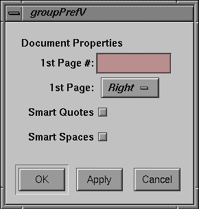
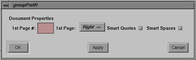
Figure 8-10 shows the same preference items grouped by a horizontal VkPrefGroup item with a label.
VkPrefList is similar to VkPrefGroup; however, it supports only a vertical orientation and it does not support displaying a group label. Unlike VkPrefGroup, VkPrefList does not pad its items so that they take equal space; instead, each item takes only as much space as it needs. Typically, you use a VkPrefList item to group other group items. For example, in Example 8-1, the top-level VkPrefList item contained a VkPrefLabel item and two VkPrefGroup items—one vertical and one horizontal—separated by two VkPrefSeparator items.
VkPrefList is also the only grouping item to which you should add VkPrefLabel or VkPrefSeparator items. You should not use VkPrefLabel or VkPrefSeparator with either VkPrefGroup or VkPrefRadio; they do not create label widgets and therefore do not align properly with other items contained in a VkPrefGroup or VkPrefRadio item.
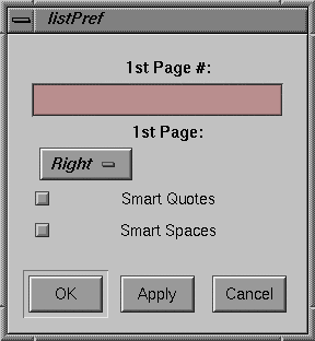
Figure 8-11 shows an example of a VkPrefList. Note that the VkPrefList item does not contain a group label; if you want to provide a label for a VkPrefList item, you can include a VkPrefLabel item in it. Also note that the VkPrefList item does not align the labels of the items it contains. (Because the VkPrefToggle items are part of a VkPrefList item, you must set the XmNlabelString resources of their base widgets instead of their label widgets, as described in “Setting Toggle Preference Item Labels”.) Each item is allocated only as much vertical space as it needs. If you were to add a larger item to this group, it would not affect the vertical spacing of the other items.
VkPrefRadio is almost identical to VkPrefGroup except that you use it only for enforcing radio-style behavior on the VkPrefToggle items that it contains. You should add only VkPrefToggle items to a VkPrefRadio item. Otherwise, VkPrefRadio supports the same functionality as VkPrefGroup.
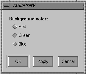
Figure 8-12 shows an example of a vertical VkPrefRadio item with a label. The label is the group item's label widget, not a VkPrefLabel item. Because the VkPrefToggle items are part of a homogenous VkPrefRadio item, you must set the XmNlabelString resources of their base widgets instead of their label widgets, as described in “Setting Toggle Preference Item Labels”.
The VkPrefGroup constructor has the following form:
VkPrefGroup(const char *name,
            Boolean horizOrientation = FALSE,
            Boolean noLabel = FALSE)
|
The VkPrefGroup constructor expects as its first argument the name of the preference item. The second argument is an optional Boolean value that determines the orientation of the group; FALSE, the default value, specifies a vertical orientation and TRUE specifies a horizontal orientation. The third argument is an optional Boolean value that determines whether or not to display a label for the group; FALSE, the default value, specifies that the group should display the label and TRUE specifies that the group should not display the label.
For instance, Example 8-1 contained the following constructor:
VkPrefGroup *numberGroup = new VkPrefGroup("numberGroup");
|
This created a new VkPrefGroup item named “numberGroup” with a vertical orientation and a visible label. Example 8-1 also contained the following constructor:
VkPrefGroup *horizGroup = new VkPrefGroup("horizGroup",
                                          TRUE, TRUE);
|
This created a new VkPrefGroup item named “horizGroup” with a horizontal orientation and no visible label.
The VkPrefRadio constructor accepts the same arguments as the VkPrefGroup constructor:
VkPrefRadio(const char *name,
            Boolean horizOrientation = FALSE,
            Boolean noLabel = FALSE)
|
For instance, Example 8-1 contained the following constructor:
VkPrefRadio *paginationGroup = new VkPrefRadio("paginationGroup");
|
This created a new VkPrefRadio item named “paginationGroup” with a vertical orientation and a visible label.
VkPrefList accepts only one argument, a character string specifying the name of the item:
VkPrefList(const char *name) |
As noted earlier, all VkPrefList items have a vertical orientation and do not display a label. Example 8-1 created a VkPrefList item as the top-level preference item to contain all other preference items:
VkPrefList *docList = new VkPrefList("docList");
|
After creating a group item, you can add other items to it with the addItem() function:
void addItem(VkPrefItem *item) |
Preference items appear in the order in which you add them. Example 8-1 added five preference items to the docList preference item:
docList->addItem(dialogName); docList->addItem(sep1); docList->addItem(numberGroup); docList->addItem(sep2); docList->addItem(horizGroup); |
Once you have added items to a group item, you can access an individual child item with the item() function:
VkPrefItem *item(int item) |
Simply provide an integer index value as an argument and item() returns a pointer to the desired preference item. The numbering of preference items within a group begins with 0, so to retrieve a pointer to the numberGroup item added above to docList, you could use the line:
item = docList->index(2); |
The size() function returns the number of preference items currently associated with a group item:
int size() |
The deleteChildren() function deletes all the items contained by a group item:
virtual void deleteChildren() |
Note that this function does not just disassociate the items from the parent group item, it actually deletes the items. This is useful for freeing memory in a destructor. ViewKit does not provide any means of disassociating preference items without deleting them or of deleting individual items in a group. This should not pose a problem as most applications create preference dialogs at startup and almost never need to modify them afterwards.
The group preference items provide a changed() function just like all other preference items; however, changed() operates differently with group items than it does with individual preference items. In group items, changed() calls the changed() functions of all child items in the group and returns TRUE if any of the child items have changed.
To set the label for a VkPrefGroup or VkPrefRadio item, you must set the XmNlabelString resource of the preference item's label widget. (Remember that VkPrefList items do not display labels.) Example 8-1 illustrated this by setting the labels for numerous group items:
*numberGroupLabel.labelString: Numbering: *paginationGroupLabel.labelString: Pagination: *textGroupLabel.labelString: Text: |
Refer to “Preference Item Labels” for more information on setting the label of a preference item.
The base preference dialog class, VkPrefDialog, is a subclass of VkGenericDialog, which is in turn a subclass of VkDialogManager. Thus, the VkPrefDialog class inherits all of the functions and data members provided by these base classes. For example, you post preference dialogs using the various post() variants, you set a preference dialog's title using the setTitle() function, and you set its button labels using the setButtonLabels() function.
Unlike the other dialog classes, VkPrefDialog does not create a global instance of a preference dialog. Instead, you must create a separate instance of VkPrefDialog for each preference dialog that you want to display in your program. For very simple preference dialogs (for example, just a few toggle buttons), you might be able to directly instantiate a VkPrefDialog object; however, in most cases you should create a separate subclass of VkPrefDialog for each preference dialog in your application. This is described in “Creating Preference Dialog Subclasses”.
The form of the VkPrefDialog constructor is as follows:
VkPrefDialog(const char *name, VkPrefItem *item = NULL) |
The VkPrefDialog constructor expects as its first argument the name of the preference dialog. The second argument is an optional pointer to a preference item that the dialog should use as the top-level preference item. See “Setting the Preference Items for a Preference Dialog” for more information on setting the top-level preference item.
For example, the following line creates a preference dialog named “simplePref”:
VkPrefDialog *simplePref = new VkPrefDialog("simplePref");
|
A preference dialog can have only one top-level preference item. In most cases, you use a group item such as VkPrefList as the top-level item.
As described in “Creating a Preference Dialog”, you can set the top-level preference item in the VkPrefDialog constructor. You can also set the top-level item with the setItem() function:
void setItem(VkPrefItem *item) |
| Note: If the preference dialog already has a top-level preference item associated with it, setItem() replaces that item with the new item, but does not delete the old item. This allows you to reuse the old preference item later. |
For example, the following line sets the item docList as the top-level item of the preference dialog simplePref:
simplePref->setItem(docList); |
The item() function returns a pointer to the top-level item associated with a preference dialog:
VkPrefItem *item() |
You post preference dialogs using any of the various post() variants provided by the base ViewKit dialog classes. You should not pass a message string argument to the post() function when posting a preference dialog.
For example, the following line posts the simplePref dialog as a non-modal, non-blocking dialog:
simplePref->post(); |
You should rarely have to unpost a preference dialog programmatically. ViewKit automatically dismisses a preference dialog when the user clicks either the OK or Cancel button. If for some reason you do need to unpost a preference dialog from your program, use the unpost() function.
When the user clicks the OK or Apply button on a preference dialog, the dialog automatically applies any change of values to the preference dialog's items by setting the items's internally-stored values so that they match whatever is currently displayed on the screen. If the user clicks the OK button, the preference dialog calls its hide() function to remove itself from the screen. If the user clicks on the Apply button, the preference dialog remains visible on the screen.
When the user clicks the Cancel button on a preference dialog, the dialog automatically resets all of the dialog's preference items's on-screen values so that they match the items's internally-stored values. Additionally, the preference dialog calls its hide() function to remove itself from the screen.
The VkPrefDialog class also supplies a ViewKit member function callback named prefCallback. The preference dialog activates this callback whenever the user clicks the dialog's Apply, OK, or Cancel button. The callback passes as call data an enumerated value of type VkDialogReason, which is defined in VkDialogManager. The value can be any of VkDialogManager::OK, VkDialogManager::APPLY, or VkDialogManager::CANCEL, corresponding to the button that the user clicked. To notify components in your application when the user changes preferences associated with a preference dialog, register member functions with this ViewKit callback.
| Note: When the user clicks the OK button, ViewKit first updates the preference items's internally stored values and activates the prefCallback callback with VkDialogManager::APPLY as the call data. Then, ViewKit activates the prefCallback callback with VkDialogManager::OK as the call data. In some ways, this is analogous to an Motif pushbutton performing an activate() action followed by a disarm() action when a user clicks it. You can use this feature to perform certain actions whenever the user updates preference values by clicking either the Apply or OK button, and a separate set of actions when the user dismisses the preference dialog by clicking the OK button. |
For example, consider a window, myWindow, that is a member of the subclass MyWindow, derived from VkWindow. In this example, assume that there is a preference dialog, displayPrefs, that is a member of the subclass DisplayPrefDialog, derived from VkPrefDialog, that allows the user to specify certain display parameters such as the font. myWindow could register its member function MyWindow::fontChanged() to be called whenever the user clicks a button in the preference dialog displayPrefs, by using the following line of code:
displayPrefs->addCallback(VkPrefDialog::prefCallback,
                  this,
                  (VkCallbackMethod) &MyWindow::fontChanged);
|
When MyWindow::fontChanged() is called, it checks to see if any of the parameters in which it is interested have changed and, if so, performs whatever processing is needed. For example:
void MyWindow::fontChanged(VkComponent *obj,
                           void *clientData,
                           void *callData)
{
  DisplayPrefDialog *dialog = (DisplayPrefDialog*) obj;
  MyWindow *win = (MyWindow*) clientdata;
  VkDialogManager::VkDialogReason reason =
                  (VkDialogManager::VkDialogReason) callData;
  // If the user clicked Cancel, nothing changed
  if (reason == VkDialogManager::CANCEL)
    return;
  // Now process new preference values as needed ...
}
|
To retrieve the value of a preference item, simply call that item's getValue() function.
This implies that preference items must be accessible to all components that need to use the preference values. For example, if you create a subclass for a preference dialog, declare as “public” those preference items that you want to access outside of the dialog.
Example 8-3 shows the header for a NamePref subclass in which two preference items, firstName and lastName, are declared “public.” These two preference items can be accessed by other components in the applications.
Example 8-3. Declaring Preference Items Publicly Accessible
class NamePref: public VkPrefDialog {

  protected:
    VkPrefGroup *nameGroup;

    static String _defaultResources[];
    virtual Widget createDialog(Widget parent);

  public:
    VkPrefText *firstName;
    VkPrefText *lastName;

    NamePref ( const char *name );
    ~NamePref();
    virtual const char* className();
};
|
The NamePref subclass also contains a group, nameGroup, which is declared “protected.” In most cases, outside components would not need to access a group item. One case in which it could be useful to make a group item publicly accessible is if you want other components to be able to activate and deactivate a group of preference items by calling the activate() and deactivate() functions on that group item.
The preferred method of handling preference dialogs in ViewKit applications is to create a separate subclass for each preference dialog in the application. Properly designed, a preference dialog can serve as a self-contained component that you can use in multiple applications.
The first step in creating a preference dialog subclass is to decide what preference items to include. List all of the information you want to be able to set with the preference dialog and determine which preference item class is appropriate for each item. For example, an item requiring text input is an obvious candidate for a VkPrefText item. However, an item allowing the user to choose one of several options can be handled by either a single VkPrefOption item or a number of VkPrefToggle items grouped with a VkPrefRadio item. Presumably, you want all of these preference items to be accessible outside of the preference dialog, so you want to declare these items in the “public” section of your class declaration.
Then determine the layout you want for the preference dialog. You should group similar items together so that a user can easily find and set related items. The layout determines what group items you need. Usually, you can define these items in the “private” or “protected” section of your class declaration; however, in some cases, you might want to declare some groups as “public.” For example, you might want to be able to activate and deactivate a group of preference items by calling the activate() and deactivate() functions on that group item.
Then determine how you want to “publicize” changes in preference items to other components in your application. In many cases, those components can simply call the getValue() functions for appropriate items as needed. However, some components need to be notified immediately whenever certain preference items change. In most cases, these components can register ViewKit member function callbacks with the preference dialog that are called whenever the user clicks one of the dialog's buttons. The components can then test for changes in preference item values in their callback functions and react accordingly.
In some cases, you might need to perform special processing when the user clicks one of the preference dialog's buttons. In that case, you can override the default ok(), apply(), or cancel() function for the dialog. These functions are called whenever the user clicks the corresponding button. In your override definition, you should perform whatever processing is needed and then call the base VkPrefDialog::ok(), VkPrefDialog::apply(), of VkPrefDialog::cancel() function as appropriate.
Usually you should also provide a set of default resource values to serve as labels for all the dialog's preference items. To do so, you must override the createDialog() function, which creates and manages all of the widgets in a preference dialog. Your preference dialog's createDialog() function must perform the following tasks, in order:
Call setDefaultResources() to set the dialog's default resources.
Create all preference items for the dialog.
Set the dialog's top-level item using the setItem() function.
Call the base VkPrefDialog::createDialog() function to create the dialog.
Pass the dialog's base widget, returned by VkPrefDialog::createDialog(), as the return value of createDialog().
Example 8-1 shows a complete example of a preference dialog subclass. You could include DocPrefDialog dialogs in any application that needed to set various document parameters.