This appendix gives you an idea of how you can expand ViewKit by describing some ViewKit classes that users have contributed. These classes are not supported by Silicon Graphics, and their interfaces might change in future ViewKit releases.
The VkMeter class supports simple compound bar charts, displayed in either vertical or horizontal mode. If you display multiple values, the data is presented in layers, with the bar representing the second value starting where the first value ends.
The VkMeter accepts the standard ViewKit component constructor arguments: a component name and a parent widget:
VkMeter(const char *name, Widget parent) |
You should rarely need to create subclasses of VkMeter.
The VkMeter destructor frees all space associated with the meter:
~VkMeter() |
Before adding any items for display to a VkMeter object, you must call VkMeter::reset() to reset the meter:
void reset(int peak = -1) |
The first value, peak, sets the initial peak value displayed by the meter. All items displayed by the meter are scaled relative to the peak value. For example, if the peak value is 200 and one of your items is 40 units long, that item will be scaled to take 20% of the meter's total length. The default peak size is 100 units.
 | Note: To change meter values or otherwise update a meter object, you must call reset() and then add the items to the meter again. |
You add items for a VkMeter object to display with VkMeter:add():
void add(int value, char *color) void add(int value, Pixel pixel) void add(int value, int width, char *color) void add(int value, int width, Pixel pixel) |
The value argument is the item's value. When displayed, the VkMeter class scales this value relative to the peak value set by reset(). For example, if the peak value is 500 and one of your items is 80 units long, that item will be scaled to take 16% of the meter's total length.
When you use these forms of the add() function, the VkMeter object displays the items sequentially. For example, if you have set the peak value to 100 and you add three items with values of 20, 10, and 30 in that order, the meter displays three bars: the first ranging from 0 to 20, the second from 20 to 30, and the third from 30 to 60.
All data items must have an associated color. You can specify the color as a Pixel value, pixel, or as a string, color. If you provide a string, add() first treats the string as the name of a resource that add() looks up relative to the component and converts to the desired color. If add() finds no such resource, it uses the string itself as the name of a color. For example, the following adds an item with the color “red”:
add(10, "red"); |
The following adds an item with the color specified by the resource name “criticalColor”:
add(20, "criticalColor"); |
You can specify the width of an item by providing a width argument, expressed in pixels. If you do not provide a width, the width of the item is the same as the width of the meter.
Two more complex forms of add() allow you to precisely control the position of bars in a meter, and even display bars side by side:
void add(int start, int size, int sideValue, int width, char *color)
void add(int start, int size, int sideValue, int width,
         Pixel color)
|
In these forms of add(), the first value, start, specifies the starting position of the bar, and the second value, size, specifies the size (length) of the bar. VkMeter scales these values relative to the peak value set by reset(). The third argument, sideValue, and the fourth argument, width, specify values in the opposite dimension. VkMeter does not scale these values relative to the meter's peak value.
For example, consider a meter with a peak value of 100. The following lines add four bars to the meter:
add(0, 20, 0, 10, "red"); add(0, 20, 10, 10, "blue"); add(0, 20, 20, 10, "green"); add(20, 20, 0, 30, "yellow"); |
If you display this meter vertically, it shows three vertical bars ranging from 0 to 20 side by side in red, blue, and green. Above them is a yellow bar spanning all of them and ranging from 20 to 40.
After adding all items to a meter, call the VkMeter::update() function to update the meter's display:
void update() |
| Note: Remember that if you want to change the meter display, you must first call reset() and then add each item in the new display. |
The meter you create can have a fixed size or it can attempt to resize itself dynamically as it requires more or less room to display the items it contains. You can specify the meter's resize policy with VkMeter::setResizePolicy():
void setResizePolicy( unsigned char policy ) |
You can provide any of the following values:
| XmRESIZE_NONE |
| |
| XmRESIZE_GROW |
| |
| XmRESIZE_ANY |
|
You can determine the dimensions that a meter needs to display itself completely by calling VkMeter::neededWidth() and VkMeter::neededHeight():
Dimension neededWidth() Dimension neededHeight() |
The following X resources are associated with the VkMeter class:
| XmNorientation |
| |
| XmNresizePolicy |
| |
| XmNdrawBorder |
|
The VkPie class is derived from VkMeter and displays data in the same way as that class. However, rather than displaying the values as a bar chart, the VkPie class displays the data as a pie chart. See “ViewKit Meter Component” for a description of VkMeter.
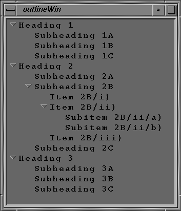
The VkOutline component, derived from VkComponent, displays a textual outline. VkOutline automatically indents items according to their depth in the outline. Figure A-1 shows an example of a VkOutline component containing three top-level items, each with several subitems.
| Note: VkOutline utilizes VkList and SgList which are undocumented and unsupported for external use. |
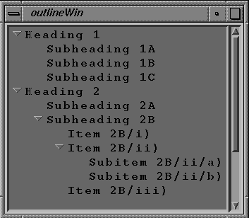
If there is not sufficient space to display the entire outline, the VkOutline component automatically displays a scrollbar, as shown in Figure A-2.
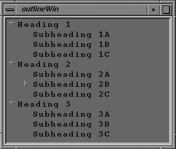
The VkOutline component displays a control icon to the left of each outline item that contains subitems. The control icon denotes whether the sub-tree under the item is displayed (open) or not (closed). The user can click the left mouse button on the control icon to toggle between the open and closed states. Figure A-3 shows the results of closing the item “Subheading 2B,” shown in the previous figure.
The VkOutline constructor accepts the standard ViewKit component constructor arguments: a component name and a parent widget:
VkOutline (const char *name, Widget parent) |
You can add items to the outline in a simple parent-child relation with VkOutline::add():
void add(char* parentName, char* childName) |
The actions performed by add() depend on whether either or both of the items already exist in the outline:
If both items already exist in the outline, add() does nothing.
If neither exists, add() creates parentName as a top-level item in the outline and then creates childName as a subitem of parentName.
If parentName already exists but childName does not, add() creates childName as a subitem of parentName.
If childName exists and parentName does not, and childName is a top-level item, add() “reparents” childName by adding parentName as a top-level item and moving childName in the outline so that it is a subitem of parentName.
If childName exists and parentName does not, but childName is not a top-level item, add() does nothing.
parentName and childName are used both as item names and as the text displayed in the outline. Note that you must use unique names for each item in the outline.
You can add multiple subitems to an existing item using VkOutline::addChildren():
void addChildren(char** parentPath, char** childNames)

void addChildren(char** parentPath, char** childLabels,
                 char** childNames, void** childData)
|
The character string array parentPath specifies the complete path of the parent item through the outline. The first element of the parentPath array is the name of the topmost item of the outline containing the specified item, the second element is the name of the second-highest item, and so on, with the name of the item itself appearing last. You must NULL-terminate the array.
The character string array childNames contains the names of the subitems to add to the specified parent item. Note that you must use unique names for each item in the outline.
In the second form of addChildren(), you can provide childLabels, an array of character strings that provide display labels for the subitem you add. VkOutline displays these labels for the items instead of the item names.
In the second form of addChildren(), you can also provide childData, an array of pointers to arbitrary data. You can retrieve a pointer to the data associated with an item using VkOutline::getHookAt(), described in “Outline Utility and Access Functions”. Usually you need to use this data only if you create a subclass of VkOutline. In a subclass, you can add callbacks so that when the user selects an outline item, you can retrieve the data associated with that item and perform some action.
VkOutline::createPath() creates or extends a path in the outline:
void createPath(char** itemLabels, char** itemNames) |
The character string array itemNames specifies a path through the outline. The first element of the itemNames array is the name of the topmost item of the outline containing the specified item, the second element is the name of the second-highest item, and so on, with the name of the item itself appearing last. You must NULL-terminate the array.
If path does not exist, then createPath() creates a new set of items with the first element in the path as the top-level item, the second element a subitem of the first, and so on. If createPath() finds a partial match in the existing outline, where the first element of itemNames matches the name of an existing top-level item and one or more lower-level items match succeeding elements of itemNames, createPath() adds those items needed to fully extend the path.
For those items that createPath() adds, it uses the corresponding elements from the itemLabels character string array as the display labels for those items. VkOutline displays these labels for the items instead of the item names.
| Note: createPath() does not alter the labels for any existing items. createPath() uses the labels only when adding new items. |
Whenever you add items to the outline, no matter which function you use to add them, you must call VkOutline::displayAll() to update the outline display:
void displayAll() |
VkOutline allows you to designate items as “keywords” and display them in a different foreground or background color, and/or font. You can also define up to four custom item highlights, each with its own foreground and background colors, and font attributes.
Use VkOutline::setKeywordAttributes() to define the keyword display attributes:
void setKeywordAttributes(Pixel fg, Pixel bg, XmFontList font) |
fg is the foreground color for the item's text. bg is the background color for the item. font is the font used to display the item's text.
Use VkOutline::displayAsKeyword() to display an item with the keyword display attributes:
void displayAsKeyword(char** path) |
You specify the complete path of the item through the outline as an array of character strings. The first element of the path array is the name of the topmost item of the outline containing the specified item, the second element is the name of the second-highest item, and so on, with the name of the item itself appearing last. You must NULL-terminate the array. Note that displayAsKeyword() requires the item names, not their display labels.
Use VkOutline::setHighlightAttributes() to define the display attributes of a custom highlight:
int setHighlightAttributes(Pixel fg, Pixel bg, XmFontList font) |
fg is the foreground color for the item's text. bg is the background color for the item. font is the font used to display the item's text. setHighlightAttributes() returns an integer identifier for the highlight. You use this identifier to apply the highlight to outline items with the highlight() function described below. If setHighlightAttributes() could not allocate a custom highlight, it returns 0.
Use VkOutline::highlight() to display one or more items with display attributes of a custom highlight:
void highlight(int itemPos, int attribID) void highlight(char** items, int attribID) |
In the first form of highlight(), you specify the position index in the outline of the item you want to highlight. Items are numbered sequentially from the top of the outline starting with zero. attribID is the attribute identifier returned by setHighlightAttributes() of the custom highlight that you want to assign to the items.
In the second form of highlight(), items is an array of strings specifying the names of the items to highlight. Note that highlight() requires the item names, not their display labels. Again, attribID is the attribute identifier (returned by setHighlightAttributes()) of the custom highlight that you want to assign to the items.
You cannot remove a custom highlight from individual items; you can only remove the highlight from all items to which you have applied it. VkOutline::unhighlight() removes a custom highlight:
void unhighlight(int attribID) |
attribID is the attribute identifier (returned by setHighlightAttributes()) of the custom highlight that you want to assign to the items.
You can programmatically toggle an outline item open or closed with VkOutline::toggleChildren():
virtual void toggleChildren(int position) |
position is the item's position in the SgList widget. Items are numbered sequentially from the top of the outline starting with zero.
You can determine the effects of the last toggle operation, whether a result of user interaction or a call to toggleChildren(), by calling VkOutline::effectOfLastToggle():
int effectOfLastToggle(int& from, int& count) |
If the last toggle operation opened an item (and therefore inserted items into the SgList widget), effectOfLastToggle() returns 1, sets the value of from to the position of the toggled item in the list, and sets the value of count to the number of items displayed by opening the item. If the last toggle operation closed an item (deleting items from the SgList widget), effectOfLastToggle() returns 0, sets the value of from to the position of the toggled item in the list, and sets the value of count to the number of items deleted from the list by closing the item.
You can determine whether a given item is closed with VkOutline::isPathClosed():
int isPathClosed(char** path) |
The character string array path specifies the complete path of the item through the outline. The first element of the path array is the name of the top-most item of the outline containing the specified item, the second element is the name of the second-highest item, and so on, with the name of the item itself appearing last. You must NULL-terminate the array.
isPathClosed() returns 1 if the item is closed, 0 if the item is open, and -1 if the item has no subitems.
VkOutline provides the following utility and access functions:
void setIndentationWidth(int width) |
VkOutline::setIndentationWidth() sets indentation width for future displays. The indentation width is the number of pixels to the right that the outline offsets a child item from its parent item:
void printTree() |
VkOutline::printTree() prints the outline on the application's standard output:
void reset() |
VkOutline::reset() re-initializes the outline, deleting all items. reset() retains any display attributes you created:
Widget listWidget() |
VkOutline::listWidget() returns the widget ID of the SgList widget that the VkOutline uses to display the outline:
void select(int position) |
VkOutline::select() selects the string displayed at the given position of the SgList widget:
void getHookAt(int position) |
VkOutline::getHookAt() retrieves the pointer to the data associated with an item given the item's position in the SgList widget. This is the data that you provided as the childData argument to addChildren() (see “Adding Items to an Outline”).
Usually, you need to use this data only if you create a subclass of VkOutline. In a subclass, you can add callbacks to the SgList widget so that when the user selects an outline item, you can retrieve the data associated with that item and perform some action.
The VkOutlineASB class, a subclass of VkOutline, provides the same functionality as VkOutline except that it uses an annotated scrollbar. With VkOutlineASB, you can display colored bars in the scrollbar to indicate the positions of highlighted items in the outline.
All functions that VkOutlineASB inherits from VkOutline operate identically. VkOutlineASB provides one additional function, VkOutlineASB::setAnnotation():
void setAnnotation(int attribID, Boolean state) |
setAnnotation() determines whether or not the scrollbar displays annotations for a given display highlight. attribID is the attribute identifier returned by setHighlightAttributes() of a particular custom highlight. If state is TRUE, the scrollbar displays annotations for the given display highlight; if state is FALSE, the scrollbar does not display annotations for the given display highlight.