There are several windows that are used primarily to examine your program's data:
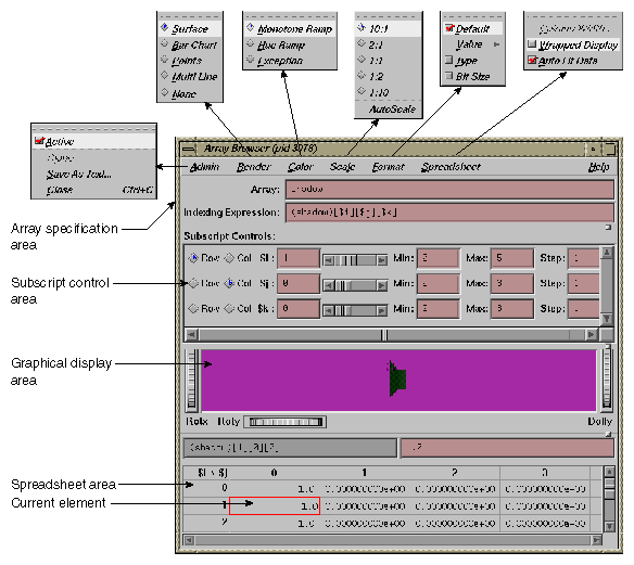
To examine numeric, pointer, or character string data in an array variable, select Array Browser from the Views menu at a point in the process where the variable is present. The Array Browser allows you to view elements in a multi-dimensional array (up to 100 x 100 elements), presented in a spreadsheet and graphically, if desired.
 | Note: The Render, Color, and Scale tear-off menus are available only if you are have an SGI workstation with Open Inventor installed on it. |
The array specification area allows you to specify the variable and its dimensions. It consists of the following fields:
Array : Allows you to enter the name of the array variable. This entry is language-dependent.
For Fortran, the expression may be an array or a dummy array variable name. If the last dimension of the array is unspecified (*), a subscript value of 1 is assumed initially.
For C and C++, the entry may be an array or a pointer. If pointers are used, the expression is treated as though it were a single element, in which case you need to use the subscript controls to see more than the first element.
Indexing Expression : The expression used to view an element in the array. It is filled in automatically when you specify an array to view.
The expression supplied is language-specific. It represents the indexing expression used in the language to access a particular element. The subscripts are specified by special indexing variables ($i, $j, $k, and so forth) that can be manipulated in the subscript controls area.
The Subscript Controls area allows you to control which elements in the variable are displayed and allows you to shift the current element. The number of dimensions in the array governs the number of controls that are displayed. A close-up view of the subscript controls area appears in Figure 6-2.
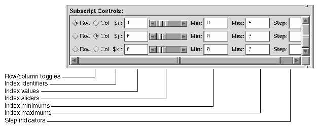
The Subscript Controls area provides the following features:
Row/column toggles: Controls whether an index variable represents rows or columns (or neither) in the spreadsheet area. You are not limited by the number of dimensions of an array, but you can only view a two-dimensional orthogonal slice of the array at a time.
Index identifiers: Indicates to which subscript the controls in the row refer.
Index values: Shows the value of the subscript for the element currently in the focus cell. You can enter a different value if you wish.
Index sliders: Lets you move the focus cell along the particular dimension.
Index minimums: Identifies the beginning visible element in that particular dimension.
Index maximums: Identifies the last visible element in that particular dimension. If you have an unspecified array, you can use this field to specify the last element in the vector to be displayed in the spreadsheet.
Step indicators: Specifies the increment between adjacent elements in the dimension to be displayed. A value of 1 displays consecutive data. Specifying some n greater than 1 allows you to display every n element in a vector.
Control area scroll bars: Allows you to expose hidden portions of the subscript control area if your window is not large enough for viewing all of the controls.
The spreadsheet area is where numeric data is displayed. It can show two dimensions at a time (indicated in the upper left corner of the matrix). The column indexes run along the top of the matrix and the row indexes are displayed along the left column. The spreadsheet area has scroll bars for viewing data elements not currently visible in the viewing area. Figure 6-3, shows a close-up of the spreadsheet area.
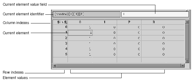
The current element is highlighted by a colored rectangle in the spreadsheet area. Its corresponding expression is shown in the current element identifier field, and the value is shown in the current element value field.
The Spreadsheet menu allows you to change the appearance of data in the spreadsheet area. It provides these selections:
Column Width: Allows you to specify the width of the spreadsheet cells in terms of characters. For instance, a value of 12 indicates that 12 characters, including punctuation and digits are viewable.
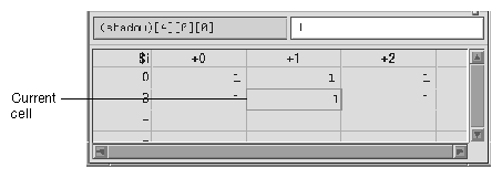
Wrapped Display: Allows you to display a single dimension of an array wrapped around the entire spreadsheet area. The index value for an element is determined by adding the appropriate row index and column index values.
Figure 6-4, shows an example of a wrapped array. There is only one index $i. The current cell is element 4 in the array (by adding 3 and +1).
Auto Fit Data: If enabled, automatically resizes the spreadsheet cell to fit the maximum size of the data to be displayed. If this is enabled, then the Column Width is disabled. This option is on by default.
The Format menu displays a separate menu that you allows you to display the elements in the following formats:
Default toggle: Toggles the default format.
Value submenu: Contains the following display toggles for formatted values:
Decimal Unsigned Octal Hex Float Exponential Char String Wide Character Type: Allows listing by data type.
Bit Size: Allows listing by bit size.
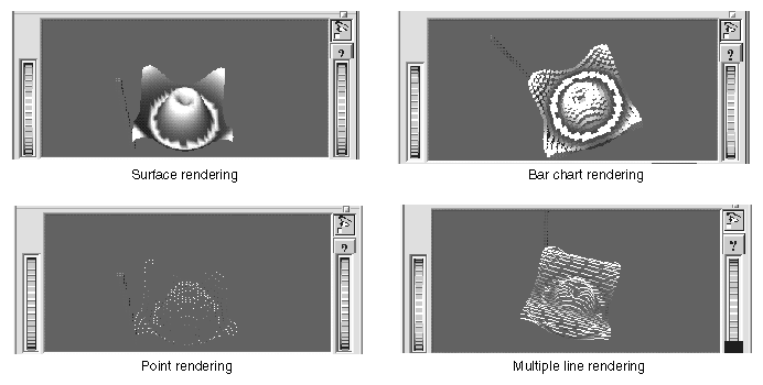
The graphical display area presents array data in a three-dimensional graph in one of the following formats:
Surface (polyhedron)
Bar chart
Points
Multiple lines (array vectors)
The Render tear-off menu is available only if you are have an SGI workstation with Open Inventor installed on it.
You select the graphical display mode through the Render menu. The Render menu has the following options:
Surface: Exhibits the data as a solid using the data values as vertices in a polyhedron.
Bar Chart: Presents the data values as 3-D bar charts.
Points: Simply plots the data values in 3-D space.
Multi Line: Plots and connects the data values in each row.
None: Allows you to display with no graphical display, in effect turning off graphical display mode.
The Color tear-off menu is available only if you are have an SGI workstation with Open Inventor installed on it.
If the Color menu is grayed out when the Array Browser window first opens, select the Surface option of the Render menu. The Color menu provides the following options:
Monotone Ramp: Displays the data values in a single tone, with lower numbers being darker and higher values lighter in tone.
Hue Ramp: Displays the data values in a spectrum of colors ranging from blue (lowest values) through green, yellow, orange, and red (highest values).
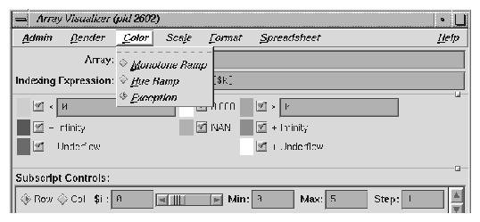
Exception: Allows you to flag certain conditions by color, usually for the purpose of spotting bad data. When you select Exception, the controls shown in Figure 6-5 appear in the window.
Thus, you can highlight data values less than or greater than specified values, values of plus or minus infinity, values of plus or minus underflow, zero values, and NaN (not a number) values.
| Note: The Scale tear-off menu is available only if you are have an SGI workstation with Open Inventor installed on it. |
If the Scale menu is grayed out when the Array Browser window first opens, select the Surface option of the Render menu.
The Scale menu provides options for changing the ratio of the z-dimension, which represents the value of the element. The number on the left represents the value of the x and y-dimensions (which are always the same as each other). The number on the right is the z-dimension.
Manipulating the z-dimension affects the ease of spotting differences in values. If your data is scattered over a narrow range of values, you may wish to heighten the graph by selecting 10:1 as your scale; this exaggerates the values in the z-dimension. If your data is in a wide range, selecting 1:2 or 1:10 as the scale minimizes the differences, flattening the graph.
| Note: The Examiner Viewer is available only if you are have an SGI workstation with Open Inventor installed on it. |
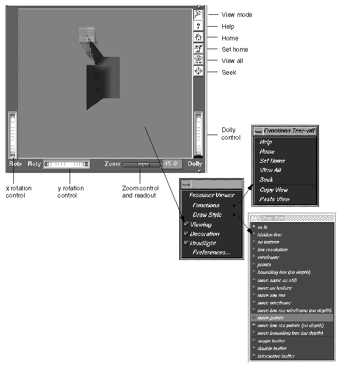
The graphical display uses controls and menus from Examiner Viewer. Examiner Viewer is based on a camera metaphor and borrows terms from the film industry, such as zoom and dolly, in naming its controls. The graphical display area of the window is shown in Figure 6-7, with its main controls and menus. Note that the buttons on the upper right side of the graphical display area may not be visible if the area is too small; you can expose them by moving either the upper or lower sash to enlarge the display area. (The lines between the window panes include a small box to the right. Click-drag this box to change the size of the panes.)
Examiner Viewer provides these controls for viewing the graph. The right side buttons provide the following actions:
view mode: Toggles between a view-only mode (closed eye) and manipulation mode (open eye).
In view-only mode, the cursor appears as an arrow and the graph cannot be moved. Clicking on a portion of the graph selects the corresponding array element in the spreadsheet.
In manipulation mode, the cursor appears as a hand and you can move the graph. Dragging the graph with the left mouse button down moves the graph in any direction as if it were in a trackball; a quick movement spins the graph. Dragging the graph with the left mouse button and the Ctrl key rolls (rotates) the graph in the plane of the screen. Dragging the graph with the middle mouse button moves it without changing the viewing angle.
If you drag the graph with both the left and middle mouse buttons down, the graph appears to move into or out of the window (this is the same as the dolly thumbwheel, which is described in this section).
help: Runs a special help system containing Inventor Viewer information.
home: Repositions the graph in its original viewing position.
set home: Changes the home (original viewing) position for subsequent use of the home button.
view all: Repositions the display area so that the entire graph is visible.
seek: Provides a special cursor that allows you to reposition the graph in the center of the display area or allows you to center the view on a point you select with the cursor. See Seek to point <or object> in the Preferences dialog box.
The following controls let you move the graphic display:
x rotation thumbwheel: Rotates the graph around its x-axis.
y rotation thumbwheel: Rotates the graph around its y-axis.
dolly thumbwheel: Changes the size of the graph and adjusts the angles to maintain perspective. The dolly control simulates moving the viewing camera back and forth with respect to the graph.
You access the Examiner Viewer menu by holding down the right mouse button in the graphical display area. The Examiner Viewer menu provides the following options (see Figure 6-7 for illustration):
Functions: Displays a submenu with the selections Help, Home, Set Home, View All, and Seek, which are the same as the right mouse button controls described in the previous section, and the Copy View and Paste View selections. These operate like standard copy and paste editing commands, enabling you to transfer graphs.
Draw Style: Displays a submenu that controls how the graph is displayed. The top group of options, from as is to bounding box (no depth) control how the graph is displayed when it is static. These override any Render menu selections.
The middle (move... ) group of options control how the graph is displayed while in motion.
The last three options, single, double, and interactive, refer to buffering techniques used in moving the graph. These affect the smoothness of the movement.
Viewing: The same as the view mode button described in the previous section. When it is off, you can select points from the graph to display in the spreadsheet but cannot move the graph. When on, it allows you to manipulate the graph.
Decoration: Displays the right side buttons when it is on and hides them when it is off.
Headlight: Controls the shadow effect on the graph. When it is on, the light appears to come from the camera.
Preferences: Causes the Examiner Viewer Preferences Sheet dialog to display.
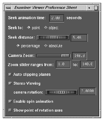
The Examiner Viewer Preference Sheet dialog provides the following options:
Seek animation time: Allows you to specify the time it takes for the graph to be repositioned after you change the seek point. Set to 0 for instant seek. See also Seek to point <or object>.
Seek to point <or object>: Seek to point uses the picked point and surface normal to align the camera.
Seek to object uses only the object center to align the camera.
Seek distance wheel: This wheel controls how close to the camera the object appears. This distance can be either an absolute distance or a percentage of the distance to the picked point.
Camera Zoom slider: This slider allows you to set (in degrees) the camera height angle (only perspective camera). If you wish, you may set this value in the field immediately to the right of the slider.
Zoom slider ranges from: Range is 1.0 to 140.0 by default, but you can reset this if you wish.
Auto clipping planes: Centers the graph in your view if enabled. If disabled, it allows you to move the graph out of view at either end of the z-axis. This is useful if you wish to focus on data above or below a set value.
Stereo Viewing: This may be turned on to see the scene in stereo (special glasses required). The offset between the left and right eye can be specified using the camera rotation thumbwheel.
Enable spin automation: When selected, you can cause the camera to continue spinning. To animate, left-click and drag in the direction of your desired spin, then release while spinning. The graph spins as if by a trackball. To stop, left-click anywhere.
Show point of rotation axes: Displays a set of three axes. You can move the graph around the x and y axes using the thumbwheel controls described in the previous section. When this option is on, you can set the size of the axes in pixels.
The Call Stack window displays call stack entries when a process has stopped.
The source display in the Main View window has two special annotations that are synchronized with the Call Stack:
The location of the current program state is indicated by a large arrow representing the PC. The source line to which the arrow points is highlighted (usually in green).
The location of the call to the item selected in the Call Stack window is indicated by a small arrow representing the current context. The source line becomes highlighted (usually in blue-green).
The Call Stack contains its own menu bar, which contains the Admin, Config, Display, and Help menus. The Admin menu is the same as that described in “Admin Menu, Task View” in Chapter 3. The Help menu is the same as that described in “Help Menu” in Chapter 1. The other menus are described in the following list:
The Config menu contains the Preferences option, which launches the Call Stack Preferences dialog that allows you the option of setting the maximum depth of the Call Stack.
The Display menu contains the following toggles which change what is displayed in each entry of the Call Stack in addition to the subroutine/function name:
Arg Values: Allows you to display argument values. Default is on.
Arg Names: Allows you to display argument names. Default is on.
Arg Types: Allows you to display argument types. Default is off.
Location: Allows you to display function location. Default is on.
PC: Allows you to display the program counter (PC). Default is off.
The Data View opens a window that allows you to display variables and their values in the source code.
Expression View displays a collection of expressions that are evaluated each time the process stops or the context changes.
In addition to the items on the menu bar, the window has two pop-up menus: the Language menu and the Format menu. The Admin menu is the same as that described in “Admin Menu, Task View” in Chapter 3. The Help menu is the same as that described in “Help Menu” in Chapter 1. The other menus are described in the following list:
The Config menu contains the following options:
Load Expressions: Launches the Load Expressions dialog box that allows you to choose source file from which to load your expressions.
Save Expressions: Launches the Save Expressions dialog box that allows you to choose a file to which you can save your expressions.
The Display menu contains the following options:
Format All, which allows you to change the default values. See “Format Pop-up Menu” for a description of format options.
Clear All option which clears all fields in the view.
The Language pop-up menu contains three buttons that allow you to select one of three languages for evaluation: C, C++, or Fortran. The Language pop-up is invoked by holding down the right mouse button while the cursor is in the Expression column.
The Format pop-up menu is displayed by holding down the right mouse button in the Result column.
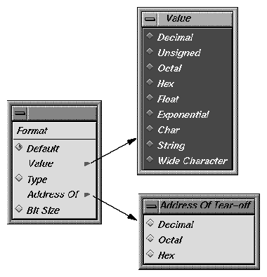
The Format popup contains the following options:
Default: Sets the format to the default values.
Value: Displays a submenu from which you can select a value of Decimal, Unsigned, Octal, Hex, Exponential, Float, Char, String, or Wide Character type.
Type: Displays a submenu from which you can select a type of Decimal, Octal, or Hex.
Bit size: Sets the format to Bit Size.
The File Browser window displays a list of source files used by the current executable. Double-click on a file in the list to load it into the source display area in the Main View or Source View windows. Some files may be listed due to subroutines/functions being resolved from system libraries. If you select such a file, you may get the following message:
Unable to find file <xxx.c> |
This is because the source for system library routines may not be stored on your system.
The Search field allows you to find files in the list.
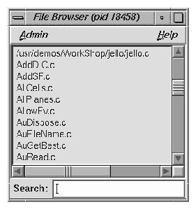
The File Browser contains an Admin menu (described in “Admin Menu, Task View” in Chapter 3) and a Help menu (described in “Help Menu” in Chapter 1). In addition, the browser has a Search field.
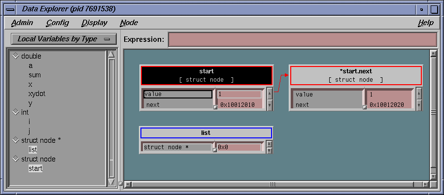
The Data Explorer window allows you to examine variables, data structures, Fortran common blocks, and the relationships of the data within them. It displays complex data structures as separate graphical objects, using arrows to indicate relationships. The variable list on the right is a list of local variable available to be displayed for the current stack frame of the current process/thread. The list can display as one of the following:
A sorted list of local variables:
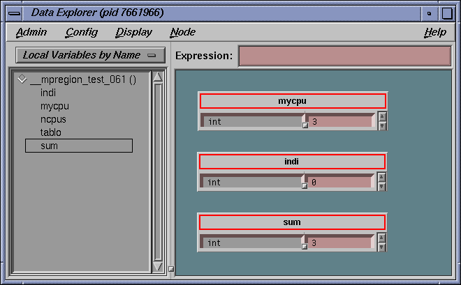
Names grouped by type:
Common blocks, if the current frame is part of a Fortran application:
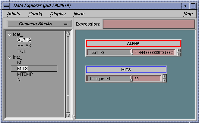
A data name is entered in the Expression field or selected by a left or right mouse click on a name in the variable list to the left of the object display area. It then appears as an object or set of objects in the display area in the lower portion of the window. The variable list represents local variables for the current process frame. Other variables that are not of local scope (for example, globals) can be entered into the Expression field. Each data item has a header identifying the data, color coded by data type. Below the header are two columns: the left displays the field name and the right displays the field's value. If a displayed data item exceeds the size of the Data Explorer window, scroll bars appear.
The Admin menu contains options for selecting the active structure, cloning structures, saving them as text, and closing the Data Explorer window.
The other menus in this window contain options that allow you to change the way data is displayed. The following data-display menus are available:
Config: Provides options for saving and reusing type-specific formats and expressions. You can also set preferences regarding how objects of a given type are to be displayed.
Display: Provides display options for all objects in the display area.
Node: Provides options for selected objects in the display area only.
The Format menu appears in the structure header display area. It allows you to change or reformat a specific value in the result column. To access this pop-up menu, hold down the right mouse button while the cursor is over the result column.
WorkShop provides the Data Explorer Overview window (from the Show Overview option in the Display menu) as another way to navigate around the display.
This window is a reduced-scale view of the requested structures. The structures are represented by solid rectangles color-coded by data type. The relative position of the currently visible area is represented by a transparent rectangle. This rectangle can be dragged (using the left mouse button) to change the display of the Data Explorer. Clicking the left mouse button in an area of this window repositions the currently visible area.
The Data Explorer accepts any valid expression. If the result type is simple, a structure displays showing the type and value. If the result type is a pointer, the pointer value and type are displayed (if the Data Explorer preference item is set, it is automatically de-referenced until a non-pointer type is reached).
If the result type is a structure or union, an object is displayed showing the structures' fields and their values. After the expression is entered, the Expression field clears. The Data Explorer can display unrelated structures at the same time; you simply enter new structures by using the Expression field.
The Expression field is also used to enter strings used in searches.
Within the display area, you select objects by clicking in the node headers. Shift-clicks add the selected object to the current selection. You can drag selected objects using the middle mouse button.
Clicking the right button while the cursor is in the right column of an object displays the Format menu, which is used to change the display. You can set a default format or request that results be displayed by value, type, address, or size in bits.
Holding down the right button in the header of an object brings up the Node pop-up menu, which is the same as the Node menu in the menu bar. It is used to change the way selected objects are displayed. When you left-click in the header of an object, it turns on the resizer, which allows you to change the size of the object. You see a small square (handle) at the upper-right and lower-left corners. Left-click-drag the handle to resize the object. Middle-click-drag the handle to move the object.
Arrows show relationships among the displayed structures. If a member field is not visible in a structure, its arrow tail is displayed at the top or bottom of the scrolling area for fields. Otherwise, its tail is adjacent to its field.
Double-clicking a value field (right column) for a pointer changes the display so that the data structure it points to is displayed.
The Display menu controls the way structures appear in the display area. The Display menu provides the following options:
Display: Determines contents of the display. The Display option has the following two options:
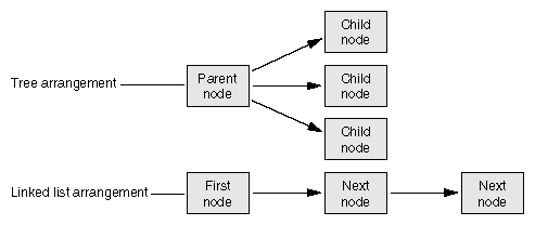
Arrange: Rearranges the currently selected nodes. Arrange has the following two options: (See Figure 6-15.)
Search: Allows you to select structures in the display area that contain the string specified in the Expression field. Search has the following four options:
Name -- Selects structures whose names contain the specified string.
Type -- Selects structures whose types contain the specified string.
Field Name -- Selects structures that have a field whose name contains the specified string.
Value -- Selects structures that have a field value containing the specified string.
Update: Explicitly updates the displayed structures. This happens automatically in the current Data Explorer when the process stops. This can be used in an inactive Data Explorer to update it. It can also be used to update the display after changes have been made in other Debugger views.
The Node menu gives you options that apply to currently selected objects.
The following menu items are available:
State: Controls the display of nodes. There are three options:
Geometry: Manages graphical objects in the display area. There are four options:
Minimize -- Sets the vertical size of an object to the default minimum number of fields. The initial default is four fields but can be changed through either the Formatting selection from the Node menu or the Preferences selection from the Config menu.
Maximize -- Displays the object as large vertically as necessary to fit all of the fields.
Raise -- Raises the selected object(s) to the top of the display.
Lower -- Lowers the selected object(s) to the bottom of the display.
Select: Allows you to select objects in various ways. There are six options:
Parents -- Selects all objects that have pointers pointing to a selected object.
Children -- Selects all objects pointed to by any fields in a selected object.
Ancestors -- Selects all objects pointed to a selected object or pointing to an object that has a descendant pointing to a selected object.
Descendant -- Selects all objects pointed to by any fields in a selected object or pointed to by any children of a selected object.
Family -- Selects all ancestors and descendants of a selected object.
All -- Selects all objects.
Other Views: Brings up other view options, such as Expression View, Data Explorer, etc.
Formatting: Brings up the type formatting dialog for this type.
Dereference Ptrs: Dereferences any pointers in selected objects.
Pattern Layout: Displays selected structures that are connected by pointers to position related structures in the same way.
Each field in a data structure has certain display characteristics. These can be specified for all objects in the Data Explorer Preferences dialog box or for type-specific objects only in the Data Explorer Type Formatting dialog box. To display the Data Explorer Preferences dialog box, select Preferences from the Config menu.
The dialog has the following fields:
Default Structure Field Count: Sets the number of fields to be displayed initially.
Default Iconic Width; The width in pixels of the object when it is in iconic form.
Automatic Dereference Limit: Limits the number of structures that are automatically dereferenced.
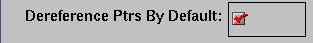
Dereference Ptrs By Default: Toggles automatic dereferencing on and off.
Use dbx Style Evaluation: Toggles to use a dbx evaluation.
To bring up the Data Explorer Type Formatting dialog box, select the set of structures under consideration and select Node Formatting from the Node menu.
The dialog box has the following fields:
Default Field Count: Lists number of fields to be displayed initially for objects of that type.
Default Structure Width: Displays the width in pixels of the object.
Default Iconic Width: Displays the width in pixels of the object when it is in iconic form.
Default State: Brings up a pop-up menu that allows you to specify whether structures are first displayed as icons (Iconic), with the minimum number of fields displayed (Normal) or with all fields displayed (Detail).
Type Color: Provides a submenu for color coding. It allows you to select a color for the header and overview rectangles for objects of a given type.
For structure and union types, the list box shows all the fields with their types. For each field, you can change the result format to one of the following types:
Default
Decimal
Unsigned
Octal
Hex
Float
Exponential
Char
String
Wide Character
Type
Dec addr
Oct addr
Hex addr
Bit Size
You can also specify whether a field is visible in normal state, and if it is a pointer field, whether it should be automatically dereferenced.
After you specify the format for this type, you can apply it to any combination of the following through the toggle buttons in the bottom left portion of the window:
Selected instances
All existing instances
Any future instances of this type
The Variable Browser window allows you to view and change the values of local variables and arguments at a specific point in a process. (Global variables can be viewed or changed using Expression View or the Evaluate Expression selection from the Data menu for one-shot evaluations.) In addition to providing values, the Variable Browser is useful for getting a quick list of the local variables in a scope without having to search for their names..
Typically, you inspect variable values at the following points:
At a breakpoint
At a frame in a call stack
As you step through a process
A useful technique is to set a trap at the entry to a function and inspect the values of the variables there. Some variables may be in an uninitialized state at that point. You can then step through the function and make sure that no uninitialized variables are used inadvertently.
| Note: In programs compiled by using the -n32 -g compiler options, you cannot click on or print an unused variable as you could when using the -o32 -g options. |
The Variable Browser allows you to change the values of variables in the window. You simply enter the new value in the result column and press Enter. Thus, you can force new values into the process and see their effect.
By using the sash between the columns, you can adjust the relative widths of the Variable and Result columns. For example, you may wish to adjust for short variable names and long result values.