This chapter is directed at application designers, rather than the people who write the algorithms of an application, although they are often one in the same. Application designers are the people who design the interface between the application algorithms and the user. In designing user interfaces, an application designer chooses the proper controls or groups of controls, or components, to pass data between the base application and the user, lays out those components naturally, and ensures that user interaction with the components and the layout are easy to use.
This chapter describes the three elements of application user interface design, as well as the principles for designing new user interface components. The four major sections of this chapter are as follows:
The user interface of an application is made up of components that perform two simple functions: presenting the application information to the user, and allowing the user to enter data for the application. Components can be divided into six types: basic controls, field controls, basic groups, layout groups, framing groups, and DialogBox groups. The groups are containers for controls and groups of controls. Groups can be nested.
The component types that should be available in a user interface toolkit are described in the following lists. The details of these components are described in the reference section in Chapter 9, "Controls, Groups, and Models Reference Pages" of this guide. The correspondence of these components to widgets available in the OSF/Motif toolkit is described in Appendix A, "OSF/Motif Widgets and Components Correspondence."
-
-
-
Layout Groups
-
A DialogBox group can either be nested within another group or organizes the contents of a secondary window. Although a DialogBox can contain any component, a simple DialogBox is composed of a Label and a Panel of PushButtons for supplying a response to the DialogBox. The OSF/Motif toolkit provides a number of ready-designed DialogBoxes for common uses: CommandDialog, FileSelectionDialog, MessageDialog, PromptDialog, and SelectionDialog. Several types of MessageDialog are available: ErrorDialog, InformationDialog, QuestionDialog, WorkingDialog, and WarningDialog.
At the highest level, components are organized into MainWindows, Menus, and DialogBoxes. Correctly deciding which component group to use for which parts of an application is one of the most important tasks of an application designer.
Every application must contain at least one MainWindow. The MainWindow can contain a MenuBar, ScrollBars, a command area, a message area, and the client area. The client area of the MainWindow contains the framework of an application. The client area should contain all the components needed to perform the primary actions of the applications. For example, in a text editor application, the MainWindow usually contains a text editing area; in a graphics editor application, the MainWindow usually contains a graphics editing area and the components for changing drawing functions. Components that are used constantly throughout the application should be contained in the MainWindow's client area. Components that are used intermittently or infrequently should be placed in Menus or DialogBoxes.
The advantages of Menus are that they are readily available, quickly accessed and dismissed, and easy to browse through. The most commonly used Menus should be placed in the MenuBar in the MainWindow to increase these advantages. Because Menus are readily available, and quickly accessed and dismissed, they should be used for components that are frequently used. The time delays of bringing up a DialogBox for frequently used components can greatly reduce user productivity. Because Menus are easy to browse through, they should also be used for components that are commonly accessed by most users.
The advantages of Menus also cause some disadvantages. A Menu is a very short-lived component group. It is displayed only while the user makes a selection. Once the user makes a selection, the Menu disappears. So a Menu is not well-suited for making several selections at once.
Adding a TearOffButton to a Menu can allow that Menu to remain available even after a user selection. By activating a TearOffButton, the user changes the current Menu into a simple DialogBox with the same contents as the Menu. A Menu with a TearOffButton allows the user to make multiple selections because the user can cause it to stay posted after a selection. A TearOffButton is useful when it is unclear whether you should include a set of buttons in a Menu or DialogBox.
Menus, other than TearOff Menus, are also modal; that is, while a Menu is posted, the user cannot interact with other elements of the application. Because of this, unless a Menu can be torn off, it should not be used for components that the user may want to have available while interacting with other elements of the application.
The other disadvantage of Menus is that they can only contain buttons and Labels. Menus should be used for performing simple actions and setting values, but they are not suitable for more complicated functions like text entry.
DialogBoxes are used for two general purposes: to present information to the user and to take user input. Applications should use DialogBoxes to present transient information to the user, like warnings, cautions, or conformations to actions. DialogBoxes that present information to the user are called Message DialogBoxes. Message DialogBoxes are often placed on the screen by applications without a request from the user. Because Message DialogBoxes can disrupt a user's work, applications should present constantly updated information in the client area of the MainWindow. Also, applications can present minor cautions, incidental notes, and simple help in the message area of the MainWindow.
The advantages of using DialogBoxes to take user input are that they are long-lived and can contain any components. Because they are long-lived, they can be used to perform more than one action at a time and can remain available while the user interacts with other parts of the application. Applications should use user-input DialogBoxes like small applications. DialogBoxes should be used to perform tasks ancillary to the application, where the user can take more than one action before dismissing the DialogBox. Applications should also use DialogBoxes where the task requires more complicated interaction than is available in a Menu, like file selection.
Table 6-1 summarizes the suggested uses for MainWindows, Menus, and DialogBoxes.
Use This Main Component Group
Table 6-1. Suggested Window Types
For These Cases | MainWindow | Menu | DialogBox |
|---|---|---|---|
Primary application actions | X | — | — |
Ancillary application actions | — | — | X |
Components used intermittently | — | X | — |
Components used frequently | X | X | — |
Components used seldomly | — | — | X |
Components accessed by most users | — | X | — |
Simple actions | X | X | — |
Complex actions | X | — | X |
Presenting transient information | — | — | X |
Presenting updating information | X | — | — |
Presenting minor information | X | — | — |
Choosing the correct components for a task is usually simple. In most cases, a task seems to naturally belong to a component; for instance, scrolling a region with a ScrollBar or choosing a value from a range with a Scale. Each component's general purpose is described in Section 6.1, "Choosing Components," as well as in the reference section in Chapter 9, "Controls, Groups, and Models Reference Pages." In some cases, though, it is difficult to decide between two controls or groups of controls that could perform the same task. The following subsections give some guidelines for choosing among some common similar components:
A single-choice component allows the user to select a single item from a group of items. Applications should use a single-choice component to limit the user to one choice; for example, choosing among available pen widths in a drawing program. The available single-choice components are as follows:
You should choose a single-choice component based on the number of items to choose among, the space available for the selection area, and the permanence of the selection. For a small number of items, the best component is a RadioBox or an OptionButton. RadioBoxes should usually contain no more than 5 or 6 items. Option Menus, which are connected to OptionButtons, should usually contain no more than 10 to 12 items. If there is very little space available in your application, you should use an OptionButton over a RadioBox, since the OptionButton takes up very little space.
When the number of items to choose from gets larger than a RadioBox or OptionButton can easily handle, you should use a List. You should also use a List when the items to choose from can change. For application consistency, the choices in a RadioBox or OptionButton should not change, but, if they do, you should use an OptionButton over a RadioBox. If a RadioBox or OptionButton choice becomes unavailable, it should be disabled rather than removed. "Showing Unavailable Components" describes disabling components in detail.
A multiple-choice control or group of controls allows the user to simultaneously choose multiple items from a group of items. Applications should use multiple-choice components, rather than a series of single-choice actions, where the user may want to select more than one item from a group.
The available multiple-choice components are as follows:
CheckBox
List
As with single-choice components, the main factor when choosing which one to use is the number of items in the group. For small groups of fewer than seven static elements, applications should use a CheckBox. Applications should otherwise use a List. Note that a List component can be used as a single-choice or multiple-choice component.
Popup Menus should only be considered as shortcuts to application features because they are hidden in the application. Features hidden in Popup Menus are difficult to find for beginning users of an application because they provide no cue to their existence; however, they can provide rapid access to frequently used functionality once the user learns their contents. Applications should use Popup Menus to allow users to remain focused on their work areas and when there is not enough space in the client area for a Panel of buttons.
Popup Menus contain a set of buttons that can be used in the same way as a Panel of buttons or a Pulldown Menu. The primary difference is availability. A Popup Menu is only visible when requested by the user. At all other times it is hidden, providing no cue to its existence. When the user requests a Popup Menu, the application displays it at the location of the pointer. Buttons and Pulldown Menus, on the other hand, are always visible, but users need to move the focus away from their main work to activate them. Another difference is that buttons take up screen space while Popup Menus do not. Pulldown Menus provide a good compromise in space and availability versus Popup Menus and Panels.
Applications should use a Panel of buttons when the user makes frequent or multiple selections and when space in the client area allows. Whenever the choice between Popup Menus and Panels is difficult, applications should favor Panels.
A good compromise solution to these problems is a TearOff Menu. A TearOff Menu is a Pulldown Menu until the user wants it torn off into a DialogBox. After the Menu is torn off, the user can position it and use it in the same way as a Panel. TearOff Menus are especially useful because they contain a set of PushButtons that are not part of the main function of an application, allowing the user to activate the PushButtons multiple times in a row; for example, a font size Menu in a text editing application. In this case, the user can use the Pulldown Menu to change the font size of a single selected word or tear off the Menu into a Panel to perform a number of font size changes in the document. After finishing the font size changes, the user can dismiss the font size Panel.
A Label is a simple mechanism for displaying text or graphics. A Label does not have any mechanisms for the user to edit its contents, or the overhead required for editing. Applications should use a Label for displaying text or graphics that do not need user editing. Applications should use a Text or Canvas when the text or graphics needs to be edited. On some systems, the contents of a Label are not selectable. If the user needs to select the contents of some noneditable text or graphics, applications should use a Text or Canvas and disable editing rather than using a Label.
The previous section described the components that are available for building an application. This section describes how to combine those components into a coherent application that encourages a user's sense of control. The guidelines presented in this section will help you create applications that are both consistent within themselves and with other OSF/Motif compliant applications.
This section discusses the following client area design topics:
Design the layout of your application windows according to the natural use order and the natural scanning order of the people who will be using your application.
First design for the natural use order. Consider the tasks that the user will perform with your application. The components should be positioned so that moving among the components is simple and quick while performing the most common tasks—the less pointer movement, the better. This is also true for keyboard traversal—the fewer keystrokes required to perform a task, the better.
The natural scanning order is most important when arranging small groups of components to help the user find the correct component for the task. You should put the most important and most used commands first. In most cases, this order is from left to right and from top to bottom. For users in right-to-left language environments, the natural scanning direction is from right to left and from top to bottom.
Your application is presented in windows. The windows can be either MainWindows, DialogBoxes, or Menus. The contents of these windows are the application client areas. Some of these client areas have common features that are described in this section. The following subsections describe in detail the contents of the MainWindow and the common MainWindow areas:
Following this is a description of some common Popup Menus and DialogBoxes. These common client areas provide a familiar base for users new to your application to begin working.
Figure 6-1 shows a MainWindow with its client areas.
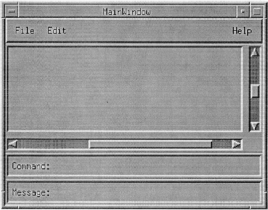
MainWindows contain the framework for your application. The principal component of a MainWindow is typically a scrollable work area. The application can also provide a group of useful controls, arranging these along the top, bottom, or side of the work area.
In a text editing application, a MainWindow usually contains the text. In a spreadsheet application, a MainWindow usually contains the spreadsheet. In a mail browsing application, a MainWindow usually contains a list of mail messages and an area for viewing a message. Every application must have at least one MainWindow.
Some applications may want more than one MainWindow; for example, applications with more than one primary function, like the query and update features of a database, and applications with more than one instance of the same primary function, like a graphics editor working on multiple figures. When an application has multiple MainWindows that serve the same primary function, each window should be treated as a separate application. Each window must close and iconify separately. When an application has multiple MainWindows that serve different primary functions, each window must be iconifiable separately, but it is up to the application to decide whether each closes separately or whether closing one window closes the entire application. You should take special care to identify, using the window manager title bar or a prominent internal Label, which DialogBoxes belong to each MainWindow.
Even though user interface applications are oriented toward direct manipulation of graphical elements, your application can provide an area for a user to enter a typed command. This can be particularly useful when updating an existing command-based application to an application based on a graphical user interface.
If your application includes a command area, it should run from border to border across the MainWindow. If the MainWindow includes a message area at the bottom, the command area should be placed just above the message area; otherwise, it should be placed at the bottom of the MainWindow.
The command area often consists of one or both of the following components:
A command entry area, consisting of a command entry field or a CommandBox
A group of PushButtons for common window actions
Your application can provide a message area in the MainWindow for presenting application messages. Your application should not use a message area for warnings or messages requiring immediate action. These should be displayed in a DialogBox.
The message area can be used to provide brief help, either in response to a request from the user or, as the focus changes, to indicate the purpose of the component with the focus.
If your application includes a message area, it should run from border to border across the bottom of the MainWindow, below any ScrollBars or the command area. Your application can display and remove the message area as needed.
An application can use ScrollBars in its MainWindow to provide a means for viewing an area larger than the MainWindow. Your application defaults should place ScrollBars on the bottom and right sides of the application. (ScrollBar placement can be a user preference.) You should place ScrollBars below the MenuBar and above any command or message area. ScrollBars should not scroll the MenuBar, command area, or message area. The ScrollBars can be displayed and removed as needed.
A MenuBar is a basic group that organizes the most common features of an application. The MenuBar must be a horizontal bar at the top edge of the application just below the title area of the window frame. The MenuBar contains a list of Menu topics in CascadeButtons with Pulldown Menus connected to them. A MenuBar must contain only CascadeButtons, because other buttons inhibit Menu browsing. Each Menu topic should have a single-letter mnemonic indicated by underlining.
The following Pulldown Menus provide general functions common to most applications. Remember that these Menu guidelines, like all the guidelines in this OSF/Motif Style Guide, apply only in a left-to-right language environment in an English-language locale. You need to make the appropriate changes for other locales.
While we recommend that you include the common Menus in the MenuBar of your application, your choice of Menu titles and items depends on the nature of your application. If your application requires it, you should design more relevant titles and selections, but do not change the meanings of items used in the common Menus.
If any of the common Menus are present, they must be arranged in the following order with respect to each other, ranging from left to right across the MenuBar in a left-to-right language environment:
File Menu Selected Menu Edit Menu View Menu Options Menu Help Menu |
You can omit any of these Menus if they are not relevant to the application. You can also intersperse other, application-specific, Menus among these Menus. However, if a File Menu is present, it must be the first Menu and must be placed at the far left of the MenuBar. If a Help Menu is present, it must be the last Menu and must be placed at the far right of the MenuBar.
The recommended contents of the File, Edit, and Help Menus follow. The contents of the Selected, View, and Options Menus are application specific and are not specified here. Each of these common Menus can contain a TearOffButton.
Figure 6-2 shows a sample File Menu. The common Menu contents are described following the figure. Note that you should only include those functions actually supported by your application. The File Menu can contain a TearOffButton.
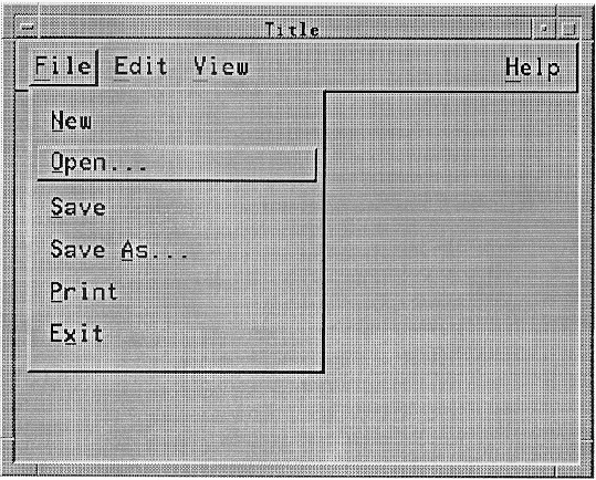
You should include Menu items in the order described. If you add new Menu items, you should insert them near similar elements.
Figure 6-3 shows a sample Edit Menu. The common Menu contents are described following the figure. Note that you should only include those functions actually supported by your application. The Edit Menu can contain a TearOffButton.
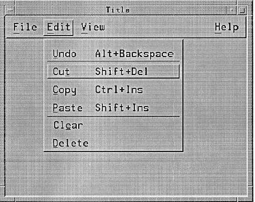
| Undo Alt+Backspace |
| |
| Cut Shift+Del | Must remove the selected portion of data from the client area to the clipboard. This action must choose the component to act on by following the rules in Section 4.2.2, "Operation Targets," for operations that act on selections. This action must have the mnemonic T. | |
| Copy Ctrl+Ins | Must copy the selected portion of data to the clipboard without removing the original data from the client area. This action must choose the component to act on by following the rules in Section 4.2.2, "Operation Targets," for operations that act on selections. This action must have the mnemonic C. | |
| Copy Link | Must copy a link of the selected portion of data to the clipboard without removing the original data from the client area. This action must choose the component to act on by following the rules in Section 4.2.2, "Operation Targets," for operations that act on selections. This action must have the mnemonic K. | |
| Paste Shift+Ins |
| |
| Paste Link | Must paste a link of the data represented by the contents of the clipboard into a client area. This action must choose the component to act on by following the rules in Section 4.2.2, "Operation Targets," for operations that do not act on selections. This action must have the mnemonic L. | |
| Clear | Must remove a selected portion of data from the client area without copying it to the clipboard. The remaining data is not compressed to fill the space that was occupied by the cleared data. This action must choose the component to act on by following the rules in Section 4.2.2, "Operation Targets," for operations that act on selections. This action must have the mnemonic E. | |
| Delete | Must remove a selected portion of data from the client area without copying it to the clipboard. This action must choose the component to act on by following the rules in Section 4.2.2, "Operation Targets," for operations that act on selections. This action must have the mnemonic D. | |
| Select All Ctrl+/ | | |
| Deselect All Ctrl+\ | | |
| Select Pasted | Must make the primary selection consist of the last element or elements pasted into a component of the client area. This action must choose the component to act on by following the rules in Section 4.2.2, "Operation Targets," for operations that do not act on selections. | |
| Reselect Alt+Insert | | |
| Promote Alt+Insert | |
You should include Menu items in the order described. If you add new Menu items, you should insert them near similar elements.
If you use accelerators for Undo, Cut, Copy, and Paste, you must use either one or both of the models presented in the following two tables.
Table 6-2. Edit Menu Accelorators, Model 1
Edit Menu Item | Accelerator |
|---|---|
Undo | <Alt> <BackSpace> |
Cut | <Shift> <Delete> |
Copy | <Ctrl> <Insert> |
Paste | <Shift> <Insert> |
Table 6-3. Edit Menu Accelorators, Model 2
Edit Menu Item | Accelerator |
|---|---|
Undo | <Ctrl> <Z> |
Cut | <Ctrl> <X> |
Copy | <Ctrl> <C> |
Paste | <Ctrl> <V> |
In addition, if your keyboard has <Undo>,<Cut>,<Copy>,and <Paste> keys, these should be supported as accelerators for the corresponding Menu items as well.
There are two acceptable models for the contents of the Help Menu. This guide allows either model.
Figure 6-4 shows a sample of the first model for the Help Menu. The common Menu contents for this model are described following the figure. Note that you should only include those functions actually supported by your application. The Help Menu can contain a TearOffButton.
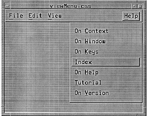
| On Context Shift+Help |
| |
| On Help | Must provide information on how to use the application's help facility. This action must have the mnemonic H. | |
| On Window | Must provide general information about the window from which help was requested. This action must have the mnemonic W. | |
| On Keys | Must provide information about the application's use of function keys, mnemonics, and keyboard accelerators. This action must have the mnemonic K. | |
| Index | Must provide an index for all help information in the application. This action must have the mnemonic I. The index can provide search capabilities. | |
| Tutorial | Must provide access to the application's tutorial. This action must have the mnemonic T. | |
| On Version | Must provide the name and version of the application. This action must have the mnemonic V. It can provide other information as well. |
Figure 6-5 shows a sample of the second model for the Help Menu. The common Menu contents in the model are described following the figure. Note that you should only include those functions actually supported by your application. The Help Menu can contain a TearOffButton.
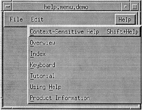
| Context-Sensitive Help Shift+Help |
| |
| Overview | Must provide general information about the application window from which help was requested. This action must have the mnemonic O. | |
| Index | Must provide an index for all help information in the application. This action must have the mnemonic I. The index can provide search capabilities. | |
| Keyboard | Must provide information about the application's use of function keys, mnemonics, and keyboard accelerators. This action must have the mnemonic K. | |
| Tutorial | Must provide access to the application's tutorial. This action must have the mnemonic T. | |
| Using Help | Must provide information on how to use the application's help facility. This action must have the mnemonic H. | |
| Product Information |
|
Applications should place additional Help Menu items between Index and Using Help.
Help is usually provided in DialogBoxes but can also appear in the message area. You should include Menu items in the order described. If you add new Menu items, you should insert them near similar elements.
A Popup Menu is a Menu that is associated with another element. It is usually hidden from the user and is posted using BMenu and <Menu>.It is used to organize actions that are specific to its associated element, but it should not be the only place in an application where those actions are available; that is, Popup Menus should be a redundant element of a user interface whose main purpose is to provide the experienced user with a quick way to perform common tasks on individual elements.
The following common actions provide general functions common to Popup Menus in many applications. While we recommend that you include these common actions in your Popup Menus consistently with the descriptions here, your choice of items depends on the nature of your application. If your application requires it, you should design more relevant titles and selections, but do not change the meanings of items used in the common Popup Menus.
Even within a single control, such as a Canvas, the contents of a Popup Menu can depend on the position within the control, or the state of the elements at that position, such as whether the Menu is popped up from within a selected range of elements. When BMenu is used to pop up the Menu, the location of the pointer when BMenu is pressed is what matters. When <Menu> is used to pop up the Menu, what matters is the position of the location cursor within the control.
Note that you should include only those functions actually supported by your application. Remember that these Menu guidelines, like all the guidelines in this guide, apply only in a left-to-right language environment in an English-language locale. You need to make the appropriate changes for other locales.
If an action invoked from a Popup Menu, such as Primary Copy, inserts or pastes data in a collection, the data must be pasted at the insertion position of the component. However, if the Popup Menu is popped up over a selection of an editable collection, the selection must first be deleted, even if pending delete is disabled, and the pasted data must replace it.
If an action invoked from a Popup Menu acts on a group of elements, it behaves according to the following rules:
If the Menu is popped up in a selection, it must act on the entire selection.
If the Menu is popped up on an unselected element of a list or graphics collection, it should act on just that element.
If the Menu is popped up in the background, except in a part of the background considered in the selection, it can act on the entire collection. However, if the operation is destructive, it must first prompt for verification.
Appropriate words, such as Selection or words denoting the type of a single element of the collection as a whole, should be added to a Label to specify which elements are affected. For example, if a Popup Menu contains the entry Copy Selection, the current selection is copied to the clipboard regardless of where in the collection the Menu is popped up.
A Popup Menu item should have an accelerator only if the result of typing the accelerator would be equivalent to popping up the Menu by pressing <Menu> and then selecting the Menu item. If Cut Selection is included in a Popup Menu, it should use the same accelerators as Cut in the Edit Menu. If Copy Selection is included in a Popup Menu, it should use the same accelerators as Copy in the Edit Menu.
Applications use DialogBoxes to interact with the user about application details not directly related to the primary purpose of the application. Applications display DialogBoxes only when needed to convey a message to the user, or when the user requests it to provide input to the application. They follow the same general layout guidelines as a MainWindow. Additional guidelines for DialogBox design are given in Section 6.2.4, "DialogBox Design," as well as in the reference section in Chapter 9, "Controls, Groups, and Models Reference Pages."
The following DialogBoxes provide general functions common to many applications.
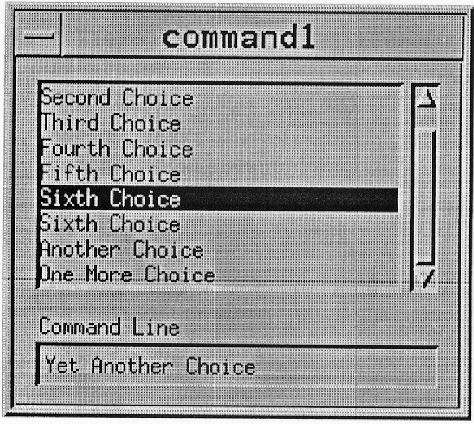
A CommandDialog should be used to enter keyboard commands. It should not interrupt the user's interaction with the application; that is, it should not be modal. It should include a CommandBox as shown in Figure 6-6 .
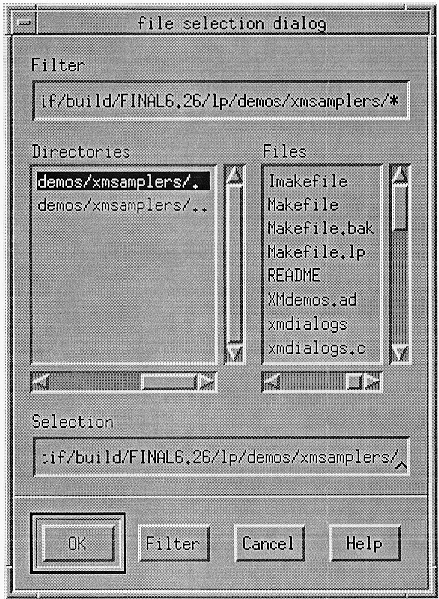
A FileSelectionDialog should be used to enter the name of a file for processing. It should not interrupt the user's interaction with the application; that is, it should not be modal. It should include a FileSelectionBox as shown in Figure 6-7 .
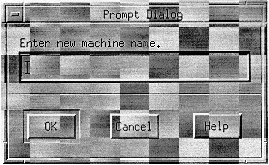
A PromptDialog should be used to prompt the user for input. It can interrupt the user's interaction with the application; that is, it can be application modal. It should include a message, a text input area, and one of the following button arrangements as shown in Figure 6-8 .
OK Cancel OK Cancel Help OK Apply Cancel OK Apply Cancel Help OK Apply Reset Cancel OK Apply Reset Cancel Help |
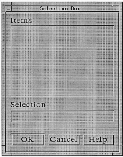
A SelectionDialog should be used to allow a user to make a selection from a list of choices. It can interrupt the user's interaction with the application; that is, it can be application modal. It should contain a SelectionBox as shown in Figure 6-9 .
A MessageDialog should be used to convey a message to the user. It should include a message and one of the following button arrangements:
OK OK Help OK Cancel OK Cancel Help Yes No Yes No Help Yes No Cancel Yes No Cancel Help Cancel Cancel Help Retry Cancel Retry Cancel Help |
There are a number of different types of MessageDialogs: ErrorDialog, InformationDialog, QuestionDialog, WorkingDialog, and WarningDialog.
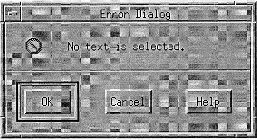
An ErrorDialog should be used to convey a message about a user error. It should stop user interaction with the application until it is dismissed; that is, it should be application modal. It should include an error symbol, a message, and one of the following button arrangements as shown in Figure 6-10 .
OK Cancel OK Cancel Help |
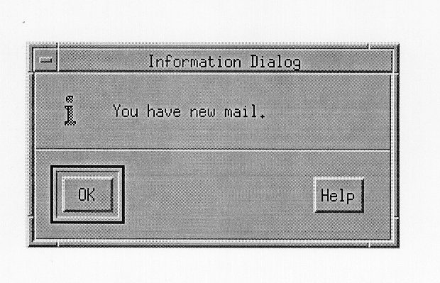
An InformationDialog should be used to convey information to the user. It must not interrupt the user's interaction with the application; that is, it must not be modal. It should include an information symbol, a message, and one of the following button arrangements as shown in Figure 6-11 .
K OK Help |
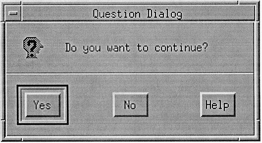
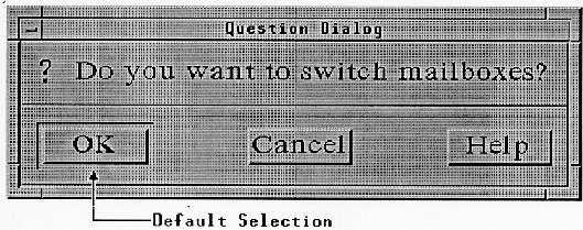
A QuestionDialog should be used to get a user response to a question. It should interrupt the user's interaction with the application; that is, it should be application modal. It should include a
question symbol, a message, and one of the following button arrangements as as shown in Figure 6-12 .
Yes No Yes No Help Yes No Cancel Yes No Cancel Help |
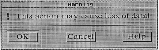
A WarningDialog should be used to alert the user to a possible danger. It should interrupt the user's interaction with the application; that is, it should be application modal. It should contain a warning symbol, a message, and one of the following button arrangements as shown in Figure 6-13 .
Yes No Yes No Help OK Cancel OK Cancel Help |
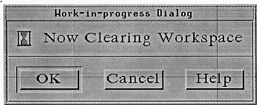
A WorkingDialog should be used to show work in progress and give the user an opportunity to cancel the operation. It should not interrupt the user's interaction with the application; that is, it should not be modal. It should contain a working symbol, a message, and any of the following sets of buttons in order as shown in Figure 6-14 .
Close Cancel or Stop Pause Resume Help |
A WorkingDialog should also include a progress indicator if that information is available.
The following subsections describe how you should group components by using the group components described in Section 6.1, "Choosing Components."
Separators are a good tool for visually separating groups of components. You should use Separators in your application any place where the border between two groups of components is not obvious by some other means, such as for a significant change in component types, framing, or a division by space.
Components similar in appearance and function group together naturally. You should organize similar components together. Similar PushButtons, as in a Menu, and a Panel of CheckButtons, as in a list of options, are good examples of where grouping is important. Without grouping, related actions are difficult to find. One of the most important cases is a Panel of RadioButtons. Without grouping, when you turned on one RadioButton, you might not see the previous button turn off. You can also associate a title with a group of components to better associate the group and its purpose.
Components that are grouped using a Composition group component can be positioned as they best fit, both physically and visually. This is often the case in the MainWindow client area, and is also useful when the layout of the components is important to the application.
When you lay out components in this manner, remember that your application can be resized by the user. This can be compensated for in a number of ways. If the area has a fixed size and is not appropriate to scroll, like a control panel, you can either clip the area or turn off resizing. If the area has a fixed size and is appropriate to scroll, you should include ScrollBars for scrolling the viewable area.
Composition component groups can also be positioned so that the position and size of each component is relative to the Composition component group or other components in the group. This style of layout permits the components to change size proportionally to any change in the size of the Composition component.
Sometimes a window is resized too small to be useful. Your application can either simply ignore this, clip the region once all the components are at their minimum size, remove less useful components to make room for more shrinking, or replace all the components with a message that indicates that the minimum size is reached, stating that the user needs to enlarge the window to continue working in it.
Panels can arrange components aligned horizontally, vertically, or in two dimensions. Buttons are usually aligned in Panels horizontally along the bottom of the client area, either in a MainWindow or in a DialogBox. ToggleButtons should be arranged in vertical Panels so the graphics align and look neat. A common use of Panels is in building Menus or RadioBoxes; that is, a set of RadioButtons. Two-dimensional Panels are commonly used in graphics programs to present drawing styles and in spreadsheets to contain cells.
Your application should use Panels to provide the best organization for large groups of similar components. Panels should be placed in a Composition component group to allow for proper user resizing either by using ScrollBars or by resizing the elements of the Panel.
PanedWindows provide a way for the user to simply adjust the size of components relative to one another. You should use PanedWindows to separate user tasks in an application with limited space. This allows the user to ignore elements of the application that are unused.
PanedWindows can also be used to present two simultaneous views of the same data. For example, a text editor can use multiple Panes, with a separate Text component in each Pane to allow the user to write in one section of a document while looking at another. The user can then resize the Panes to show more or less of either block of text.
PanedWindows can be composed of either vertical (one on top of the other) or horizontal (side by side) sets of Panes, Separators, and Sashes. Users can resize Panes by dragging the boundary between them. Making one Pane bigger makes the other Pane smaller, while the overall size of the window remains the same.
Menus are the primary means of organizing most of an application's features. Because of screen size limitation and visual simplicity, Menus organize components used frequently by users and components used in most application sessions.
There are four types of Menus:
Pulldown Menus
TearOff Menus
Popup Menus
Option Menus
Pulldown Menus are pulled down from a CascadeButton. CascadeButtons should always be available in the context that they are needed. Menus can also contain CascadeButtons so that Menus can be nested. The MenuBar is a horizontal collection of CascadeButtons.
TearOff Menus are a combination of a TearOffButton and another Menu, usually a Pulldown Menu. A TearOffButton contains a dashed line graphic representing perforations. TearOffButtons must be the first element within a Menu. When the TearOffButton is activated, the Menu changes into a DialogBox. A TearOff Menu is useful when you do not want the Menu to disappear after a Menu selection.
Popup Menus are context sensitive, but give no cue to their existence. They are popped up when the user presses BMenu over a component with an associated Popup Menu. Popup Menus should only be used to provide shortcuts, since new users of an application may not realize or remember that they exist. Even within a single control, such as a Canvas, the contents of a Popup Menu can depend on the position within the control, or the state of the elements at that position, such as whether the Menu is popped up from within a selected range of elements.
Option Menus provide a means of selecting from a set of choices while taking up very little space. An Option Menu is popped up from an OptionButton, which is distinguished by a bar graphic on the right side of the button.
Menus are composed of titles, elements, mnemonics, and accelerators. A Menu's title should be unique to avoid confusion. The title should clearly indicate the purpose of the Menu.
A Pulldown Menu's title is taken from the Label in the CascadeButton.
A Popup Menu's title should be placed at the top of the Popup Menu and separated from the Menu elements by a Separator.
An Option Menu's title is usually a Label to the left of the OptionButton, but it can be at the top of the Option Menu itself.
Most basic controls can be Menu elements including Labels, Separators, PushButtons, ToggleButtons, and CascadeButtons. The elements can be identified by either a text label or a graphic. A Menu must be wide enough to accommodate its widest element.
A mnemonic provides a quick way to access Menu elements from the keyboard. While the location cursor is in a Menu or MenuBar, pressing the mnemonic letter of an element activates that element. The MenuBar's and any Option Menu's mnemonics can be used by pressing <Alt> with the mnemonic letter. An element's mnemonic should be the first character of the element's Label. If that character conflicts with another mnemonic in the Menu, another character in the Label should be used. The mnemonic of an element should be underlined in the element's Label. When the appropriate mnemonic letter does not appear in the element's Label, it should appear in parentheses after the Label.
An accelerator provides a way to access Menu elements from the keyboard without posting the Menu. Accelerators are useful to the experienced user for saving time when using frequently used components. You should provide accelerators primarily as a matter of utility, not design conformity.
If a keyboard accelerator exists for a Menu entry, it should appear following the Menu's Label, justified on the same line. The accelerator and the selection should be separated by enough space to make them visually distinct.
You should use the following guidelines when designing Menus and Menu systems:
Keep Menu structures simple.
Group like Menu elements together.
List Menu selections by frequency of use.
List Menu selections by order of use.
Separate destructive actions.
Provide mnemonics and accelerators.
Use TearOffButtons in frequently used Menus.
Applications should keep Menu structures simple. One of the primary benefits of Menus is the ease of access to the elements of the Menu. While cascading submenus help the application and the user organize Menu elements, each level of a submenu reduces the ease of access to the Menu elements. Multiple levels of cascading submenus can also quickly create visual clutter. Whenever you consider using a cascading submenu, you should consider using a DialogBox or more Pulldown Menus instead.
Applications should group Menu elements into logical groups. This helps the user locate specific Menu elements. You should first try to place a new Menu element into the common Menu groups described in Section 6.2.1.5. If that is not appropriate, you should group new Menu elements according to function, with the more frequently used element appearing first. You should also use Separators between logical groups of elements.
As in other client areas, applications should order Menu elements according to the frequency of usage, positioning the most frequently used elements near the top of the Menu.
More important to Menu design than the frequency of use is the order of use. Applications should order Menu elements according to the order of usage. For example, the Copy element should be placed before Paste. This helps the user's interactions flow smoothly.
Applications should separate destructive actions from frequently chosen selections. This is to avoid accidental selection of the destructive element. Destructive elements, like Delete or Clear, should be placed at the end of a Pulldown Menu and separated from other elements by a Separator.
Applications should provide mnemonics and accelerators to Menu elements. Try to choose mnemonics and accelerators that are easy to remember by using letters from the element's title. Note that mnemonics and accelerators only add to the utility of your applications. They never detract from the basic ability of a new user.
Applications should provide accelerators for frequently used Menu items. In general, accelerators should not be assigned for every Menu item in an application. It is preferable to assign accelerators that have some mnemonic value, although accelerators that use function keys are acceptable.
Applications should not use accelerators that are a combination of the modifier <Alt> and letter keys to avoid conflicts with mnemonics. For example, <Alt> <E> as an accelerator for Exit conflicts with the use of <Alt> <E> to pull down the Edit Menu since it is the mnemonic for the Edit CascadeButton in the MenuBar.
Similarly, applications that involve text entry should not use accelerators that are combinations of the modifier <Shift> and letter keys to avoid conflict with the text entry commands. Applications that expect field controls to have bindings that include combinations of the modifier <Ctrl> and letter keys, such as text editors, should also avoid these combinations.
Accelerator bindings that use only one modifier are preferable to bindings that use two or more modifier keys.
Applications should use TearOffButtons in Menus whose elements are used many times in a row. If the semantics of the entries in a Popup Menu depend on where in a component it is popped up, the Menu should not include a TearOffButton, unless context-sensitive entries are disabled when the Menu is torn off. Menu entries in a torn off Menu should be enabled or disabled as appropriate when the state of the application changes.
After a user tears off a Menu, the Menu elements are placed in a DialogBox that is titled with the Menu title, and the Menu is unposted. The TearOffButton should be removed from the DialogBox, but, if it remains, it can be used to close the DialogBox.
When designing a DialogBox, you should follow all the same layout principles as for other applications areas. DialogBoxes are usually transitory. The user usually wants to simply respond and get back to the primary tasks of the application. To help the user respond quickly, there are a number of common DialogBox actions. By using and ordering these actions consistently, you provide the user with cues to quickly respond to each DialogBox.
When a DialogBox is displayed, all components within the DialogBox should reflect the current state of the application. For example, if the DialogBox is used for changing the current font in a text editor, the DialogBox should be initially displayed with the current font. If the DialogBox is modeless, then any changes to the application should be updated in the DialogBox.
DialogBoxes can limit how a user can interact with other windows in order to force the order of interaction. These limitations, which are called modes, are described in the following text.
Remember that the guidelines presented in this section, like all the guidelines in this guide, apply only in a left-to-right language environment in an English-language locale. You need to make the appropriate changes for other locales.
While your application can sometimes require special DialogBox actions, most share common actions. The common actions provide a consistent means for the user to quickly respond to DialogBoxes and get back to the primary application tasks. The common actions should be presented
in a horizontal collection of PushButtons at the bottom of the DialogBox, separated from the rest of the DialogBox by a Separator.
No DialogBox will contain all of the common actions in the following list. You should use the ones appropriate to your application or determine new actions so they do not conflict with the common actions listed. If you create a new action, you should give it an active-voice label that indicates its purpose. An active-voice label describes the action that pressing the button causes. The actions are listed in the approximate sequence in which they should appear in DialogBoxes as follows:
If a DialogBox action causes an error, the DialogBox should not be dismissed before the error is displayed. Instead, the DialogBox should remain available after the error is dismissed to give the user a chance to correct the error and reuse the DialogBox. If the actions to be performed by OK or Apply depend on the state, then these Labels should be replaced by ones that indicate the action to be performed.
You should arrange PushButton actions in DialogBoxes in the same way you arrange other PushButtons, according to order and frequency of use. The common action PushButtons should be ordered as presented in the previous section. Positive responses to the DialogBox should be presented first, followed by negative responses, and canceling responses. Help should always be the last action on the right.
The following rules should be used when determining what default buttons to place in a DialogBox:
Modal DialogBoxes should use one of the following button arrangements unless superseded by another rule:
OK Cancel
OK Cancel Help
Modeless DialogBoxes should use one of the following button arrangements unless superseded by another rule:
OK Apply Cancel
OK Apply Cancel Help
OK Apply Reset Cancel
OK Apply Reset Cancel Help
Information DialogBoxes should use one of the following button arrangements:
OK
OK Help
Question DialogBoxes should use one of the following button arrangements:
Yes No
Yes No Help
It is possible that both the Yes and No actions of a Question DialogBox will perform an action. If this is the case, the Question DialogBox should use one of the following button arrangements:
Yes No Cancel
Yes No Cancel Help
Warning DialogBoxes should use one of the following button arrangements:
Yes No
Yes No Help
OK Cancel
OK Cancel Help
Working DialogBoxes should contain any of the following sets of buttons in order:
Close
Cancel or Stop
Pause Resume
Help
Your application determines the size and location of its DialogBoxes. You should size and place DialogBoxes so that they do not obscure important information in other windows of your application. The initial size of a DialogBox should be large enough to contain the
dialog components without crowding or visual confusion, but otherwise should be as small as possible. DialogBoxes should follow the same rules for resizing as a MainWindow as described in "Arranging Components for Resizing Layout" in this chapter.
You should place DialogBoxes on the screen so they are completely visible.
In general, you should place DialogBoxes close to either the component that caused it to be displayed, the current action, or the information needed to respond to it. When a DialogBox relates to an item in an underlying window, you should position the DialogBox to the right of the item. If there is not enough room to the right of the item, try to position the DialogBox to the left, below or above the item, in that order, depending on screen space available. You should only obscure related information as a last resort.
If a DialogBox does not relate to items in the underlying windows, the DialogBox should be placed centered in the application's work area.
If two DialogBoxes need to overlap, you should offset the top DialogBox to the right and below the title of the lower DialogBox. Use your best judgement, knowing that the screen area for DialogBoxes is limited.
While the previous suggestions seem simple enough, they cannot always be followed completely. Therefore, DialogBoxes, once displayed, should be movable so that the user can relocate them as needed to see information in underlying windows.
By default, applications allow the user to drag text from just about everywhere and drop it into any writable Text component. If you want to use the features of drag and drop to and from other components in your application, you need to design these features into your application.
The most important decision you need to make in designing drag and drop into your applications is which elements you want to make draggable and which components you want to allow drops onto. When making this decision, keep in mind that drag and drop not only transfers data within an application but also between applications. Therefore you need to consider the impact of unfamiliar data being dropped into your application, and in which formats you want to allow your own application's data to be transferred out. The following subsections discuss the following other application considerations when designing drag and drop into your application:
At the start of a drag operation, the pointer is replaced with a drag icon. The drag icon is defined by the application for each draggable element and can be composed of the following:
A source indicator
An operation indicator
A state indicator
The source indicator should give a visual representation of the primary data type of the draggable element; for example, horizontal lines in a rectangle for representing text or a color palette for representing a color tool. All drag icons must include a source indicator. Figure 6-15 shows move, copy, and link drag icons for graphics and textual information.
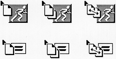
The operation indicator shows whether a drop will result in a move, copy, or link of the transferred data. Most drag icons should include an operation indicator, but an operation indicator should only be included in the drag icon when the result of the drop operation is a data transfer. The operation indicator can be shown either as a separate element of the drag icon or as a variation of the graphic used for the source indicator.
The state indicator shows whether the current pointer location is over a valid drop site for the dragged elements. The state indicator can show three different states:
Valid drop site — The hotspot of the drag icon is over a valid drop site for the data the user is dragging. A drop at this point usually results in a successful transfer.
Invalid drop site — The hotspot of the drag icon is over a drop site, but the data the user is dragging is not compatible with the drop site. A drop at this point results in a failed transfer.
No drop site — The hotspot of the drag icon is not over a drop site. A drop at this point results in a failed transfer.
All drag icons can include a state indicator. The state indicator should be coincident with the hotspot of the pointer. The state indicator can be a separate element in the drag icon or a change in the visual representation of the drag source.
When defining new drag icons for your application, you should follow the same rules as for defining any other new pointers described in Section 2.2.2, "Pointer Shapes."
The source of the dragged elements can also provide visual indications of the result of a drop. For example, if the default operation for the dragged elements is a move, the source can be hidden or deemphasized; or, if the default operation of the dragged elements is a link, a line can be drawn from the source to the pointer.
A drag-under effect is a change to the visual state of a possible valid drop site when the drag icon pointer is over the drop site. All drop sites should use some kind of drag-under effect. Drop sites can use a solid line around the site, or a raised or lowered beveled edge around the drop site, as a drag-under effect. Drop sites can also change any visual component of the drop site, or even animate those changes, as a drag-under effect. For example, an icon representing a folder might show an animated image of the folder opening as a user drags a file onto it.
Help on drag and drop operations should be provided by the drop site under the drag icon pointer at the time help is requested. If a drop site gets a help request during a drag and drop operation, the drop site application should post a DialogBox with help information about the results of a drop at that location and the choices for the completion of the drag and drop operation. The DialogBox should allow for canceling the drag and drop operation or dropping the elements at the current location as a move, copy, or link.
The drag and drop help DialogBox should be an Information DialogBox with a message describing the possible results of a drop at that location. The first button in the row of buttons at the bottom of the DialogBox should contain the default transfer option (Move, Copy, or Link) or OK for the single transfer action described in the text of the DialogBox. If the user has not specified a transfer option using modifier keys, and more than one is possible, then:
If there is a valid move transfer option, the DialogBox should contain the move transfer option on a button labeled Move.
If there is a valid copy transfer option, the DialogBox should contain the copy transfer option on a button labeled Copy.
If there is a valid link transfer option, the DialogBox should contain the link transfer option on a button labeled Link.
The DialogBox should not include an OK button.
Drag and drop help DialogBoxes must contain a Cancel button for canceling the drag and drop operation in progress. The DialogBox can contain a Help button for providing further help on the DialogBox actions.
After a drop operation, the application containing the drop site determines the best format to use to transfer the data, based on the data types that the drag source can send. The drop site can use any heuristic to determine this format.
If multiple transfer formats (in the case of links, multiple view formats) are acceptable in the drop site, the drop site application should let the user choose the correct transfer format either through a customization feature or through a DialogBox that lists the possible choices. The DialogBox should be a Question DialogBox asking the user to choose the best transfer format. The DialogBox must provide a choice of available transfer formats. The choice can be provided as a row of buttons along the bottom of the DialogBox, or in a RadioBox within the QuestionDialog. Using either method, there must be a Cancel button in the bottom row of buttons in the DialogBox. The DialogBox can also include a Help button that provides help on the results of a drop at the current location. If the DialogBox uses a RadioBox to present the format choices, the most likely format should be first and initially selected, formats that are currently invalid should be set insensitive, and the DialogBox must include an OK button in the bottom row of buttons for accepting the RadioBox choice. A Popup Menu can be used instead of a DialogBox to let the user choose the format.
This section gives guidelines for creating applications with consistent interactions. When an application behaves as expected and the user is not surprised by the results of the actions, the user can complete tasks quicker. The following subsections present the following guidelines for good application interaction:
The first step to consistent interaction is to provide cues to the result of every action. This means that actions of components should be indicated by the component's shape, label, and graphics. It also means that the actions and interactions of components should remain consistent, so the user always knows what to expect.
Lastly, it means that interactions should be simple. As interactions become complicated, it also becomes difficult to visually represent the interaction. Complicated interactions and components create the possibility for more errors. Even the most complicated concepts can be clarified by careful organization, so, if your application's interactions seem complicated, consider reorganizing them for simplicity.
Users expect components to behave consistently across all applications. PushButtons always perform an action. OptionButtons always provide selections. Because of this, when users want to perform an action, they look for a PushButton, usually in a Menu. They do not look for an OptionButton. You should use the components that are provided when appropriate, rather than create new ones. You should not alter the look of a component so drastically that its type is unrecognizable.
One of the best indicators of the action of a component is its Label. The Label can be either text or a graphic. You should choose your Labels carefully to indicate the action of each component.
Components that perform actions should be labeled with active verbs. Components that present options should be labeled with nouns. You should also label component groups, including Panels, with nouns to indicate the contents of the group.
Consider the use of graphics as Labels with two cautions. Graphic Labels cannot be nouns or active verbs, so choose a graphic whose meaning is clear in the context of the component. Also remember that, while graphic symbols are very language independent, they can be highly culture specific. In some cultures, a mailbox graphic can indicate a mailer action; but, since mailboxes are not common in all cultures, an envelope graphic may be better, or you can provide a mechanism for changing the graphic based on the locale.
Many components also include a small graphic symbol following the Label to indicate the action of the component. CascadeButtons should use an arrow graphic that points in the direction the cascading Menu will appear. OptionButtons should use a rectangle graphic to distinguish them from PushButtons.
Any component that needs more information to complete its action should include an ellipsis following the Label. This additional information should be requested in a DialogBox. The ellipsis should not be used to indicate that the component will post a DialogBox. The ellipsis should be included only if the purpose of the DialogBox is to gather more information needed to complete the requested task. For example, the Menu choice Print would use an ellipsis if a DialogBox is posted requesting print characteristics prior to the printing action, but the Menu choice Help would not use an ellipsis even though the help information is presented in a DialogBox.
All previously mentioned graphics should follow the text or graphic of the Label. In left-to-right language environments, the graphic should be on the right. In right-to-left language environments, the graphic should be on the left. Note that the graphic indicating the state of a ToggleButton precedes the Label in a left-to-right language environment.
Your application should use default values for common settings or obvious selections. Default values should be shown in the on state. For example, the default value for a Text area should be in the Text area in the selected state whenever text entry is requested; the default selection in a List should be set in the selected state whenever a list selection is requested; or the default RadioButton should be filled in a Panel at application start-up time. In any case, once the state is changed, the new state should take the place of the default until the state is reset. Your application can decide whether to save its state after being closed.
Groups of controls, such as a DialogBox, can also have a default action. The default action is usually activated by pressing <Enter> or <Return>.The default action of a component group should be distinguished from the other selections by an extra border as shown in Figure 6-16 .
The OK PushButton should be the default PushButton in modal DialogBoxes and modeless DialogBoxes that are transient. The Apply PushButton should be the default PushButton in a modeless DialogBox that is likely to be displayed for multiple actions.
Using the keyboard to navigate through the PushButtons, the button with the location cursor should become the default PushButton. This ensures that pressing <Enter> or <Return> over a PushButton invokes the correct PushButton. When the location cursor leaves the PushButtons, the original default button should once again become the default.
A component has modes when its action changes based on some previous action or the state of the application. This is very confusing to the user, who was expecting the original action of the component. Components in your application should not have modes. Your application should use multiple components rather than modal components.
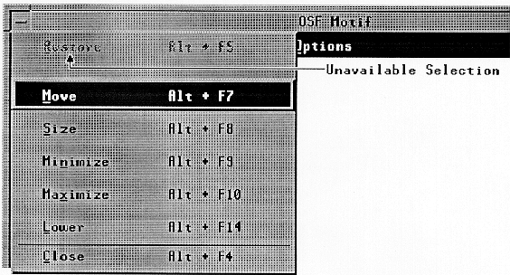
As the state of your application changes, certain components become inappropriate. For example, the Minimize selection in a window Menu is inappropriate when the window is already minimized. In such cases, you should make the inappropriate components unavailable. This is also called disabling the components. Disabled components should be visually deemphasized, usually by graying the Label of the component.
You should not remove unavailable components from the application client areas. The components should remain visible to remind the user of their existence and to ensure application consistency. Figure 6-17 shows a disabled Menu element.
You should disable Menu items and components to help avoid errors. In general, you should disable the lowest level component that results in an irreversible error state. For example, consider a graphics editor that has a DialogBox that is used for aligning selected graphics objects. If the user might want to see the choices in the DialogBox even if the choices are not available, this DialogBox should be displayable at all times; its Menu item should not be disabled. If there are no graphics objects to align, the DialogBox should still be displayed, but its OK and Apply buttons should be disabled. Once graphics objects are selected, the OK and Apply buttons should become enabled.
Menu items that are inappropriate and that result in error messages should be disabled. Some examples are the Edit Menu's Cut and Copy actions when nothing is selected. The Edit Menu's Undo entry should be disabled if the last operation cannot be undone.
Menu items that perform no action need not be disabled. For example, the New entry in the File Menu need not be disabled immediately after it is invoked. It can be selectable repeatedly, even though it performs no new action, because it does not result in an error state.
A Menu item that displays a modal DialogBox should be disabled if it would cause an error either on display of the box, or on clicking the OK or Apply buttons in the DialogBox. Since the DialogBox is modal, nothing can be changed in the application to correct the error until the box is dismissed, and it should not be displayable until the application is in a state that makes the action of the DialogBox possible.
Menu items that display modeless DialogBoxes should never be disabled. If a box is modeless, the user can change the state of the application at any time to make the DialogBox useful. If the action cannot be completed because some necessary information is not yet available, then the OK and Apply buttons should be disabled.
After a TearOff Menu is torn off, an application can disable elements that are not appropriate in the torn off state. Elements in a torn off Menu can be disabled in the same manner as elements in any other Menu or DialogBox.
You should avoid frequently disabling and enabling components in situations where the state change would cause a distracting flashing. For example, editing a Text component in a DialogBox can cause some buttons to be inappropriate at each invalid text value. In this case, you should display an error message if the OK or Apply button is clicked for an inappropriate text value. Of course, the error message should explain the valid text values.
Another important element to user interaction is providing feedback about the current state of the application. This is done, as described in the previous section, by using labels and graphics and by keeping the interface consistent. Your application should also dynamically indicate the state of the application's actions. For example, the mouse pointer shape changes to indicate when and where special actions can occur. Chapter 2, "Input Models" describes mouse pointer shapes in detail. Other ways to provide the user feedback are described in the following subsections.
If an action takes a long time to complete, the user may mistake the delay to mean that the system or the application stopped working. For actions that take a long time to complete, your application should indicate that there will be a delay with a WorkingDialog. If your application can track the progress of long actions, it should try to update the WorkingDialog with the progress of the action.
Certain actions can cause destructive results, such as closing an application before saving changes in the current file. Applications should not disallow such destructive actions; instead, they should warn the user of the consequences with a WarningDialog. The WarningDialog must allow the user to cancel the destructive action. Note that too many WarningDialogs can be disruptive to the user's main task. WarningDialogs should be reserved for truly destructive actions. For destructive actions that can easily be recovered, applications should provide undo actions to reverse them; for example, the Undo element of the Edit Pulldown Menu.
Even in the most intuitive application, the purpose of a component or the way to do a task can be hard to figure out for a new user. Your application should provide a help mechanism for all of its aspects. "MenuBar" and "Help Menu Contents," describe the most common base for a help mechanism, the Help Pulldown Menu on the MenuBar. Context-sensitive help should also be available by using <Help>.
Good user-application interaction should also allow user flexibility. No matter how well your application is designed, some users will not like parts of it. They will want to change some elements of it; for example, from simple elements like the colors and fonts to complicated elements like the default values. You should allow users to adjust elements of your applications because it increases their sense of control over the applications. You should consider the following attributes of your applications for user customization:
Application parameters
Colors
Fonts
Default values
Key bindings
Labels
Messages
Help information
The exact list of attributes you should allow the user to customize depends on your application.
For consistency with other applications, you should always try to use existing components for your application tasks, but there are cases where new components are needed. In designing new components, you should follow the same rules as application designers follow. You should think of components as small applications. They perform a task, present information to the user, and take information from the user. New components must follow the guidelines for designing applications.
The first step to designing a new component is to compare its features with those of the other components. If the new component has a feature that is the same as another component, the mechanisms for using the feature, layout, key bindings, graphics, and so on, should be the same in the new component. You should also try to match the appearance style of components on your system. Most OSF/Motif compliant systems use a 3-dimensional beveled presentation style. Appearance is not specified as a matter of component style in this guide; however, any new components will assimilate better with existing components if they are designed to conform to the implied appearance style for the system on which they will be used.