This chapter explains how to use the IconSmith tool to draw an icon for your application. This chapter contains these sections:
“About IconSmith” briefly describes the IconSmith tool.
“Where to Install Your Completed Icon” explains where to put your icon file, after you've finished drawing your icon.
“Some Definitions” defines some terms you'll need to use IconSmith.
“Starting IconSmith” explains how to start the IconSmith tool.
“IconSmith Menus” discusses IconSmith's main menus: the IconSmith menu and the Preview menu.
“IconSmith Windows” lists IconSmith's windows: the main window, the Palette window, the Constraints window, and the Import Icon (Set Template) window.
“Drawing With IconSmith” describes IconSmith's drawing tools.
“Selecting” describes IconSmith's selection features.
“Transformations” describes IconSmith's transformation features.
“Concave Polygons” explains how to construct concave polygons in IconSmith.
“Constraints: Gravity (Object) Snap and Grid Snap” explains how to use IconSmith's gravity snap and grid snap features to guide your drawing.
“Icon Design and Composition Conventions” explains how to make sure that your icon complies with the basic icon design and composition conventions described in “Designing the Appearance of Icons” in Chapter 2 of the IRIX Interactive User Interface Guidelines.
“Advanced IconSmith Techniques” describes some advanced techniques, such as drawing circles and ovals in IconSmith.
IconSmith is a program for drawing Desktop icons. Icons drawn with IconSmith are saved in an icon description language. The icon description language is described in Appendix D, “The Icon Description Language”.
Designed for the specific requirements of the Desktop, IconSmith produces icons that draw quickly and display properly on the Desktop on all Silicon Graphics workstations.
An icon picture generally consists of a unique badge plus a generic component (for example, the “magic carpet” designating executables). The badge is the part of the icon picture that appears in front of the generic component and that uniquely identifies your application. The generic components are pre-drawn and installed by default when you install the IRIX Interactive Desktop environment.
You don't need to draw the generic components of your icons. When using IconSmith to draw your icon badge, you can import the generic component as a template as described in “Importing Generic Icon Components (Magic Carpet)”. Then your ICON rule in your FTR can include the generic components so they appear behind your badge(s) when the icon is rendered on the Desktop.
 | Note: Iconsmith is not a general-use drawing application. Use it only to draw Desktop icons. |
After drawing your badge with IconSmith, save the badge—the filename should end in .fti—and install the saved file in the correct directory:
If you install your FTR (.ftr) files in the /usr/lib/filetype/install directory (where you typically should install your FTR files), then install your icon (.fti) files in the /usr/lib/filetype/install/iconlib directory.
If you install your FTR files in one of the other directories listed in Appendix F, “FTR File Directories”, then install your badge in a subdirectory of that directory. Name the subdirectory iconlib if the subdirectory doesn't already exist.
After you install the badge in the appropriate directory, see the following for more information:
IconSmith uses some terms that may not be familiar to you. This section defines some terms used in the rest of this chapter.
The caret (shown in Figure 12-1) is a small red and blue cross. The caret always shows the location of the last mouse click—when you click the left mouse button, the caret appears where the cursor is pointed. Unlike the cursor, the caret shows the effects of grids and gravity (described in “Constraints: Gravity (Object) Snap and Grid Snap”).
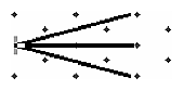
The transformation pin (shown in Figure 12-2) indicates the point from which an object is scaled or sheared and around which an object is rotated. It is a blue and white cross, larger than the caret. It can be dropped anywhere to affect a transform.
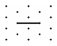
A vertex (shown in Figure 12-3) is a selectable point, created when the mouse is clicked in the IconSmith window while the <Ctrl> key is held down.
A path (shown in Figure 12-4) is one or more line segments between vertices. Paths can be open or closed. A closed path can be filled or unfilled.
To start IconSmith from the Desktop, double-click the IconSmith icon, shown in Figure 12-5.

To start IconSmith from the command line, type:
% /usr/sbin/iconsmith |
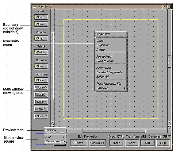
The IconSmith main window, shown in Figure 12-6, provides two popup menus, the IconSmith menu and the Preview menu:
Access the IconSmith menu by holding down the third (typically the right) mouse button anywhere in the main window drawing area.
Access the Preview menu by holding the third (right) mouse button down within the blue preview square located in the lower left corner of the IconSmith main window.
Besides the main window, IconSmith provides three other primary windows:
Palette (Selection Properties) window, which is described in “Drawing Filled Shapes”.
Constraints window, which is described in“Constraints: Gravity (Object) Snap and Grid Snap”.
Import Icon or Set Template window, which is described in “Templates”.
IconSmith provides tools for drawing paths, selecting colors, importing design elements from other icons, drawing shapes, and using template images. This section covers the following topics:
Before you begin drawing, it's often useful to set up the preview box to represent the Desktop as closely as possible. This helps you choose colors and draw your icon to look its best when it appears on the Desktop and in the Icon Catalog. To do this:
Set the Background color to WorkSpace from the Preview popup menu. This gives the preview area the background color of the Icon Catalog.
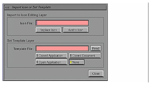
Click the Import button at the bottom of the IconSmith window to display the Import Icon or Set Template window (shown in Figure 12-7).
Import an appropriate template from the Import menu. For example, if you are drawing an icon for a new application, import the Closed Application template by clicking that button. This helps you center and size your design appropriately.

Tip: Draw your icon design on a clear transparency, and tape the transparency to the top of the monitor housing. Using the drawing as a guide, trace it using IconSmith. Tip: When drawing in IconSmith, it is easy to select the wrong object. One technique that you can use is to draw adjacent icon components separately to prevent confusion when selecting and editing an object. When you have finished working with the parts, you can move them together.
There is an “Undo” option in the IconSmith popup menu. To bring up the IconSmith popup menu, hold down the right mouse button. You can undo up to nine operations using the <F1> key. To redo something you have undone, hold the <Shift> key and press the <F1> key.
No single polygon can contain more than 255 vertices.
Also, be careful not to draw outside the royal blue boundary that appears in the preview box and in the drawing area. The Desktop doesn't display correctly outside those areas.
To draw a path with IconSmith:
Select a starting point by clicking the primary (usually the left) mouse button.
Move the mouse to a new position.
Hold down the <Control> key and click the primary (left) mouse button.
This process creates a line segment. To add more line segments connected to the first, repeat steps 2 and 3 as many times as necessary. To create a disconnected line segment, repeat from step 1.
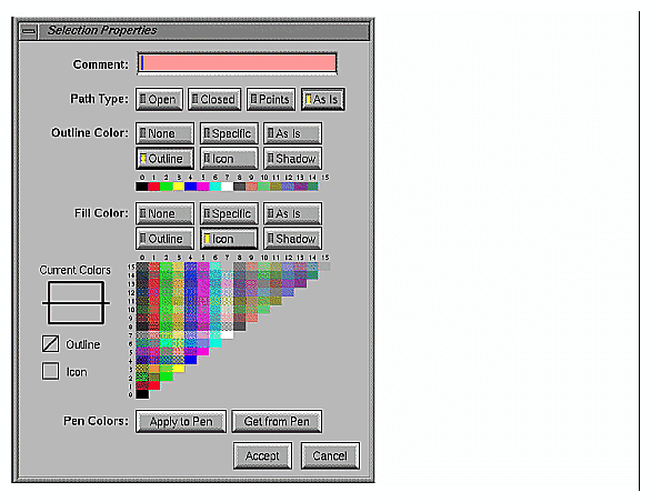
In IconSmith, you can fill a closed path (one in which the beginning and end points meet) with a color. To begin, click the Palette button at the bottom of the IconSmith window to display the Palette window, shown in Figure 12-8.
To draw a filled shape, select a fill color from the Palette menu, and proceed to draw. When you finish creating the closed path, the shape is filled with the current fill color. To change the fill color of an existing polygon, select it by clicking on one of its vertices. Then choose a new fill color from the Palette. Also, you can change the fill color of a path by selecting the path and then selecting a new fill color.
Fill does not work properly with concave closed paths, nor with paths in which the beginning point does not meet the end point. See “Concave Polygons”.
The default fill color is “Icon,” a special white color, and the default line color is “Outline,” a special black color (see “Selecting Colors”).
To delete any path or vertex, select it and press the <Back Space> key, or use “Delete” in the IconSmith popup menu.
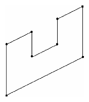
Icons created by Silicon Graphics are drawn in the same isometric view, which provides an illusion of 3-D, even though the polygons composing the icons are 2-D. If you draw icons facing the screen at right angles, they look 2-D. To generate a 3-D effect, draw “horizontal” lines so that they move up 1 unit in the y-axis for every 2 units they extend along the true x-axis. See Figure 12-9.
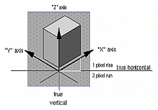
Use the same projection that the original icon set uses. Icons tilted in the wrong direction look off-balance, and destroy the 3-D appearance. For your convenience, IconSmith provides an isometric grid. By following the diagonals of this grid, as shown, you can create an icon that fits in exactly with other isometric icons in the Desktop. You can count along these diagonal grid dots, to help measure, align, or center pieces of your icon.
Desktop icons can be displayed in many sizes. IconSmith includes two features useful in designing your icon for display at all sizes, the Preview box and the slider on the right side of the drawing area.
You can use the Preview box to see your icon design in common sizes and background colors. The Preview box is the blue box in the lower left corner of the main IconSmith window. By default, the Preview box shows your drawing at the default Desktop icon display size and no background color. You can change the icon size and background color in this window using the Preview box popup menu.
As you design your icon, periodically check its appearance in the Preview box. Because users can enlarge icons only to a maximum size of about 1x1 inch, many details will not appear or will become distorted at normal icon size. Also, keep in mind that the more detail your icon has, the longer it takes for the Desktop to render the icon.
You can import design elements such as circles into your badge. Importing elements where possible saves you work and makes it easy to include common design elements in all the icons for one application.
To import an existing icon or icon element, click the Import button. This brings up the Import Icon or Set Template window. Use the “Import to Icon Editing Layer” area to specify the icon file you want.
Generic and sample material can be found in the /usr/lib/filetype/iconlib directory. For example, to import a sample circle, type the filename:
/usr/lib/filetype/iconlib/sample.circle.fti |
Other icons can be found in:
/usr/lib/filetype/default/iconlib
/usr/lib/filetype/system/iconlib
/usr/lib/filetype/vadmin/iconlib
All icons are potential sources for design elements. However, if you are designing a unique set of executable or document badges, you should make use of templates as described in “Templates”, and “Icon Design and Composition Conventions”.
You can use templates to help you design your icons or for tracing. You can import a template so that you can see it in the IconSmith drawing window, without saving or displaying as part of the design. This is most useful for getting position information while you are designing a unique badge to use in conjunction with the generic executable and document icons.
| Note: You cannot move or change an icon template in IconSmith. |
To display a template, click the Import button. In the Import Icon or Set Template window (shown in Figure 12-7), type the name of the template icon file you want in the textfield “Template File” in the area labeled “Set Template Layer.” Alternately, click any of the three template buttons to retrieve common generic components. These template images are the most often used, and they are discussed in “Icon Design and Composition Conventions”.
Before you edit, move, delete, or change the color of an object or vertex, you have to tell IconSmith which object you want. This section describes aspects of selecting:
Selecting can be difficult in a complex composition. The following tips can make the task easier:
To select an object or vertex, move the cursor on top of the object's outline and click the left mouse button. The vertices highlight blue and white when the object is selected. To move an object, double-click, hold down the left mouse button and move with the mouse. The vertices highlight green and yellow when you can move the object.
To move a vertex, click once on the vertex, then drag it to a new location.
You can select more than one object or vertex by holding down the <Shift> key during the selection process. To move the objects or vertices, move only one and the rest will follow.
You can select all vertices in an area with your mouse. Hold down the left mouse button and sweep the cursor across the vertices you want. The area you select is indicated by a box. When you let go of the left mouse button, all vertices are selected.
You can deselect a vertex by holding down the <Shift> key and clicking the vertex.
When you use the mouse to select an area with objects in it, you can include only some vertices of some objects. When you toggle on the Partial button, objects partially selected are highlighted. When you toggle off the Partial button, only objects that fall entirely within the swept-out area are selected.
In compositions with many objects, you can use “Deselect Fragments” to make selection easier. When selecting the objects in the drawing area, you can also select adjacent objects, then deselect what you don't want. Hold the <Shift> key down and click one vertex of each object you don't want. This deselects the vertex, which makes the object partially selected. Then you can use “Deselect Fragments” from the IconSmith popup menu to deselect the entire object.
“Select Next” allows you to select a vertex that is covered by another vertex. When two or more trajectories (lines) each have a vertex at a common location, such as two triangles with a coincident edge, the “Select Next” operator is useful for selecting a trajectory other than the top one. “Select Next” is also useful in images with tiled parts, where most vertices share a location.
Select a shared vertex by clicking its location. That vertex is highlighted in yellow and green (and the red and blue caret appears at that spot). The other vertices of the trajectory selected are highlighted in white to indicate the trajectory to which the selected vertex belongs. Now each time you choose “Select Next” from the IconSmith menu, you step through all the other vertices of all the other trajectories which have a vertex at that point.
The Transform buttons let you shrink, enlarge, stretch, and rotate portions of your icon design. These features can make drawing easier and more precise.
To use any Transform button, follow this procedure.
Choose the Transform option you want using any of the six transform buttons located on the left side of the IconSmith window: Scale, Scale XY, Scale X, Scale Y, Rotate, or Shear Y.
Choose a point in the main IconSmith window drawing area as a reference point for the transformation by positioning the cursor and clicking the left mouse button.
Bring up the IconSmith popup menu and select “Move to Caret” from the Transform Pin rollover menu.
To select an entire object for transformation, hold down the <Alt> key and double-click the object you want to transform. Otherwise, you may select individual vertices by holding down the <Alt> and <Shift> keys while clicking each desired vertex. Do not release the <Alt> key when you have finished selecting vertices.
While still holding down the <Alt> key, position the cursor inside the object you want to transform. Press and hold down the left mouse button and move the mouse to transform the object.
For example, here is how you enlarge a circle:
Choose “Scale” from the Transform menu.
Choose a point on the perimeter of the circle.
Bring up the IconSmith popup menu and select “Move to Caret” from the “Transform Pin” rollover menu.
Hold down the <Alt> key and double-click the circle. All vertices on the circle are now highlighted in green and yellow.
Continue to hold down the <Alt> key. Position the cursor on a vertex of the circle. Press and continue to hold down the left mouse button while you sweep the mouse out of the circle. The circle perimeter follows the cursor, enlarging the circle.
Release the left mouse button and <Alt> key when the circle is the size you want.
The buttons marked Scale X and Scale Y limit scaling transformations to either horizontal or vertical, respectively. Unlike the Scale button, the Scale XY button allows you to stretch your object both horizontally and vertically.
The Shear Y transformation transforms rectangles into parallelograms with one pair of sides parallel to the y axis. The Shear Y button is useful for transforming art that is drawn in a face-on view to an isometric view.
Note that strictly speaking, the Shear Y transformation performs two transformations: shear in y and scale in x.
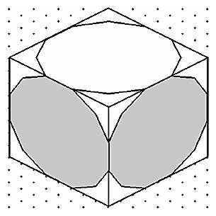
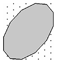
Figure 12-10 shows a concave polygon.
By default, IconSmith does not fill concave polygons properly. If you prefer to have concave polygons filled properly while drawing your icon design, you can tell IconSmith to draw concave polygons. Bring up the IconSmith popup menu with the right mouse button. Select “Concave” and pull out the rollover menu. Select “No GL Check” from the rollover menu. IconSmith will not check for concave polygons until you select “GL Check” from the Concave menu.
You can use gravity snap and grid snap to guide your drawing in IconSmith, allowing you to align and compose objects perfectly. This makes drawing easier and more precise. Grid snap causes the caret to “snap” to vertices or to the edges of the grid pattern displayed behind the objects you are editing. Gravity snap causes the caret to snap to vertices and the edges of objects you have already drawn. It is a good idea to make use of these features to ensure that your icon looks clean and precise at all sizes.
Typically, it's sufficient to toggle on gravity snap and grid snap. However, you can control gravity snap and grid snap properties by using the Constraints window.
Click the Constraints button at the bottom of the IconSmith window to display the Constraints window, shown in Figure 12-11.
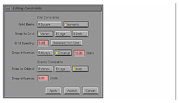
When using the Constraints window, remember to click either the Apply or Accept button to implement your changes. The Accept button implements your changes and closes the Constraints window, and the Apply button leaves the window on your screen.
In the main IconSmith window, the Snap button under the heading “Grid” lets you turn on or off the grid setting you've made in the Constraints window. The Show button lets you display or hide the grid. To change the grid behavior, use the settings in the “Grid Constraints” portion of the Constraints window.
You can change grid properties by selecting various buttons in the Grid Constraints section of the Constraints window. Selections include:
Grid Basis buttons control the shape of the grids. IconSmith includes two types of grids. The isometric grid provides guidance in the perspective described in “Keeping the 3-D Look”. IconSmith also provides a traditional square grid. To change the type of grid you are using, select a Grid Basis button, and then click the Apply button.
Snap to Grid buttons affect what the caret gets snapped to: either vertices or edges. These changes are reflected in the appearance of the grid after you click the Apply button the appearance of the grid changes.
Grid Spacing controls the distance between points in the grid. You can type in the number of pixels you want, or base the distance on a selected line in your icon design. Measure from Line measures the grid spacing from the line you select in the drawing area. When you copy an object using “Duplicate,” the copy is placed one grid space down and to the right from the original (or the previous copy). You can use Grid Spacing to control where IconSmith places duplicate objects.
Snap Influence allows you to adjust the area influenced by the “magnetic field” of the grid.
The controls in the “Gravity Constraints” portion of the Constraints window control how gravity snap behaves. In the main IconSmith window, the Snap button under the “Gravity” heading lets you turn on or off the influence of gravity on objects.
Snap to Object allows you assemble objects in your design smoothly. The object's edge, vertex, or both attract other objects when they are moved within range of gravity.
Snap Influence allows you to determine the range, in pixels, of the gravity influence of objects in your design.
The standard set of Desktop icons has been designed to establish a clear, predictable visual language for end users. As you extend the Desktop by adding your own application-specific icons, it is important to make sure that your extensions fit the overall look of the Desktop and operate in a manner consistent with the rest of the Desktop. This section discusses:
“Designing the Appearance of Icons” in Chapter 2 of the IRIX Interactive User Interface Guidelines contains extensive guidelines for designing the look of your icon.
Many icons share common components. One example is the “magic carpet” component used as a background component by most executable files; individual applications can add unique badges.
Rather than redrawing the common “generic” component in each individual icon, you can instead draw only the unique badges, and then use the ICON directive in the FTR file to combine the badge with the generic component. “Getting the Icon Picture: The ICON Rule” in Chapter 13 describes how to do this. An advantage to this approach is that you don't have to create separate icons to identify open or closed states. You can simply create the unique badge and then set up the FTR file to include either the generic open component or the generic closed component as appropriate.
While designing your icon, you can import the appropriate generic component as a template using the “Set Template Layer” of the “Import or Set Template” window; this helps you achieve the correct icon placement and perspective. When you import a component into the template layer, the template component is displayed in the drawing area, but not saved as part of the icon. When you are finished, you can save your icon in a .fti file, and combine it with the generic component in the FTR file.
If you import a generic component using the “Icon Editing Layer” section of the “Import or Set Template” window, the component becomes part of your icon. In general, you shouldn't do this; if you do, you use more disk space and icon design is more difficult. Instead, you should draw only the badge. Then in your FTR file, you use the ICON rule to display the appropriate generic component before displaying your badge. (See “Getting the Icon Picture: The ICON Rule” in Chapter 13 for information on the ICON rule.)
The blue boundary in the IconSmith drawing area indicates the area of your design that draws in the Desktop and is sensitive to mouse input. You must confine your final icon design to the area within this boundary. You can display or hide the boundary by using the Show button under Bounds in the main IconSmith window.
You can select or change the color of any outlined or filled object by using the features in the Selection Properties window. To bring up this window, click the Palette button. The currently selected outline and fill colors are displayed under the “Current Colors” heading.
There are two palettes in the Selection Properties window: one for the outline color, and another for the fill color. The outline color palette consists of the first 16 entries in the IRIS color map. The fill color palette gives you 128 colors created by dithering between the color values of the first 16 colormap entries.
In addition to the colors on these palette, there are three special colors available that you should use extensively when drawing your icon. The Desktop changes these colors to provide visual feedback when users select, locate, drag, and otherwise interact with your icon. These colors and their uses are:
| Icon Color | Use extensively for drawing the main icon body | |
| Outline Color | Use for outlining and line work in your icon | |
| Shadow Color | Use for contrasting drop shadows below your icon |
Select outline and fill colors displayed in the palettes by clicking the appropriate buttons. If you want subsequent objects to use your color selections, click “Apply to Pen.” If you want to update current objects with colors already in your pen, click an existing object with the left mouse button, and then select “Get from Pen” from the Selection Properties window. The object gets the outline and fill colors currently assigned to the pen.
On the Desktop and in the Preview box, the icon color turns yellow when the icon is selected and royal blue when an object is dropped on it. For more information on the use of color in designing icons, refer to “Icon Colors” in Chapter 2 of the IRIX Interactive User Interface Guidelines.
This section contains hints that make common IconSmith operations easier. This section also provides a step-by-step example of creating an icon. Topics include:
Here is a trick for drawing a circle using lines:
Draw a path the length of the radius of the circle you want. Figure 12-12 shows an example.
Select “Grid Spacing” of 0 pixels in the Constraints window.
Duplicate the line 12 times. Because grid spacing is set to 0, the duplicate lines stack.
Select one vertex, bring up the IconSmith popup menu, and select “Push Pin” from the Transform Pin rollover menu.
Click the Rotate button from the Transform menu.
Hold down the <Alt> key and select the other vertex of the stack of paths.
Sweep out each path until the figure resembles a wheel, as shown in Figure 12-13.
Connect the outside vertices, as shown in Figure 12-14.
Delete the inside “spoke” paths, to get a circle like the one in Figure 12-15.


Circles and other shapes can be time-consuming to create. Another way of adding circles to your icon is to import a circle from another icon or from the icon parts library. See “Sharing Design Elements”, for more information.
To create an oval, stretch the circle you have already drawn.
Double-click a circle.
Bring up the IconSmith menu, and select “Move to Caret” from the Transform Pin menu.
Place the pin directly above the circle.
Select Scale Y from the Transform menu.
Hold down the <Alt> key and use the mouse to stretch the circle to the oval shape you want. Figure 12-16 shows an example.

You can now assemble the parts to make a simple icon, as shown in Figure 12-17.

The circular icon created above is not a good central icon design because it is not isometric. The circle looks awkward in the context of isometric icons and may be misconstrued to be a sphere. Here are two ways to make the same design in isometric space.
You can use the Shear Y button with an isometric grid to make any object seem 3-D.
Duplicate your circle.
Click Shear Y in the Transform menu.
Bring up the IconSmith menu, and select “Push Pin” from the Transform Pin menu.
Place the pin on one of the vertices at the bottom of the circle.
Hold down the <Alt> key and align the bottom line of the circle using the grid.
If another icon contains the shape you need, recycle it.
Click the Import button.
Import the icon file /usr/lib/filetype/iconlib/sample.big.3circles.fti. You should now have the design shown in Figure 12-18 in your IconSmith drawing area.
Delete all parts of this icon except the lower right circle.
Using either method, you can create an isometric circle, shown in Figure 12-19. Starting with the isometric circle, you can easily create isometric ovals, using the procedure in “Drawing an Oval”.
The final, isometric version of the icon is shown in Figure 12-20. Note that the design still looks flat. However, if you want to show a sphere, create a straight-on circle, as was done for the WebMagic icon.

A finished application icon is actually three or four .fti files: one or two badges, plus generic components for the open (running) and closed (not running) icon states. You need two badges rather than one if you want to animate your icon by changing its appearance which the user double-clicks it. Figure 12-22 shows a possible open version for the example icon created in the previous section. When the icon appears on the Desktop, the generic executable icon component appears if you correctly define the ICON rule in the FTR file, as discussed in “Getting the Icon Picture: The ICON Rule” in Chapter 13.
To see how your finished application icon appears on the Desktop:
Import the generic closed executable component using the Import button. In the “Import” dialogue box, under “Set Template Layer”, press the Closed Application button. The generic icon component appears under your closed badge design.
Center your design on the generic component template you have imported, as shown in the example illustrated in Figure 12-21.
(Optional, but recommended.) Follow the same two steps to create an open badge. You can give the appearance of animation by changing your design slightly and saving the changed version as an open badge.
Save your icon designs to files with the suffix .fti.

For a discussion of icon file installation, see “Where to Install Your Completed Icon”. To learn how to integrate your icon into an FTR file, see “Getting the Icon Picture: The ICON Rule” in Chapter 13.