This chapter discusses the SGI enhanced IRIS IM widgets, the mixed-model programming widgets for using OpenGL in an IRIS IM application, and the HTML viewer widget. This chapter contains these sections:
“Using the SGI Enhanced Widgets” explains how your application can access the SGI enhanced widgets.
“Using the Widget Demos” explains how to use the provided demos to experiment with some of the SGI enhanced widgets.
“The SGI Enhanced Widgets” lists and discusses each of the new widgets.
“The Enhanced Widgets” lists and discusses each of the enhanced widgets.
“The Mixed-Model Programming Widgets” discusses the mixed-model programming widgets that SGI provides for use with your OpenGL or IRIS GL application.
“HTML Viewer Component” explains the HTML viewer component that provides the widgets and libraries necessary for applications to directly access the World Wide Web to display online help and licensing information.
To use a new or enhanced widget, first switch on the IRIX Interactive Desktop enhanced look and schemes, as described in Chapter 2, “Getting the IRIX Interactive Desktop Look”, and Chapter 3, “Using Schemes”, respectively.
SGI provides demos for some of the SGI enhanced widgets. These demos let you experiment with the different resources for each widget.
The widget demos are in /usr/src/X11/motif/Sgm. The demos are part of the motif_dev.sw.demoSgi subsystem—if you cannot find them on your system, check to make sure this subsystem is installed.
The demo tree is shipped with X11 Imakefiles, not Makefiles. To build the demos:
Change to the IRIS IM demos build tree location.
% cd /usr/src/X11/motif/Sgm
Build the initial Makefile.
% ../mmkmf
Verify that the Makefile is OK.
% make Makefile
Update the rest of your Makefiles.
% make Makefiles
Clean the directory. If you do notand this is not your first installation, obsolete binaries might remain, giving unexpected results.
% make clean
Update Makefile dependencies to make sure that everything is installed properly.
% make depend
Build the demos.
% make all
SGI provides enhanced versions of these existing IRIS IM widgets:
This section describes how to use the enhancements to these widgets. For guidelines on when to use these widgets, refer to the IRIX Interactive User Interface Guidelines.
The FileSelectionBox widget (SgFileSelectionBox), shown in Figure 4-1, is an enhanced version of the existing IRIS IM FileSelectionBox widget (XmFileSelectionBox). The API is consistent with the IRIS IM version of the widget, but the presentation is different.
 | Note: To get the enhanced FileSelectionBox, you need to set the SgNuseEnhancedFSB resource to true (in addition to linking with -lSgm). Typically, do this in your application's app-defaults file. |
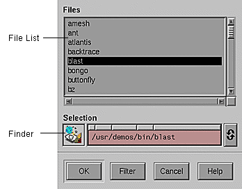
The FileSelectionBox traverses directories, shows files and subdirectories, and selects files. It has these main areas:
| Show menu and Hidden Files toggle | |
They control what appears in the scrolling list of directories and files beneath them. The Show menu allows the user to restrict the list to display only files of a particular type or format. Minimally the list has two items: All and Custom... . “All” always appears at the top of the menu, and “Custom...” always appears at the bottom of the menu following a separator. All shows an unrestricted view of all files and directories in the current subdirectory. Custom... launches the custom filter dialog. | |
| Files and directories list | |
The scrollable list in the enhanced FileSelectionBox contains both files and directories. Directories appear in bold at the top of the list. Files appear after the directories and are sorted alphabetically. | |
| Finder widget | |
The DropPocket displays the icon and the text field displays the name of the current directory or file. The user can select a file or directory by dropping its icon on the DropPocket or typing its name in the text field. Automatic file completion is supported. Clicking the right mouse over a path bar button of the path navigation bar shows the directory/file choices at that level. The user can also recall a previously-selected directory from the DynaMenu. “The Finder Widget” discusses the Finder widget in more detail. | |
| Command panel | |
The buttons at the bottom of the FileSelectionBox reflect the action name; the OK, Cancel and Help buttons operate the same in the enhanced FileSelectionBox as they do in the regular version. The Filter button pops up a Filter Dialog, which allows a user to enter a shell-style filename expression as filter pattern. The enhanced FileSelectionBox displays only those files in the current directory that match the given pattern. (The FileSelectionBox continues to display any subdirectories in the current directory.) | |
The programmatic interface to the enhanced FileSelectionBox differs from the regular version in the following points:
You can retrieve the Finder child of the FileSelectionBox using the standard XmFileSelectionBoxGetChild(3X) by providing the defined constant SgDIALOG_FINDER as the child. You should check the returned widget for validity; it is NULL if the FileSelectionBox is not enhanced.
XmNdirMask is not guaranteed to be exactly the same as the regular version of the FileSelectionBox in all situations. It does conform to the definition in the XmFileSelectionBox(3X) man page. Specifically, the directory portion XmNdirMask may not be present in the enhanced FileSelectionBox's representation.
XmNfileTypeMask behavior is different because there is no separate directory list. In the enhanced FileSelectionBox:
XmFILE_REGULAR and XmFILE_ANY_TYPE show both files and directories in the file list
XmFILE_DIRECTORY shows only directories
For detailed information on the FileSelectionBox widget, refer to the SgFileSelectionBox(3X) man page. For an example program using the FileSelectionBox widget, see “Example Program for File Selection Box” in Appendix A. See Chapter 10, “Dialogs,” in the IRIX Interactive User Interface Guidelines for guidelines on using dialogs in your application. For information about standard XmFileSelectionBox resources, behavior, and callbacks, see the XmFileSelectionBox(3X) man page.
The Scale widget (SgScale), is an enhanced version of the IRIS IM Scale widget (XmScale). The enhanced Scale widget is also referred to as the Percent Done Indicator or Progress Indicator.
To implement this indicator, set the following resources:
*scale.sliderVisual: flat_foreground *scale.slidingMode: thermometer *scale.slanted: true |
For an example of code, see “Example Programs for Scale (Percent Done Indicator) Widget” in Appendix A. Also see “IRIX Interactive Desktop Scales” in Chapter 9 of the IRIX Interactive User Interface Guidelines for guidelines on using scales in your application. For more information on the enhanced Scale widget, refer to the SgScale(3X) man page. For more information on the unenhanced version of the widget, refer to the XmScale(3X) man page.
The Text and TextField widgets (SgText and SgTextField) are enhanced versions of the IRIS IM Text and TextField widgets (XmText and XmTextField). In addition to the standard XmText and XmTextField resources, these widgets provide the following new resources:
| selectionBackground | The background color for selected text. | |
| selectionForeground | The foreground color for selected text. | |
| errorBackground | The background color for text that you select with an “error status” by using the SgTextSetErrorSelection() or SgTextFieldSetErrorSelection() function (depending on whether the widget is a SgText or SgTextField widget). | |
| cursorVisibleOnFocus | If TRUE (the default), the widget displays the text cursor only when the widget has focus. If FALSE, the cursor is always visible even when the widget does not have keyboard focus. |
The SgTextSetErrorSelection() and SgTextFieldSetErrorSelection() functions operate almost identically to the XmTextSetSelection() and XmTextFieldSetSelection() functions. You use them to select a range of text as the primary selection. The only difference is that the selected text is drawn with the background color specified by the errorBackground resource instead of that specified by the selectionBackground resource.
For a detailed description of the new resources for the enhanced versions of these widgets, refer to the SgText(3X) and SgTextField(3X) man pages. For information on the unenhanced versions of these widgets, refer to the XmText(3X) and XmTextField(3X) man pages. See “Text Fields” in Chapter 9 of the IRIX Interactive User Interface Guidelines for guidelines on using text fields in your application.
SGI provides two sets of mixed-model programming widgets: one set for use with OpenGL and one set for use with IRIS GL.
A mixed-model program, briefly, is an X program that creates one or more subwindows that use OpenGL or IRIS GL for rendering. Such a program uses Xlib or Xt calls for windowing, event handling, color maps, fonts, and so on. A “pure” IRIS GL application, on the other hand, uses IRIS GL calls for windowing, event handling, color maps, and fonts. (For a more detailed discussion of mixed-model programming, refer to the OpenGL Porting Guide.)
If you plan to port your IRIS GL application to OpenGL, a good first step is to port it to mixed-model. The switch to OpenGL is then much easier. The IRIS GL mixed-model widgets make it much easier to port pure IRIS GL applications to mixed-model.
If you are writing a new application, just start with OpenGL and the OpenGL versions of the mixed-model widgets (or use Open Inventor instead of OpenGL—Open Inventor handles all this for you).
The mixed-model widgets are:
IRIS GL | OpenGL |
GlxDraw | GLwDrawingArea |
GlxMDraw | GLwMDrawingArea |
The GlxDraw and GLwDrawingArea widgets are suitable for use with any widget set. The GlxMDraw and GLwMDrawingArea widgets are designed especially for use with IRIS IM.
This manual does not tell you how to create a mixed-model program. For instructions on mixed-model programming, refer to the OpenGL Porting Guide. (The OpenGL Porting Guide contains mixed-model programming information that's relevant for both IRIS GL and OpenGL programmers.)
You can find examples of many mixed-model programs for both OpenGL and IRIS GL in the 4Dgifts directories. If you have trouble finding the relevant directories, refer to the README file in /usr/people/4Dgifts. This README file explains the contents and organization of the 4Dgifts directories.
SGI provides these new widgets:
For guidelines on when to use the different widgets (for example, when to use a Thumbwheel or a Dial) refer to the IRIX Interactive User Interface Guidelines.
This section describes each important new IRIS IM widget. It does not discuss new widgets that are part of composite widgets, unless they are generally useful.
The ColorChooser widget (SgColorChooser) allows users to select colors in RGB or HSV color spaces. Figure 4-2 shows the ColorChooser's default configuration.
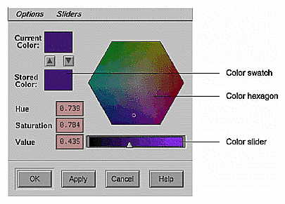
The ColorChooser includes these components:
Menus for setting options and sliders for the color chooser.
A color hexagon that provides visual selection of the hue and saturation components of a color in an HSV color space.
Color sliders for each of the hue, saturation, value, red, green, and blue color components. To make the color sliders visible, the user can select items from the Sliders menu. (Figure 4-3 shows the ColorChooser with all the sliders visible.) You can also display the color sliders programmatically. Text fields show the exact value of each current color component and allow users to set these values numerically.
Two color swatches: one for showing the current selected color and one for enabling the user to store a second color for reference.
Three or four buttons. The default button labels are OK, Cancel, Help, and Apply. If the parent of the ColorChooser widget is a DialogShell, then the Apply button is managed; otherwise it is unmanaged.
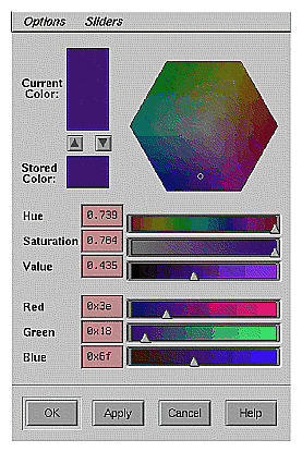
Users can select a color by manipulating the color hexagon and any of the six sliders, or by changing the values in any of the text fields.
You must include the header file <Sgm/ColorC.h> in any source file that uses a ColorChooser widget.
For more detailed information about the ColorChooser widget, refer to the SgColorChooser(3X) man page. For an example program using the ColorChooser widget, see “Example Program for Color Chooser” in Appendix A. You can also examine, compile, and experiment with the colorc demonstration program in the directory /usr/src/X11/motif/Sgm/colorc. See “A Specific Standard Support Window: The IRIX Interactive Desktop Color Chooser” in Chapter 6 of the IRIX Interactive Desktop for guidelines on using the ColorChooser widget in your application.
By default, the ColorChooser widget uses GL's Gouraud shading to display the colors in the hexagon and sliders. You can force the ColorChooser widget not to use GL by setting the value of the SgNuseGl resource to FALSE. When SgNuseGl is FALSE, the ColorChooser widget uses only X function calls. In this case, it does not draw a color hexagon and it uses XmScale widgets instead of the special color sliders.
When using GL, the ColorChooser normally shades the color hexagon and color sliders so that each point is a true representation of the color that would be selected if the user were to move the hexagon pointer or color slider to that point. However, if the value of the SgNwysiwyg resource is FALSE, then the ColorChooser always displays the hexagon colors with a Value (intensity) of 1 (maximum intensity), and the RGB sliders with a color range of black to the maximum RGB color component value.
For example, if the current selected color RGB value is (100, 200, 50), then the Red color slider displays the colors (0, 200, 50) through (255, 200, 50) if SgNwysiwyg is TRUE, and (0, 0, 0) through (233, 0, 0) if SgNwysiwyg is FALSE. (Note that the user can also toggle the value of SgNwysiwyg by selecting the “WYSIWYG” option from the ColorChooser's Options menu.)
The SgNshowSliders resource determines which of the color sliders are visible. Possible values are:
| SgValue | Show only the slider for the color Value (the default) | |
| SgRGB_and_Value | Show the Value and RGB sliders | |
| SgRGB_and_HSV | Show all six sliders, the HSV and RGB sliders |
The default labels (in the C locale) for the ColorChooser buttons are “OK,” “Apply,” “Cancel,” and “Help.” You can change these by setting the values of SgNokLabelString, SgNapplyLabelString, SgNcancelLabelString, and SgNhelpLabelString respectively.
You can add additional children to the ColorChooser after creation—they are laid out in the following manner:
The first child is used as a work area. The work area is placed just below the menu bar.
Buttons—All XmPushButton widgets or gadgets, and their subclasses are placed after the OK button, in the order of their creation.
The layout of additional children that are not in the above categories is undefined.
In ColorChooser callback functions, the RGB color values are provided as the r, g, and b parameters of the SgColorChooserCallbackStruct structure passed to the functions. “Handling User Interaction with the Color Chooser” describes the ColorChooser callbacks.
ColorChooser also provides several convenience routines for getting and setting both the current color values and setting the stored color value.
SgColorChooserSetColor() sets both the current and the stored color values to the same color:
void SgColorChooserSetColor(Widget w, short r, short g,
                            short b);
|
SgColorChooserGetColor() retrieves the current color values:
void SgColorChooserGetColor(Widget w, short *r, short *g,
                            short *b);
|
SgColorChooserSetCurrentColor() sets the current color but not the stored color:
void SgColorChooserSetCurrentColor(Widget w, short r,
                                   short g, short b);
|
SgColorChooserSetStoredColor() sets the stored color but not the current color:
void SgColorChooserSetStoredColor(Widget w, short r,
                                  short g, short b);
|
For each function, w is the ColorChooser widget and r, g, and b are the red, green, and blue values, respectively.
The ColorChooser widget defines the following callback resources:
| SgNapplyCallback | Invoked when the user activates the Apply button. The callback reason is SgCR_APPLY. | |
| SgNcancelCallback | Invoked when the user activates the Cancel button. The callback reason is SgCR_CANCEL. | |
| SgNokCallback | Invoked when the user activates the OK button. The callback reason is SgCR_OK. | |
| SgNvalueChangedCallback | Invoked when the user selects a color. The callback reason is XmCR_VALUE_CHANGED. A color is selected when the user changes the value of a color component with the color hexagon, one of the color sliders, or one of the color components text widgets. | |
| SgNdragCallback | Specifies the list of callbacks called when the user drags the mouse over the color hexagon or one of the color sliders to select a color. The callback reason is XmCR_DRAG. |
A pointer to a SgColorChooserCallbackStruct structure is passed to each ColorChooser callback function:
typedef struct {
    int reason;
    XEvent *event;
    short r, g, b;
} SgColorChooserCallbackStruct;
|
| reason | Indicates why the callback was invoked. | |
| event | Points to the XEvent that triggered the callback. | |
| r | Indicates the red color component of the currently selected color. | |
| g | Indicates the green color component of the currently selected color. | |
| b | Indicates the blue color component of the currently selected color. |
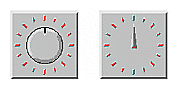
The Dial widget (SgDial), shown in Figure 4-4, is a new widget that allows users to input or modify a value from within a range of values. Figure 4-4 shows two forms of the Dial widget, one with the input control in the shape of a knob and the other in the shape of a pointer. The user can modify the Dial's value by spinning the knob or pointer. The Dial is usually surrounded by tick marks (marked divisions around the perimeter of the Dial).
You must include the header file <Sgm/Dial.h> in any source file that uses a Dial widget.
For more detailed information about the Dial widget, refer to the SgDial(3X) man page. For an example program using the Dial widget, see “Example Program for Dial” in Appendix A. You can also examine, compile, and experiment with the dial demonstration program in the directory /usr/src/X11/motif/Sgm/dial. See “Dials” in Chapter 9 of the IRIX Interactive User Interface Guidelines for guidelines on using the Dial widget in an application.
You control the display characteristics of a Dial through widget resources.
The SgNdialVisual resource determines whether the Dial uses a knob or a pointer. The default value, SgKNOB, specifies a knob and SgPOINTER specifies a pointer. If you use a pointer, you can also specify the color of the small “indicator” at the center of the pointer using the SgNindicatorColor resource; the default color is red.
Specify the position of the lowest value on the Dial with the SgNstartAngle resource. The value, which must be between 0 and 360 inclusive, specifies the number of degrees clockwise from the top of the Dial. A default value of 0 corresponds to the top of the Dial.
The SgNangleRange resource determines the range of the Dial in degrees. The value, which must be between 0 and 360 inclusive, specifies the number of degrees clockwise from the start angle of the Dial. The default value of 360 allows the Dial to rotate completely.
The Dial widget displays evenly spaced “tick marks” along the perimeter of the Dial's angle range. You control the number of tick marks with the SgNdialMarkers resource; the default number is 16. The length of the tick marks in pixels is determined by the SgNmarkerLength resource; the default length is 8 pixels. The SgNdialForeground resource determines the color of the tick marks; the default is red.
The resources XmNminimum and XmNmaximum determine the minimum and maximum values of the Dial. The Dial takes on the minimum value at the position specified by SgNstartAngle and takes on the maximum value at the position SgNangleRange degrees clockwise from SgNstartAngle. The value of XmNmaximum must be greater than or equal to the value of XmNminimum. The default value of XmNminimum is 0 and the default value of XmNmaximum is 360.
The XmNvalue resource, which must be a value between XmNminimum and XmNmaximum inclusive, contains the current position of the Dial. You can set or get the value of a Dial widget at any time by respectively setting or getting its XmNvalue resource.
In Dial callback functions, the Dial value is provided as the position parameter of the SgDialCallbackStruct structure passed to the functions. “Detecting Changes in the Dial's Value” describes the Dial callbacks.
Dial also provides a convenience routine, SgDialSetValue(), for setting the value of XmNvalue:
void SgDialSetValue(Widget w, int value); |
w is the Dial widget whose value you want to set and value is the new value.
You can get the current value of a Dial widget at any time by retrieving the value of its XmNvalue resource. Dial also provides a convenience routine, SgDialGetValue(), for getting the value of XmNvalue:
void SgDialGetValue(Widget w, int *value); |
w is the Dial widget whose value you want to get. Upon returning, value contains the Dial's value.
The Dial widget defines two callback list resources, XmNvalueChangedCallback and XmNdragCallback. A Dial widget invokes XmNvalueChangedCallback whenever its value changes either programmatically (for example, by calling SgDialSetValue()) or through user interaction. A Dial widget invokes XmNdragCallback whenever the user clicks and drags, or “spins,” the Dial's knob or pointer.
A pointer to a SgDialCallbackStruct structure is passed to each Dial callback function:
typedef struct {
    int reason;
    XEvent *event;
    int position;
} SgDialCallbackStruct;
|
The SgDialCallbackStruct parameters are:
| reason | The reason the callback was invoked. This value is XmCR_VALUE_CHANGED in the event of a XmNvalueChangedCallback and XmCR_DRAG in the event of a XmNdragCallback. | |
| event | A pointer to the XEvent that triggered the callback | |
| position | The new Dial value |
The ThumbWheel widget (SgThumbWheel), shown in Figure 4-5, is a new widget that allows users to input or modify a value, either from within a range of values or from an unbounded (infinite) range.
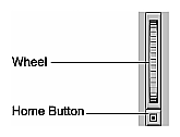
A ThumbWheel has an elongated rectangular region within which a wheel graphic is displayed. Users can modify the ThumbWheel's value by spinning the wheel. A ThumbWheel can also include a home button, located outside the wheel region. This button allows users to set the ThumbWheel's value to a known position.
You must include the header file <Sgm/ThumbWheel.h> in any source file that uses a Thumbwheel widget.
For detailed information on the ThumbWheel widget, refer to the SgThumbWheel(3X) man page. For an example program using the ThumbWheel widget, see “Example Program for ThumbWheel” in Appendix A. You can also examine, compile, and experiment with the thumbwheel demonstration program in the directory /usr/src/X11/motif/Sgm/thumbwheel. See “Thumbwheels” in Chapter 9 of the IRIX Interactive User Interface Guidelines for guidelines on using the ThumbWheel widget in your application.
You control the display characteristics of a ThumbWheel through widget resources.
The resources XmNminimum and XmNmaximum determine the minimum and maximum values of the ThumbWheel. Setting XmNmaximum equal to XmNminimum indicates an infinite range.
The default value of XmNminimum is 0 and the default value of XmNmaximum is 100.
The SgNangleRange resource specifies the angular range, in degrees, through which the ThumbWheel is allowed to rotate. The default of 150 represents roughly the visible amount of the wheel. Thus clicking at one end of the wheel and dragging the mouse to the other end would give roughly the entire range from XmNminimum to XmNmaximum.
In conjunction with XmNmaximum and XmNminimum, the SgNangleRange resource controls the fineness or coarseness of the wheel control when it is not infinite. If this value is 0, the ThumbWheel has an infinite range. If the range of the ThumbWheel is infinite, you can use the SgNunitsPerRotation resource to specify the change in the ThumbWheel's value for each full rotation of the wheel.
If the value of SgNshowHomeButton is TRUE, the default, the ThumbWheel displays a home button by the slider. The user can click on the home button to set the value of the ThumbWheel to a known value, which is specified by the SgNhomePosition resource. The default value of SgNhomePosition is 50.
The XmNorientation resource determines whether the orientation of the ThumbWheel is vertical, indicated by a value of XmVERTICAL, or horizontal, indicated by a value of XmHORIZONTAL. The default value is XmVERTICAL.
The XmNvalue resource contains the current position of the ThumbWheel. XmNvalue must be a value between XmNminimum and XmNmaximum if the ThumbWheel is not “infinite.” You can set or get the value of a ThumbWheel widget at any time by respectively setting or getting its XmNvalue resource.
In ThumbWheel callback functions, the ThumbWheel value is provided as the value parameter of the SgThumbWheelCallbackStruct structure passed to the functions. “Detecting Changes in the ThumbWheel's Value” describes the ThumbWheel callbacks.
The ThumbWheel widget defines two callback list resources, XmNvalueChangedCallback and XmNdragCallback. A ThumbWheel widget invokes XmNvalueChangedCallback whenever its value changes either programmatically (that is, by setting the value of XmNvalue) or through user interaction. A ThumbWheel widget invokes XmNdragCallback whenever the user clicks and drags, or “spins,” the ThumbWheel's wheel.
A pointer to a SgThumbWheelCallbackStruct structure is passed to each ThumbWheel callback function:
typedef struct { int reason;
                 XEvent * event;
                 int value;
               } SgThumbWheelCallbackStruct;
|
The SgThumbWheelCallbackStruct parameters are:
| reason | The reason the callback was invoked. This value is XmCR_VALUE_CHANGED in the event of a XmNvalueChangedCallback and XmCR_DRAG in the event of a XmNdragCallback. | |
| event | A pointer to the XEvent that triggered the callback. | |
| position | The new ThumbWheel value. |
The Drop Pocket widget (SgDropPocket), shown in Figure 4-6, receives and displays Desktop icons.

When users drop Desktop file icons onto the Drop Pocket, the Drop Pocket determines the name of the icon and returns information describing the icon to the application in the callback.
When users drag an acceptable icon over the Drop Pocket, the Drop Pocket background changes color and the Drop Pocket displays the dropped icon. If the type of a file is not known, or if the file does not exist (for example, if the user is specifying a new file), the Drop Pocket displays the icon for unknown file types (this icon looks like a round balloon).
For more information on the Drop Pocket widget, refer to the SgDropPocket(3X) man page. You can find example code in /usr/src/X11/motif/Sgm/dropPocket directory. For an example program using the Drop Pocket widget, see “Example Program for Drop Pocket” in Appendix A.
SYNOPSIS #include <Sgm/DropPocket.h>
New Resources
| SgNDropPocketActivePixel | Specifies the color for the background of the DropPocket when an icon that can be dropped is above the DropPocket. | |
| SgNiconDataBasePath | Specifies the location of the icon database. The default value is /usr/lib/filetype/workspace.otr. Setting this resource to a filename that is not a legal icon database will cause serious problems for the DropPocket. | |
| SgNname | Specifies the compound string that is the name of the current icon. By setting this resource, the application can control the initial icon that appears in the DropPocket. If this resource is NULL, the DropPocket will appear empty. Refer to XmString(3X) for more information on the creation and structure of compound strings. |
Callback Information
The Callback structure is SgDropPocketCallbackStruct. A pointer to the following structure is passed to each callback:
typedef struct { int reason;
                 XEvent * event;
                 Window window;
                 XmString iconName;
                 char * iconData;
               } SgDropPocketCallbackStruct;
|
| reason | Indicates why the callback was invoked. The constant SgCR_ICON_CHANGE is the reason associated with callbacks generated by a successful icon drop on the DropPocket. | |
| event | Points to the XEvent that triggered the callback | |
| window | Specifies the window of the DropPocket. | |
| iconName | Specifies the name of the icon. For icons representing files, this is the file name. For other types of icons, the name may not completely specify the icon. For example a person icon may have the name jake, but the icon represents a person in /usr/lib/faces/jake. | |
| iconData | The full string description of the icon. |
The Finder widget (SgFinder), shown in Figure 4-7, is a new widget that accelerates text selection of long objects such as filenames. (A good way to experiment with a Finder widget is to select “An Icon” from the Find toolchest.)
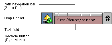
The Finder widget is customizable for various applications (it is not just for looking at directories; see the SgFinder(3X) man page for customization details). The Finder widget includes four components:
You must include the header file <Sgm/Finder.h> in any source file that uses a Finder widget.
For more detailed information on the Finder widget, refer to the SgFinder(3X), SgDropPocket(3X), and SgDynaMenu(3X) man pages. For an example using the Finder widget, see “Example Program for Finder” in Appendix A. You can also examine, compile, and experiment with the finderTest demonstration program in the directory /usr/src/X11/motif/Sgm/finder. See “File Finder” in Chapter 9 of the IRIX Interactive User Interface Guidelines for guidelines on using the Finder widget in your application.
If you do not need the drop pocket feature of the Finder widget, you can set the value of the resource SgNuseDropPocket to FALSE when you create the widget. This bypasses the costs of setting up drag and drop and loading the file icon libraries. Note that you cannot set this resource using XtSetValues(); if you do not originally create a Finder widget with a drop pocket, you cannot add one afterwards.
Similarly, if you do not need the Recycle button, you can set the value of the resource SgNuseHistoryMenu to FALSE. Note that you cannot set this resource using XtSetValues(); if you do not originally create a Finder widget with a Recycle button, you cannot add one afterwards.
You can customize the appearance of the Recycle button by setting the value of the SgNhistoryPixmap resource to the pixmap you want to display.
By default, the Finder widget determines where to place the buttons on the path navigation bar by the location of the forward slash (/) character in the text field. You can specify a different separator character by providing it as the value of the SgNseparator resource. This feature is useful if you want to use the Finder widget to display something other than filenames.
You can retrieve the current value of the Finder's text field with SgFinderGetTextString():
char *SgFinderGetTextString(Widget w); |
You can set the value of the text field with SgFinderSetTextString():
void SgFinderSetTextString(Widget w, char *value); |
You can add an item to the “history list” of the Recycle button with SgFinderAddHistoryItem():
void SgFinderAddHistoryItem(Widget w, char *str); |
You can clear the Recycle button's history list with SgFinderClearHistory():
void SgFinderClearHistory(Widget w); |
You can access a widget component within a finder using SgFinderGetChild():
Widget SgFinderGetChild(Widget w, int child); |
child specifies the component and can take any of the following values:
| SgFINDER_DROP_POCKET | |
The drop pocket | |
| SgFINDER_TEXT | |
The text field | |
| SgFINDER_ZOOM_BAR | |
The path navigation bar | |
| SgFINDER_HISTORY_MENUBAR | |
The Recycle button | |
When the user clicks a button in the path navigation bar, the default action of the Finder is to set the current directory to the directory listed underneath that button. You can change this behavior by setting the SgNsetTextSectionFunc resource to the handler you want to use. The handler function must be of type SgSetTextFunc, which is defined in <Sg/Finder.h>:
typedef void (*SgSetTextFunc)(Widget finder, int section); |
The first argument is the Finder widget and the second is an integer corresponding to the button pressed. Buttons are numbered sequentially from the left, starting with 0. You can perform whatever operations you want in this function, but typically you include a call to SgFinderSetTextString() to set the value of the text field after the user clicks a button.
Additionally, the Finder widget defines two callback list resources:
| XmNactivateCallback | Invoked when the user clicks a path navigation bar button, when the text field generates an activateCallback (for example, the user presses the <Return> key in the text field), or when you set the text string by calling SgFinderSetTextString(). A pointer to an XmAnyCallbackStruct structure is passed to each callback function. The reason sent by the callback is XmCR_ACTIVATE. | |
| XmNvalueChangedCallback | Invoked when text is deleted from or inserted into the text field. A pointer to an XmAnyCallbackStruct structure is passed to each callback function. The reason sent by the callback is XmCR_VALUE_CHANGED. |
The Graph widget (SgGraph) allows you to display any group of widgets as a graph, with each widget representing a node. Figure 4-8 shows an example of a Graph widget.
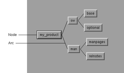
The arcs used to connect the nodes are instances of an Arc widget (SgArc), developed specifically for use with the Graph widget.
The Graph widget allows you to display any group of widgets as a graph, with each widget representing a node. The graph can be disconnected and can contain cycles. The arcs used to connect the nodes are instances of an Arc widget (SgArc), developed specifically for use with the Graph widget. Arcs may be undirected, directed, or bidirected. Note that the Graph widget does not understand the semantics of arc direction; in other words, for layout and editing purposes, an Arc will always have a parent and a child regardless of its direction.
The Graph widget has the ability to arrange all nodes either horizontally or vertically according to an internal layout algorithm, and supports an edit mode in which arcs and nodes may be interactively repositioned as well as created. There is also a read-only mode in which all events are passed directly to the children of the Graph widget. In edit mode, the Graph takes over all device events for editing commands.
The Graph is a complex widget, and a full discuss of its resources, utility functions, and capabilities is beyond the scope of this document. For detailed information about the Graph and Arc widgets, refer to the SgGraph(3X) and SgArc(3X) man pages.
You must include the header file <Sgm/Graph.h> in any source file that uses a Graph widget. You must include the header files <Sgm/Graph.h> and <Sgm/Arc.h> in any source file that uses an Arc widget.
The SpringBox widget (SgSpringBox) is a new container widget that arranges its children in a single row or column based on a set of spring constraints assigned to each child. You can use the SpringBox widget to create layouts similar to those supported by the XmForm widget, but the SpringBox widget is usually easier to set up.
The value of the SpringBox widget's XmNorientation resource determines its orientation. The default value, XmHORIZONTAL, specifies a horizontal SpringBox and the value XmVERTICAL specifies a vertical SpringBox.
To use the SpringBox, you set constraint resources on each child of the widget to specify the “springiness” for both the widget's size and position relative to its siblings.
You control the springiness of a widget's size by setting the values of its XmNverticalSpring and XmNhorizontalSpring resources. A value of zero means the child cannot be resized in that direction. For non-zero values, the values are compared to the values of other springs in the overall system to determine the proportional effects of any resizing. For example, a widget with a springiness of 200 would stretch twice as much as a widget with a springiness of 100. The default value of both resources is zero.
The values of the resources XmNleftSpring, XmNrightSpring, XmNtopSpring, and XmNbottomSpring control the springiness of a widget's position in relation to its neighboring boundaries. By default, the value of each of these springs is 50. A value of zero means that the SpringBox widget cannot add additional space adjacent to that part of a widget. Larger values are considered in relation to all other spring values in the system.
You must include the header file <Sgm/SpringBox.h> in any source file that uses a SpringBox widget. For more detailed information on the SpringBox widget, refer to the SgSpringBox(3X) man page.
The Grid widget (SgGrid) is a new container widget that arranges its children in a two-dimensional grid of arbitrary size. You can separately designate each row and column of the grid as having a fixed size or as having some degree of stretchability. You can also resize each child in either or both directions, or force a child to a fixed size.
You must include the header file <Sgm/Grid.h> in any source file that uses a Grid widget. For detailed information on the Grid widget, refer to the SgGrid(3X) man page.
You specify the number of rows and columns in a Grid by setting the values of its XmNnumRows and XmNnumColumns resources, respectively. The default value for each is 1. Note that you can set the size of a Grid only when you create it; you cannot use XtSetValues() to change the number of rows or columns in a Grid.
The XmNautoLayout resource determines the layout policy for a Grid. If its value is TRUE (the default), all rows and columns that have a non-zero resizability factor (described below) are sized according to the desired natural size of the widgets in that row or column.
If XmNautoLayout is FALSE, all widgets in resizable rows or columns are sized according to the resizability factor for that row or column. By default, the resizability factor is “1” for all rows and columns, which results in each cell in the grid having an equal size. You can change the resizability factor for a row or column by calling SgGridSetRowMargin() or SgGridSetColumnMargin() respectively:
SgGridSetRowResizability(Widget widget, int row, int factor);

SgGridSetColumnResizability(Widget widget, int column,
                            int factor);
|
widget is the Grid widget. The second argument specifies the row or column. Rows are numbered sequentially from the top starting at 0; columns are numbered sequentially from the left starting with 0. factor is the resizability factor for the row or column. Setting this value to 0 establishes the specified row or column as not resizable, regardless of the setting of XmNautoLayout. Other values are taken relative to all other rows. For example, if a Grid has three rows whose resizability factors are set to 100, 100, and 200, the first and second rows will occupy one quarter of the space (100/(100+100+200)), while the third row will occupy one half of the available space.
The XmNdefaultSpacing resource default spacing between rows and columns. The default value is 4 pixels. You can override the value on a per row/column basis using SgGridSetColumnMargin() or SgGridSetRowMargin() respectively:
SgGridSetRowMargin(Widget widget, int row, Dimension margin);

SgGridSetColumnMargin(Widget widget, int column,
                      Dimension margin);
|
widget is the Grid widget. The second argument specifies the row or column. margin specifies the margin in pixels between the row or column's edges and the widgets it contains. The margin is added to both sides of each row or column, so adding a 1 pixel margin increases the relevant dimension of the affected row or column by 2 pixels.
You can display the boundaries of a Grid by setting the value of its XmNshowGrid resource to TRUE. You might find this useful for debugging resize specifications. The default value is FALSE.
The XmNrow and XmNcolumn resources of a Grid's child widget specify the row and column in which the Grid places the child. If you do not specify these values, the Grid widget places the child in a randomly selected unoccupied cell.
The XmNresizeVertical and XmNresizeHorizontal resources determine whether the Grid can resize the child to fill the cell in the vertical and horizontal directions. The default value of TRUE allows the Grid to resize the child.
If a child is a fixed size, and smaller than the cell that contains it, the child's position within the cell is determined by an XmNgravity resource. Gravity may be any of the gravity values defined by Xlib except StaticGravity and ForgetGravity. The default is NorthWestGravity. Note that gravity has no effect if both XmNresizeVertical and XmNresizeHorizontal are TRUE.
Example 4-1 creates a grid of four buttons that all size (and resize) equally to fill one quarter of their parent.
Example 4-1. An Example of Using the Grid Widget
createGrid(Widget parent)
{
    int n;
    Arg args[10];
    Widget grid, child1, child2, child3, child4;
    n = 0;
    XtSetArg(args[n], XmNnumRows, 2); n++;
    XtSetArg(args[n], XmNnumColumns, 2); n++;
    grid = SgCreateGrid(parent, "grid", args, n);
    child1 = XtVaCreateManagedWidget("child1",
                                     xmPushButtonWidgetClass,
                                     grid,
                                     XmNrow, 0,
                                     XmNcolumn, 0,
                                     NULL);
    child2 = XtVaCreateManagedWidget("child2",
                                     xmPushButtonWidgetClass,
                                     grid,
                                     XmNrow, 0,
                                     XmNcolumn, 1,
                                     NULL);
    child3 = XtVaCreateManagedWidget("child3",
                                     xmPushButtonWidgetClass
                                     grid,
                                     XmNrow, 1,
                                     XmNcolumn, 0,
                                     NULL);
    child4 = XtVaCreateManagedWidget("child4",
                                     xmPushButtonWidgetClass
                                     grid,
                                     XmNrow, 1,
                                     XmNcolumn, 1,
                                     NULL);
    XtManageChild(grid);
}
|
Example 4-2 creates four buttons. The top row has a fixed vertical size, while the bottom row is resizable. The left column has a fixed size, but the right column can be resized. The button in the lower right can be resized, but the others cannot. The button in the lower left cell, which can be resized vertically, floats in the middle of its cell. The button in the upper right stays to the left of its cell.
Example 4-2. Another Example of Using the Grid Widget
createGrid(Widget parent) {
    int n;
    Arg args[10];
    Widget grid, chidl1, child2, child3, child4;

    n = 0;
    XtSetArg(args[n], XmNnumRows, 2); n++;
    XtSetArg(args[n], XmNnumColumns, 2); n++;
    grid = SgCreateGrid( parent, "grid", args, n );

    SgGridSetColumnResizability(grid, 0, 0);
    SgGridSetRowResizability(grid, 0, 0);

    child1 = XtVaCreateManagedWidget("child1",
                                 xmPushButtonWidgetClass,
                                 grid,
                                 XmNrow, 0,
                                 XmNcolumn, 0,
                                 NULL);
    child2 = XtVaCreateManagedWidget("child2",
                                 xmPushButtonWidgetClass,
                                 grid,
                                 XmNrow, 0,
                                 XmNcolumn, 1,
                                 XmNresizeHorizontal, FALSE,
                                 XmNgravity, WestGravity,
                                 NULL);
    child3 = XtVaCreateManagedWidget("child3",
                                 xmPushButtonWidgetClass,
                                 grid,
                                 XmNrow, 1,
                                 XmNcolumn, 0,
                                 XmNresizeVertical, FALSE,
                                 XmNgravity, CenterGravity,
                                 NULL);
    child4 = XtVaCreateManagedWidget("child4",
                                 xmPushButtonWidgetClass,
                                 grid,
                                 XmNrow, 1,
                                 XmNcolumn, 1,
                                 NULL);
    XtManageChild(grid);
}
|
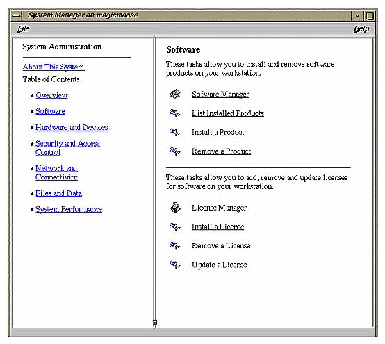
The HTML viewer component provides the widgets and libraries necessary for applications to include direct Web access for information from within an application (no external applications have to be run). Thus, applications can provide direct Web access to licensing, online help, and information retrieval.
For example, applications can use this component with a form and the post method to obtain a license for a user on a local or remote server. Also, applications can use the component to format text and images as read-only text, or provide help to the user. Figure 4-9 shows an example of the HTML widget.
This section covers the following aspects of the HTML viewer component:
The HTML viewer makes the World Wide Web accessible from any application. Prior to the Web, applications had to develop a protocol for remote help and construct a server to answer the protocol. Today, however, the Web supplies a predesigned protocol. And the HTML viewer provides the additional components to implement a Web viewer.
The HTML viewer understands how to render HTML markup language. The viewer is derived from the widget and class library licensed for the SGI WebMagic authoring environment. The library allows each application to decide exactly what it needs to support. This component is not meant to supplant general Web browsers which have support for things like bookmarks and search engines. However, the HTML viewer component answers the need for online access to licensing and help.
The viewer ViewKit component uses the Motif widget to access Web sites, a prebuilt GUI, and provides browsing, navigation, and history control. The ViewKit component requires the use of C++. It is composed of the following components:
VkWebViewerBase class, which is for programmers who want to provide their own interface. VkWebViewerBase is, from a widget point of view, just a scrolled window with a viewer in it. The scrolled window is held in a form. The subclass uses this form to add the other controls.
VkWebViewer class, which is a more complete browser for an application programmer that does not want to do a lot of programming with the component.
The include file is /usr/include/Vk/VkWebViewer.h. For example, to create the widget:
   _viewer = new VkWebViewer(“Viewer”, mainWindowWidget());
    addView(_viewer);
|
For more information about ViewKit, see the IRIS ViewKit Programmer's Guide.
Table 4-1 lists the HTML viewer supported tags. The tags are basically all of HTML 2, selective tags of HTML 3, and extended tags from Netscape and SGI
Table 4-1. HTML Viewer Tags and Attributes
Tag | Attributes |
|---|---|
A | HREF, TARGET, NAME |
AREA | HREF, TARGET, COORDS, SHAPE |
BASE | HREF, TARGET |
BASEFONT | SIZE (1..7, or exact size such as 24pt) |
BLOCKQUOTE, BQ |
|
BR |
|
BODY | BACKGROUND, VLINK, LINK. ALINK, BGCOLOR, TEXT, LANG |
CAPTION | ALIGN |
DIV | ALIGN |
DIR, OL, MENU, UL | START (for OL). See also P, Hn |
DL |
|
DT |
|
FRAME | SRC, NAME, WIDTH, HEIGHT |
FRAMESET | COLS, ROWS |
FORM | METHOD, ACTION, TARGET |
HEAD |
|
HTML |
|
HR | SIZE, WIDTH, NOSHADE, ALIGN |
IMG | SRC, NOFLOW, ALT, ALIGN, WIDTH, HEIGHT, BORDER, VSPACE, CLEAR |
INPUT | NAME, VALUE, TYPE, SIZE, MAXLENGTH, CHECKED |
ISINDEX | PROMPT |
LI |
|
LISTING | Deprecated |
MAP | NAME |
NOBR |
|
NOFRAMES |
|
OPTION | VALUE, SELECTED |
P, Hn | CLEAR |
PLAINTEXT | Deprecated |
PRE |
|
SELECT | NAME, SIZE, MULTIPLE |
TABLE | CELLSPACING, CELLPADDING, BORDER, ALIGN, WIDTH, NOFLOW, CLEAR, BGCOLOR |
TD, TH | ROWSPAN, COLSPAN, ALIGN, VALIGN, BGCOLOR, NOWRAP |
TEXTAREA | NAME, ROWS, COLS |
TITLE |
|
TR | ALIGN, VALIGN, BGCOLOR |
WBR |
|
XMP | Deprecated |
Table 4-2 lists HTML viewer character tags.
Table 4-2. HTML Viewer Character Tags
|
|
|
|---|---|---|
ADDRESS | B | BIG |
CITE | CODE | DFN |
EM | I | KBD |
FONT SIZE=(0..7) |
|
|
COLOR=”#rrbbgg” [a] |
|
|
S | SAMP | SMALL |
STRIKE | STRONG | SUB |
SUP | IT | U |
UL | VAR |
|
[a] COLOR=”#rrbbgg” or COLOR=”colorname” | ||